Archives
High Line Art Timeline
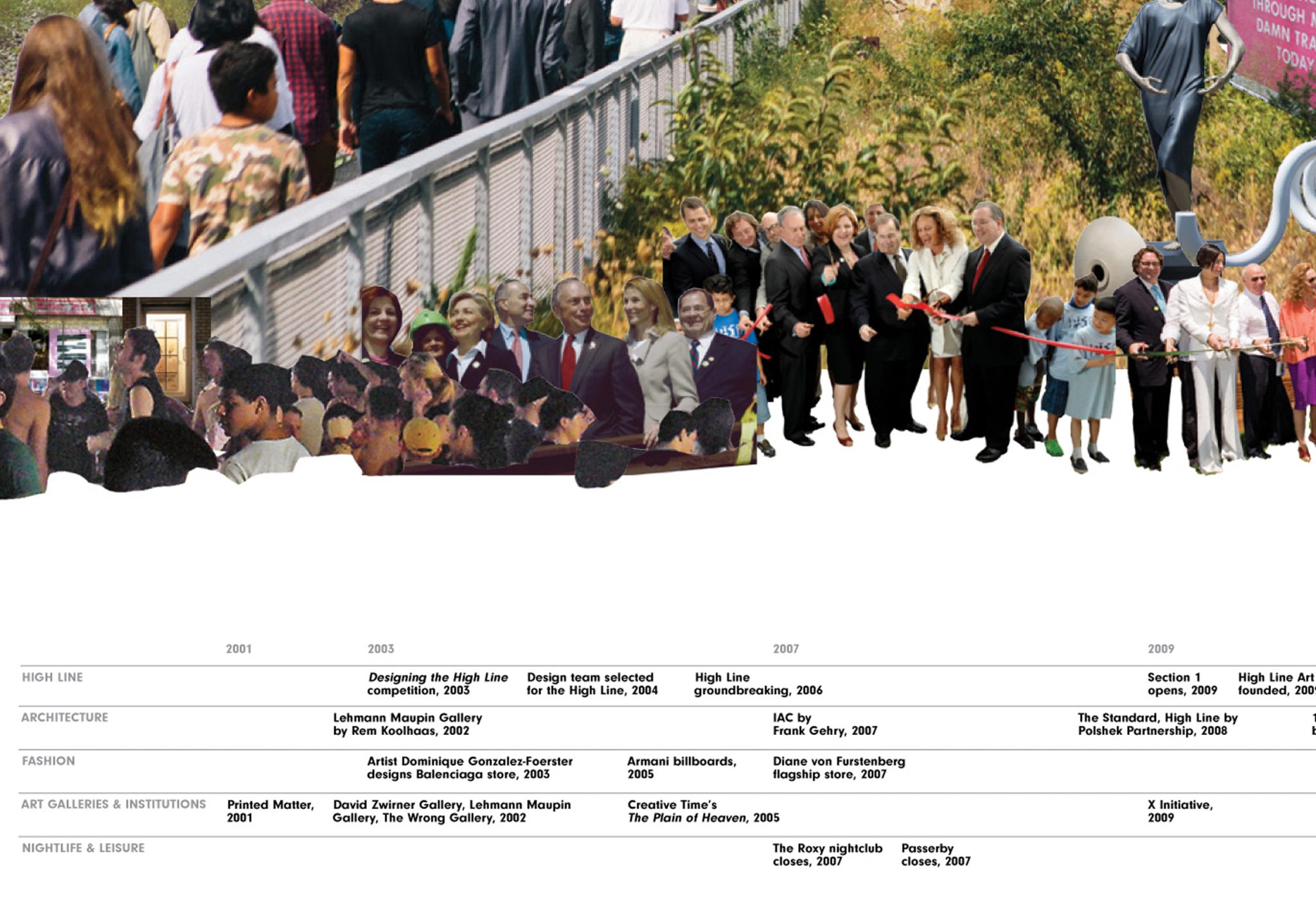
High Line Art is a department within Friends of the High Line devoted to curating art along the length of this public space, including sculptures, video, and live performances. When High Line Art decided to publish a book called High Art, we were asked to create a timeline illustrating the history of the High Line and HLA’s place within that timeline.
To begin, we received a large volume of data about the history of the High Line and High Line Art. Our challenge was to tease a narrative out of this data and give the history a point of view, while also translating the data into a visual that would tell the story chronologically in a direct, interesting and accessible way.
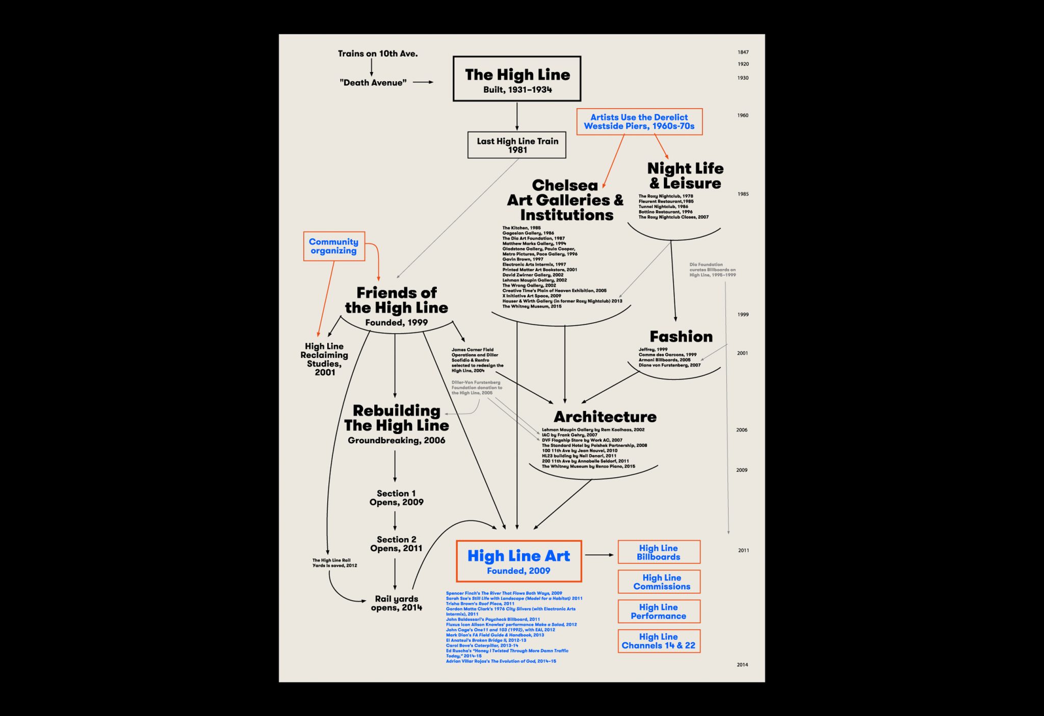
Our minds first jumped to Alfred Barr’s diagram of Modern Art for inspiration. Barr created his diagram “Cubism and Modern Art” in 1936, and by naming various artistic movements connected through red or black arrows and placed along a chronology, he visually depicted how these movements related and influenced each other over a span of 45 years. We wondered, what if we sketched a similar diagram for the history of the High Line in order to see what narrative might emerge?
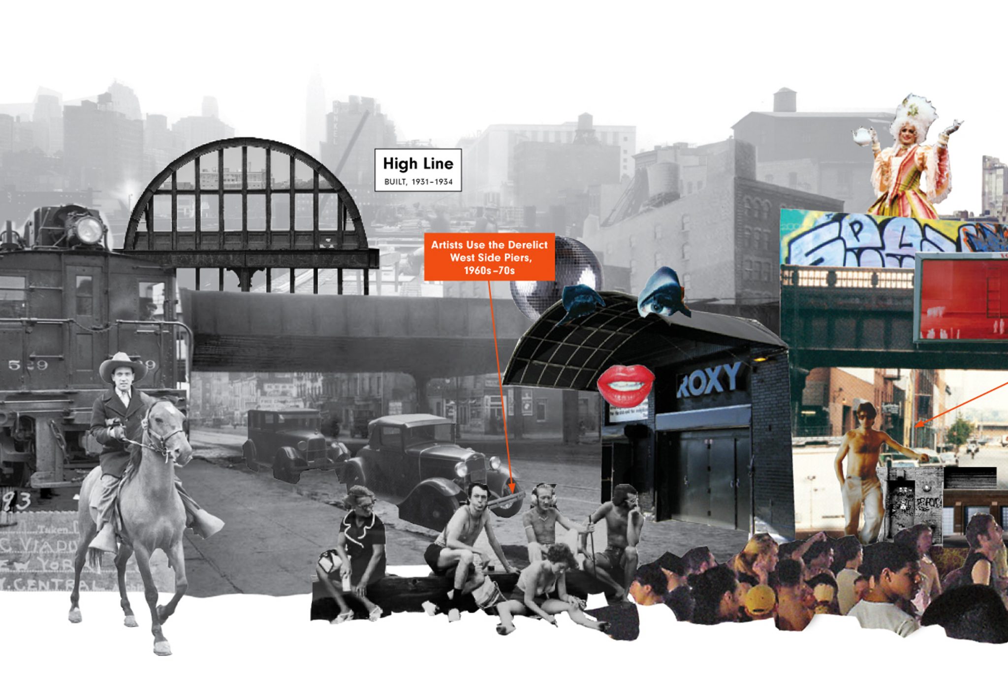
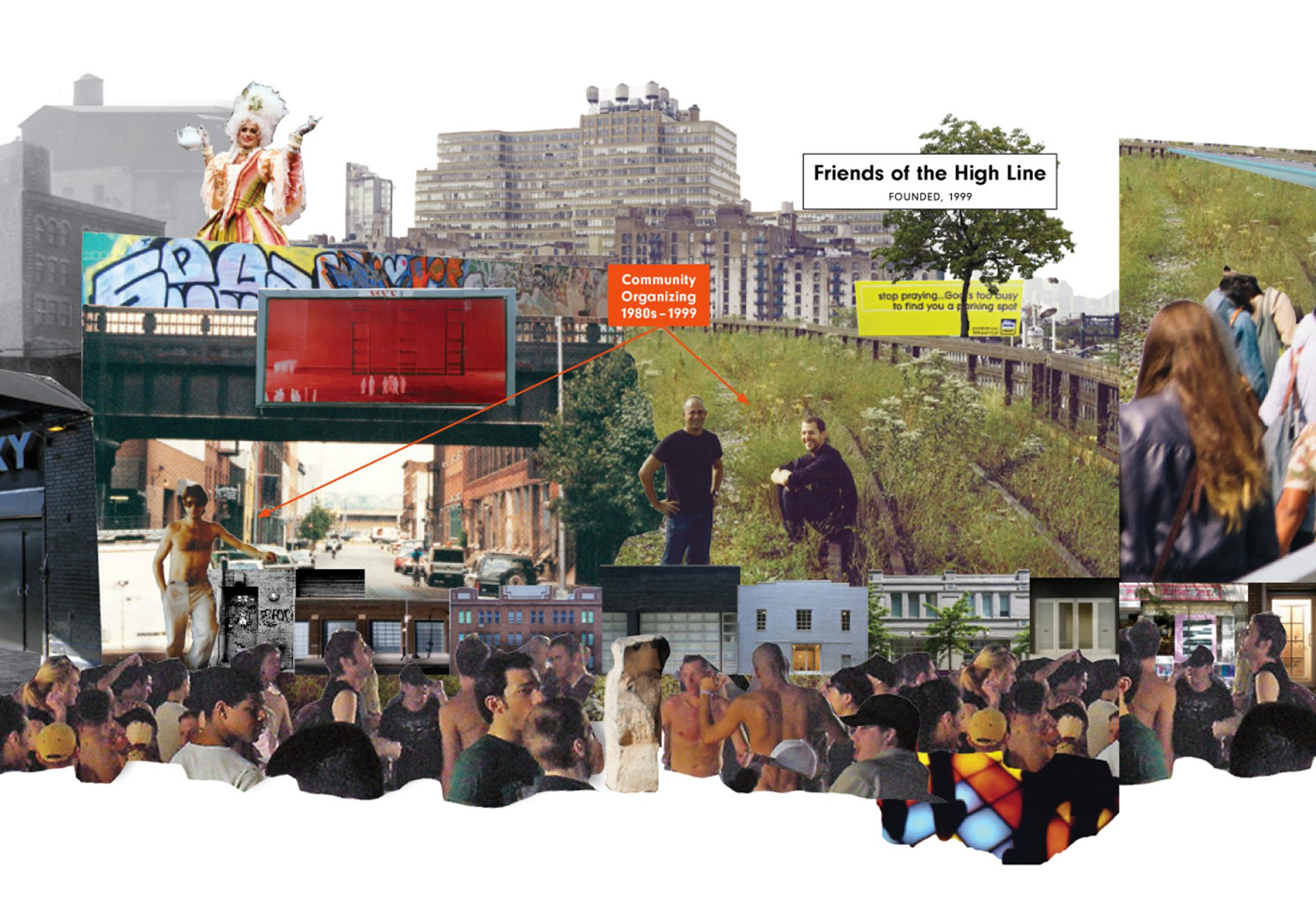
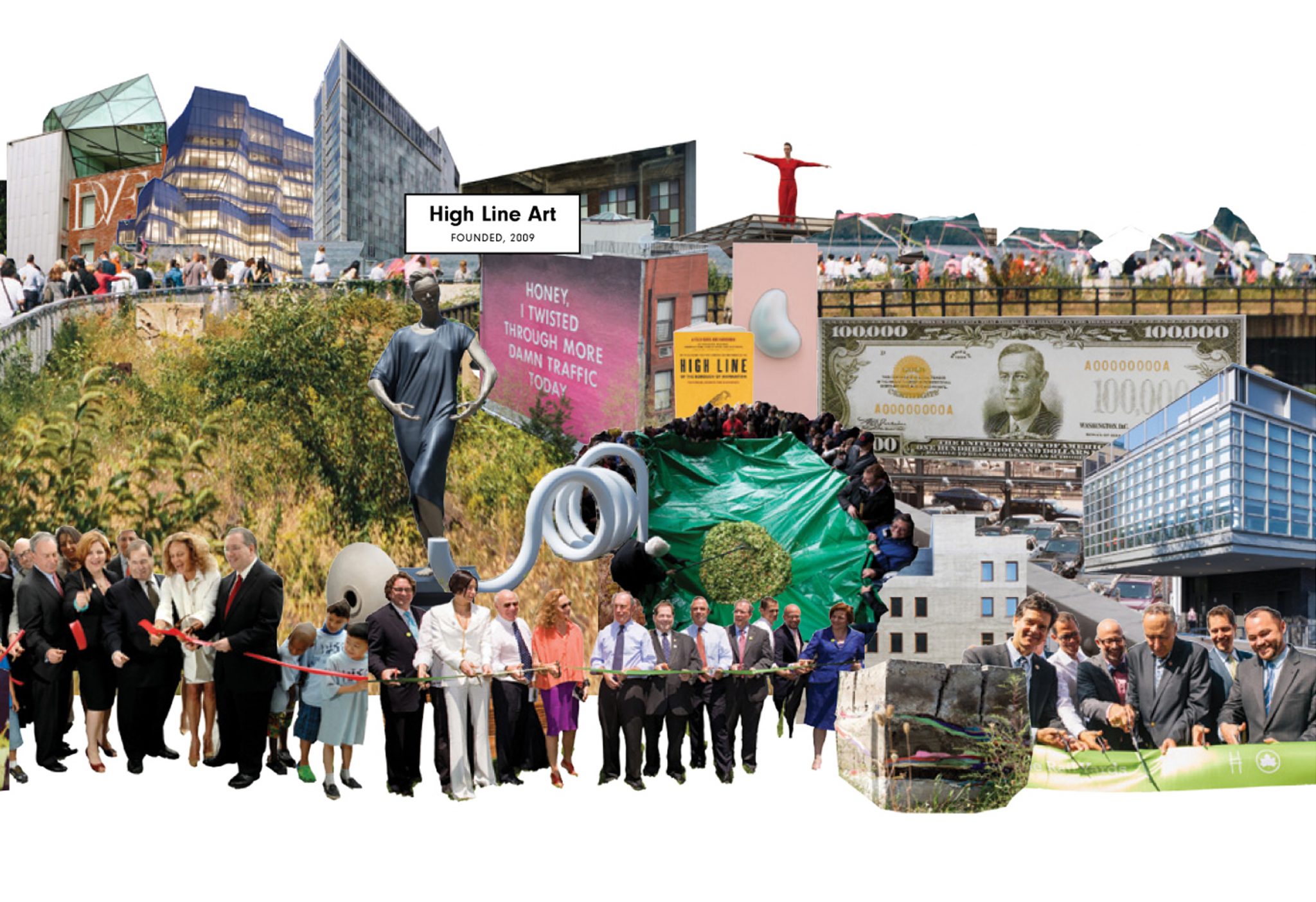
This experiment brought us to the key ideas behind the timeline we ended up creating: that art and the High Line are the perfect match, because art has always been at the heart of this public space. Initially an isolated area in the Meatpacking district of lower Manhattan, the abandoned railroad tracks were first only valued by experimental artists and other fringe communities who challenged the norms of society. They were the seeds of the High Line as we know it today, ultimately becoming a showcase for art institutions and a celebration of public space.
To illustrate these ideas, we decided to create a visual collage along a horizontal chronology starting with the original use of the tracks and ending with the High Line’s most recent and high-profile supporters, openings and events. The timeline is divided into thematic categories shown in parallel rows, with years at the top and pictures clustered above. In a way, the history of the High Line can be seen as a microcosm of the city itself: dazzling magnificence that has its roots in humble but fearless, imaginative outliers.
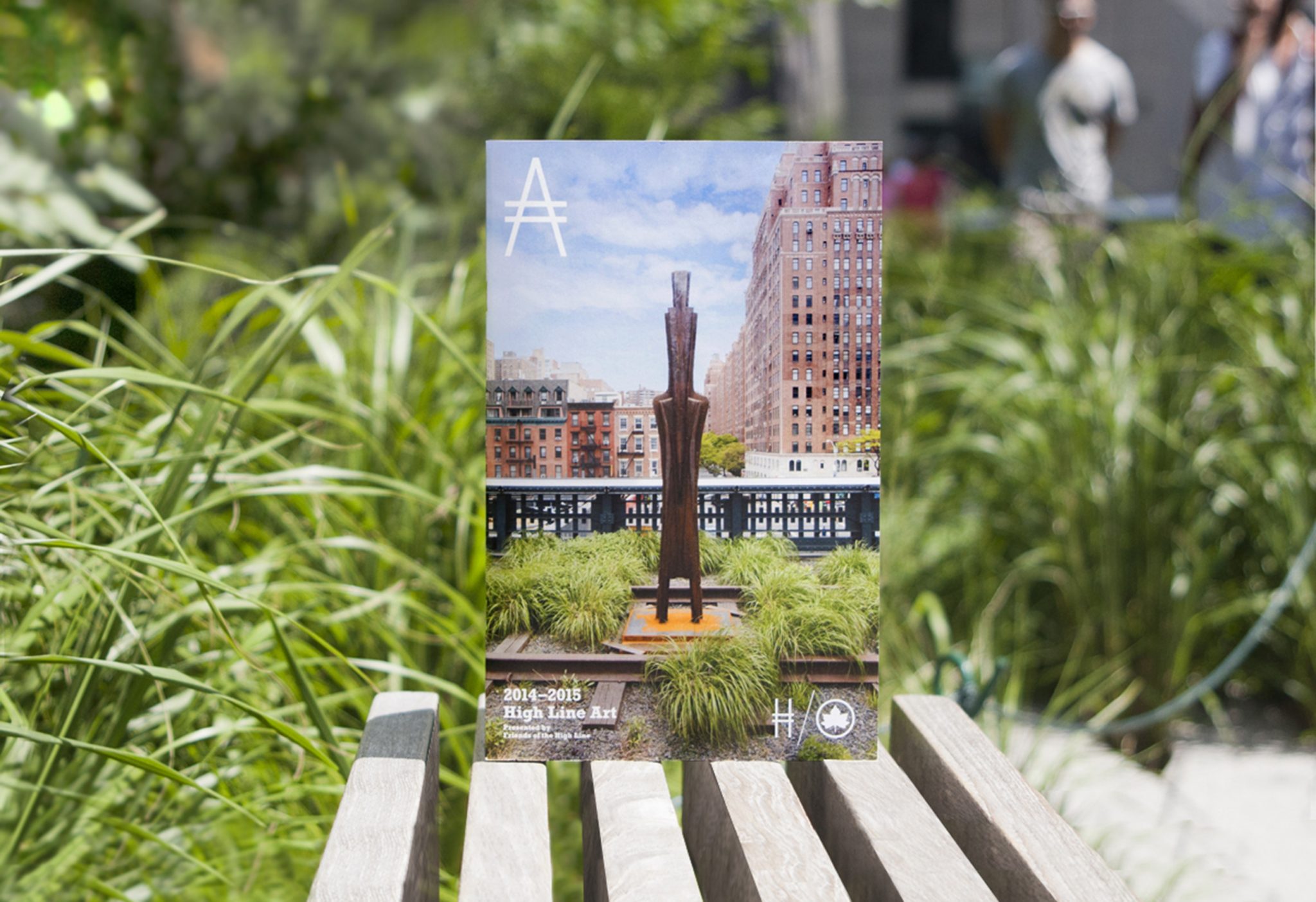
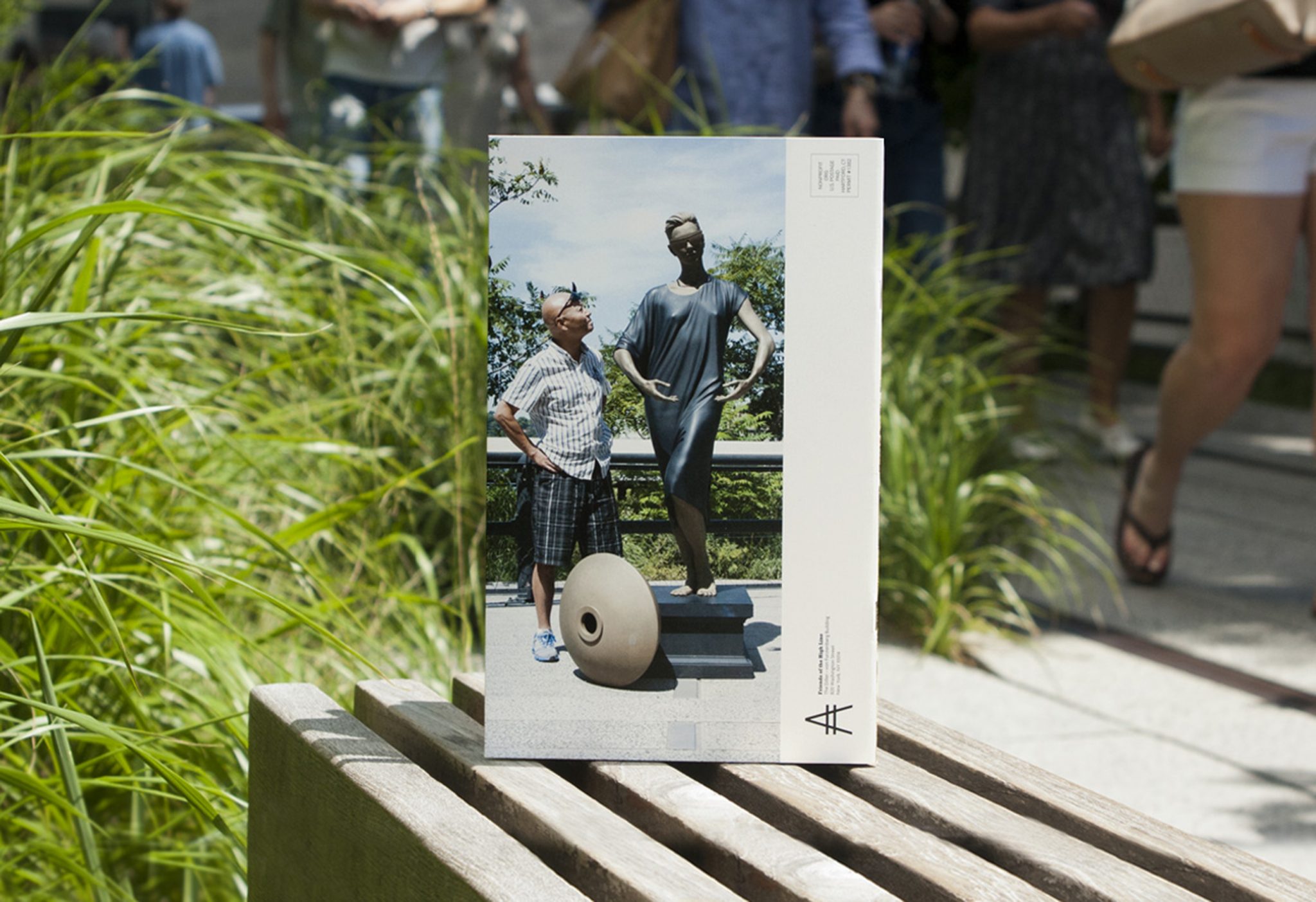
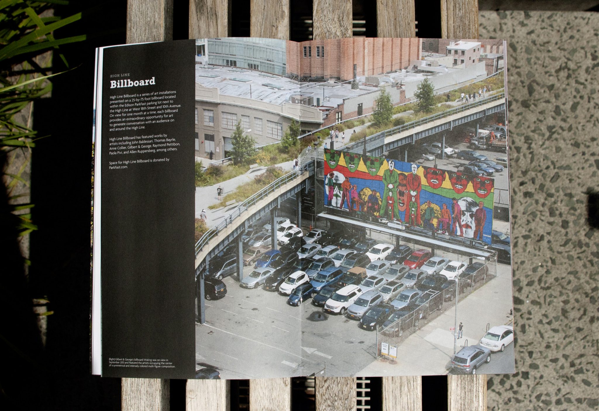
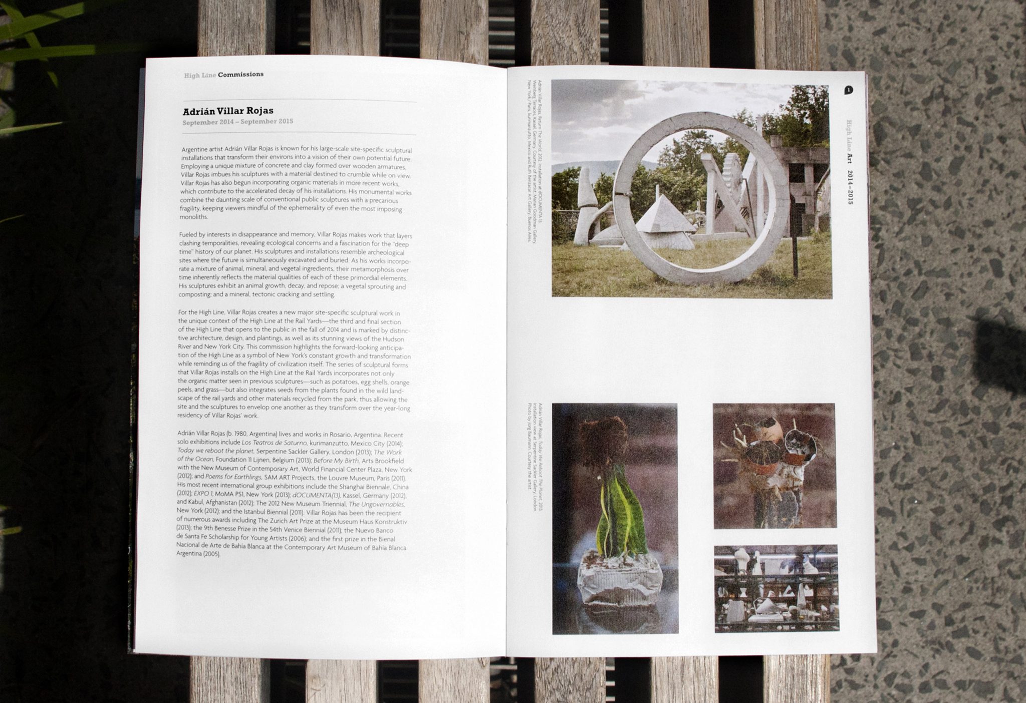
High Line Art Brochure
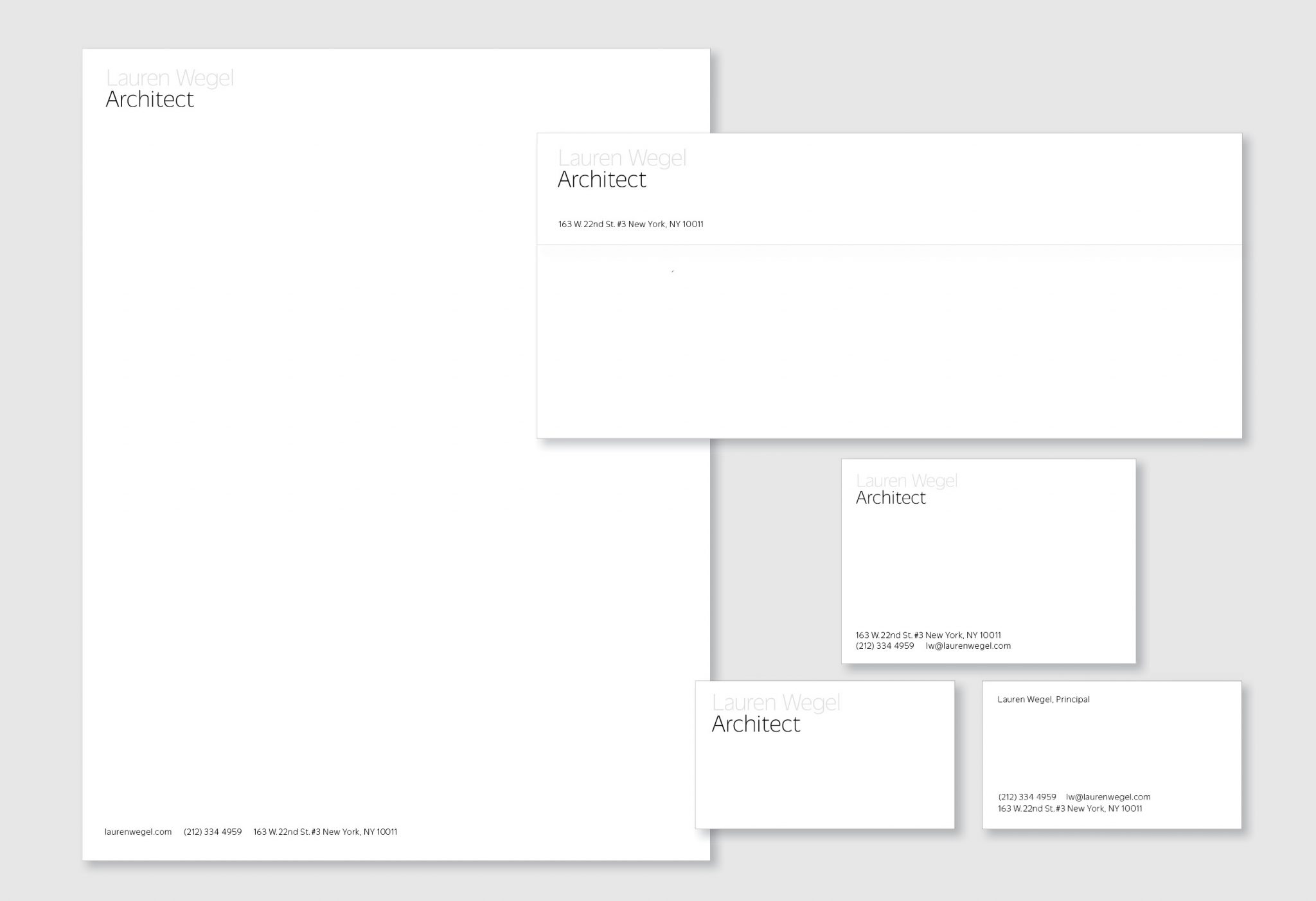
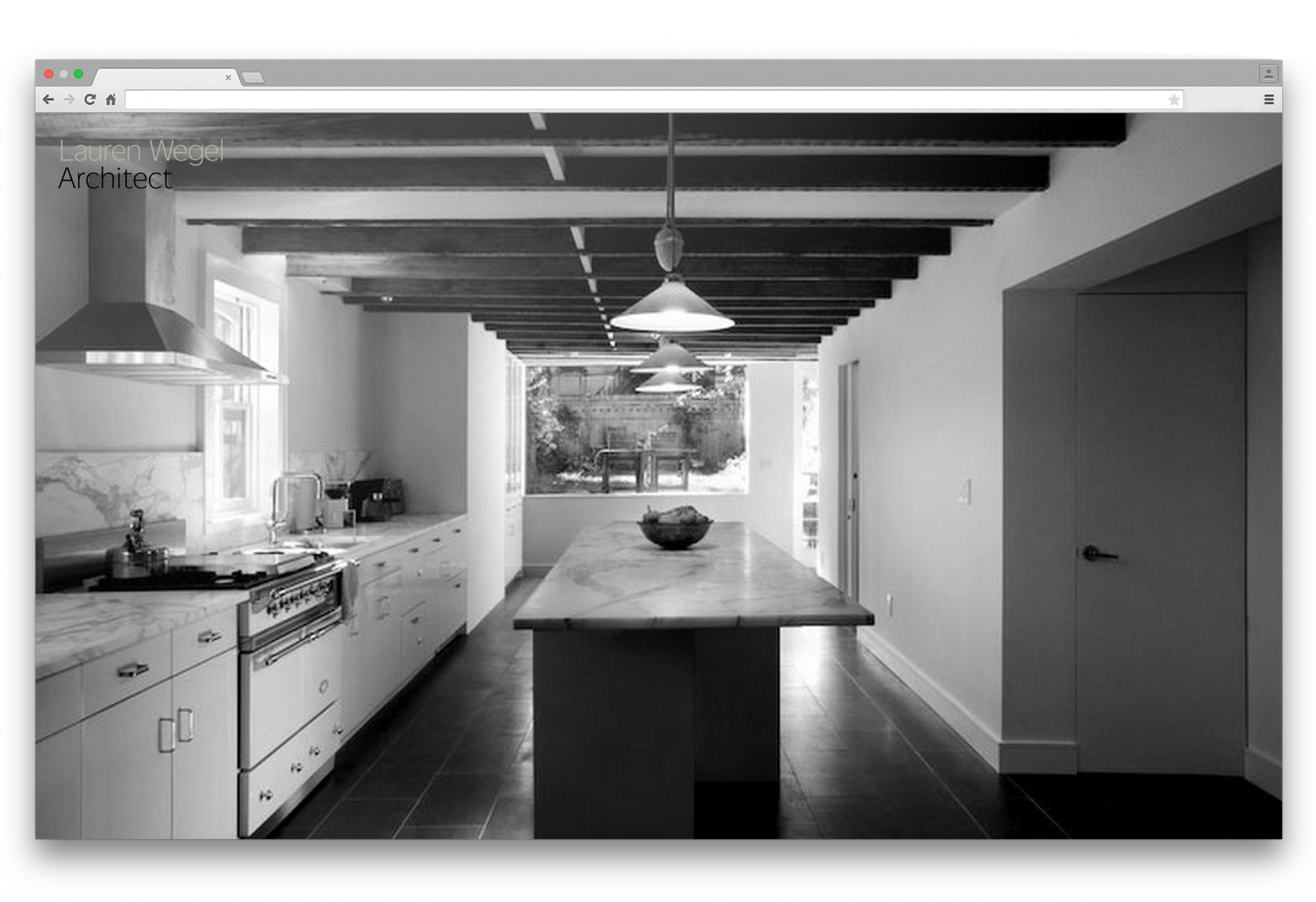
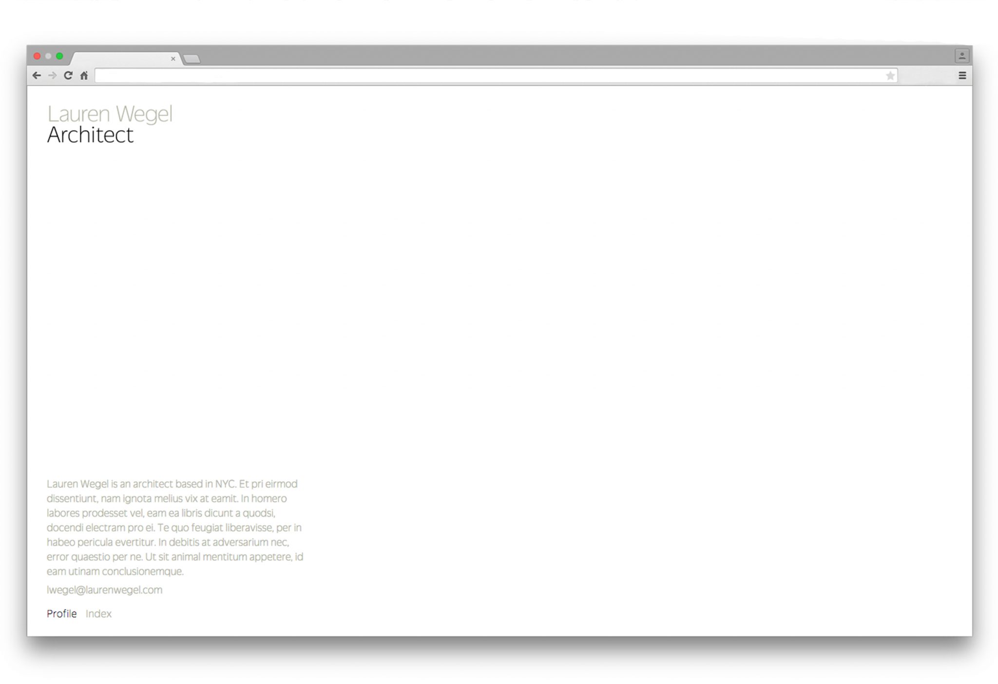
Lauren Wegel Architect
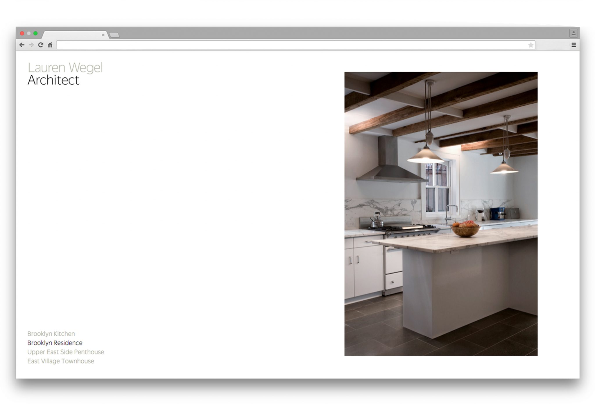
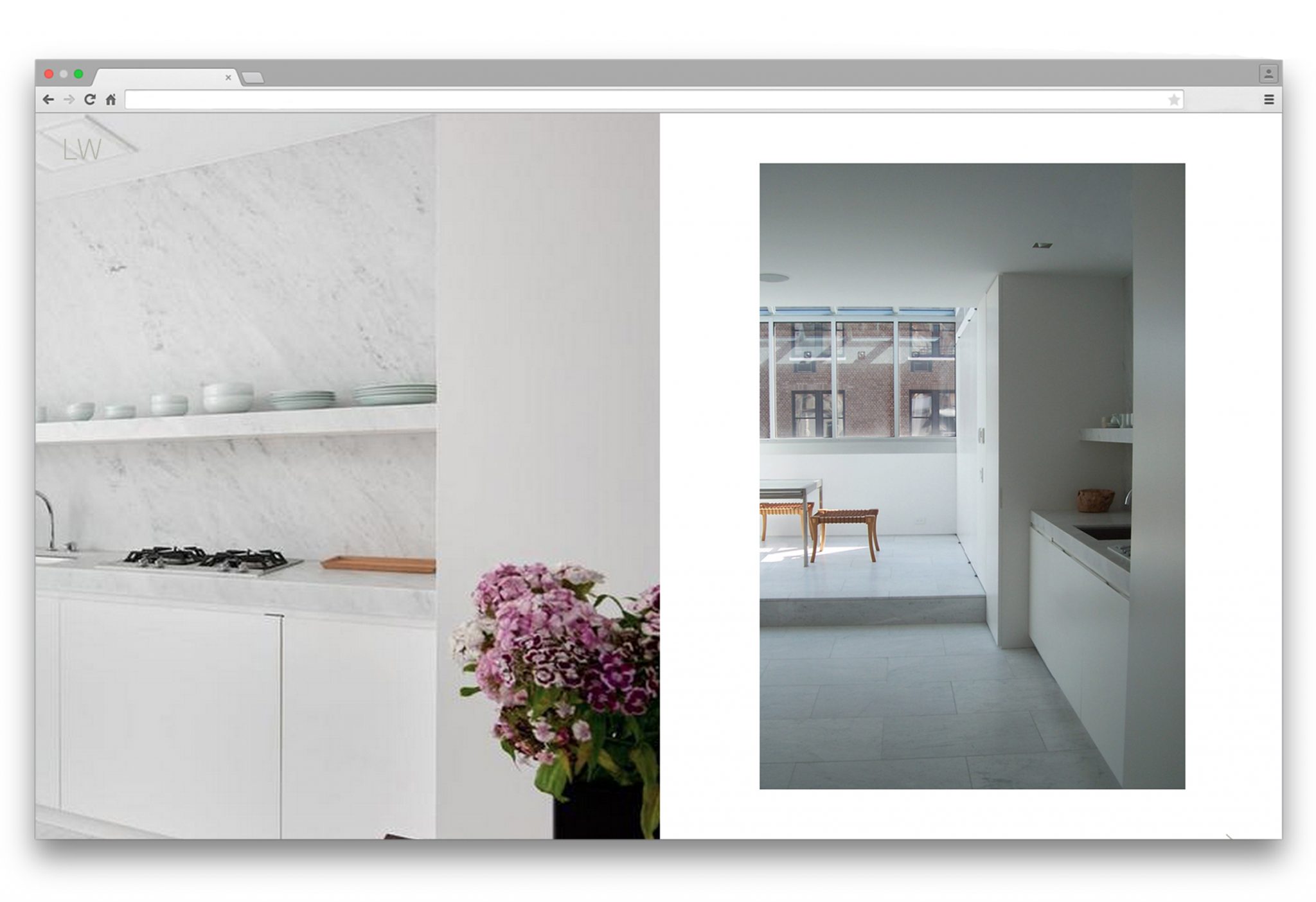
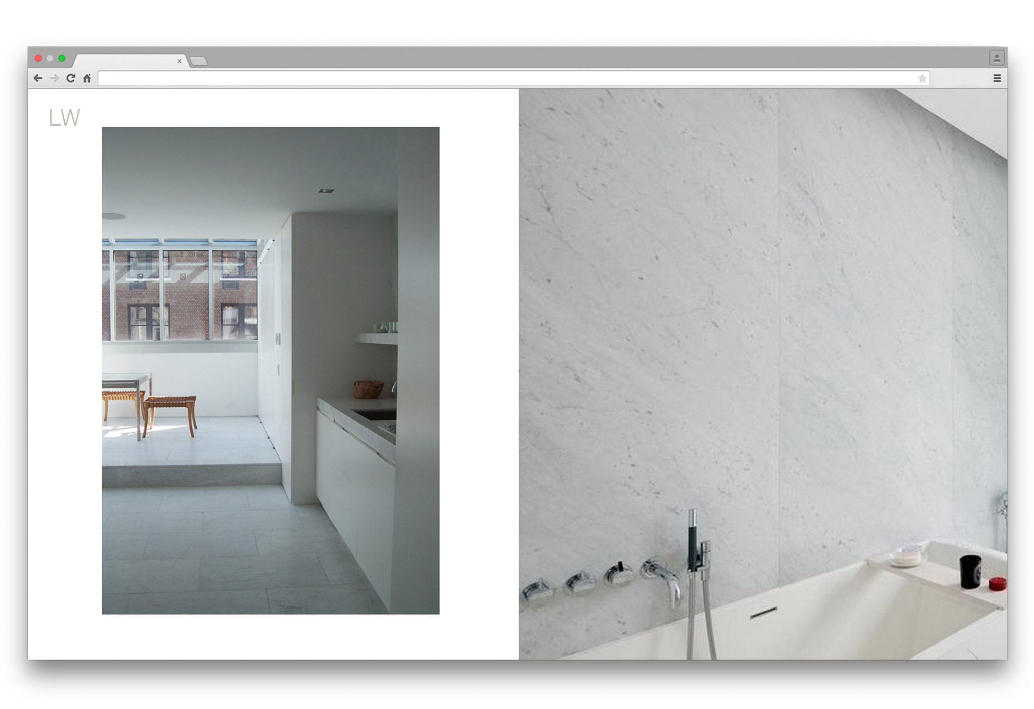
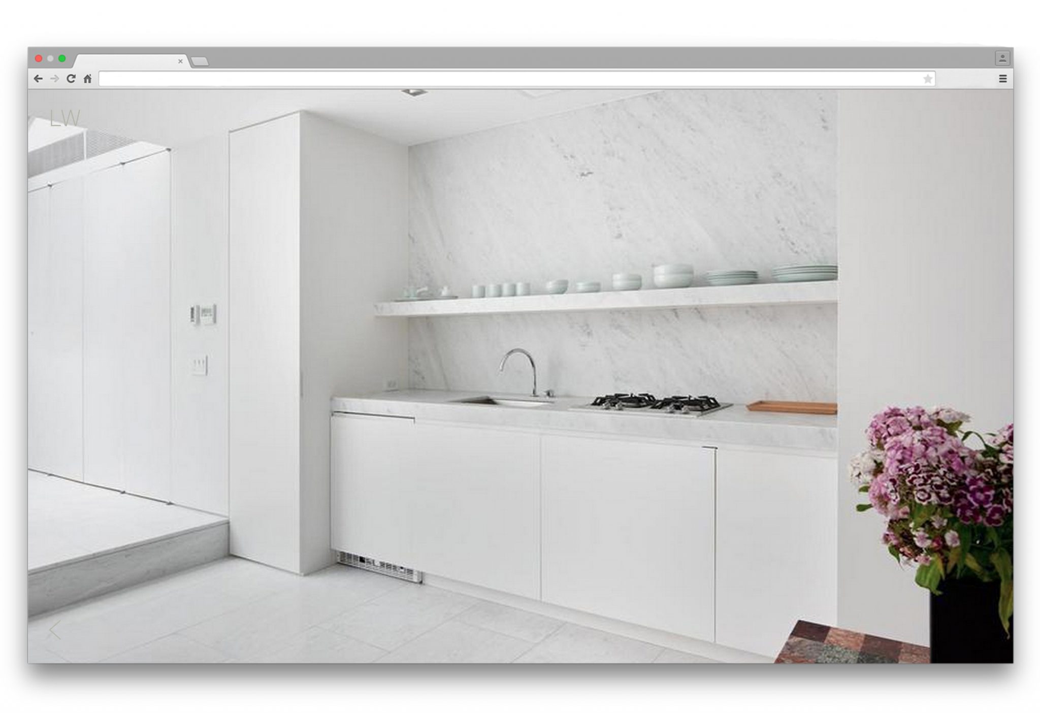
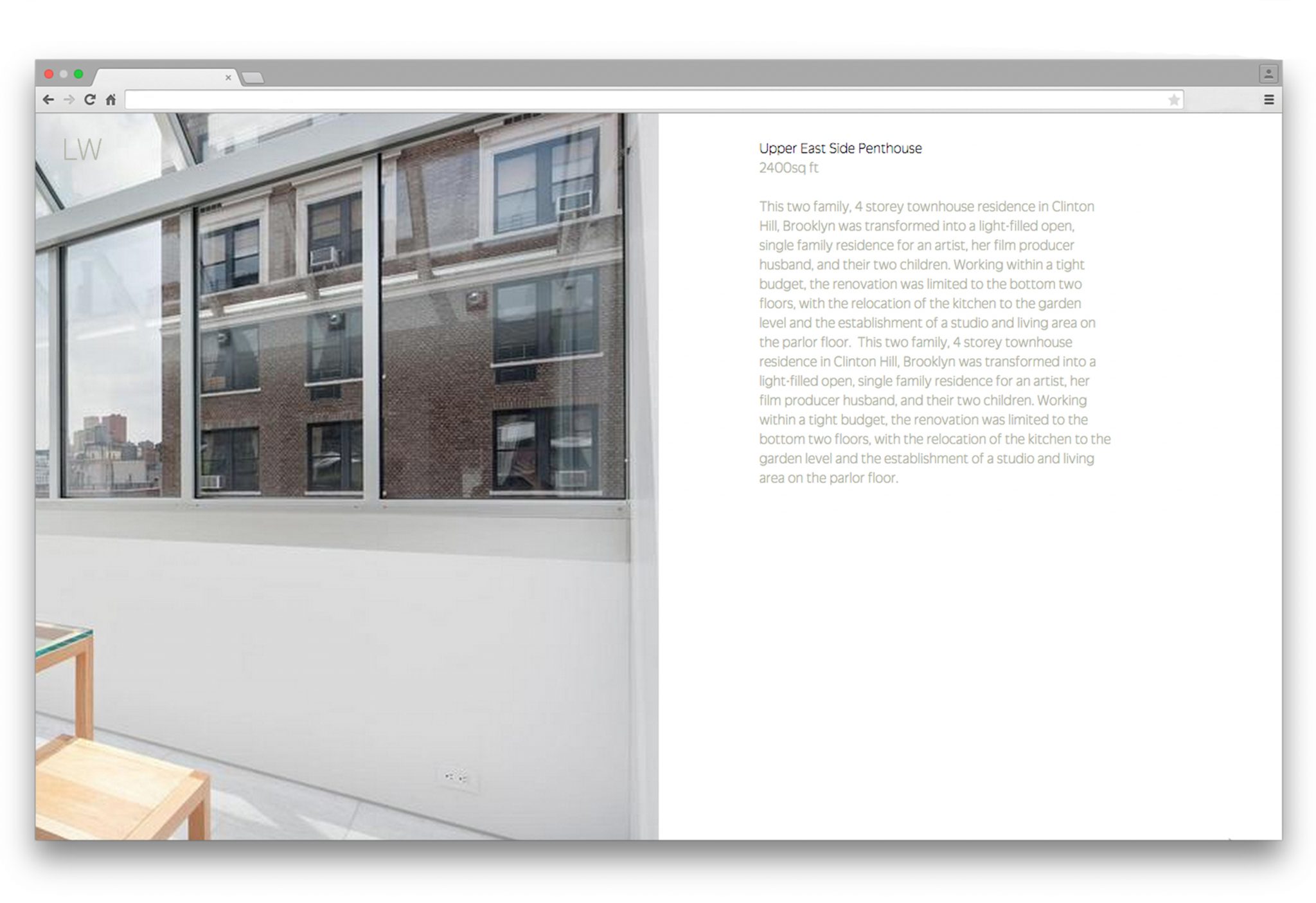
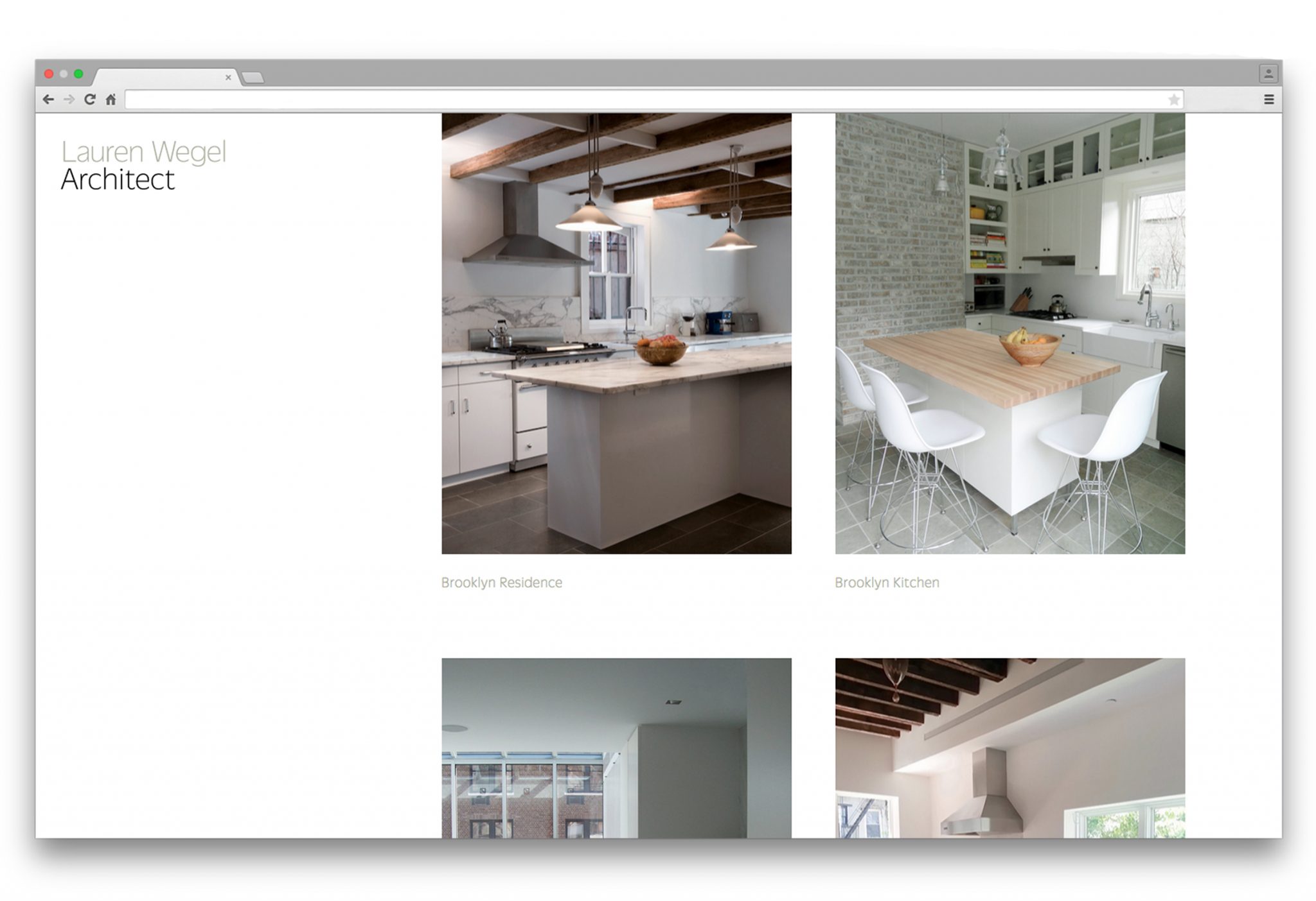
Architect Lauren Wegel was looking to share and promote her work in a way that would reflect her quiet, delicate style while assuaging any apprehension about her work being exposed to the public.
For her logotype, we looked for ways that would reflect her strength and precision as an architect, and the subtle beauty of her minimalism. The custom letterpress is a subtle tactile statement rather than loud pronouncement, and expresses her light, exact, and balanced touch. Her name is grayed out, again in line with her preference for the delicate statement.
Similarly, in designing her website, we wanted to present her projects in a minimalist way that showcased her precision and harmony. We found inspiration in fashion editorials, where a strict relationship of images invites the reader to pause and take a closer look at the content. Her work is shown in photographs both cropped and fullscreen in order to create a focus on detail as well as a framing of the work as a whole. The partial advancement of the slideshow images crops the fullscreen images into halves, allowing for details to be focused on and nearly doubling the quantity of images.
NYC 1993 Timeline
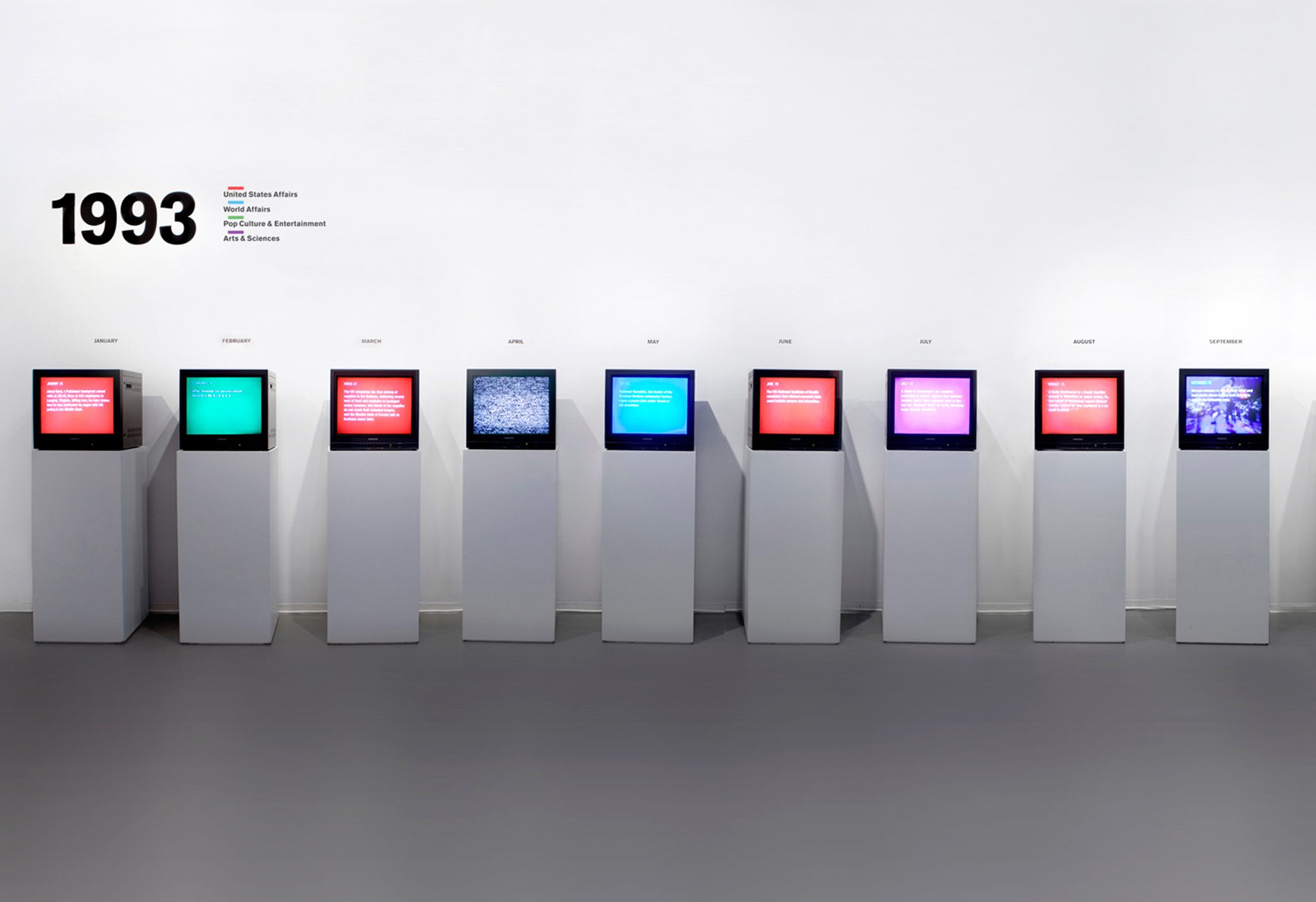
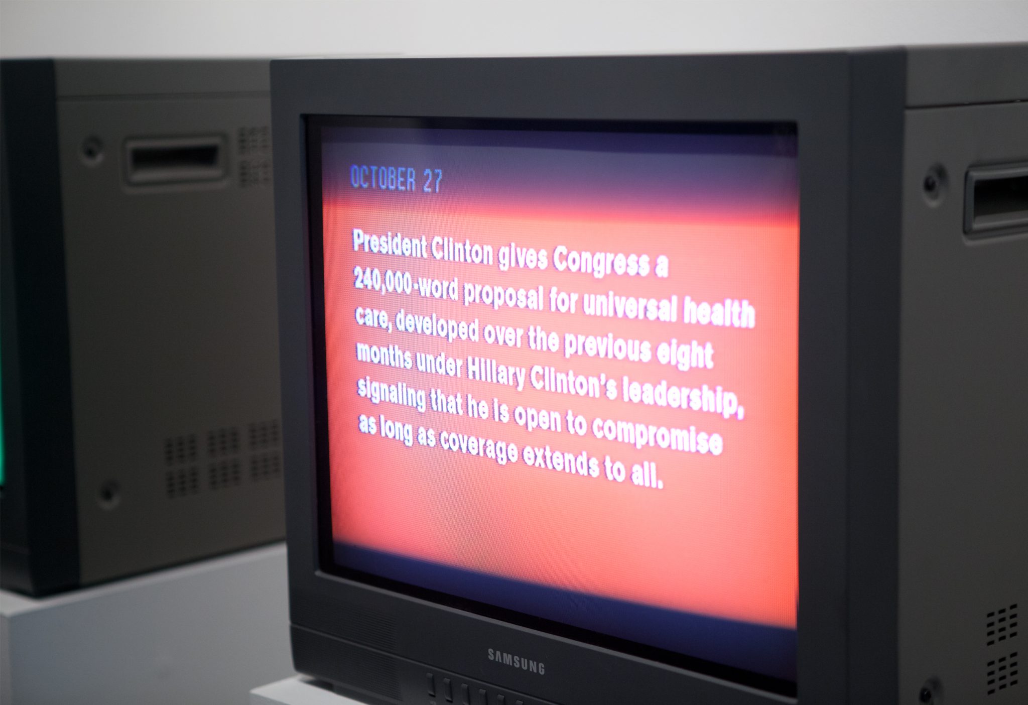
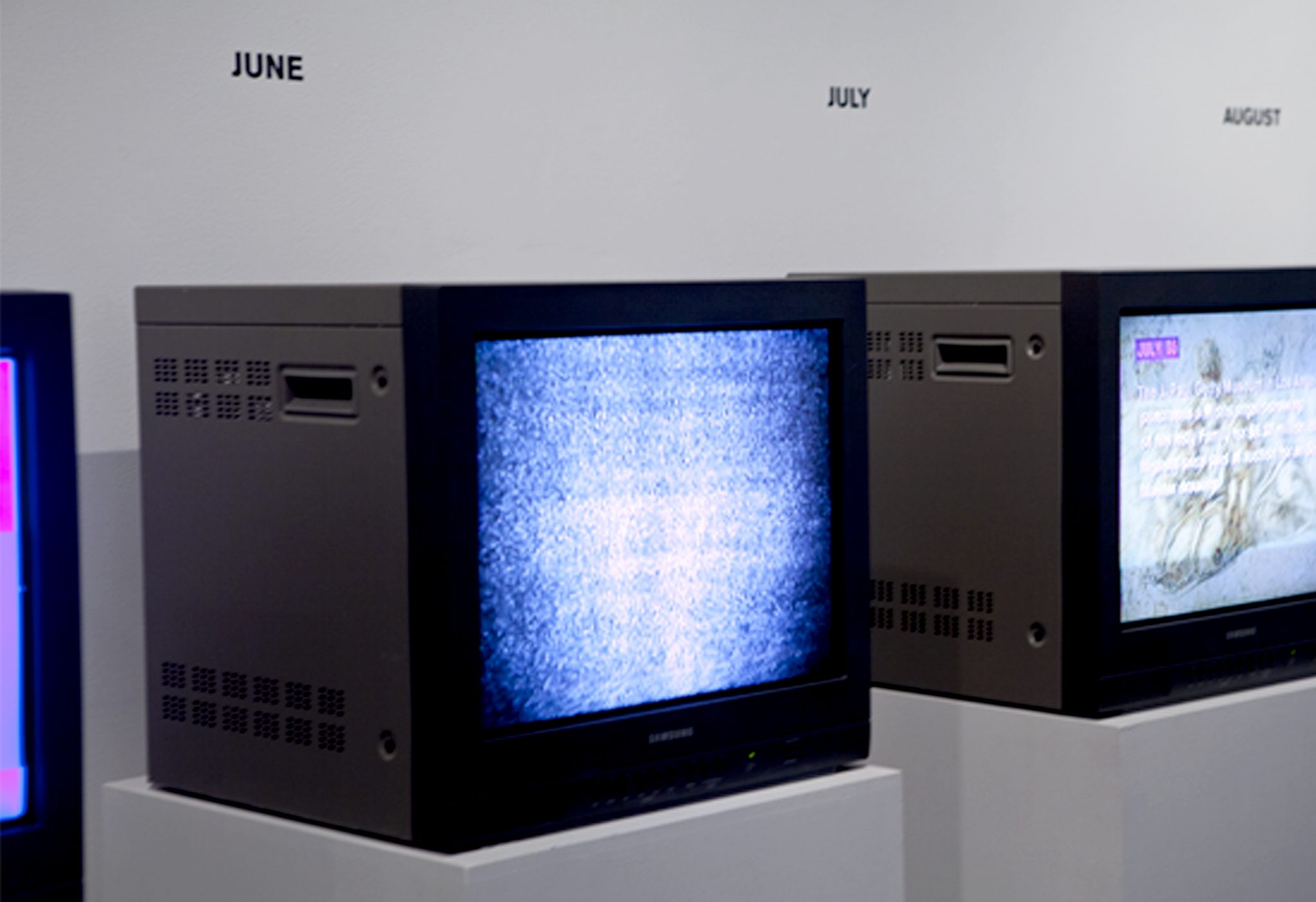
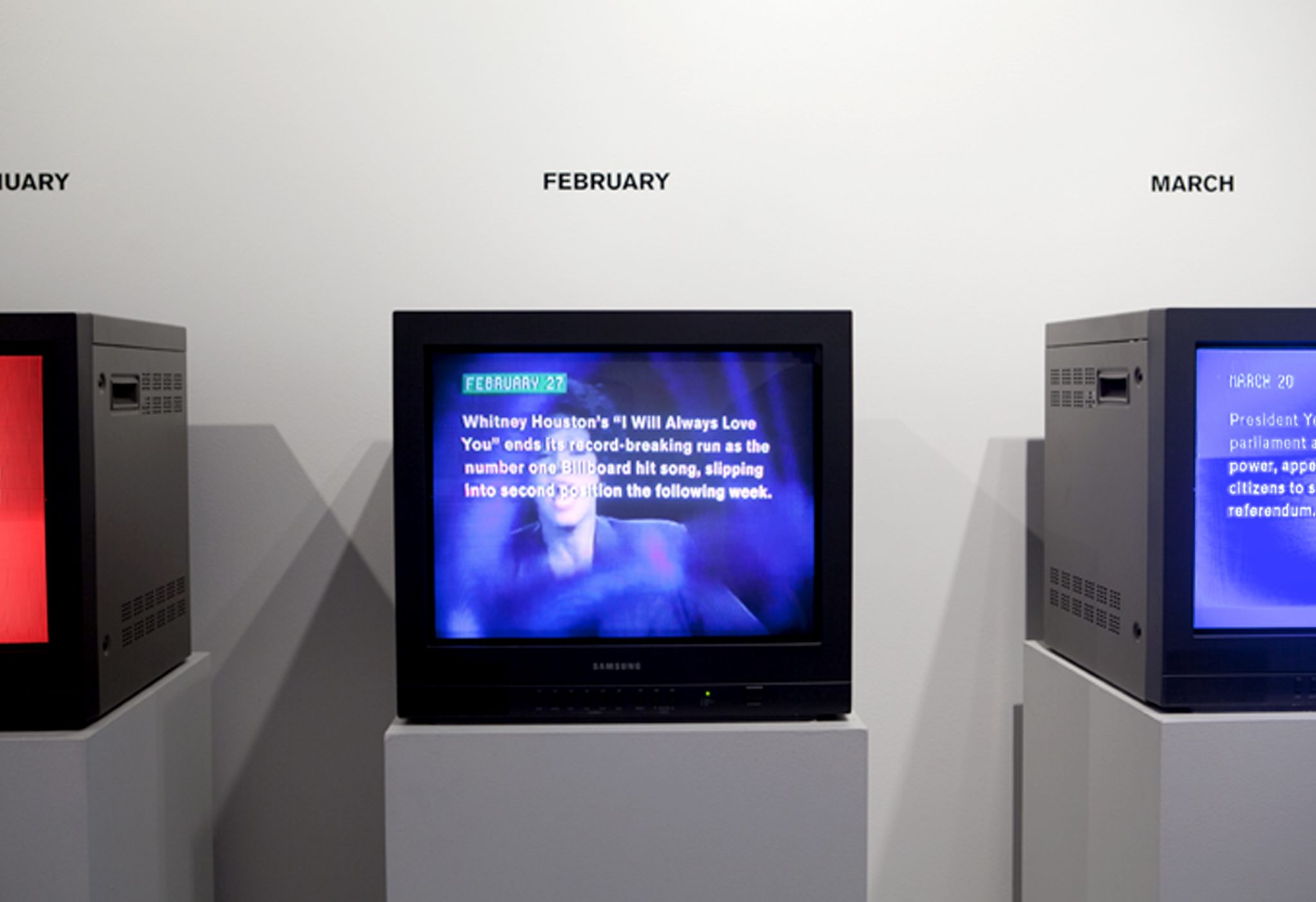
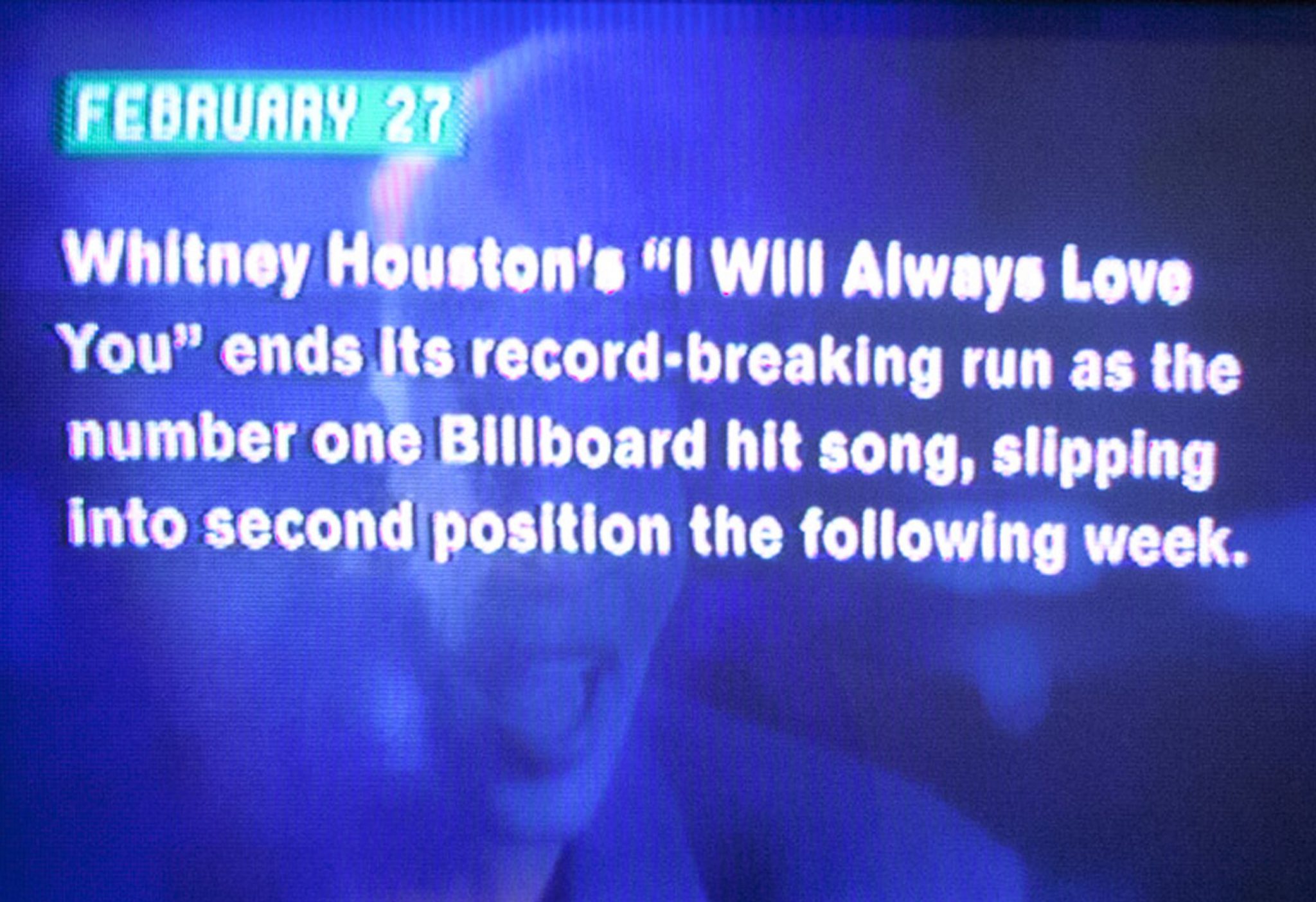
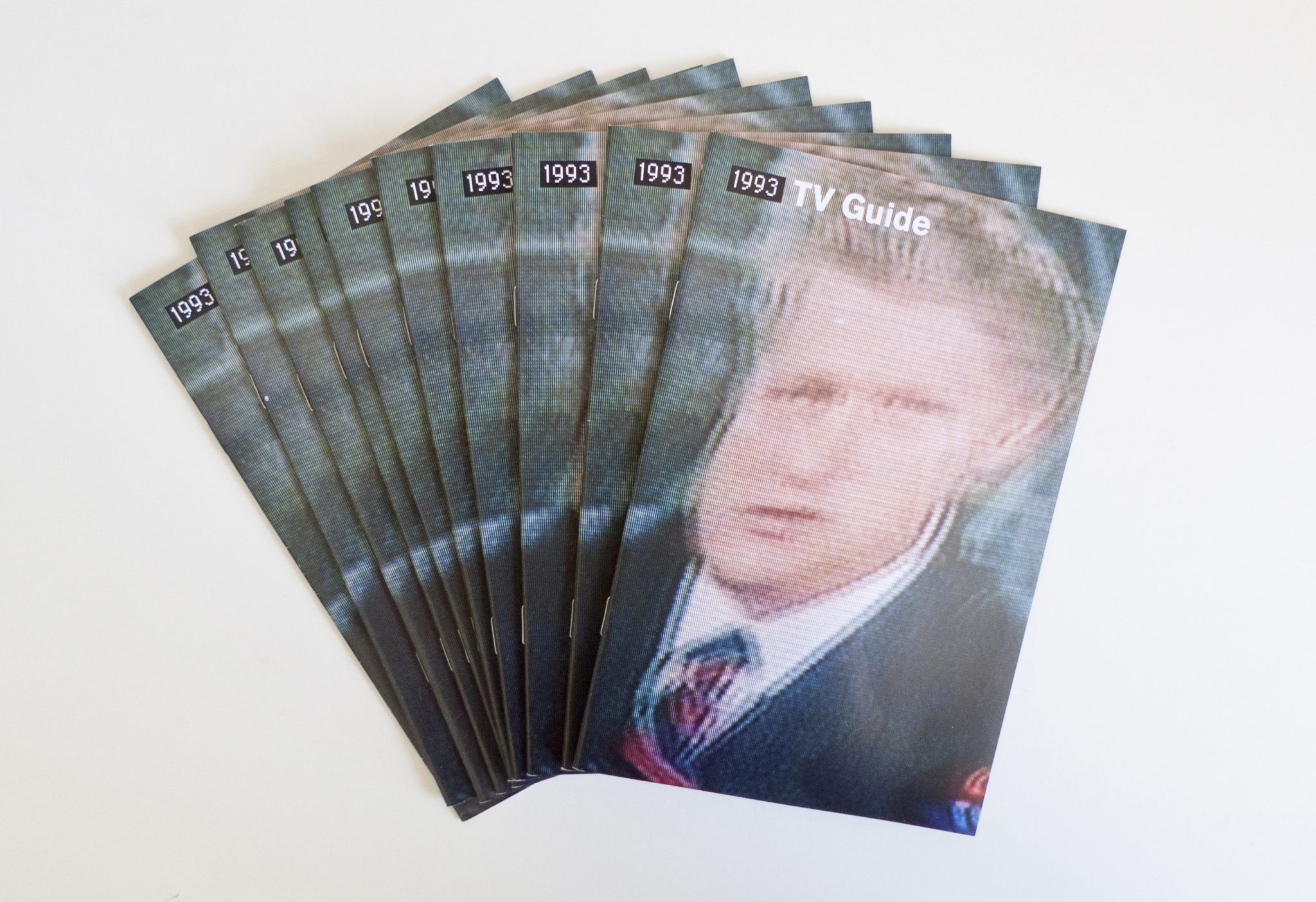
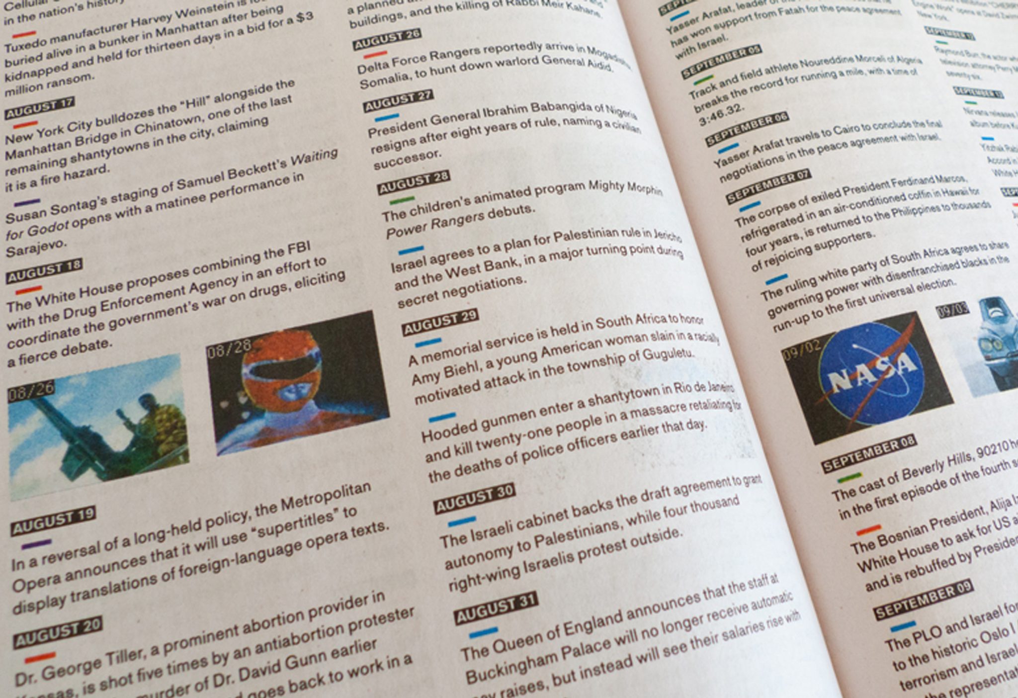
We won a commission from The New Museum of Contemporary Art in NYC to create a timeline of the year 1993 as part of their 2013 exhibition NYC 1993: Experimental Jet Set Trash and No Star. Given the sheer volume of content (around 1,200 events) we chose to work in video over a more traditional wall vinyl display. Since cable TV was the dominant form of media in the early 90’s we displayed the videos on monitors from the era. To reinforce the timeline, we created a 12-channel video installation, allotting one month per monitor.
Events were color-coded into four categories: US Affairs, World Affairs, Pop Culture and Arts and Sciences. We sourced 1993 TV content for each month from YouTube, making the timeline filled with primary content from the era. Each monitor contains a looping video of events from a given month, interspersed with tv channel-changing ‘fuzz’. All monitors play simultaneously and the variation of unique events creates unexpected overlaps between pop cultural references, global war and political disasters. In this regard, the timeline is both chronological and non-linear, and a true representation of the diversity of recorded history.
We designed an accompanying “TV Guide” publication, a takeaway for the first week of the NYC:1993 exhibition. It included the full written timeline in chronological order, printed on cheap newsprint to reference its predecessor.
Storefront—Being
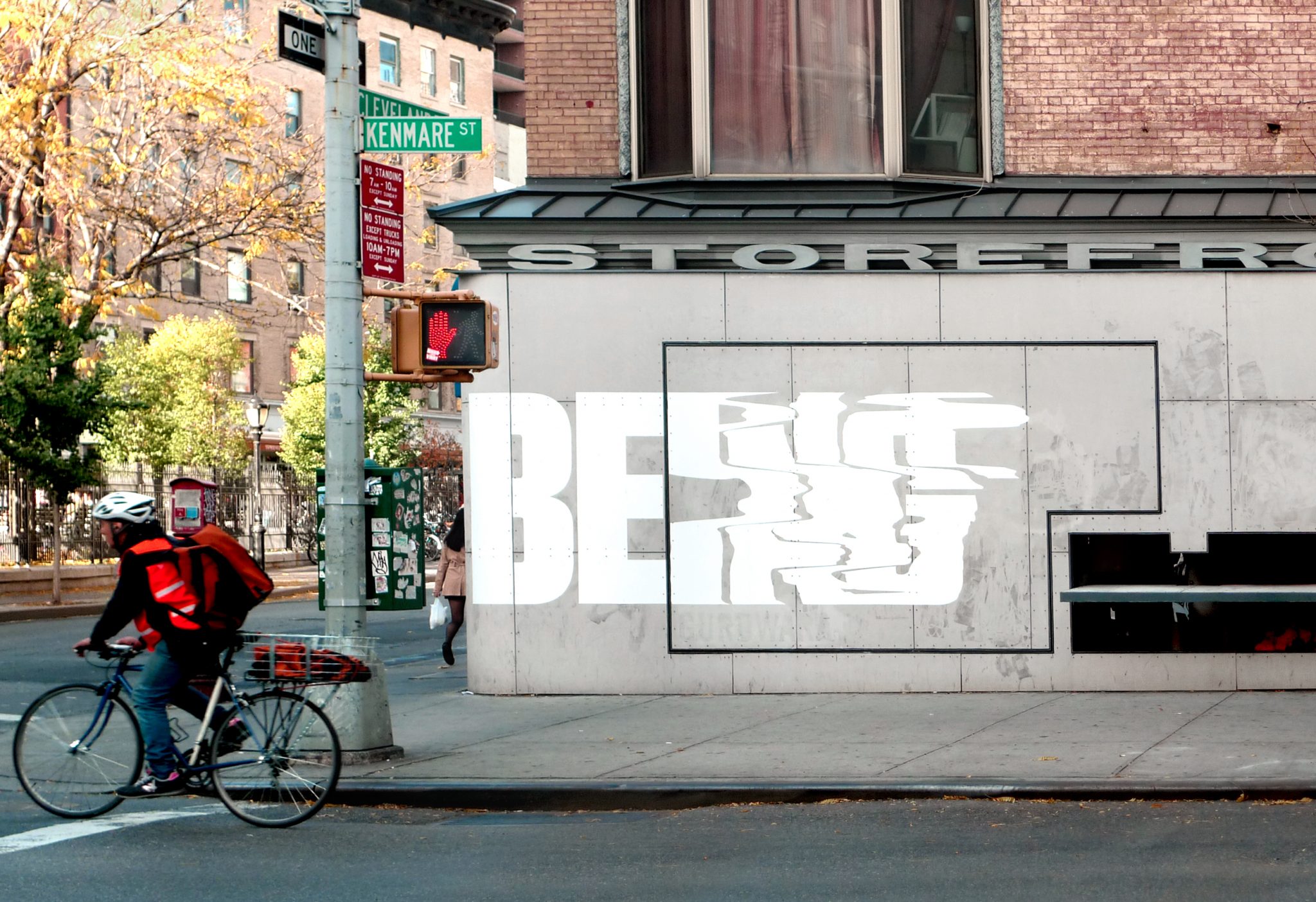
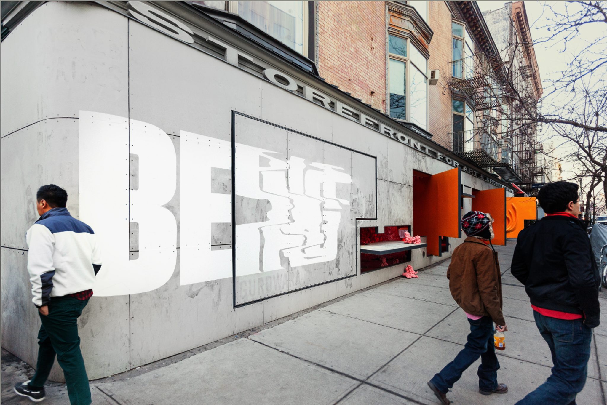
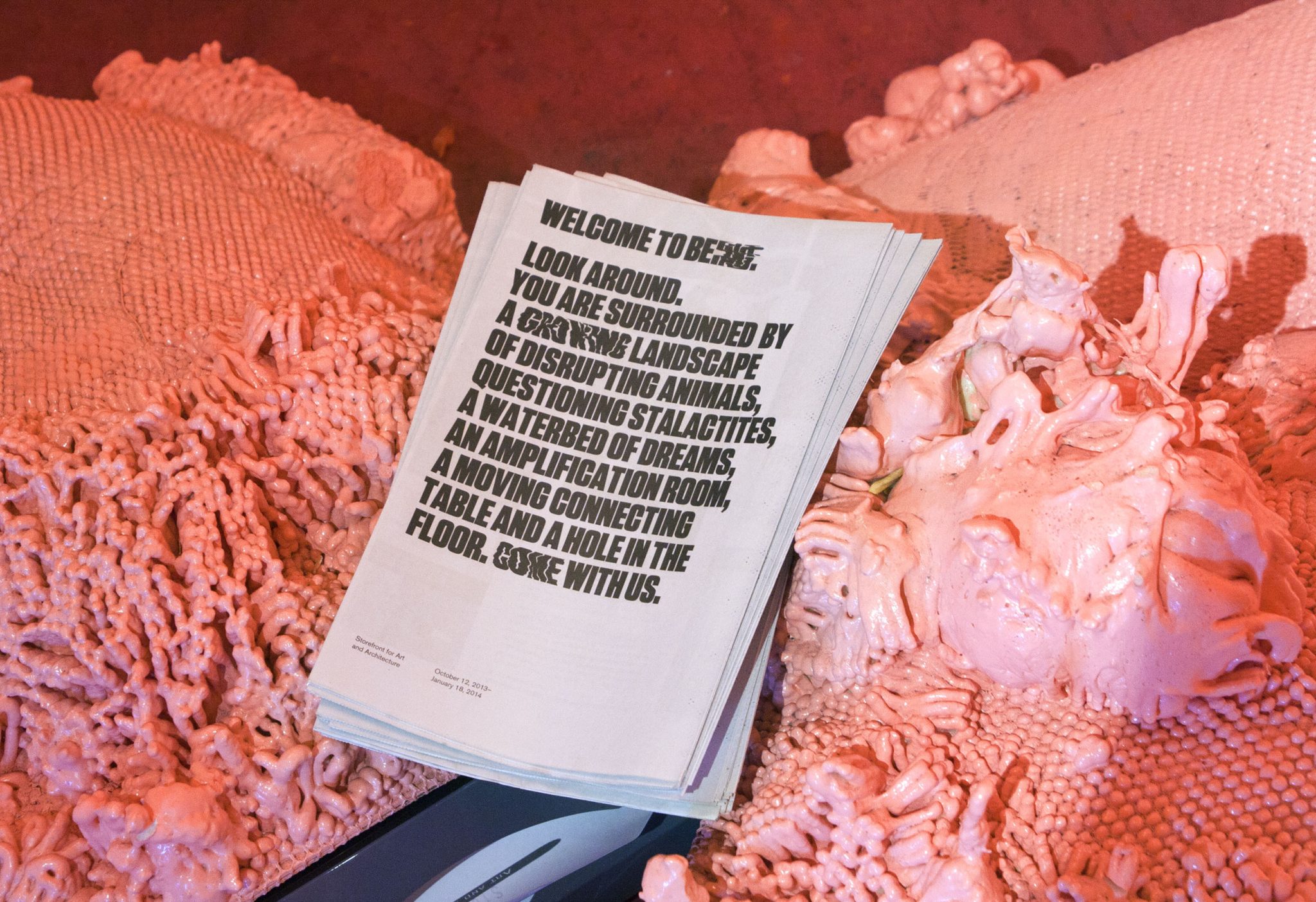
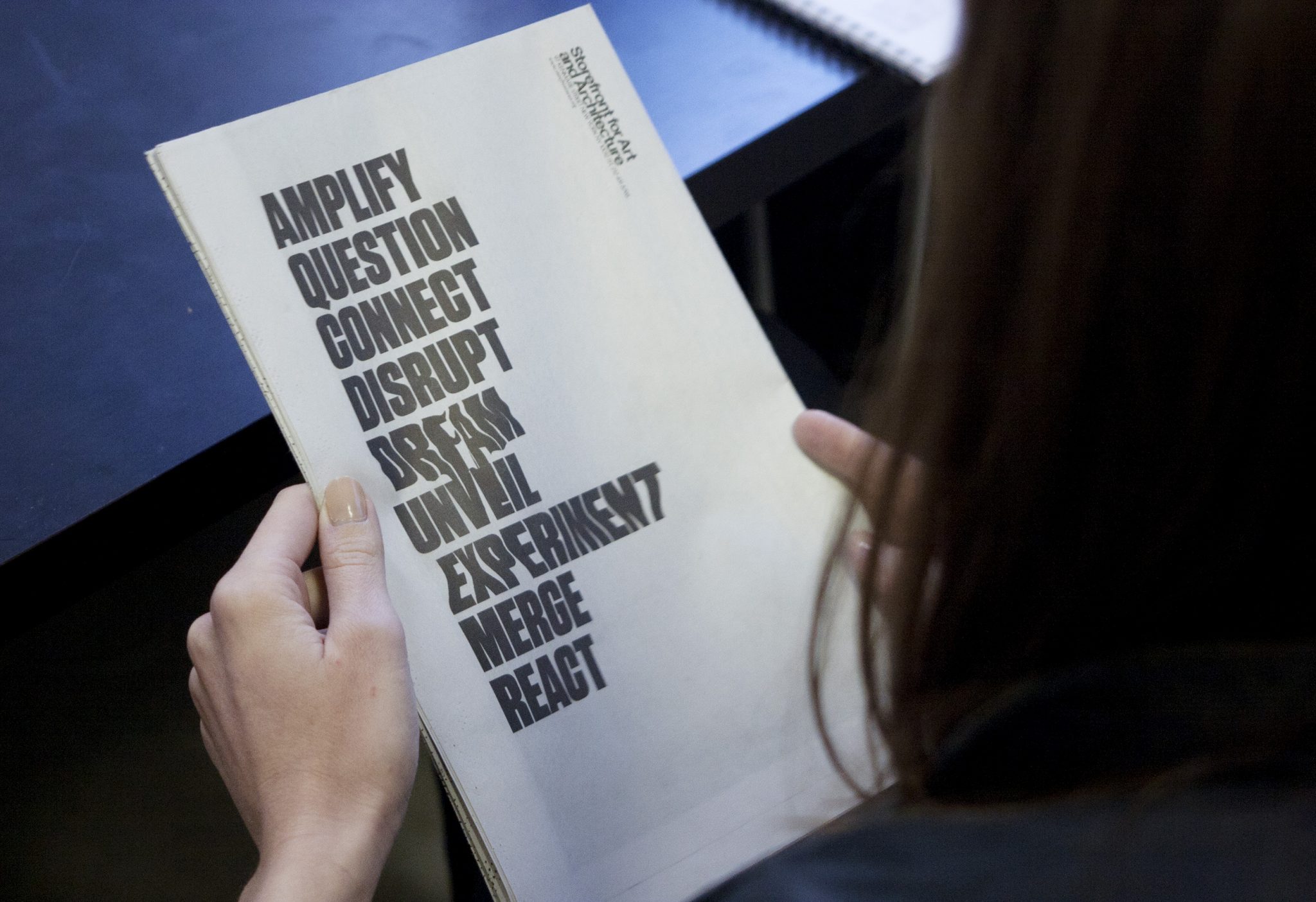
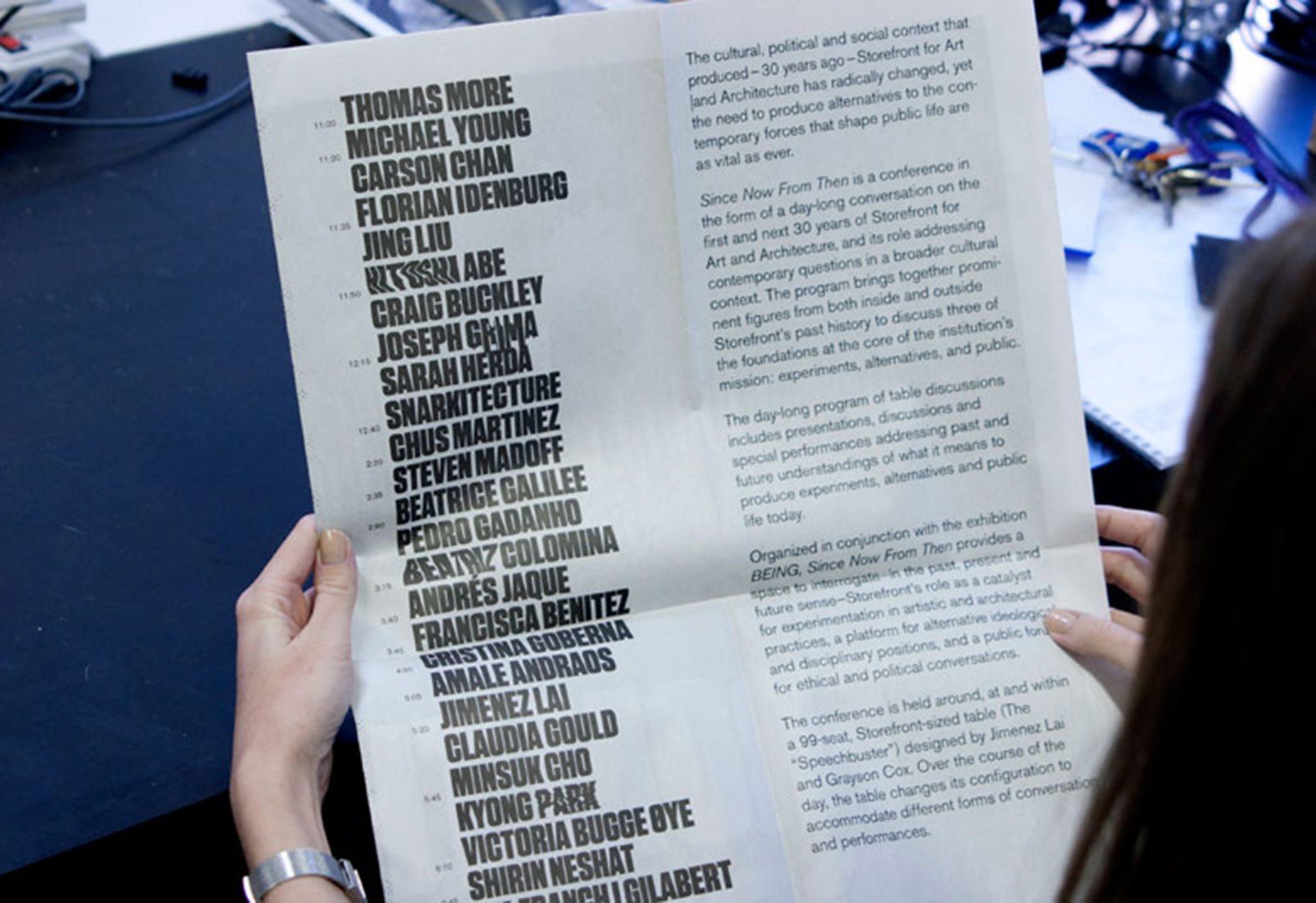
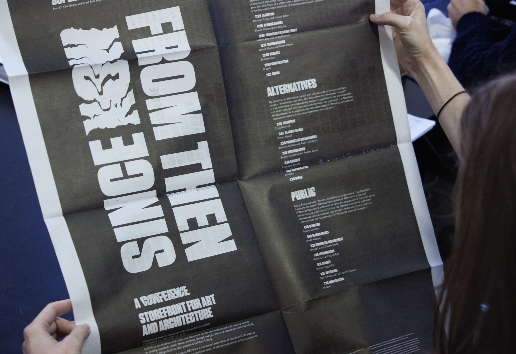
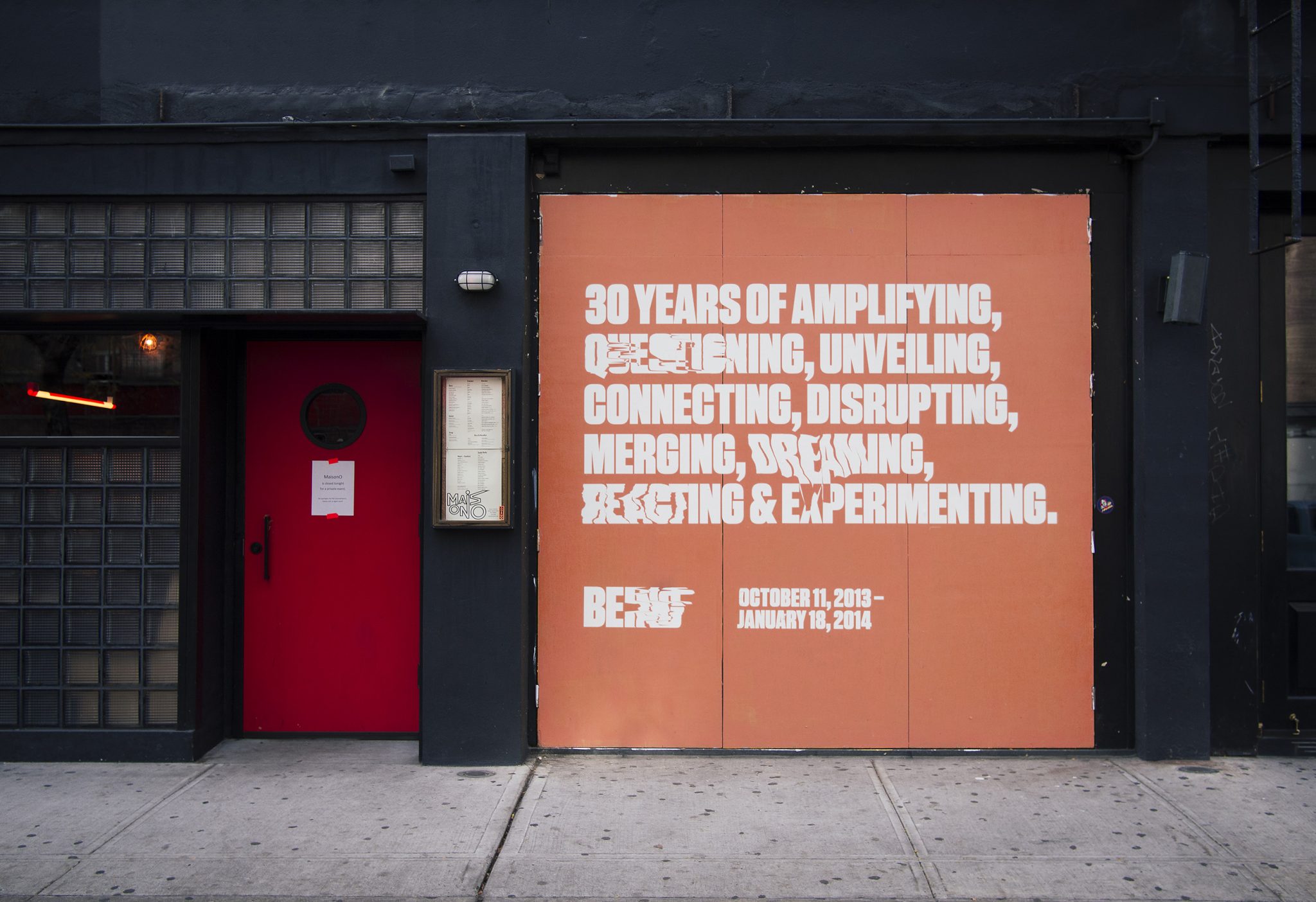
We collaborated with the Storefront for Art and Architecture, for their 30-year celebration show, titled Being. The show was an experiment about Being Storefront in the form of 9 actions. Our challenge was to create an identity that was alive, and we created a typographic form that had something like a pulse, with an on-beat and an off-beat.
The identity is both a rational, high impact graphic that is clearly legible, and also a chaotic graphic form whose extreme instances melt into abstraction. The pulse appears in the print work in randomly selected words within the various program texts. The identity maintains readability and graphic impact, and allows for unique variations to occur. Our black and white palette reduced the message into didactic form alone, and highly contrasted the pink, fleshy architecture of the show.
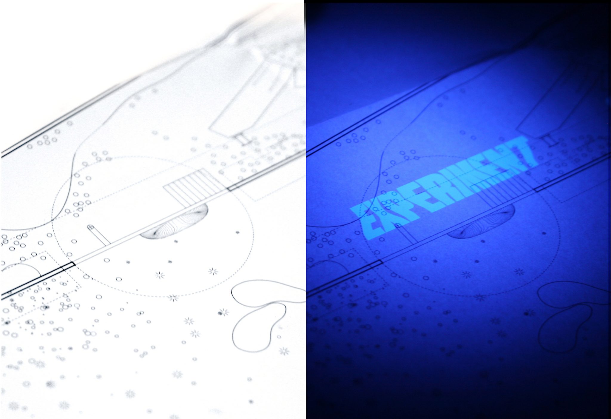
We designed a limited-edition print guide to the exhibition. It used Ultraviolet inks to make the piece come alive only when in the black-light lit areas of the gallery.
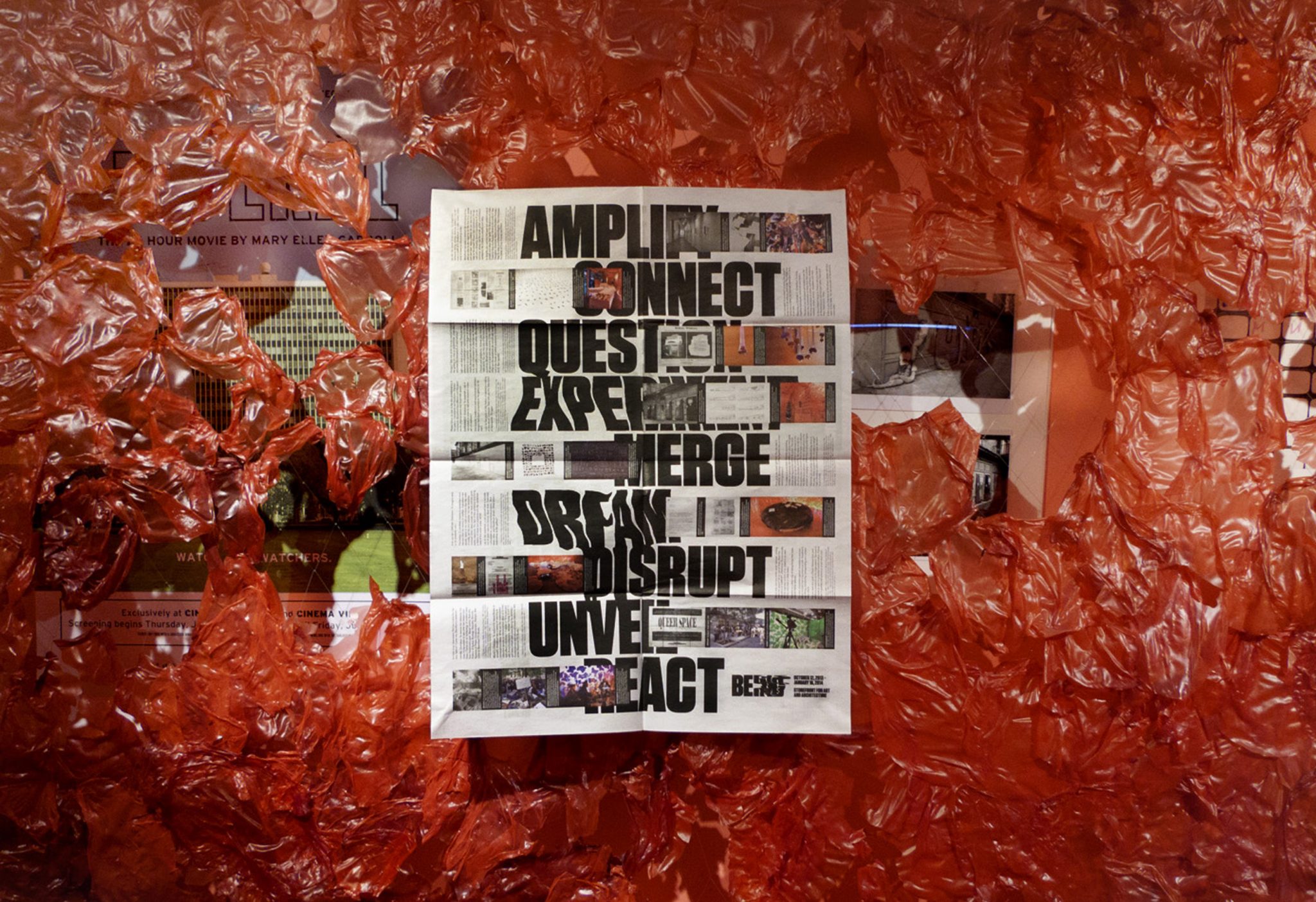
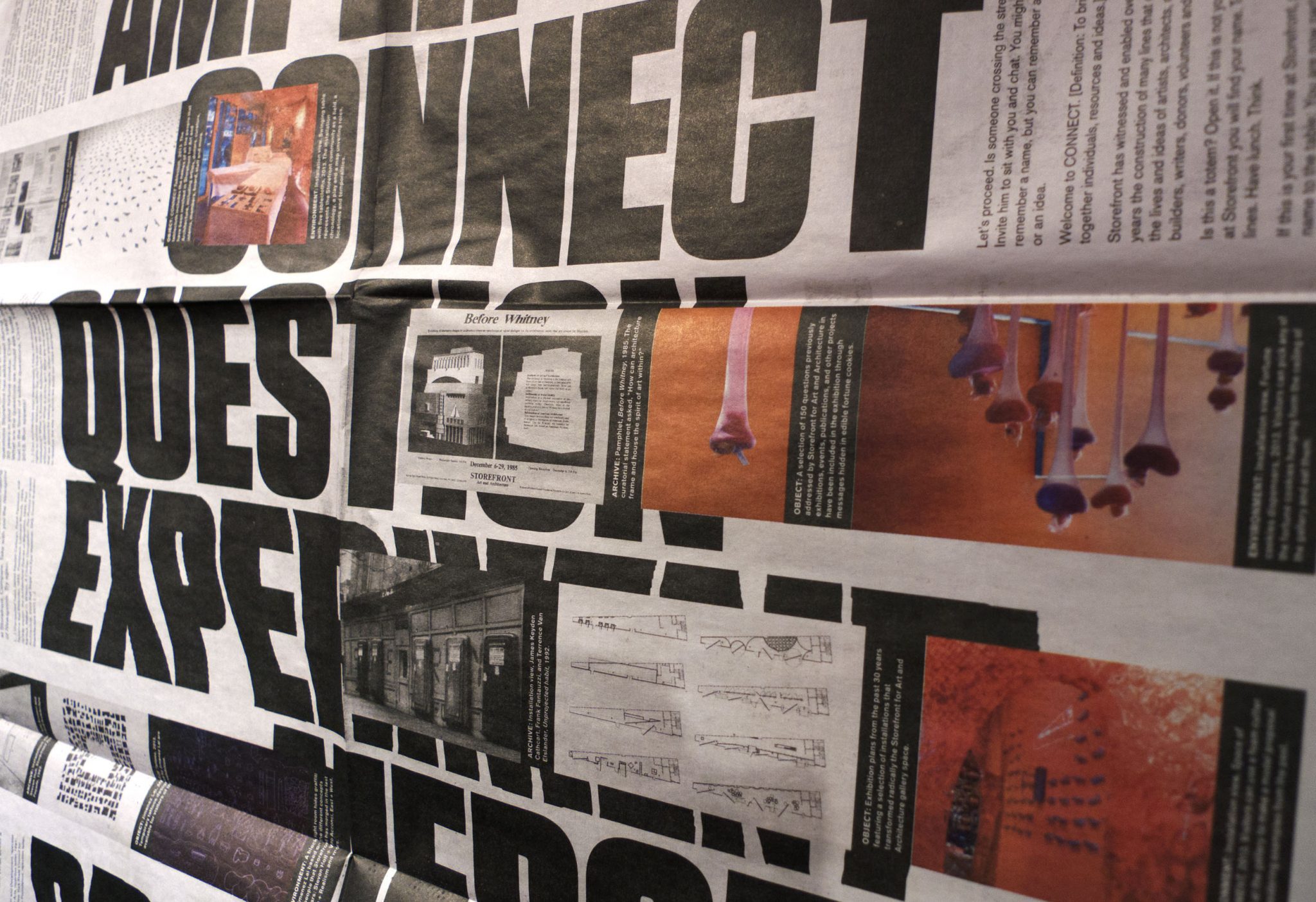
Newsprint broadsheets were designed to catalogue the show, and to announce the related conference. The poster side of the newsprint featured clusters of 3 images (archival, object and environment) that relate Storefront events to each of the nine verbs the exhibition used to express the idea of “Storefront-ness.”
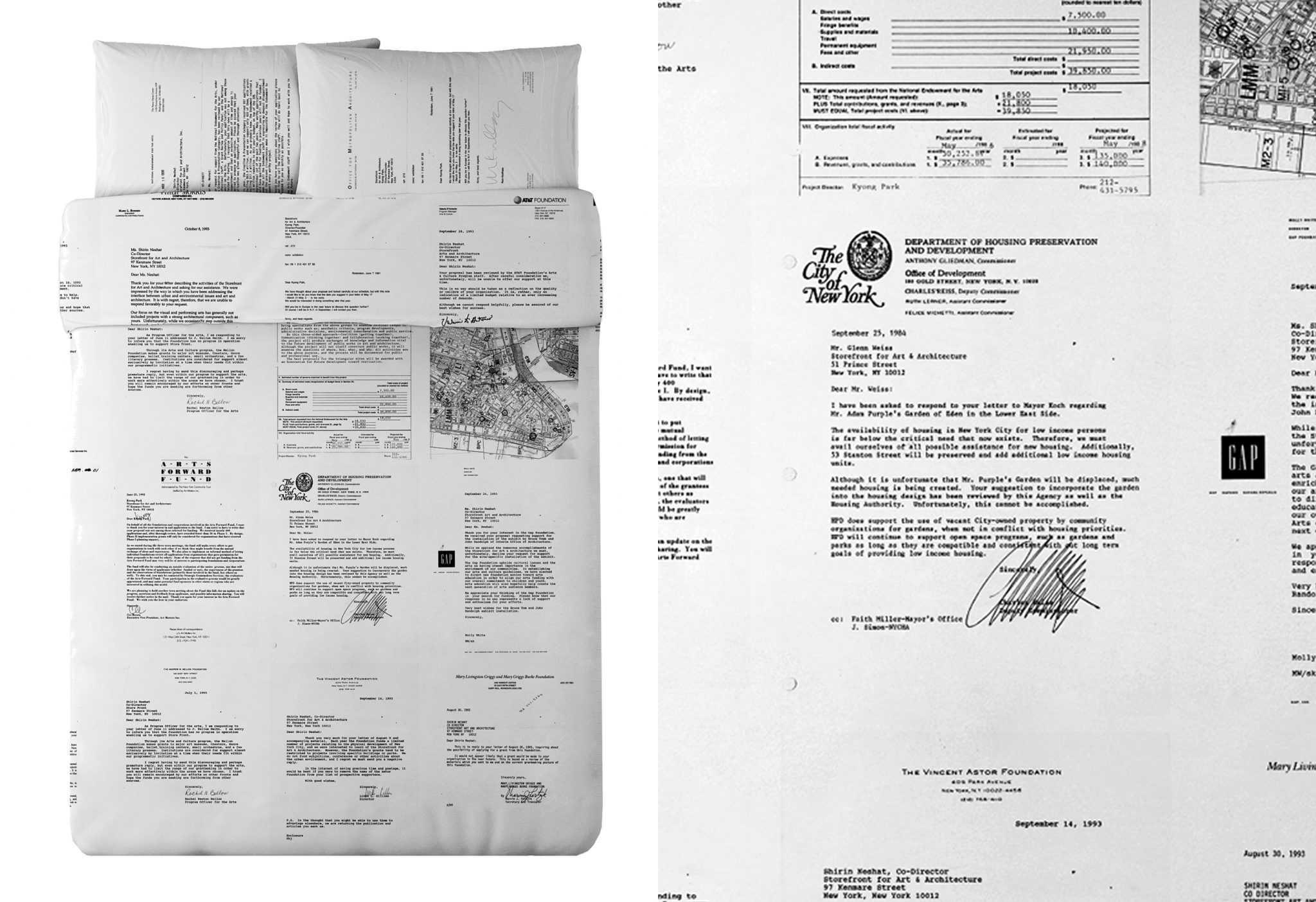
For the exhibition we designed limited-edition Queen duvet set and pillows for the waterbed that appeared in the show. It uses rejection letters of failed grant applications from Storefront’s history— displaying all of the failed ‘dreams’ of past Storefront directors.
Ms. Foundation 40-Year Timeline
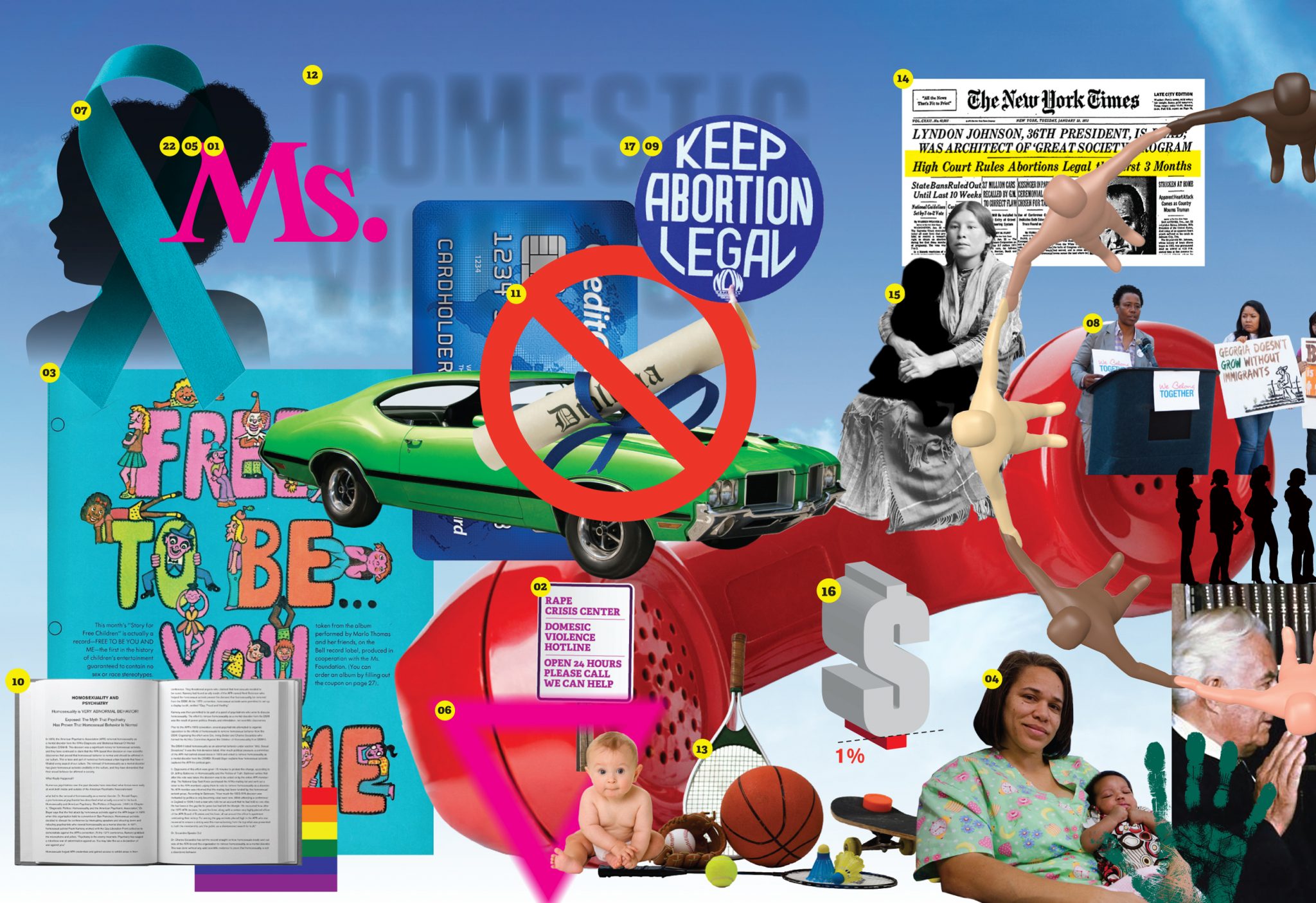
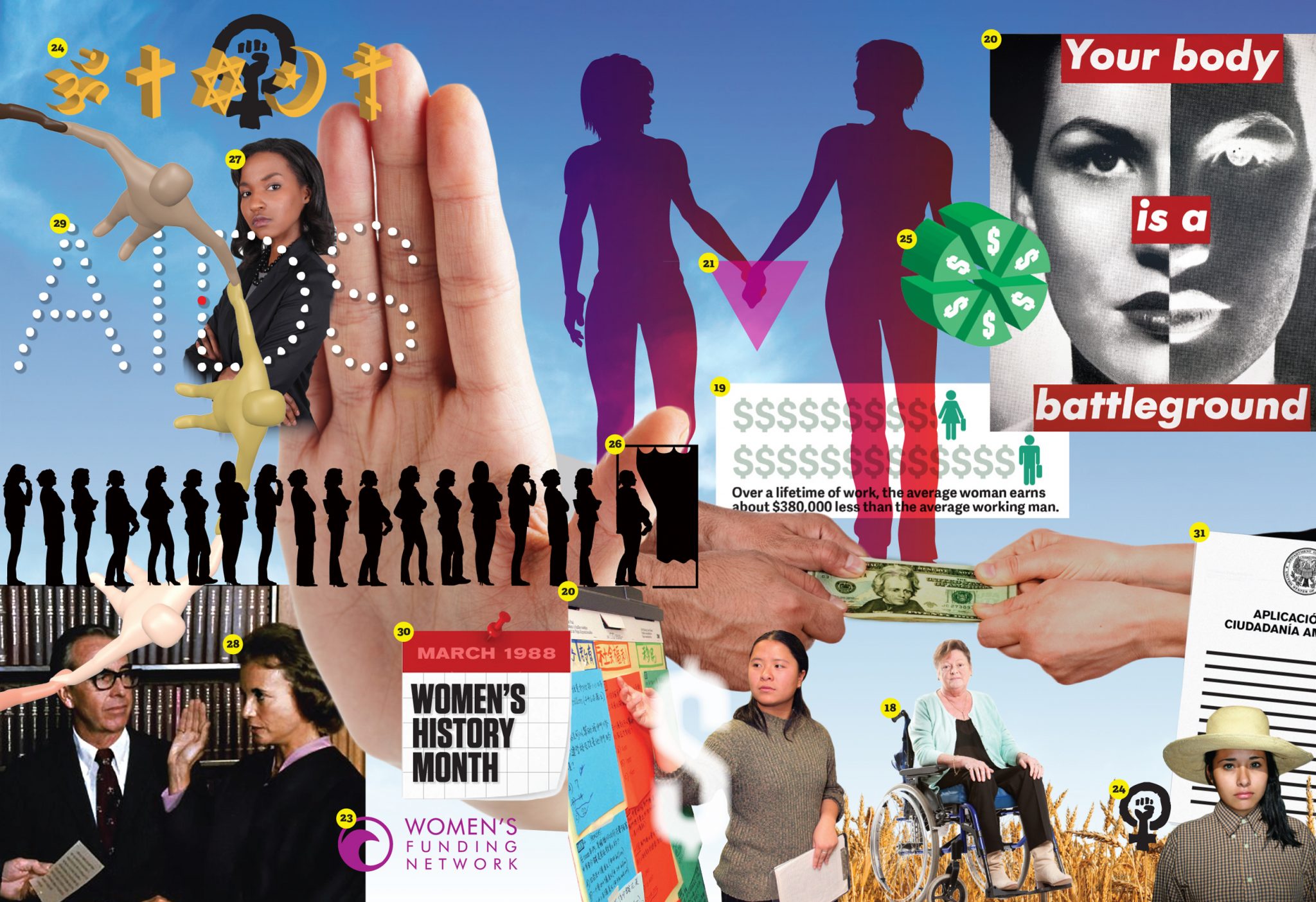
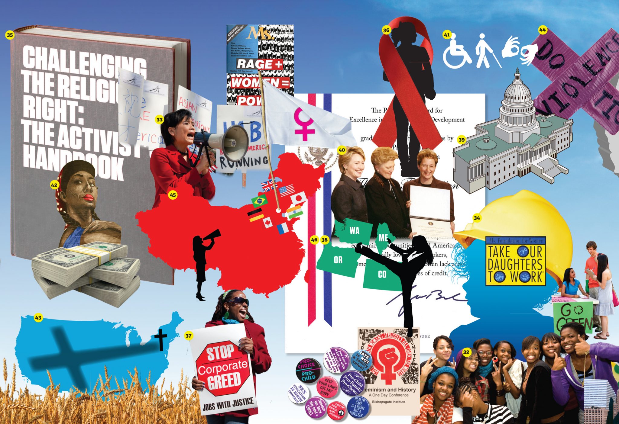
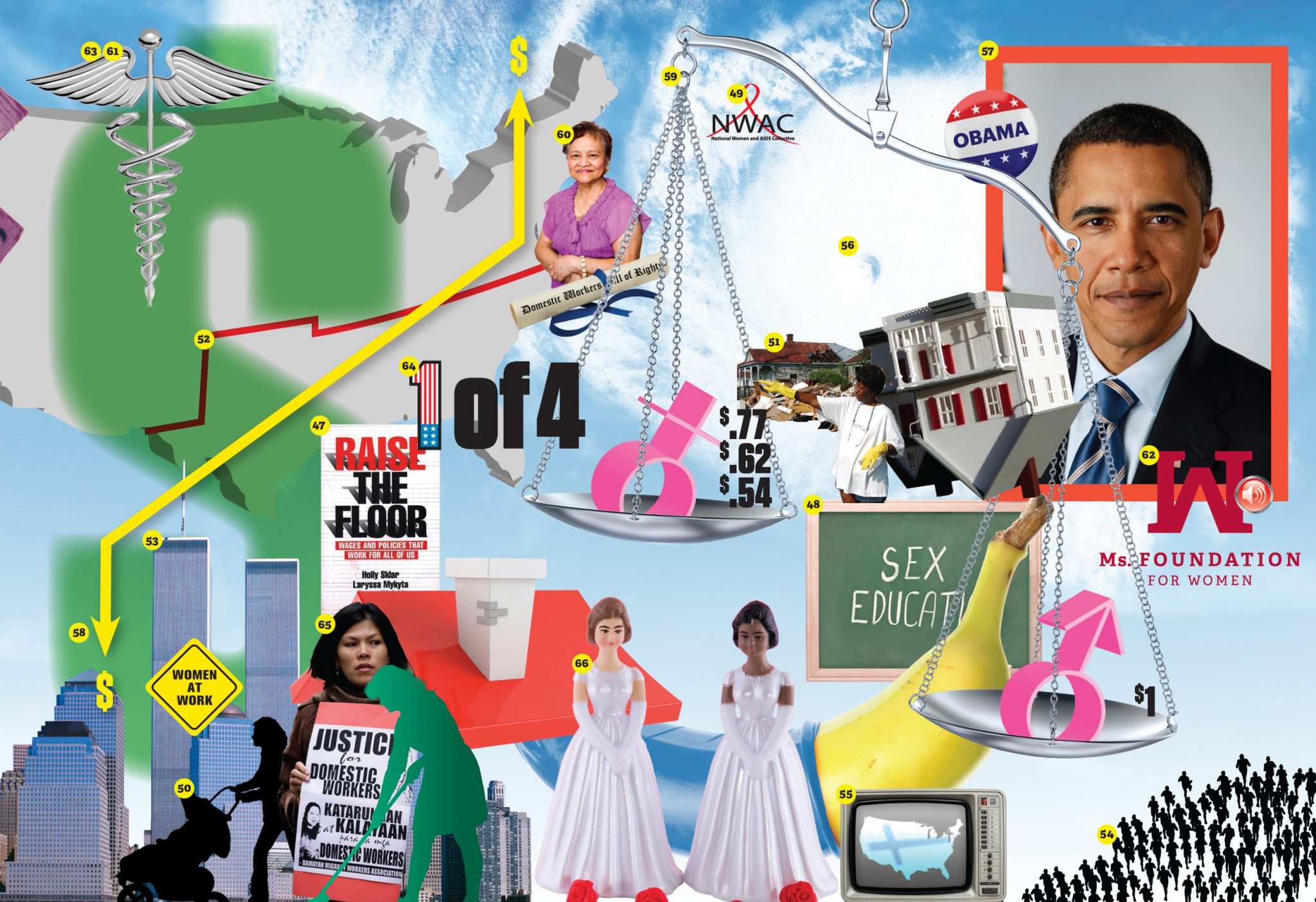
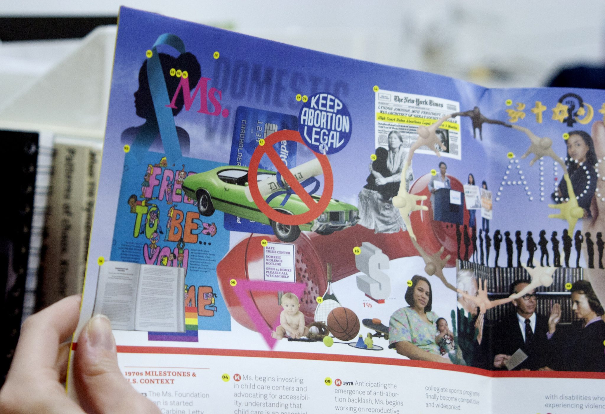
We were approached by the Ms. Foundation for Women to create a timeline of the last 40 years of Women’s rights on the occasion of their 40th anniversary.
The timeline highlights Ms. Milestones from 1972–2013 and also showcases events in the ever-changing political climate in the US. The timeline has both depth and breadth, with the aim to cover a wide range of ground to tell the overall story of changing women’s rights, and also to focus on the specific moments that had great impact. Since the Ms. Foundation’s mission focuses on the collectivity of women working together for change, we thought their story would not be served well by using singular, iconic images to highlight only the ‘best-of’ events or people. Instead, we thought every event should be represented with a visual; this way there was no added hierarchy of importance in the design. No singular moment or woman defines who the Ms. Foundation is or represents; it is instead a diverse collective whose achievements build from one small step to the next.
Our design represents that multitude and diverse collective of women, rendered in a variety of graphic means. The timeline is a textured collage of imagery, using professional and amateur photography, iconic artwork, and graphic illustrations. The design mixes the highbrow— Sandra Day O’Connor getting sworn in as US Supreme Court Judge— with the more everyday—a collage of credit card, student loan, and car, to illustrate what a women couldn’t get in their own names in 1972. We customized many of the illustrations to further the narratives, and for maximum impact. The bright, highly saturated color palette suits the dynamism of the Ms. Foundation. The timeline also folds out into a poster that collects all the images, and was framed in the Ms. Foundation’s offices.
Mic.com Rebrand
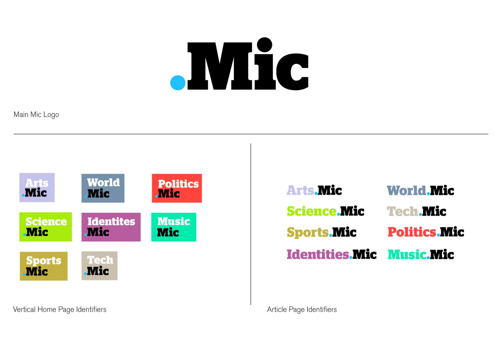
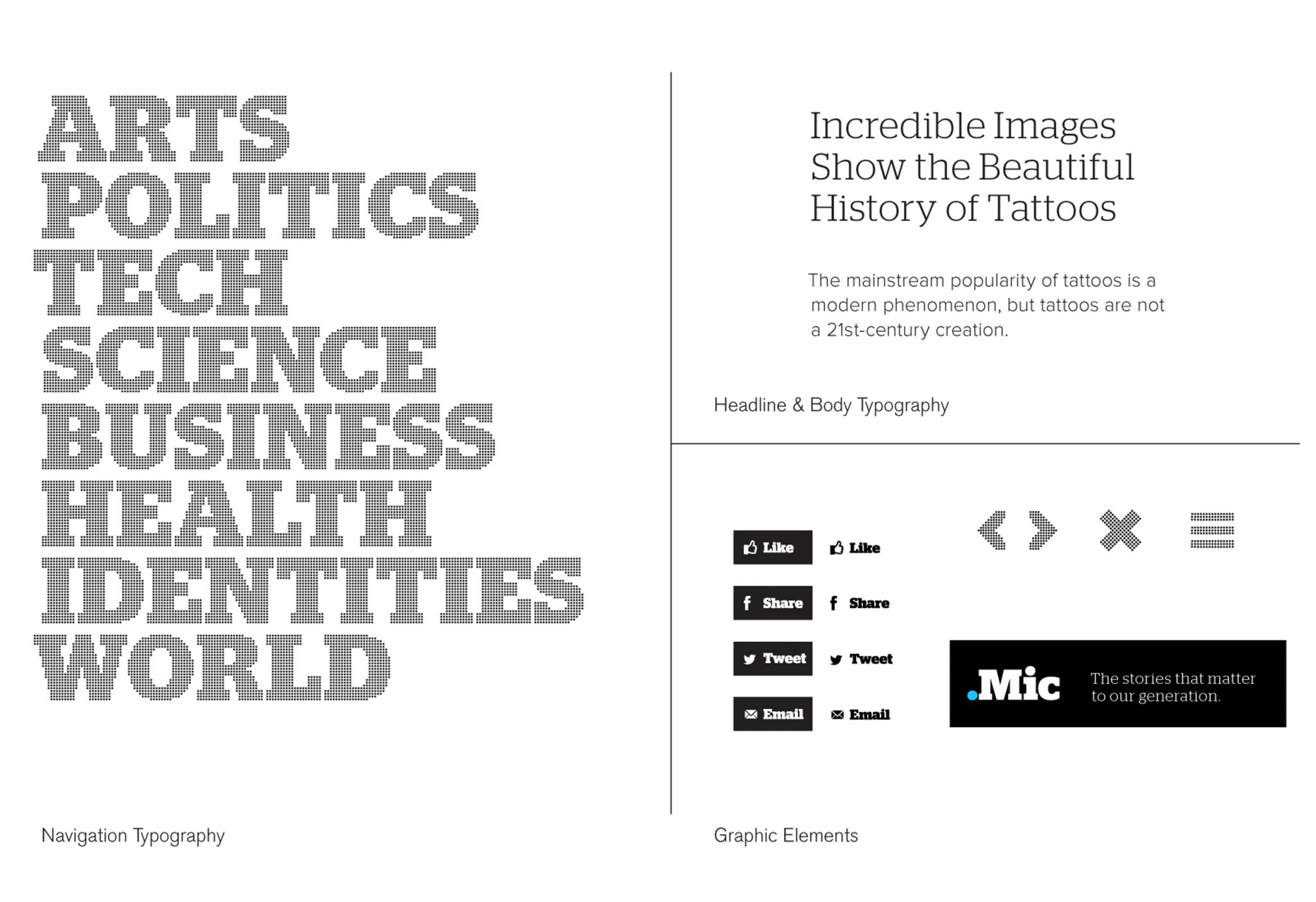
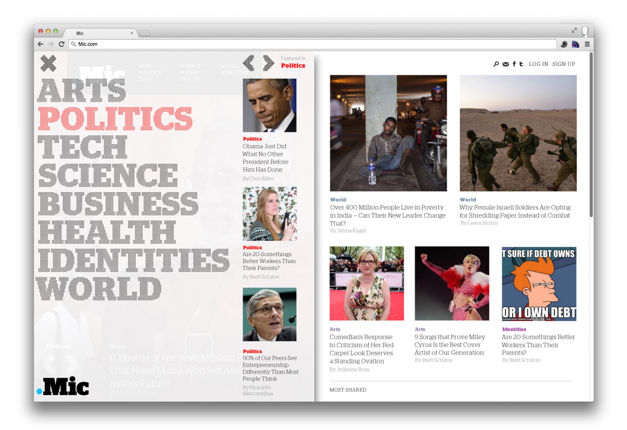
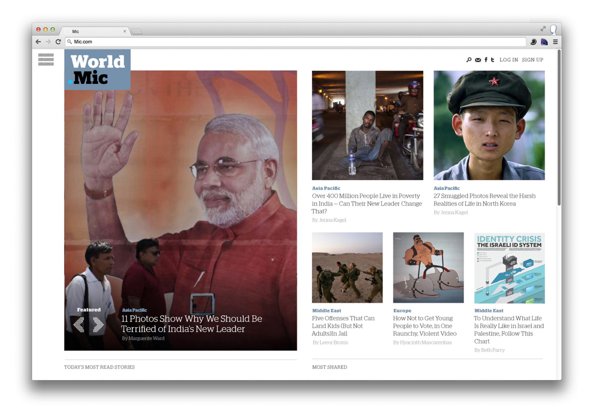
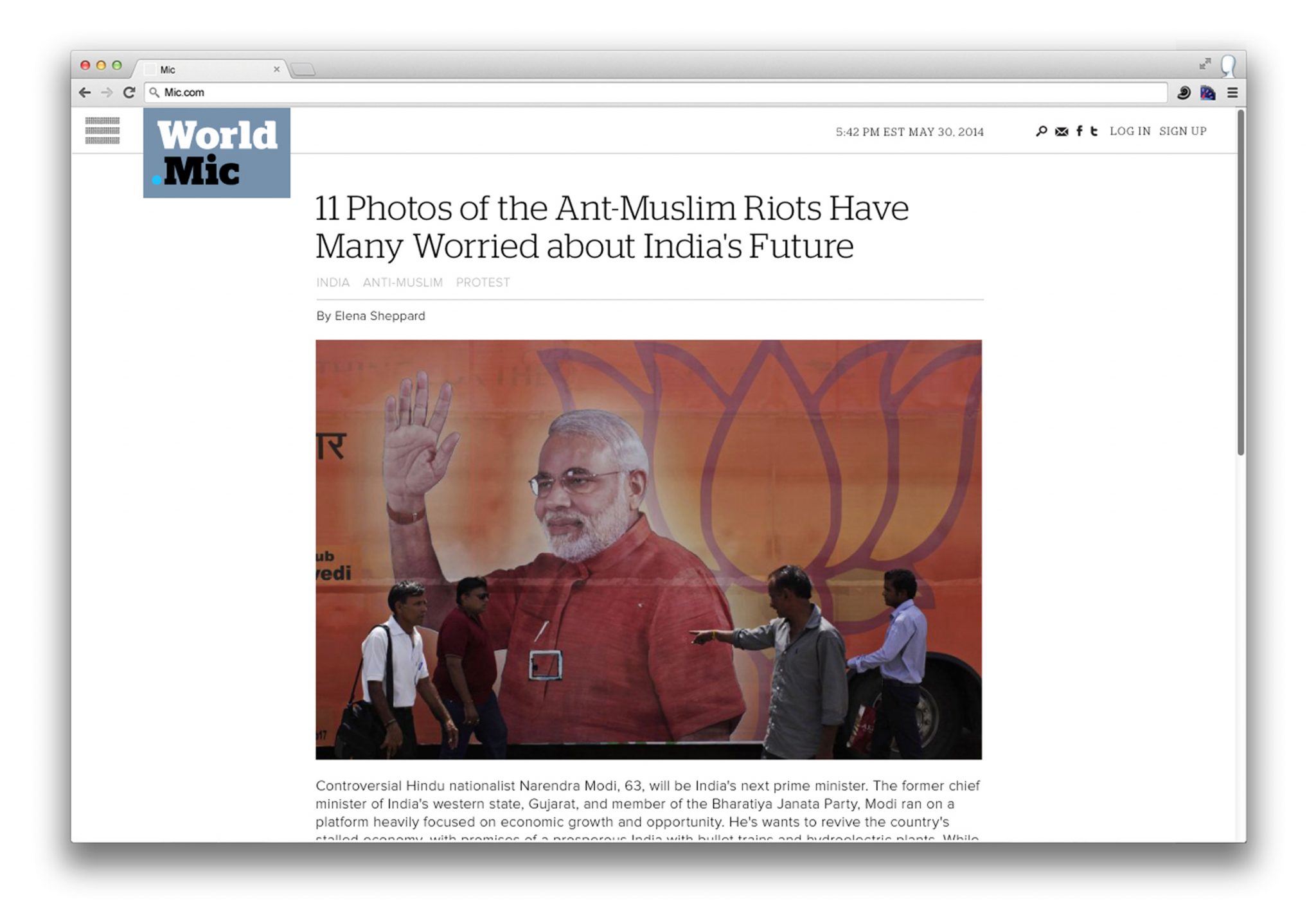
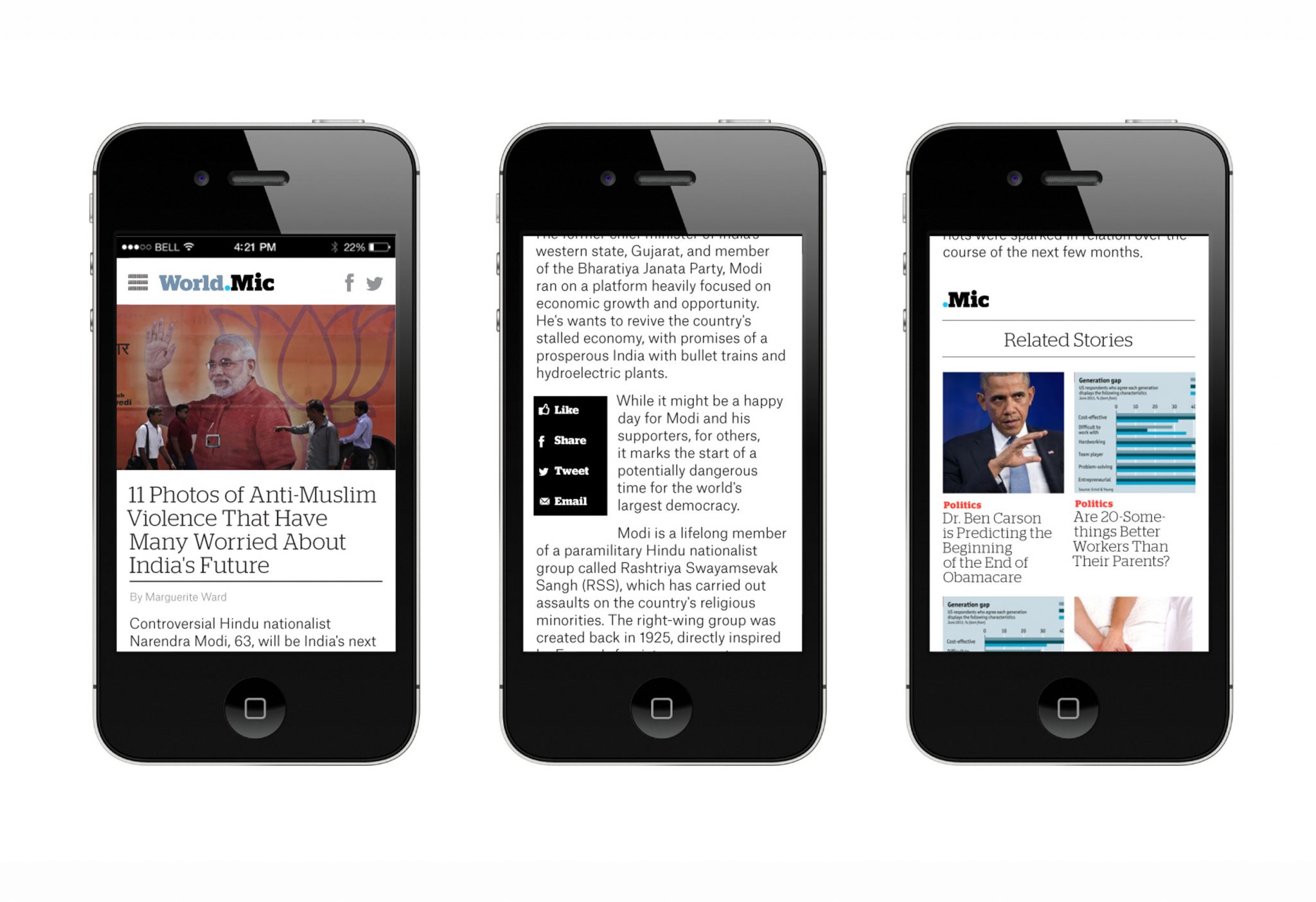
In redesigning the Mic brand, we avoided anything gimmicky or overtly stylish— their audience was too media-savvy for that. Instead, the new Mic logotype and graphic system had to project their engaged, socially-conscious voice, and feel unpretentious, confident and most importantly: casually smart.
We mulled over the name a lot — “Mic,” an abbreviation (so Millennial) for ‘microphone.’ We kept coming back to the dot-pattern typically found on microphone icons. The dot also surfaced in the new verticals nomenclature — the sports vertical would be ‘Sports.Mic’, the music vertical would be ‘Music.Mic’ and so-on — and thus the dot became the primary visual element of the brand. The identity extends into dot-matrix typography, and takes on a tech-savvy feeling, something friendly and credible without being authoritative.
As a whole the new Mic identity is an interlocking system of parts — the main ‘Mic’ logo, the dot matrix-typography, the bold identifying verticals colors, all connected by the dot. The system gives the brand its real visual strength. All the parts of the identity — vertical pages, social media avatars, overall Mic logo—reinforce each other without over-repeating the same graphic mark. In this case, a strong identity is an elegant system of parts that plays out in different platforms, emphasizing Mic’s Millennial aptitude.
Future Scenarios
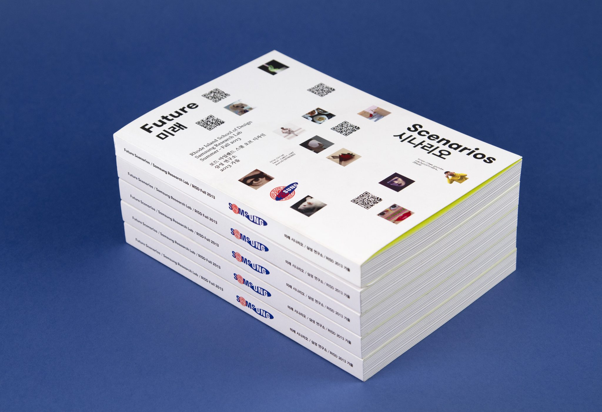

Tech giant Samsung sponsored a studio at RISD under the theme of the future of industrial design. This project united Samsung with graduate students from both the Digital Media and Industrial Design departments in a class called “Future Scenarios”. After the semester we were asked to create a publication to archive all of the work done in class.
Rather than focus on possible future products, RISD approached the class as an opportunity to raise questions about the relationship between people, technology and industrial design and, more specifically, how industrial design might change how people are in a more fundamental way. The idea behind “Future Scenarios” was also to explore the unintended consequences and new social scenarios that might emerge through new forms of design.
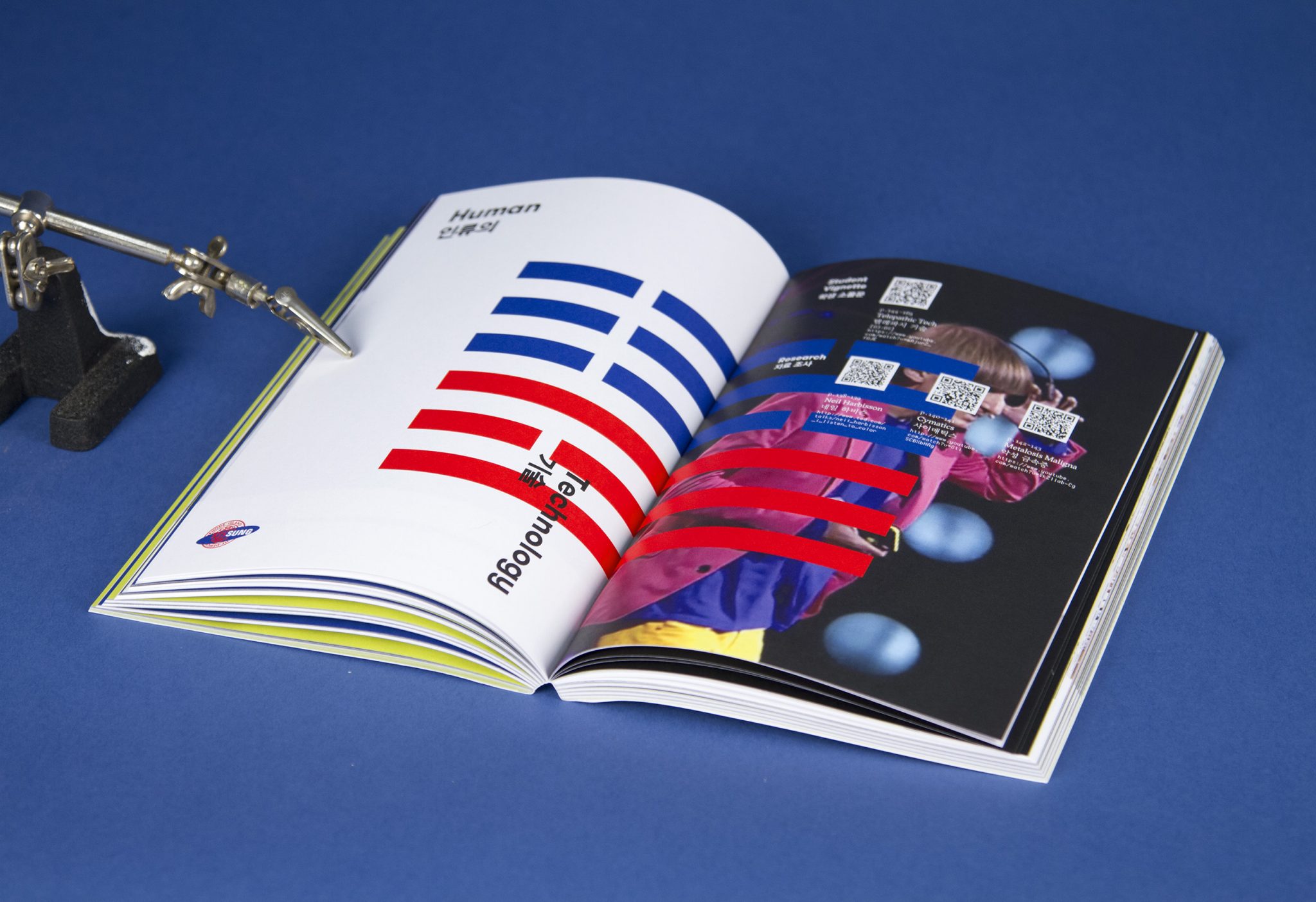
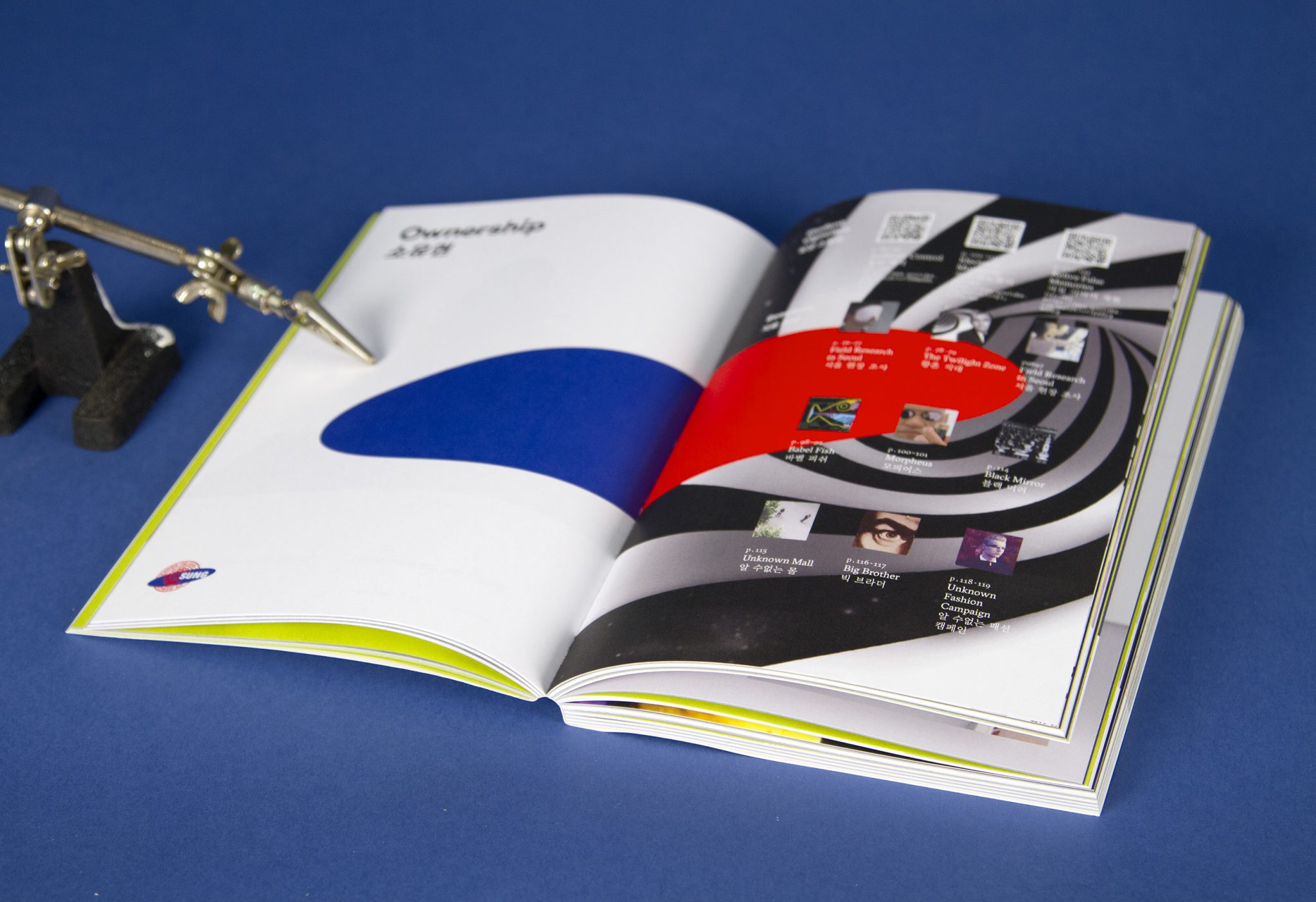
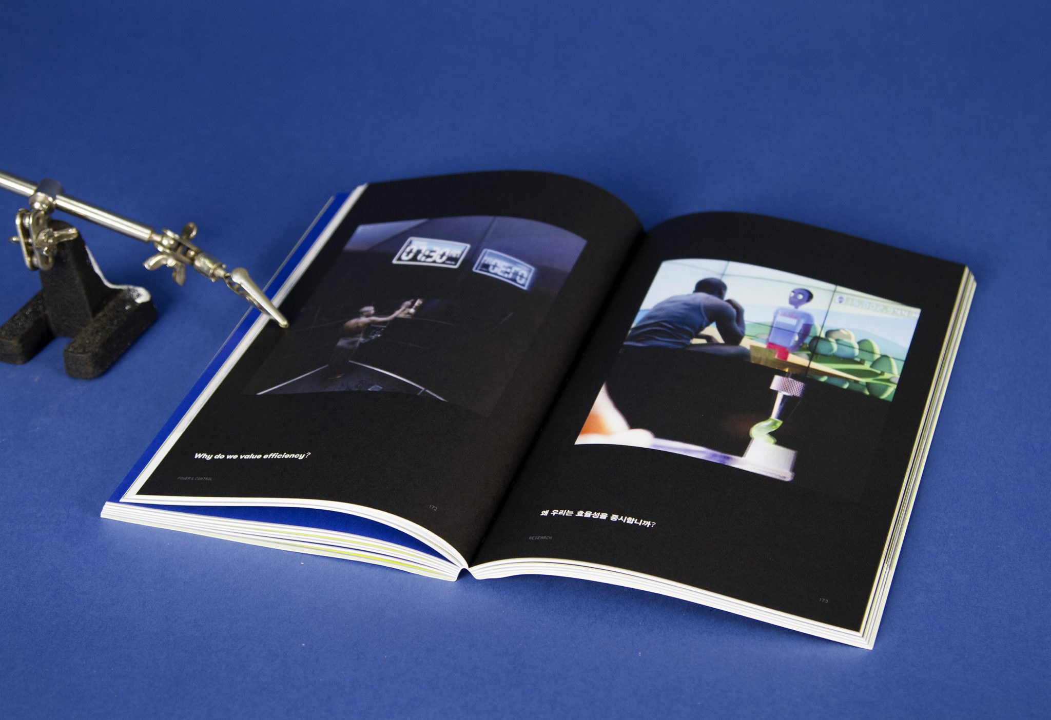
The challenge we faced was how to pull together all the various student work and voices into a clear, coherent, and meaningful archive to present to Samsung after the class concluded. Students had created ten video vignettes exploring possible future scenarios and generated hundreds of open-ended, provocative questions relating to those videos, ranging from humorous to poignant to foreboding.
We decided to use these engaging questions as the core of the project because they seemed to explain the students’ videos without offering any concrete answers. Consequently, we created a book where each spread featured a video still along with a student question generated from that same video. The reader would not have to start from the beginning of the book, and instead could open the book at any point and experience a randomized, non-linear interaction with student ideas surrounding the common theme of “future scenarios”.
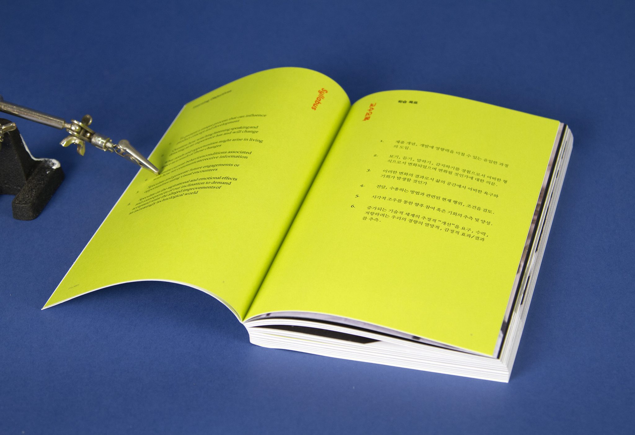
The reader will also notice a tight organizational scheme for the book. It has four thematic sections, each with a table of contents and divided into chapters that then are organized consistently throughout. Each chapter opening features an original design incorporating black, red, white, and blue, which is a merging of the colors of the flags of South Korea and the United States. (The logo we designed for the book, visible on the cover and spine, is also a merging of the RISD and Samsung identities.)
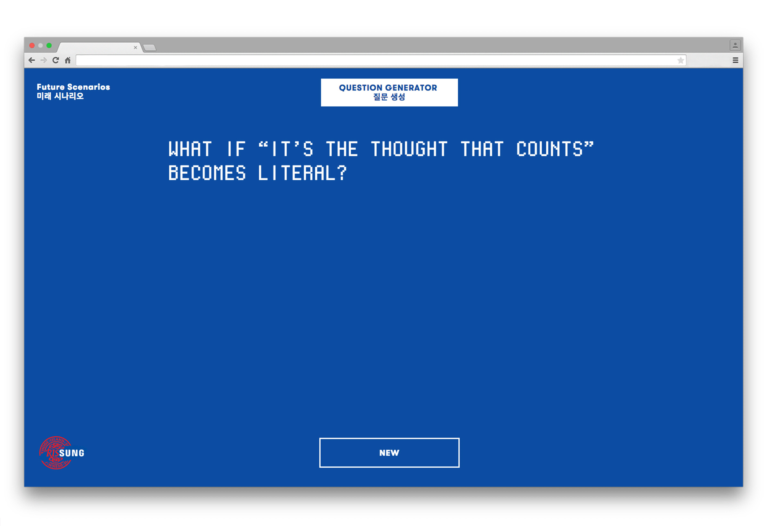
In addition, certain elements to this tangible print book link the reader to various online resources. We provide access to student videos in full online by including corresponding QR codes. We also created an online question generator that creates even more questions pertaining to “future scenarios” through a computer program that randomizes words from the original student questions, suggesting an infinite source of questions and a technologically driven interplay between absurdity and originality. The blue pages of each chapter opener feature sample website-generated questions.
By reading and interacting with the print book, we hope that the reader gets a sense of the expanse of student ideas during the class and the spirit of inquiry and curiosity that drove them. The print book is available on-demand through Amazon.
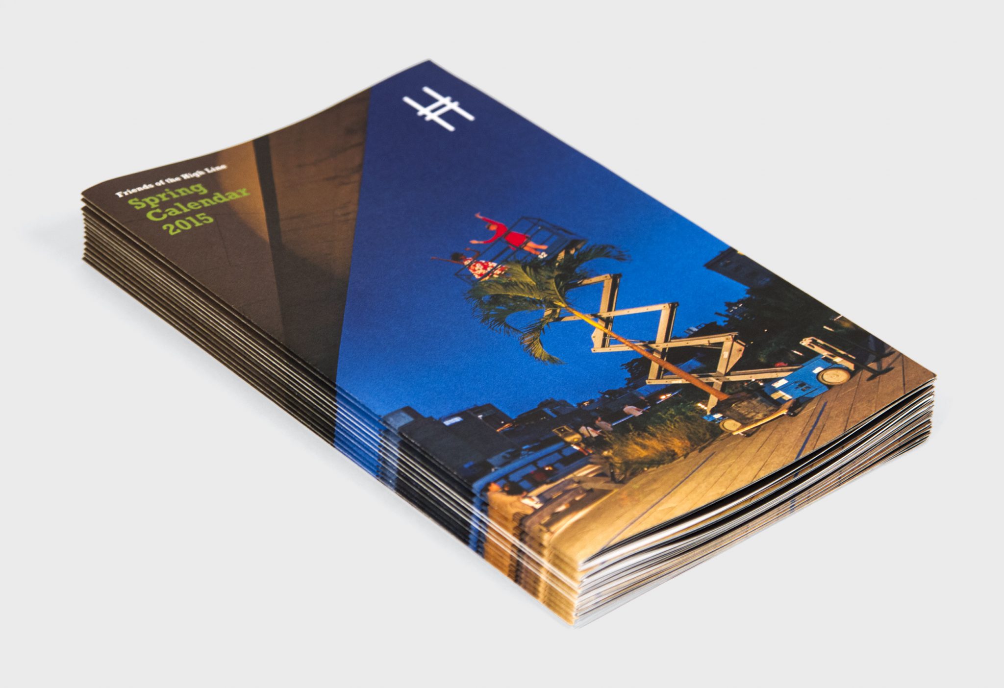
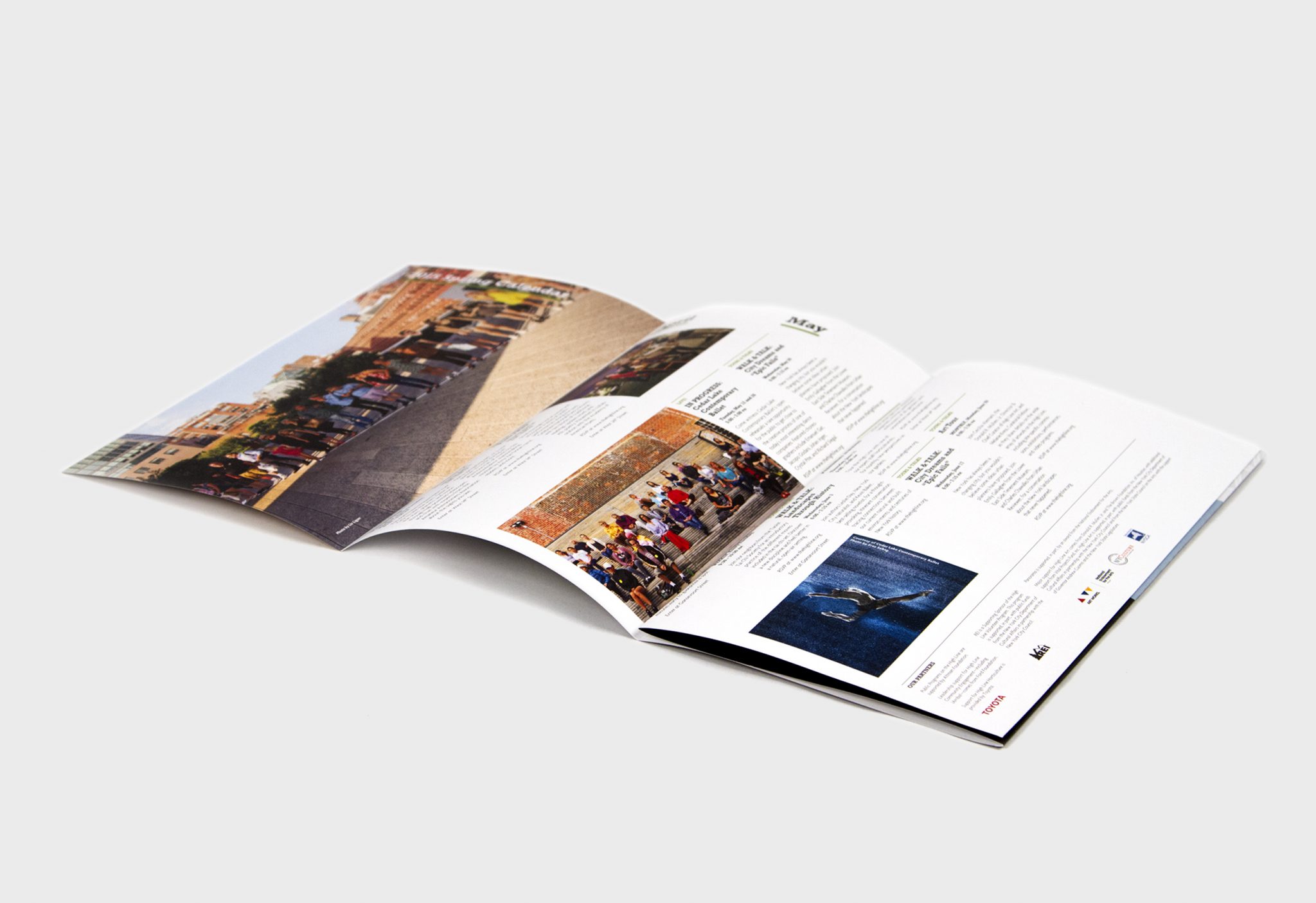
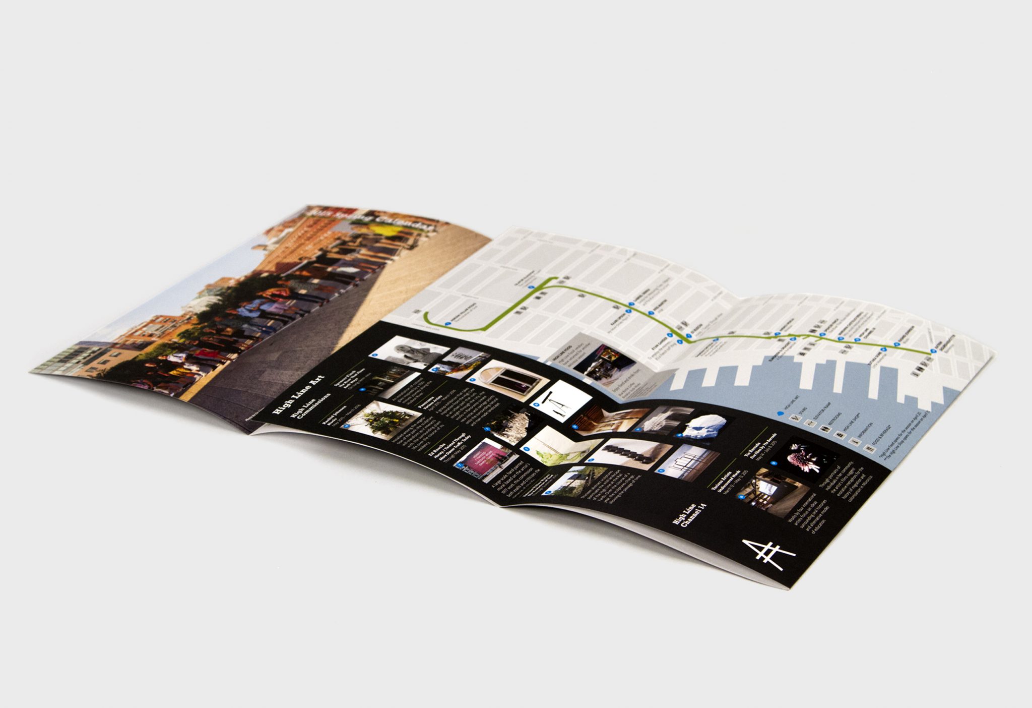
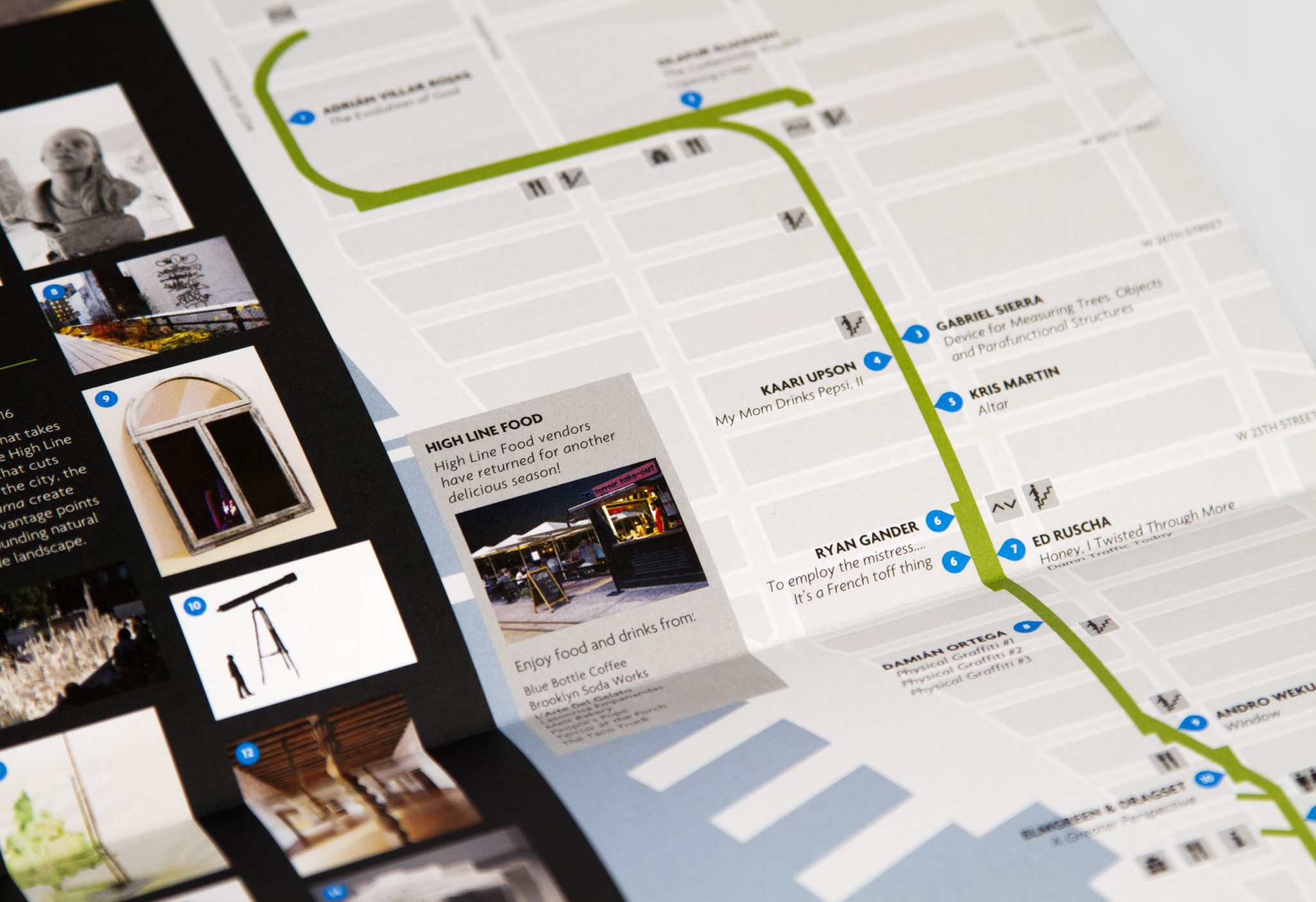
Friends of the High Line 2015 Calendars
After Sunset: Poetry Walk
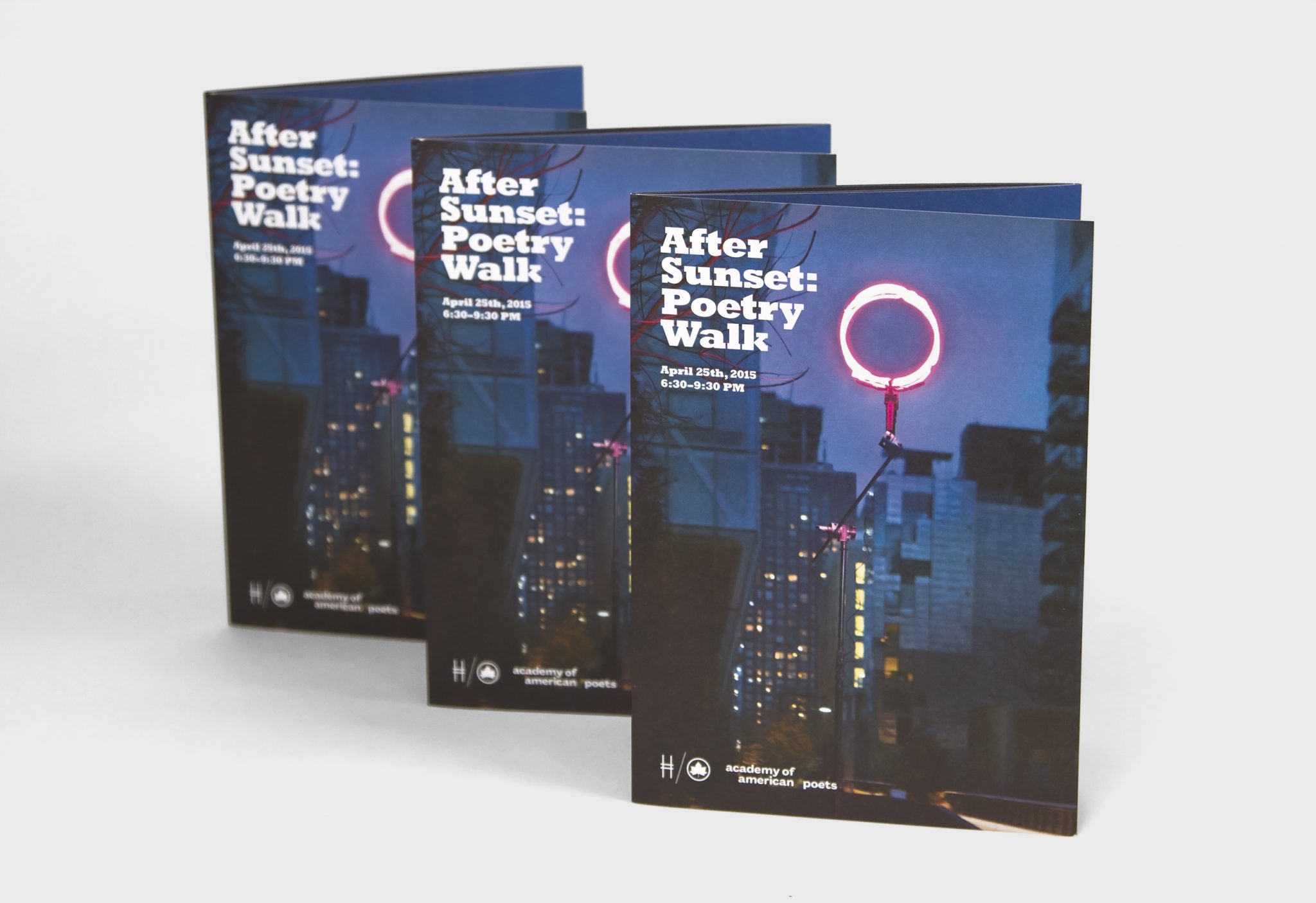
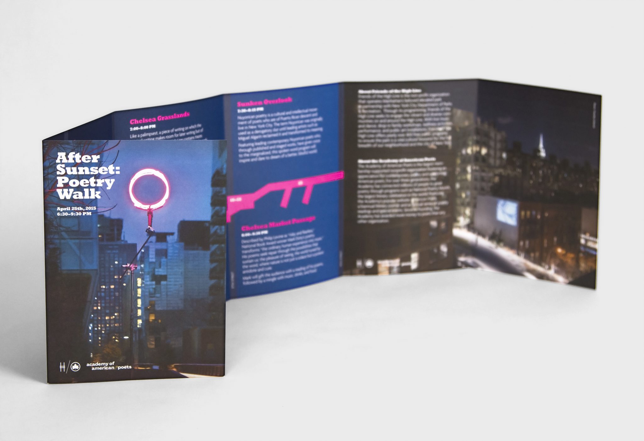
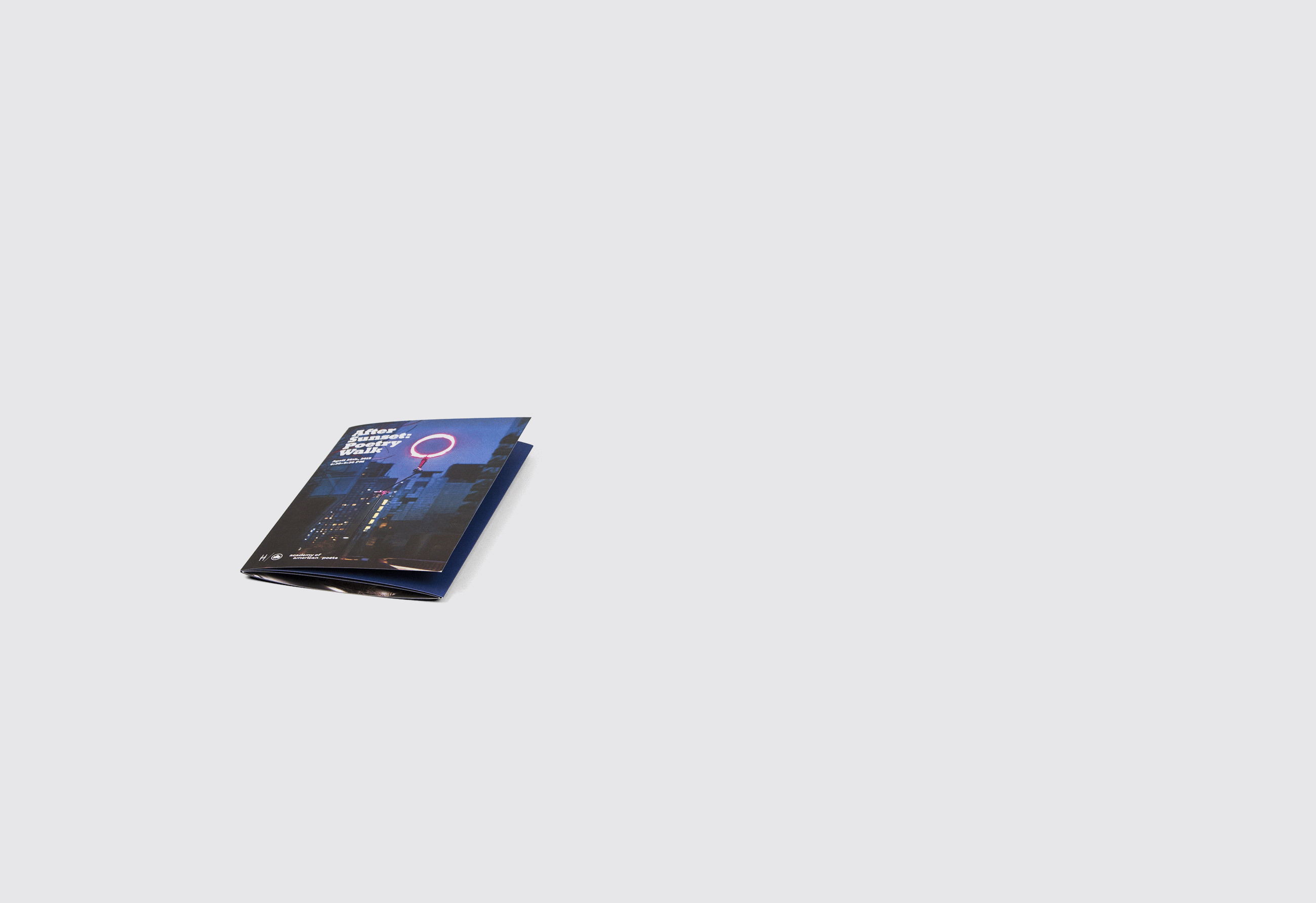
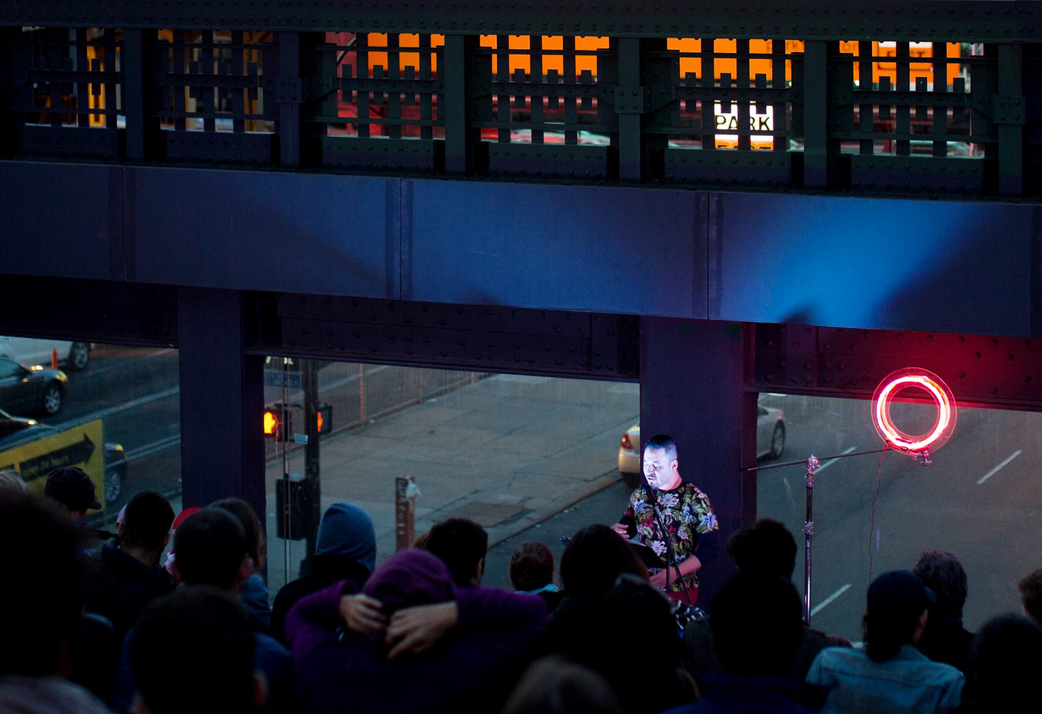
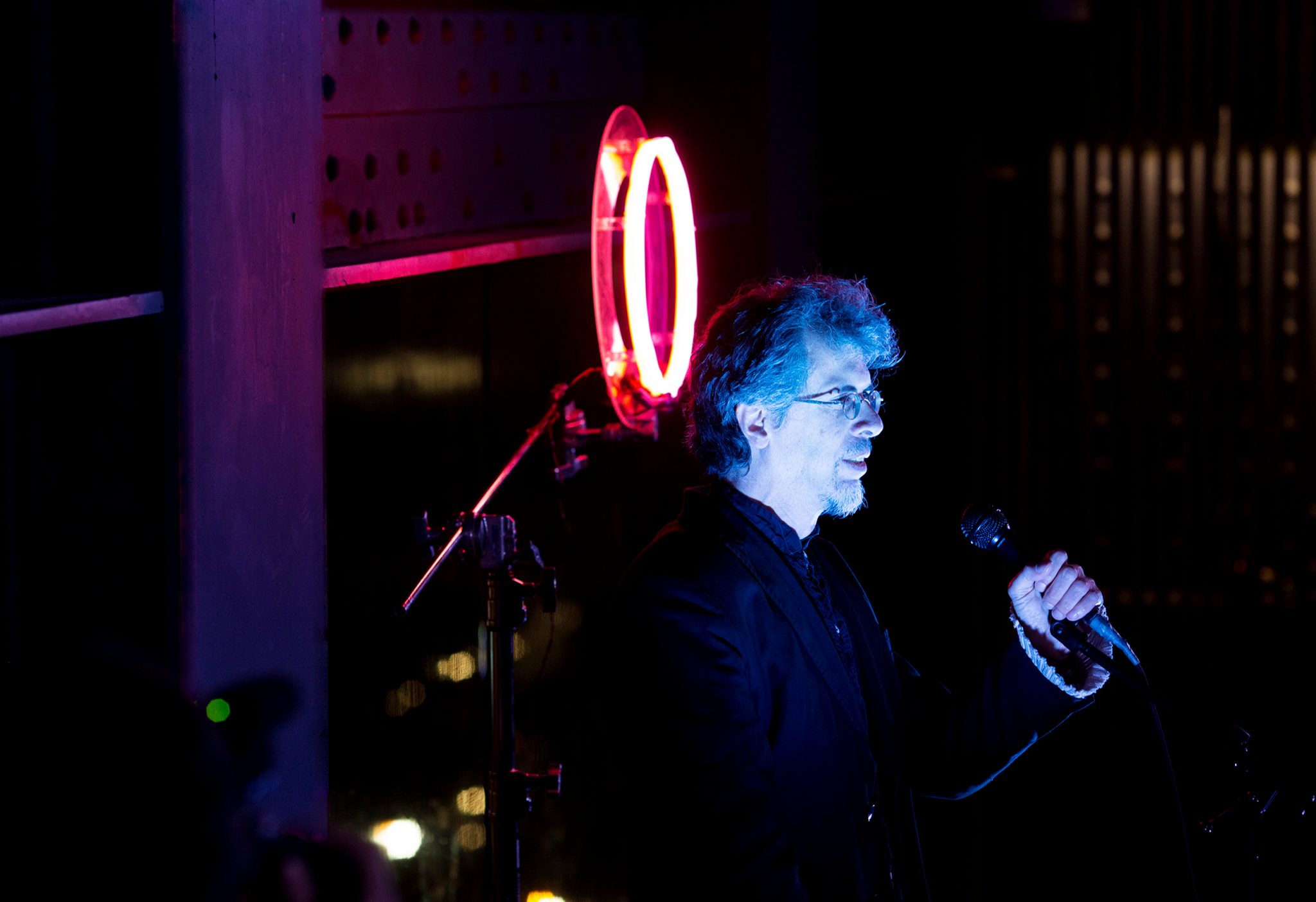
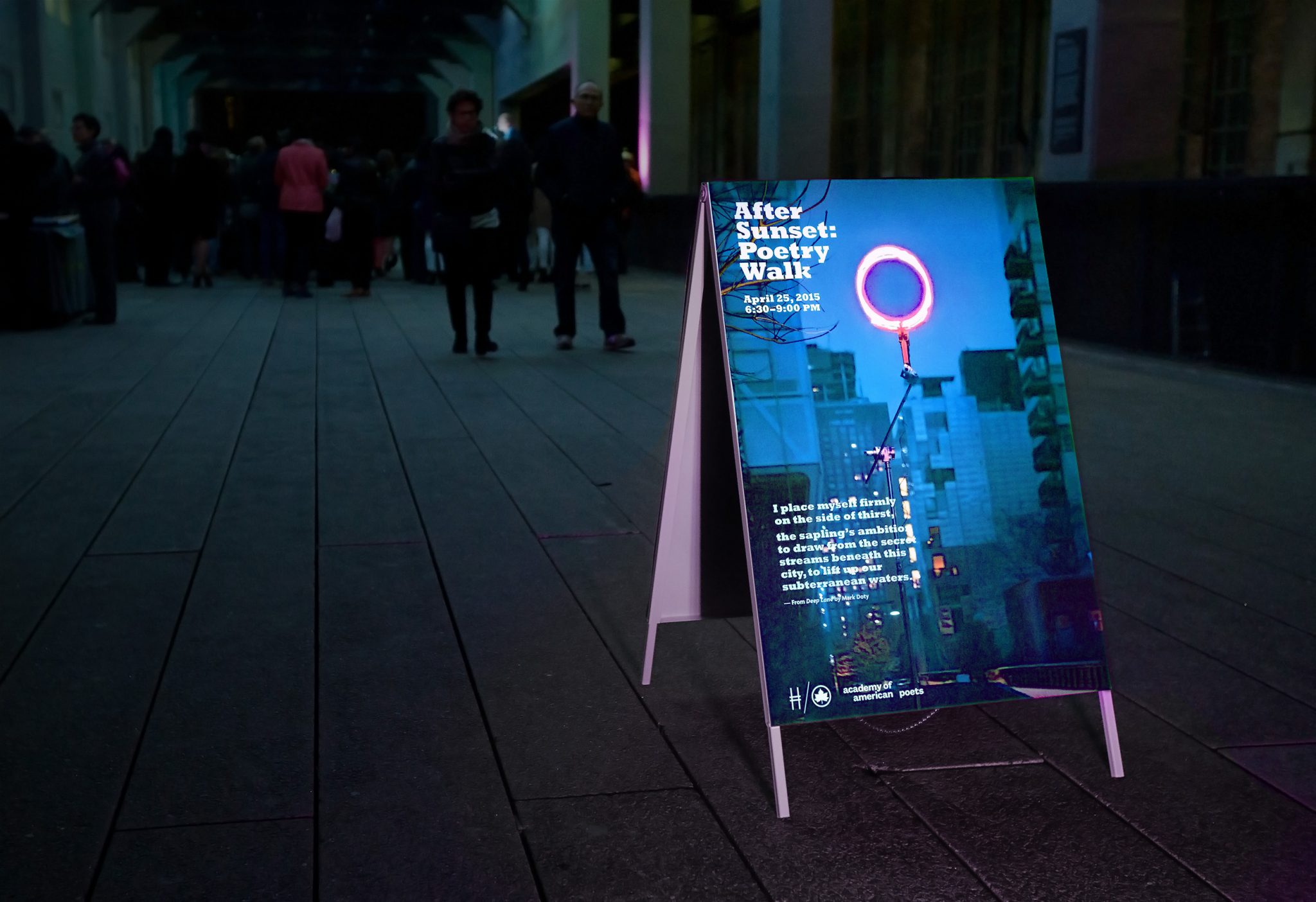
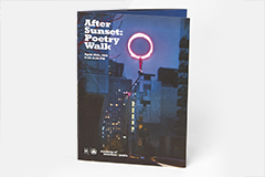
At sundown the evening of April 25, 2015, the High Line hosted the “After Sunset Poetry Walk,” an event that brought together 30 poets who read their poetry over a stretch of twenty blocks of the High Line. Since the event would begin at dusk, we searched for a way to illuminate the darkened atmosphere and provide a way to guide visitors down the High Line to listen to the various poets.
After experimenting with various glowing materials, we created a glowing ring out of orange and pink neon tubes. This would serve as the unifying theme of the experience and suggested a unique kind of sun that rose after sunset. We placed the ring at the steps overlooking Tenth Avenue to serve as a backdrop for where one poet was stationed and read his work.
Wanting to maintain the idea of illumination in the poster and pamphlet that advertised the event, we directed a photo shoot to capture the pink glowing ring at the High Line after dusk. The photo was then used as the poster placed every few blocks along the High Line, and some posters featured screen prints of various poems being read that evening.