Categories for Poster
Interrupt 3: Language Art Conference
In the spring of 2015 Brown University hosted the third annual “Interrupt” conference, an event created by the Digital Language Arts program of the Department of Literary Arts. This conference explored ways that coding can create new forms of literature. The format of the conference included “Interrupt sessions” in which artists had five minutes to present their work but could be interrupted at any point by another presenter. In this way interruption itself became a protagonist, taking on various unexpected forms and playing with how people experienced interruption.
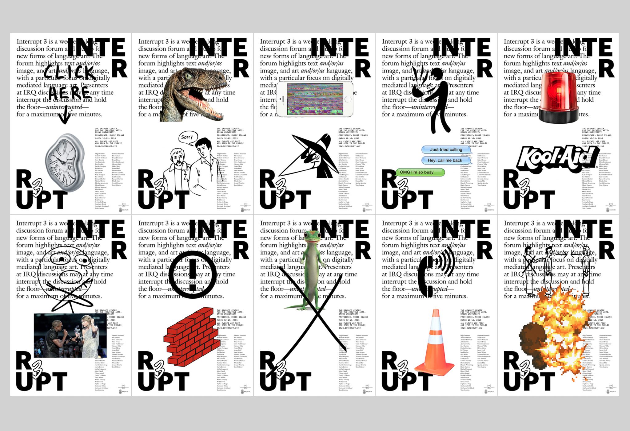
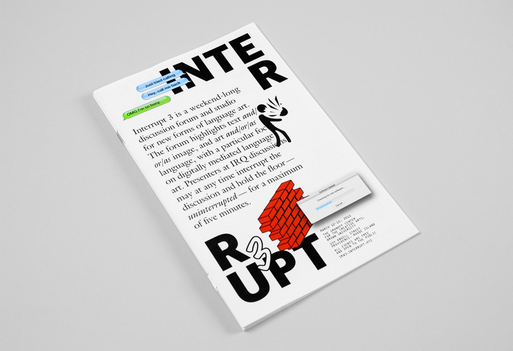
We were asked to create the identity of this event, including posters, a pamphlet, and the website. Two elements formed the core of the identity we would use throughout these materials: the logo with the word “Interrupt 3” split apart and in opposite corners, and seemingly random pop-up images that would appear actively on a screen or would surprise a reader on a printed page or surface.
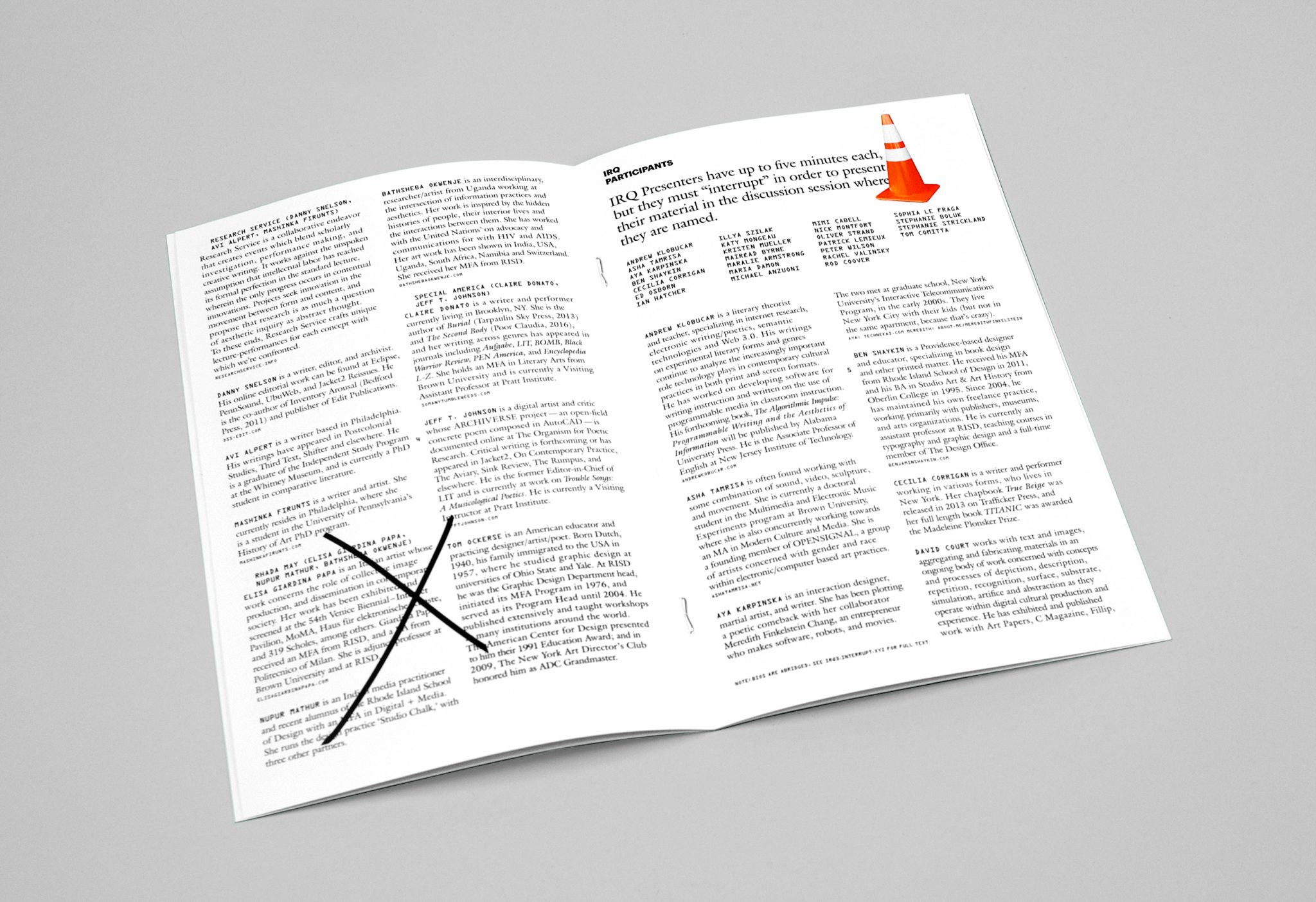
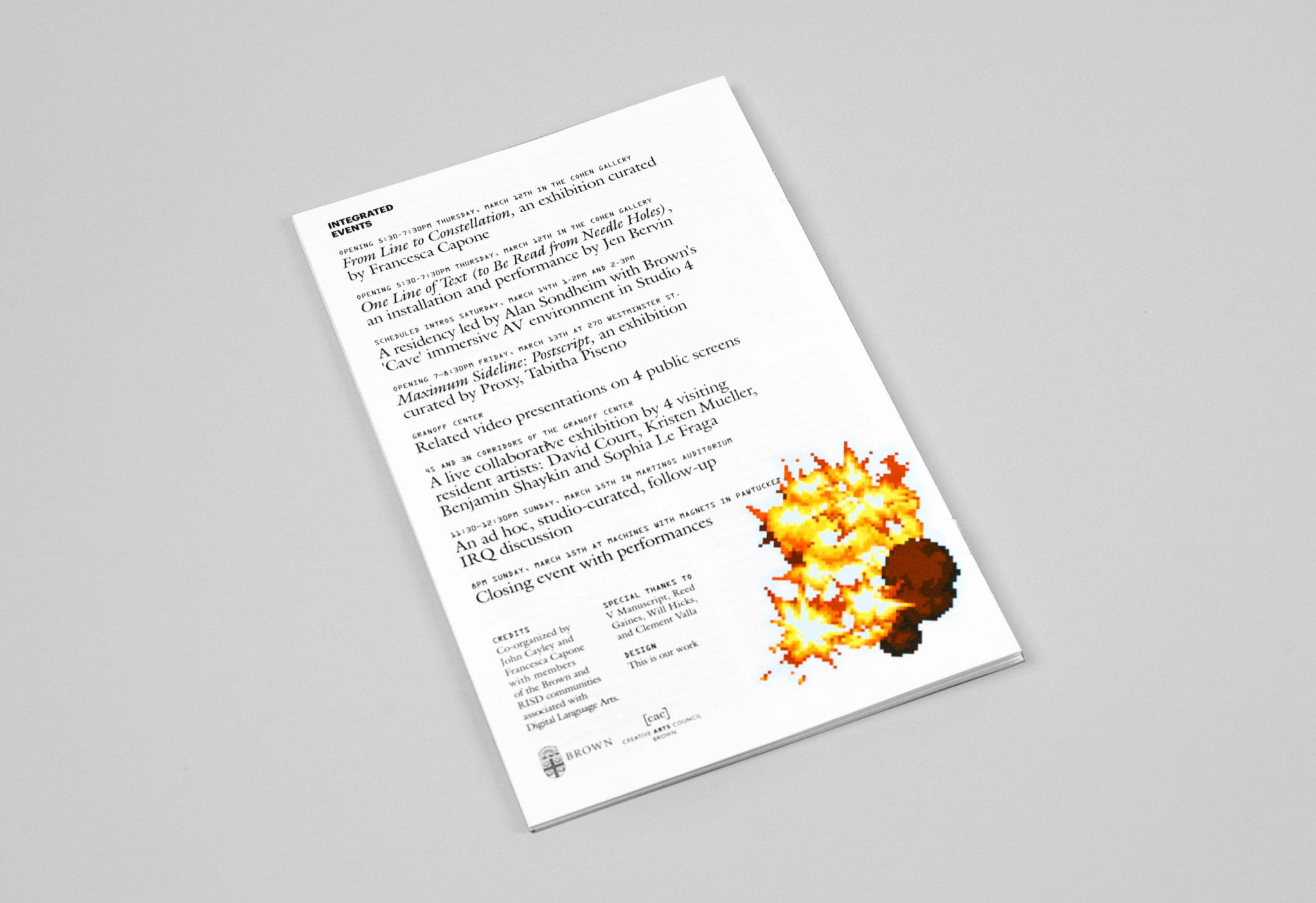
Our posters feature background text that is covered by interruptions of the logo and pop-up images. We created ten different versions of this poster, each with a unique combination of an illustration and photograph as pop-ups. While the pop-ups might seem haphazard, they were actually placed systematically and posters were shown in groups of three so that all text would be visible on at least one of the posters. In this way we made sure that the names of presenters would always be visible somewhere while also emphasizing the idea that the overriding narrative of the event are the interruptions themselves; a search for meaning will only be frustrated at some point. Pop-up pictures also occur throughout the pamphlet we created for the event, but in a way that is less obtrusive for the reader needing access to the information in print.
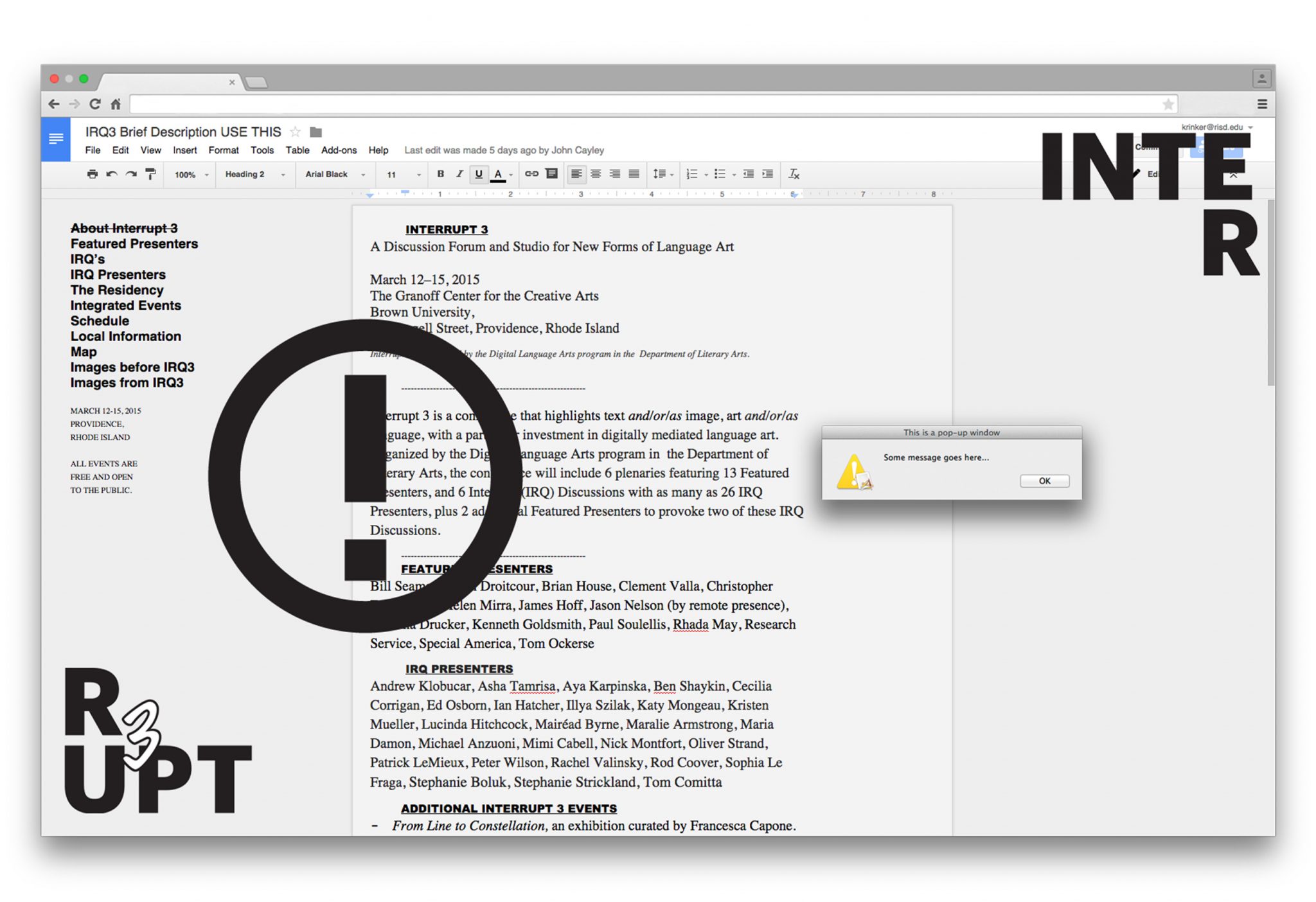
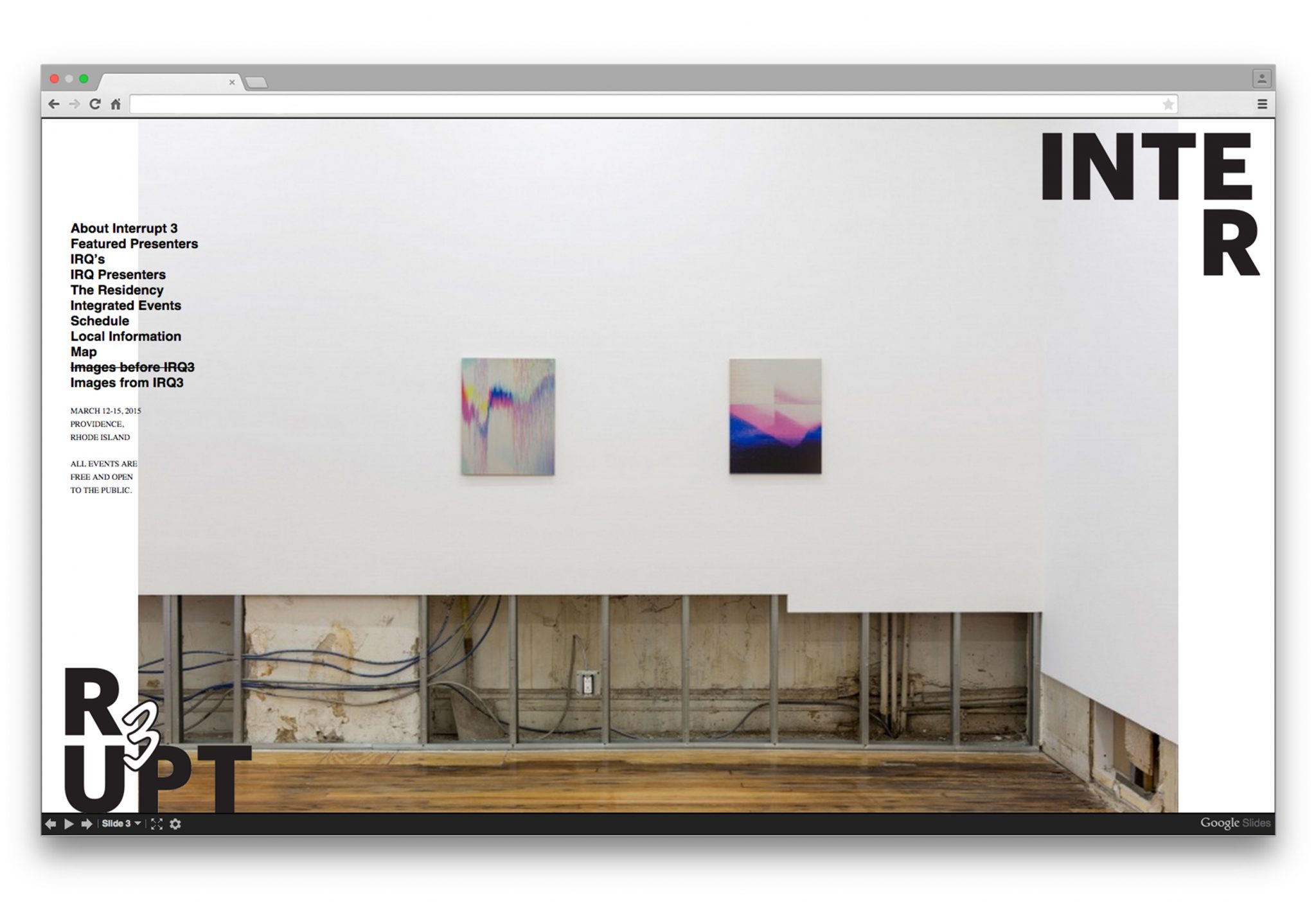
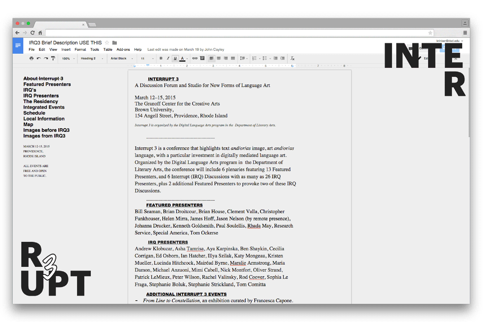
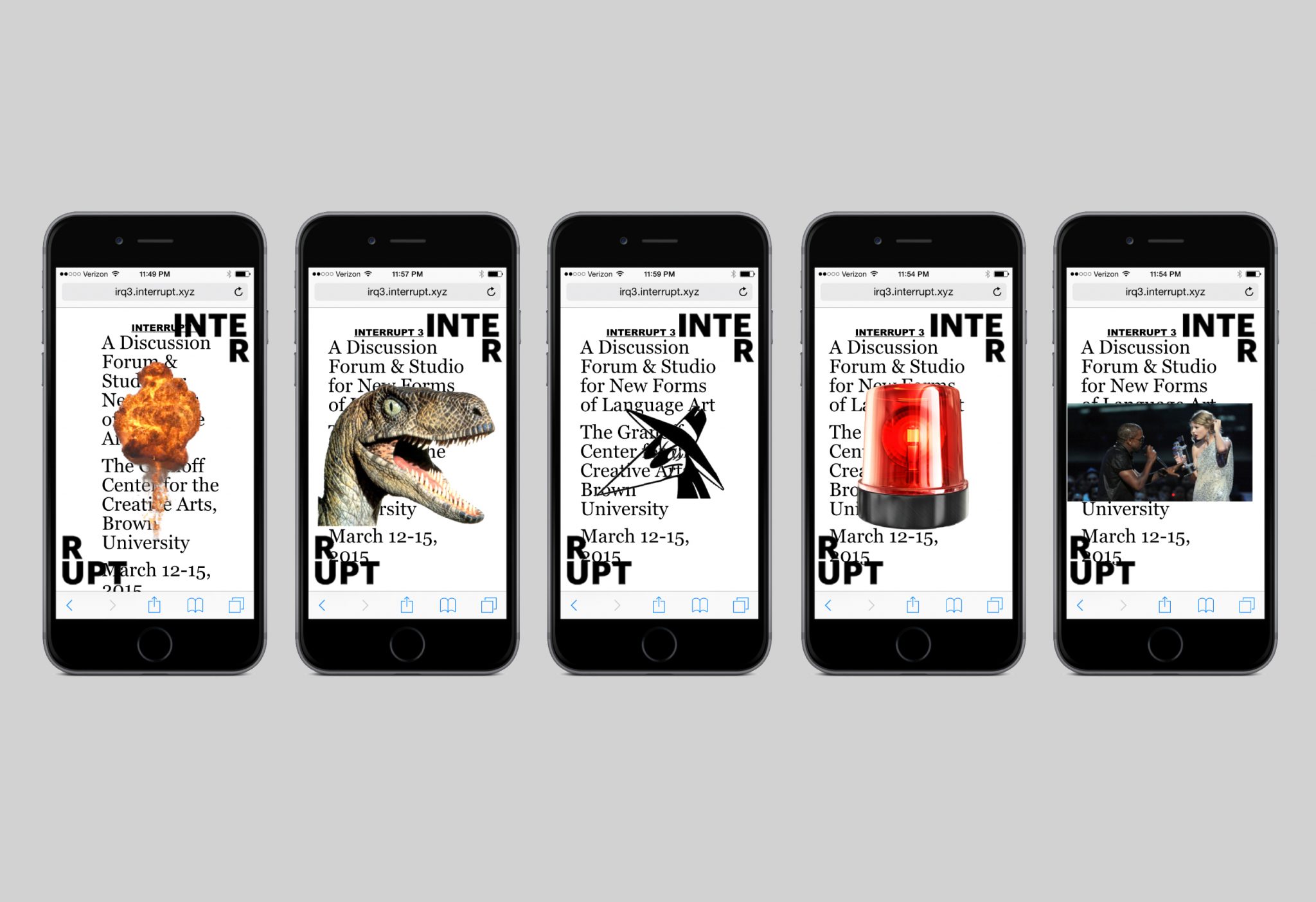
The most interactive and playful use of the pop-up interruption is in the website. The reader has the choice to click on each pop-up to remove it, or do nothing and allow the pop-ups to gradually invade the screen. We built the site on top of an actual google document page, so that conference organizers could make content updates until the very last minute. This feature also allowed us to apply the pop-ups to every page of the website without interfering with the website itself.
Storefront—Being
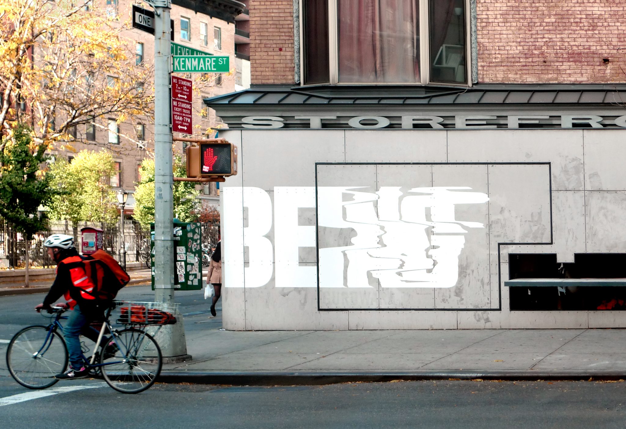
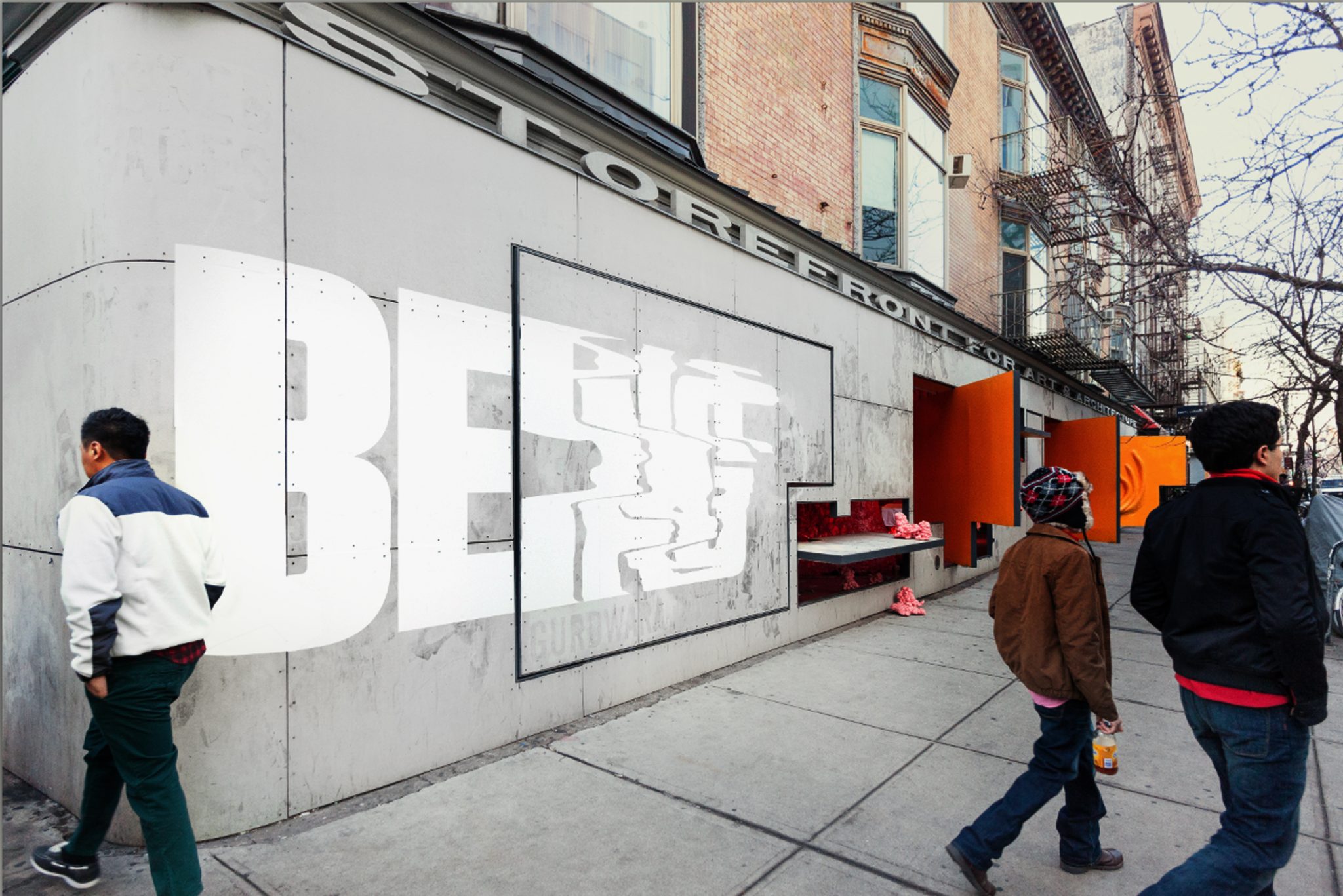
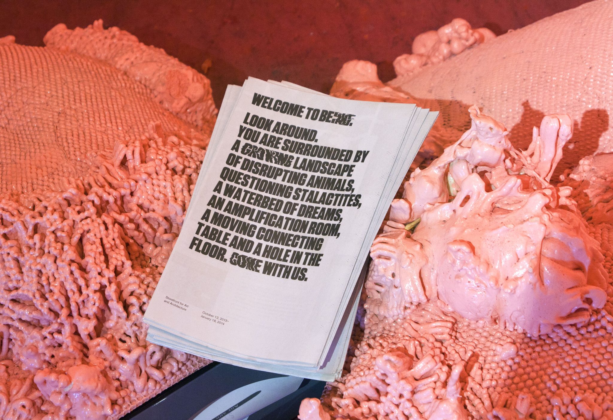
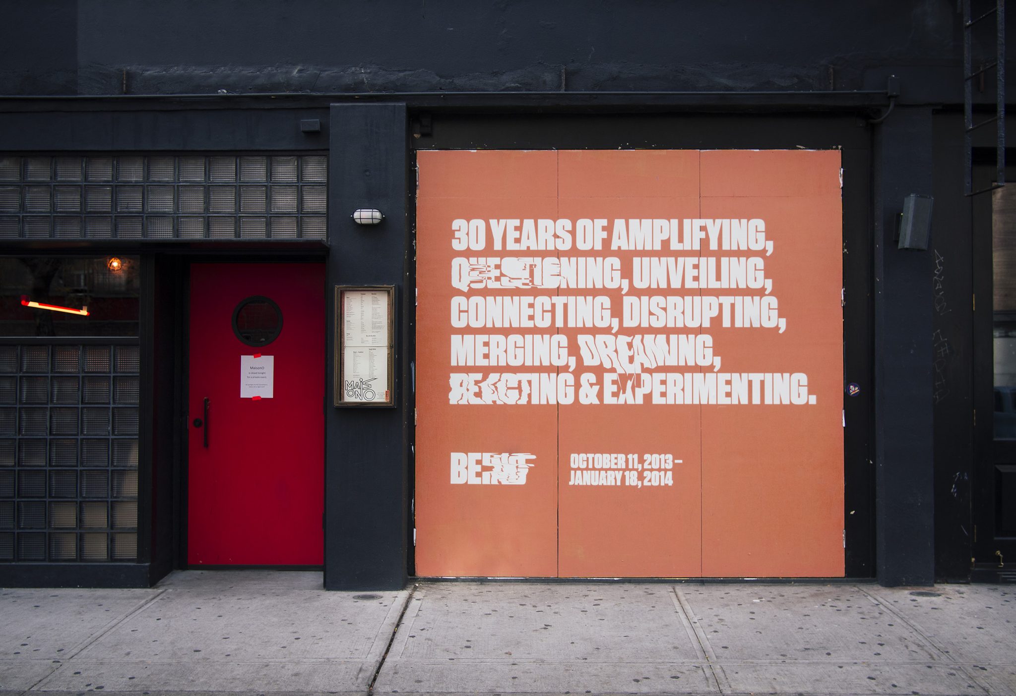
We collaborated with the Storefront for Art and Architecture, for their 30-year celebration show, titled Being. The show was an experiment about Being Storefront in the form of 9 actions. Our challenge was to create an identity that was alive, and we created a typographic form that had something like a pulse, with an on-beat and an off-beat.
The identity is both a rational, high impact graphic that is clearly legible, and also a chaotic graphic form whose extreme instances melt into abstraction. The pulse appears in the print work in randomly selected words within the various program texts. The identity maintains readability and graphic impact, and allows for unique variations to occur. Our black and white palette reduced the message into didactic form alone, and highly contrasted the pink, fleshy architecture of the show.
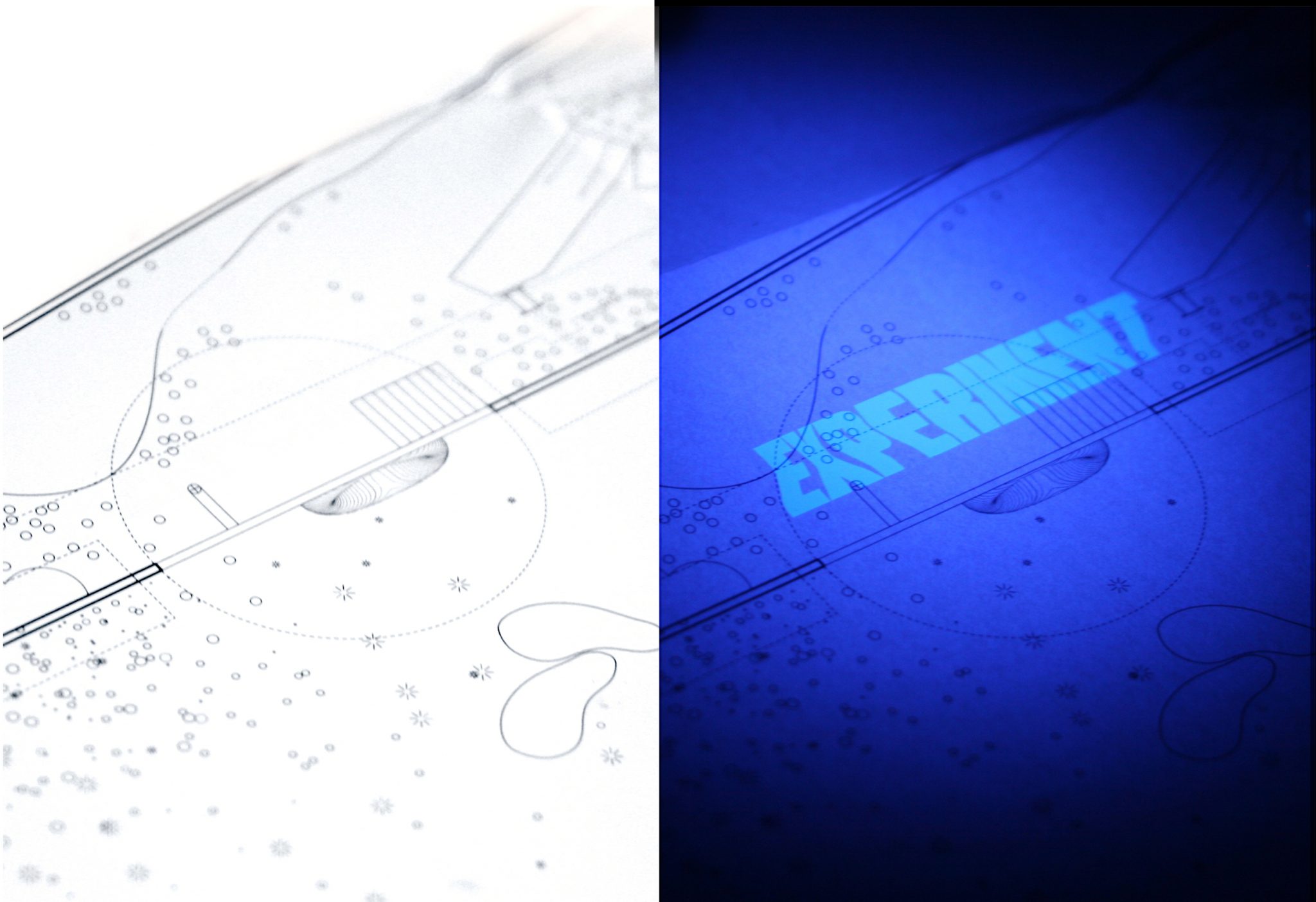
We designed a limited-edition print guide to the exhibition. It used Ultraviolet inks to make the piece come alive only when in the black-light lit areas of the gallery.
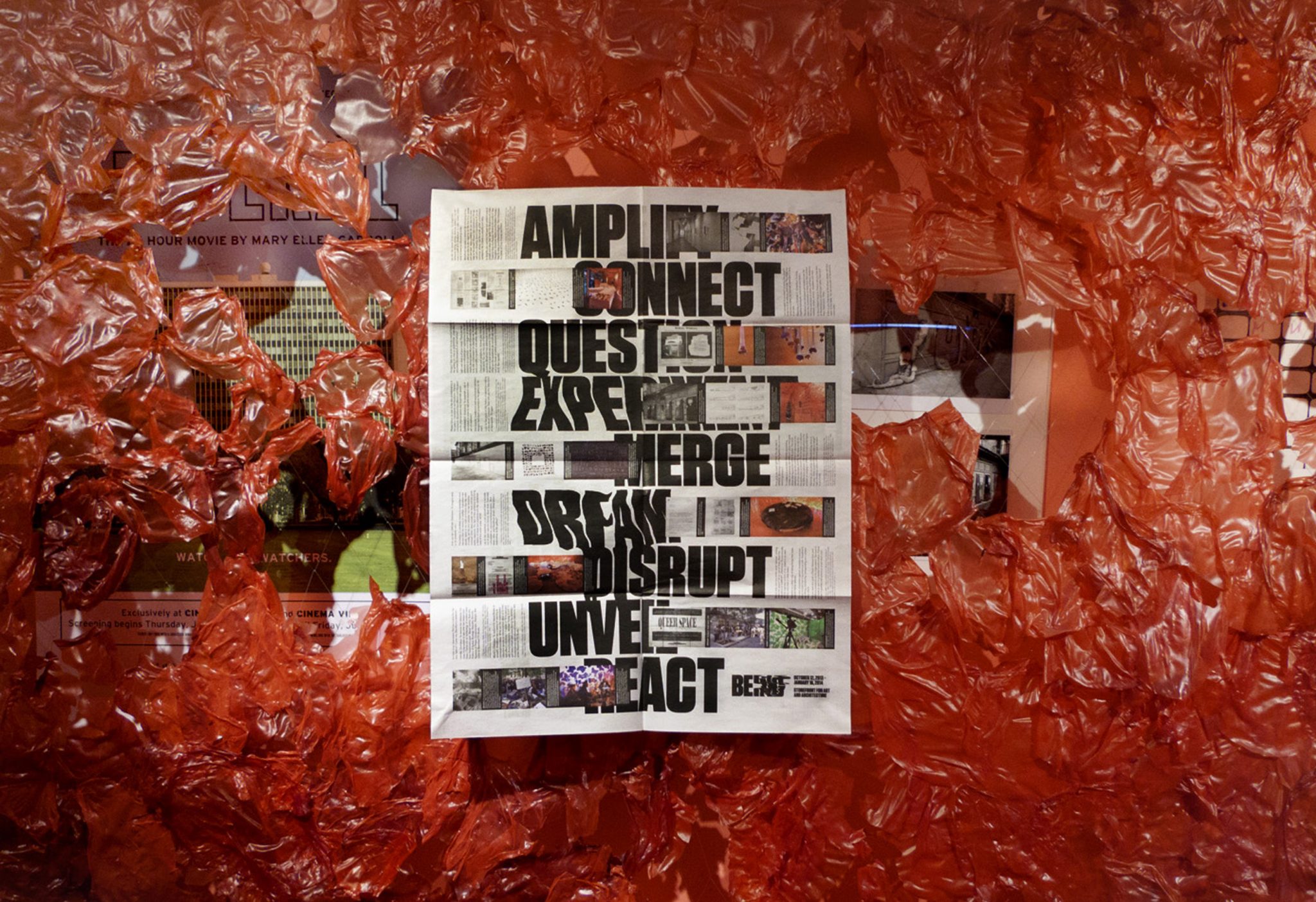
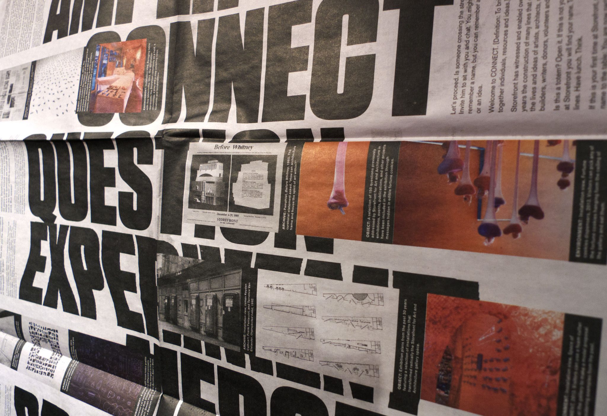
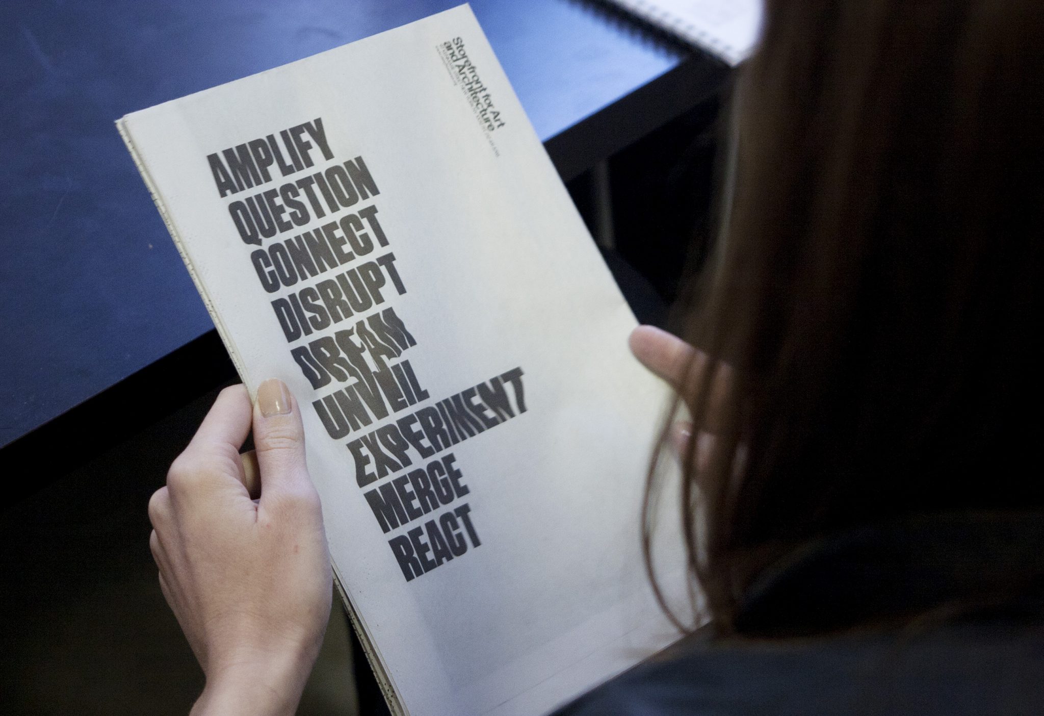
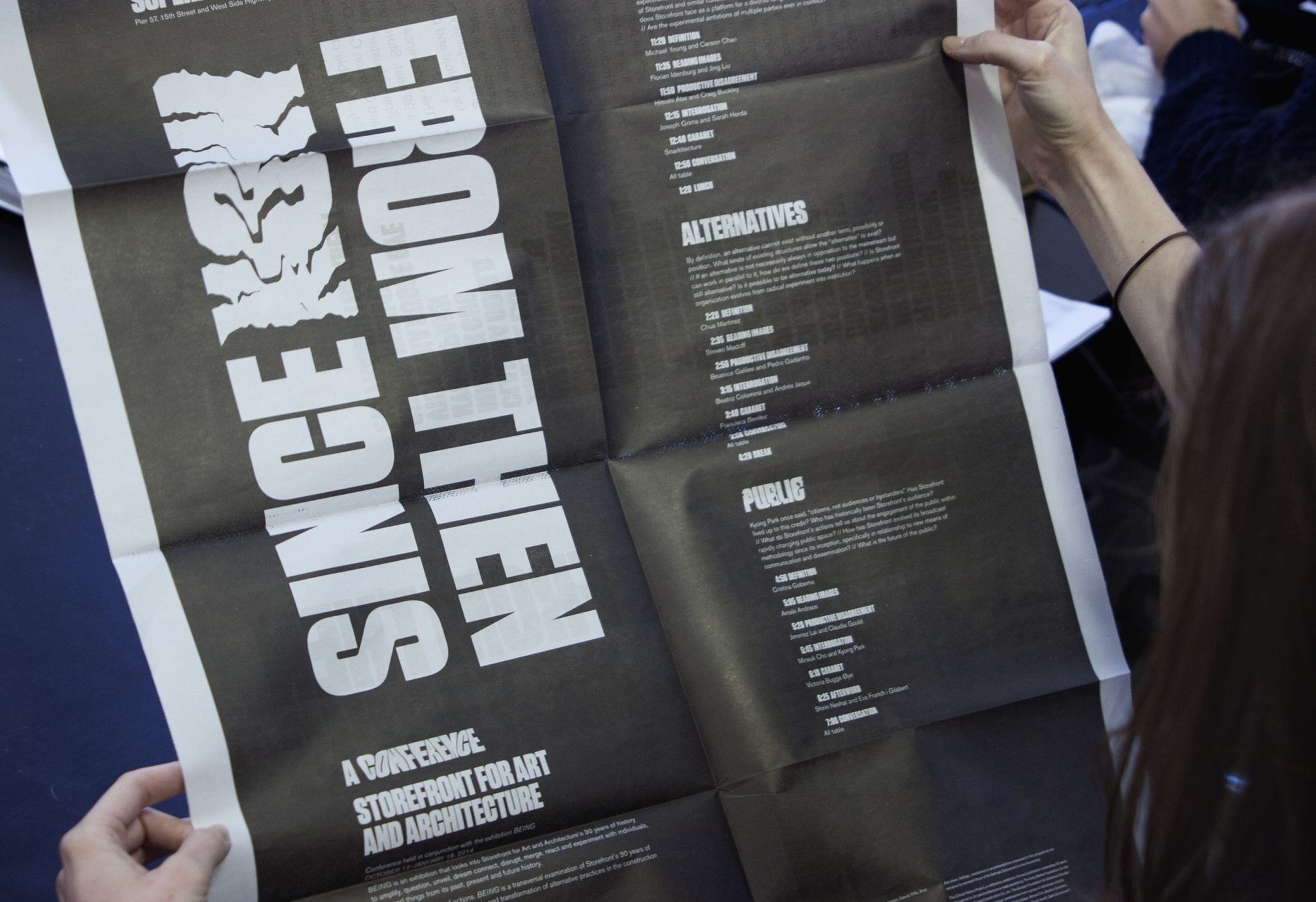
Newsprint broadsheets were designed to catalogue the show, and to announce the related conference. The poster side of the newsprint featured clusters of 3 images (archival, object and environment) that relate Storefront events to each of the nine verbs the exhibition used to express the idea of “Storefront-ness.”
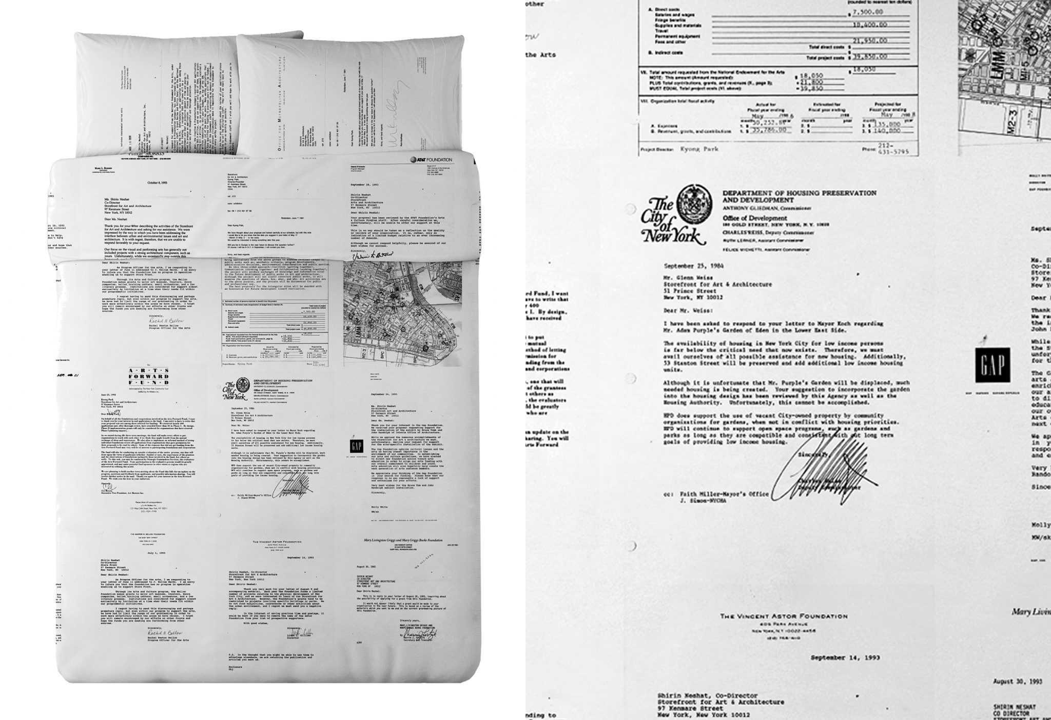
For the exhibition we designed limited-edition Queen duvet set and pillows for the waterbed that appeared in the show. It uses rejection letters of failed grant applications from Storefront’s history— displaying all of the failed ‘dreams’ of past Storefront directors.
After Sunset: Poetry Walk
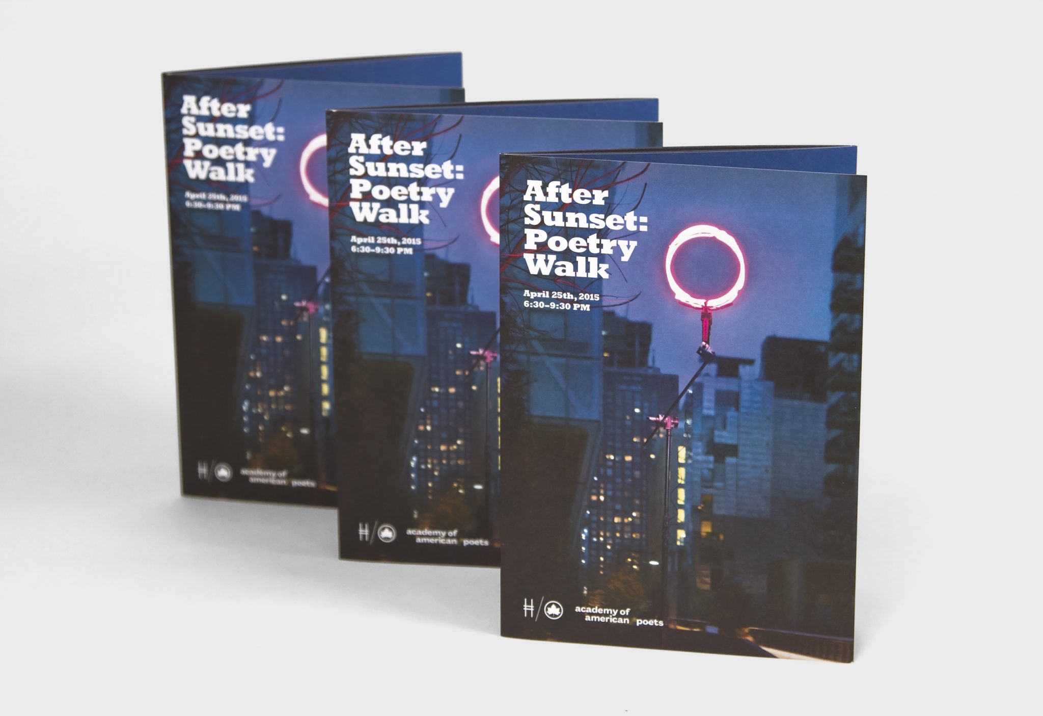
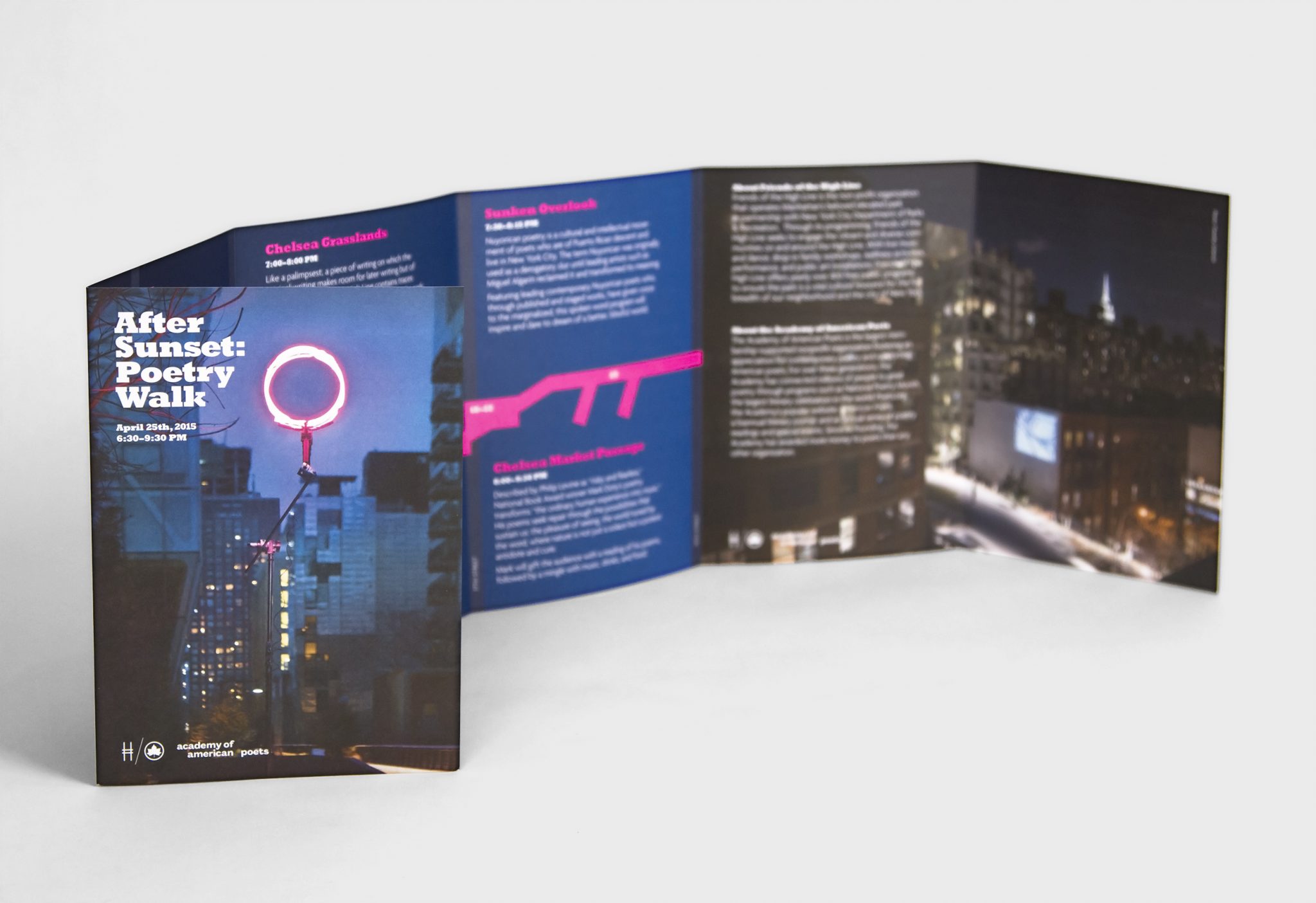
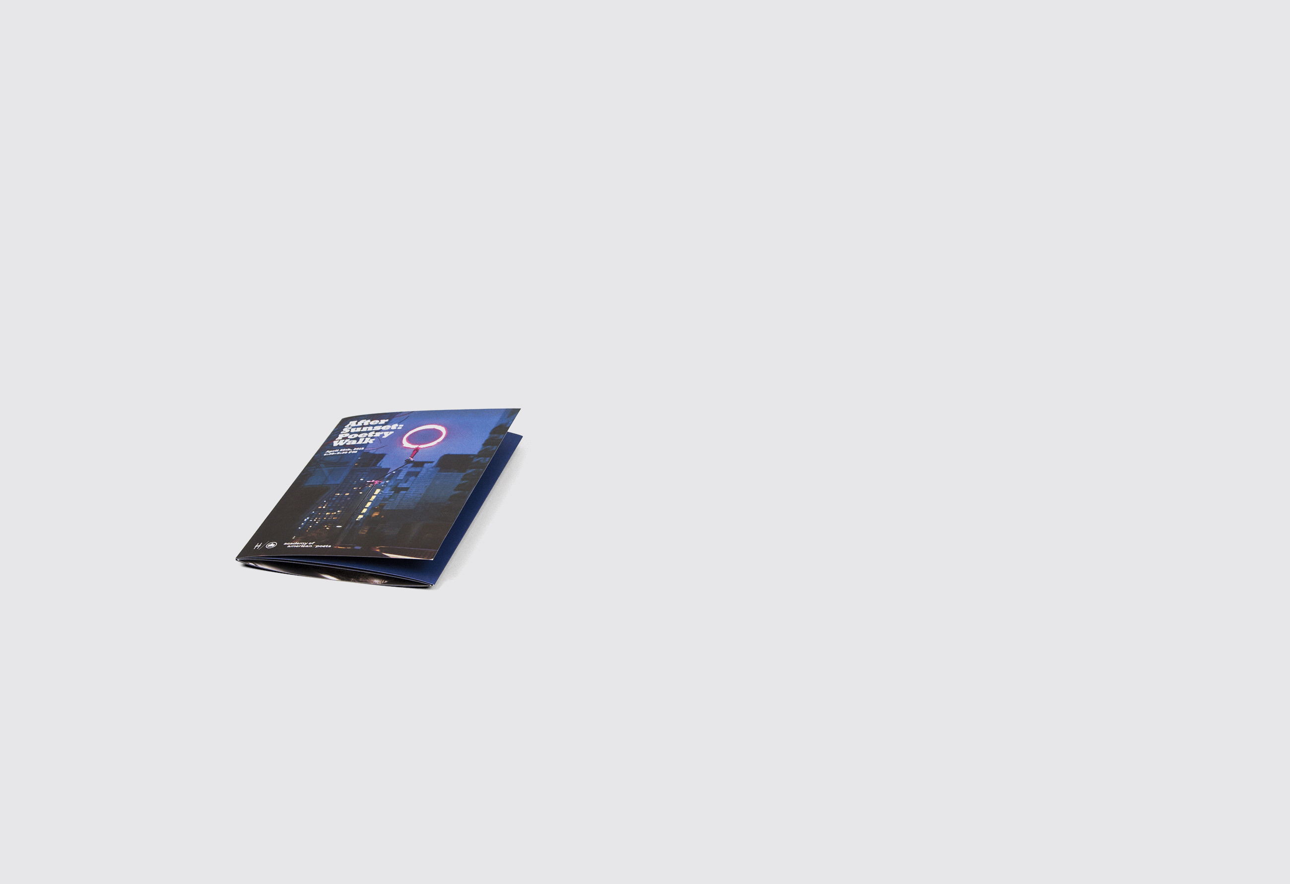
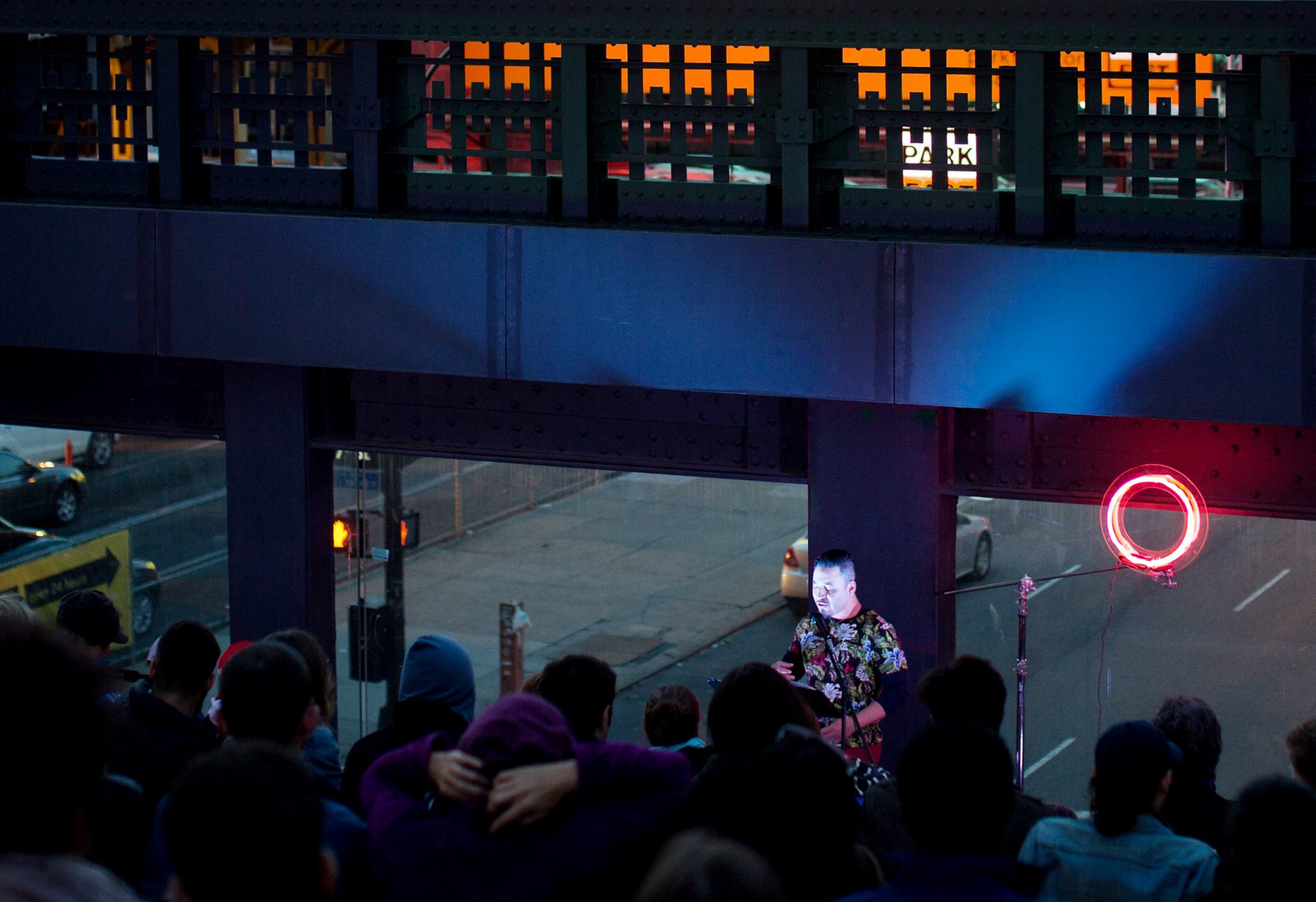
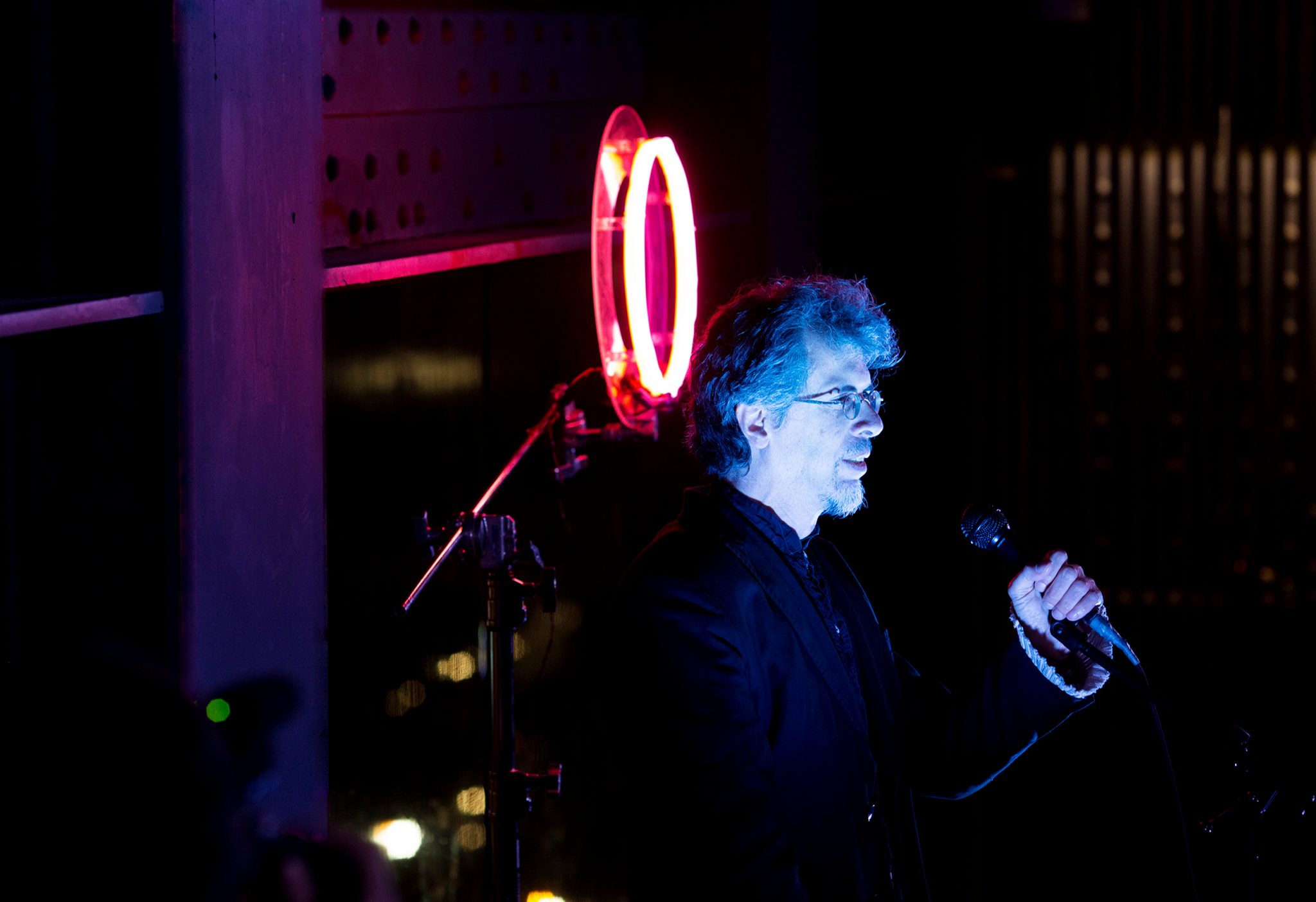
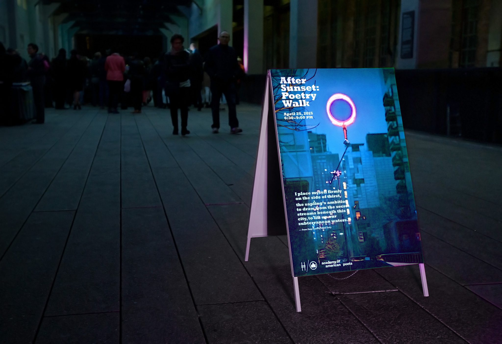
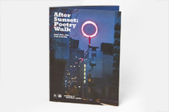
At sundown the evening of April 25, 2015, the High Line hosted the “After Sunset Poetry Walk,” an event that brought together 30 poets who read their poetry over a stretch of twenty blocks of the High Line. Since the event would begin at dusk, we searched for a way to illuminate the darkened atmosphere and provide a way to guide visitors down the High Line to listen to the various poets.
After experimenting with various glowing materials, we created a glowing ring out of orange and pink neon tubes. This would serve as the unifying theme of the experience and suggested a unique kind of sun that rose after sunset. We placed the ring at the steps overlooking Tenth Avenue to serve as a backdrop for where one poet was stationed and read his work.
Wanting to maintain the idea of illumination in the poster and pamphlet that advertised the event, we directed a photo shoot to capture the pink glowing ring at the High Line after dusk. The photo was then used as the poster placed every few blocks along the High Line, and some posters featured screen prints of various poems being read that evening.
New Museum Mini-Catalogs
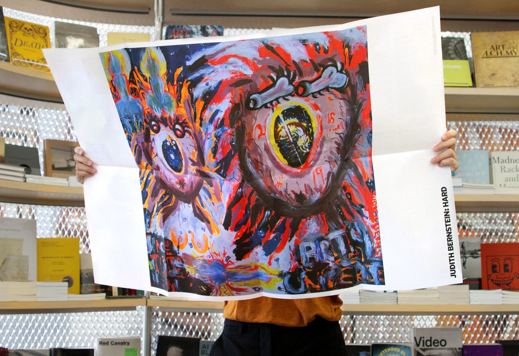
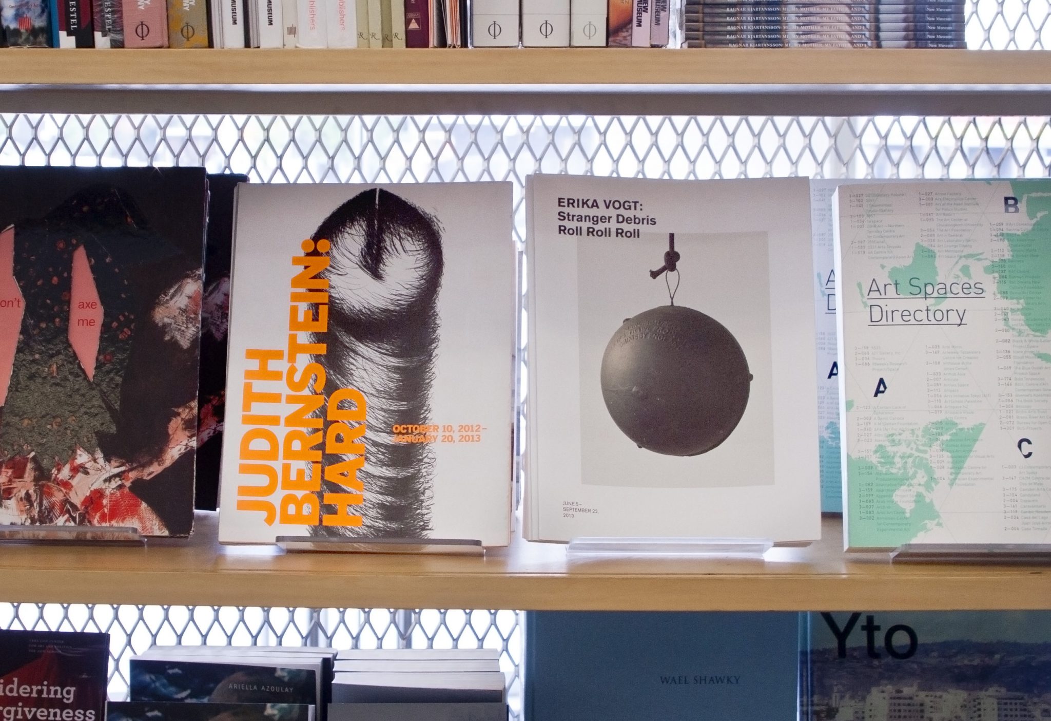
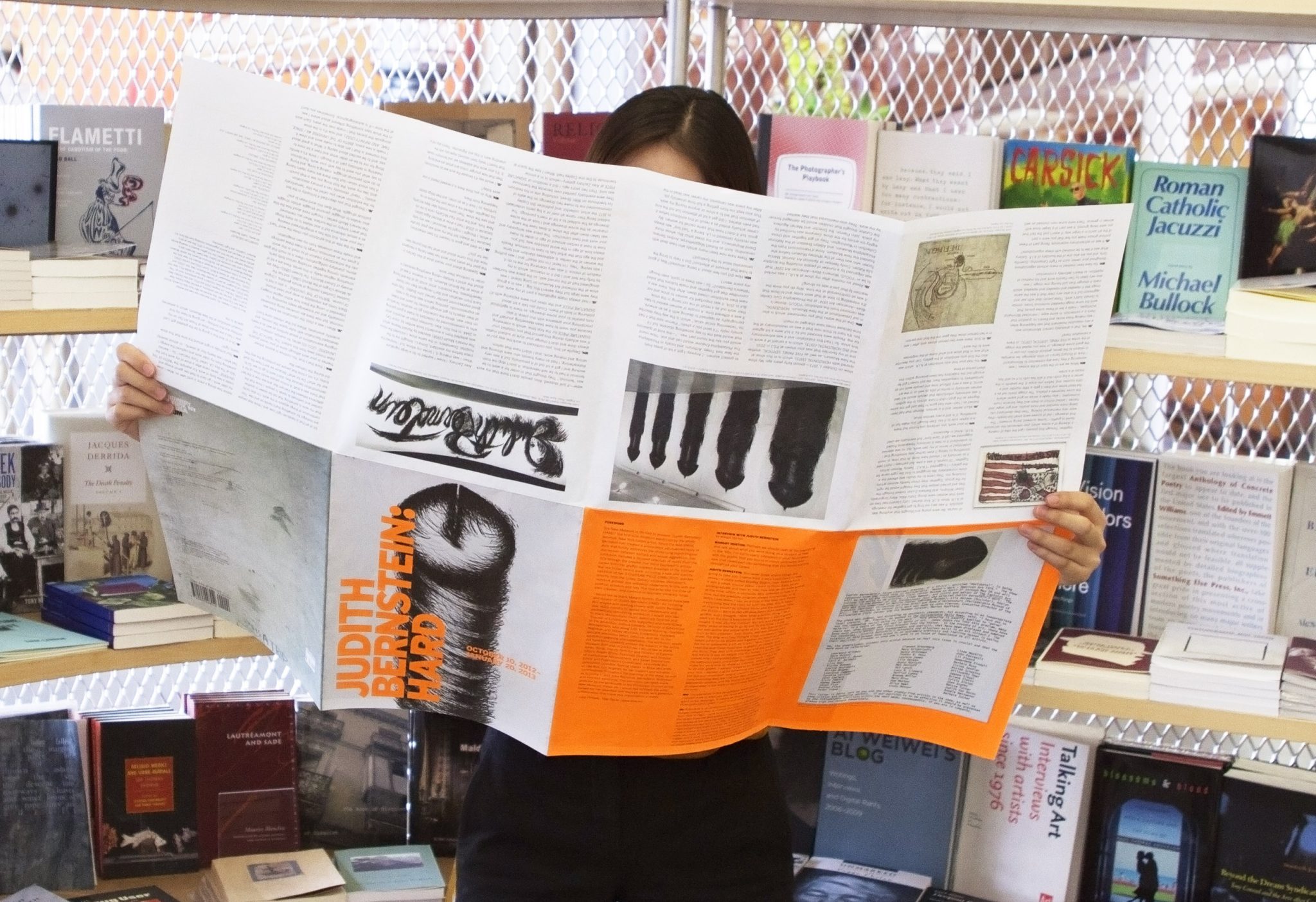
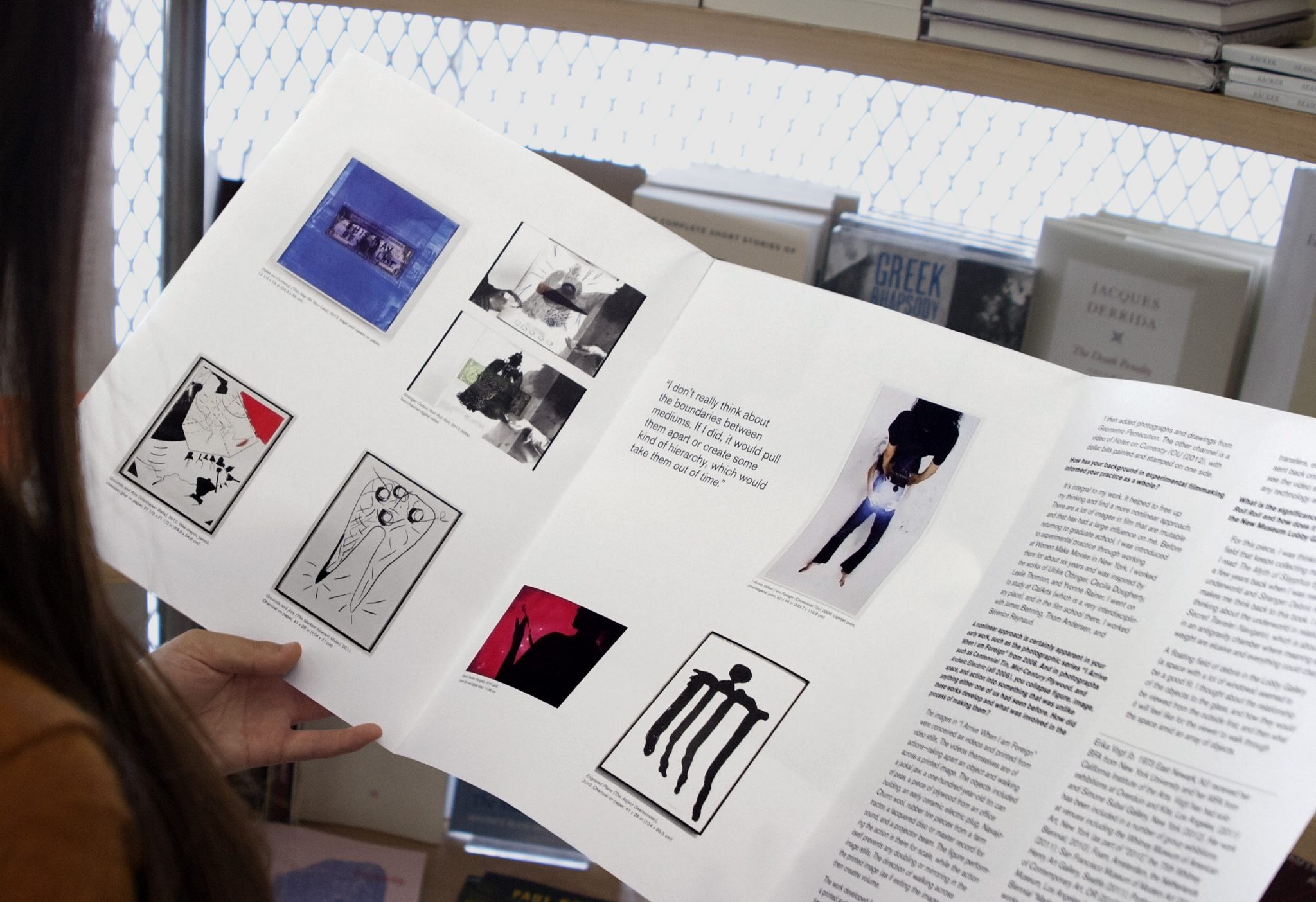
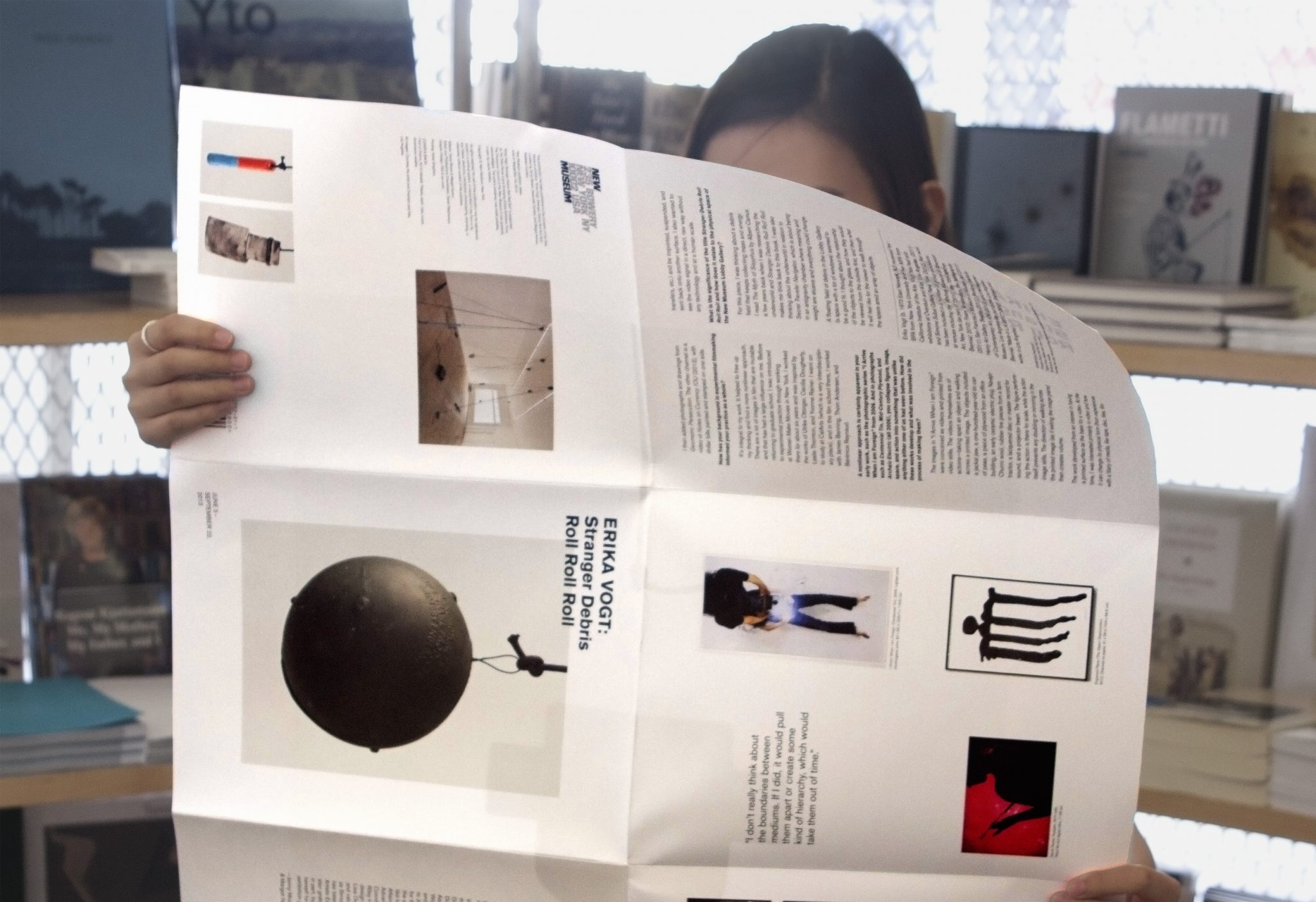
We designed mini-catalogues for two separate exhibitions in the New Museum’s lobby gallery — one for Judith Bernstein’s show ‘Hard’, and the other for Erika Vogt’s show ‘Stranger Debris Roll Roll Roll.’
Each mini-catalog was formatted in the same way, with a roll-fold that opened up into a large poster. Both include an interview with the artist and a selection of images.
Each design highlighted an aspect of each artist’s work — Bernstein being more bold, with neon orange day-glo spot color, and Vogt being more subdued, balanced and contemplative.
The Grass-Mud Horse Lexicon
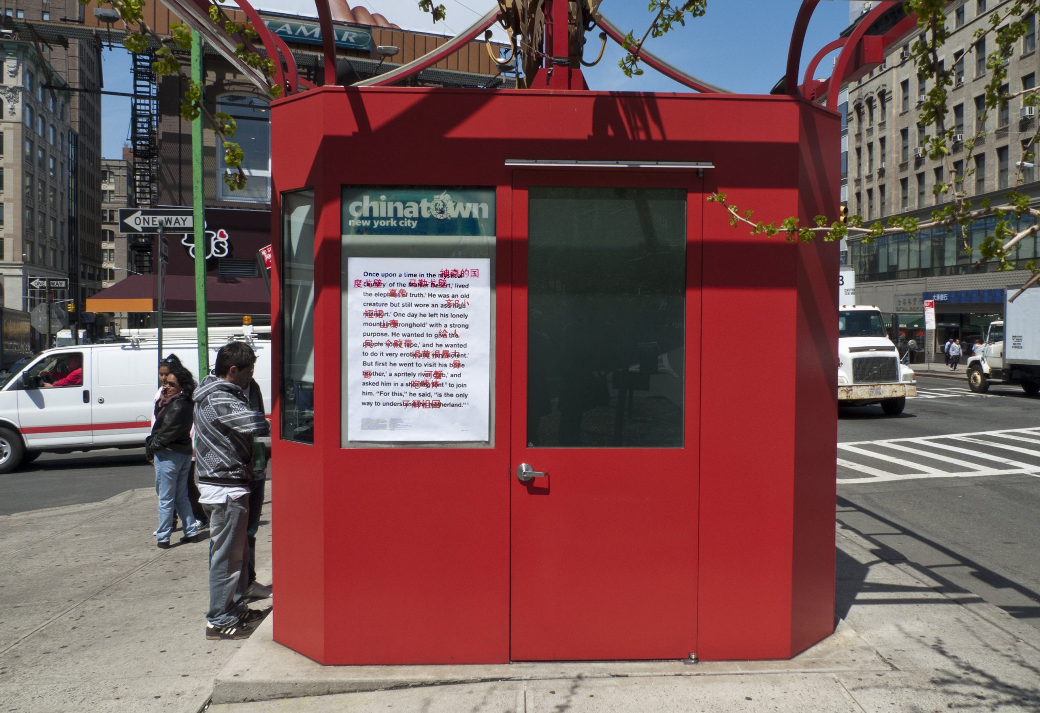
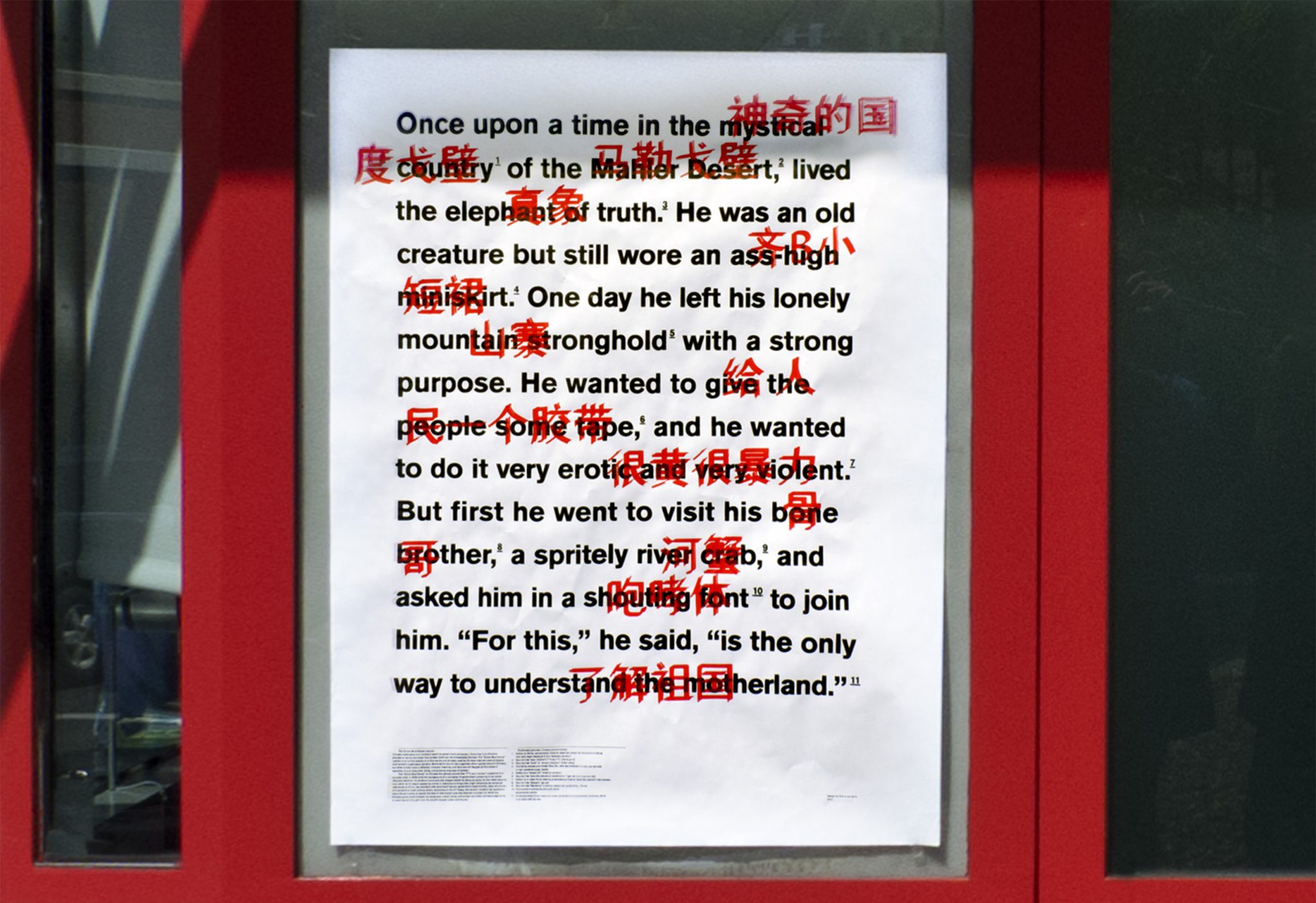
For our submission to Typoshow, an exhibition of typographic posters traveling to universities throughout China and the US, we created a poster about Chinese internet censorship.
We wrote a story by stringing together a series of nonsense words from the “Grass-Mud Horse” Lexicon. The Lexicon is an online catalog of words and phrases that bypass Chinese cyberspace censors. Some terms sound like vulgarities when spoken aloud in Chinese, but when written have a different, innocent meaning, and thus evade the censors’ searches. The Lexicon is an absurdist, biting, and growing language of protest. After creating an oversized xerox of the story (with footnotes revealing all double meanings) we then had the Chinese translation drawn on top of the terms from the Lexicon. During the process we experimented with different ways of rendering the Chinese text, including hand drawn lettering by our friend Stacy Wang as well as using a range of paint markers on an old pen plotter, making each poster unique.