Categories for Installation
After Belonging: Exhibitions
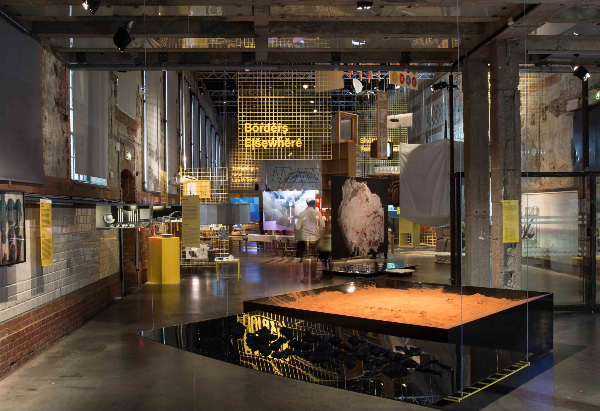
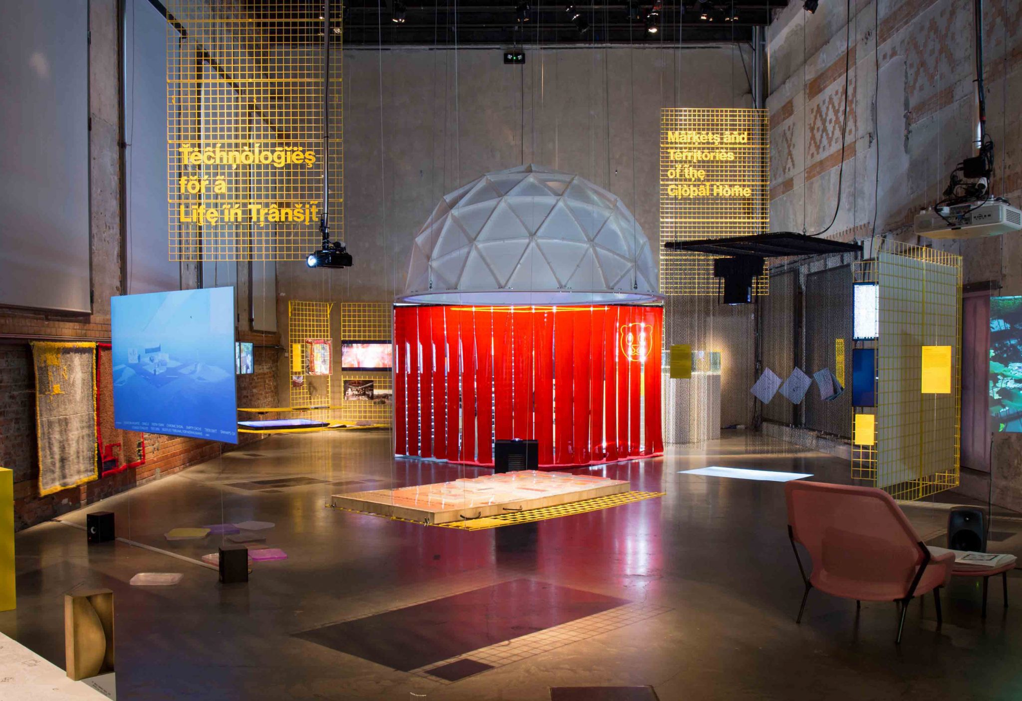
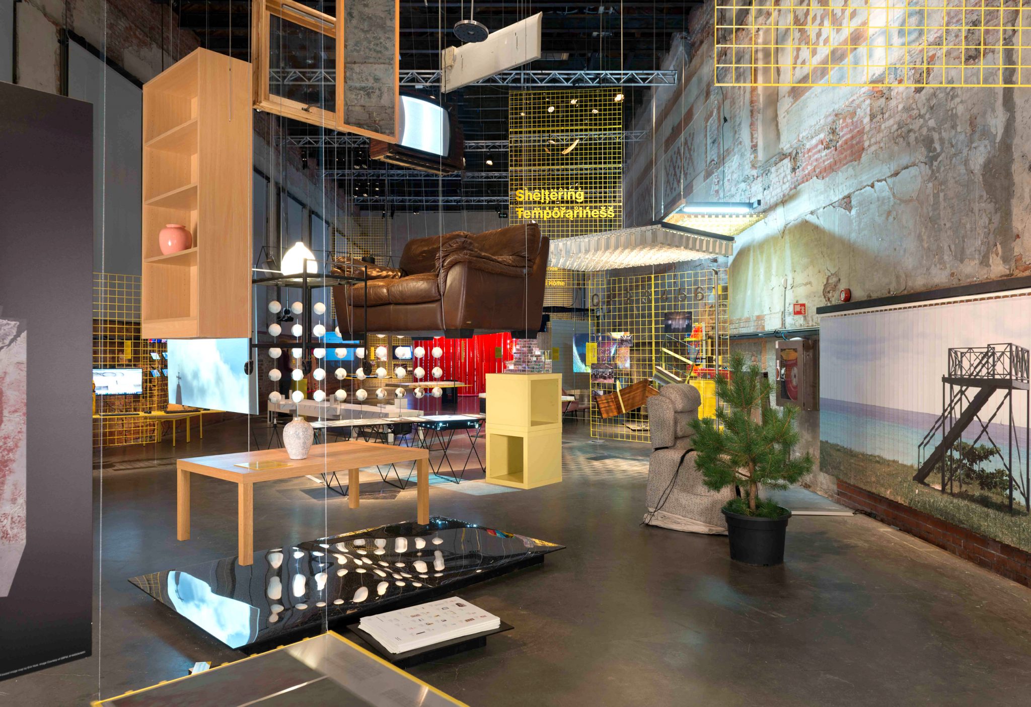
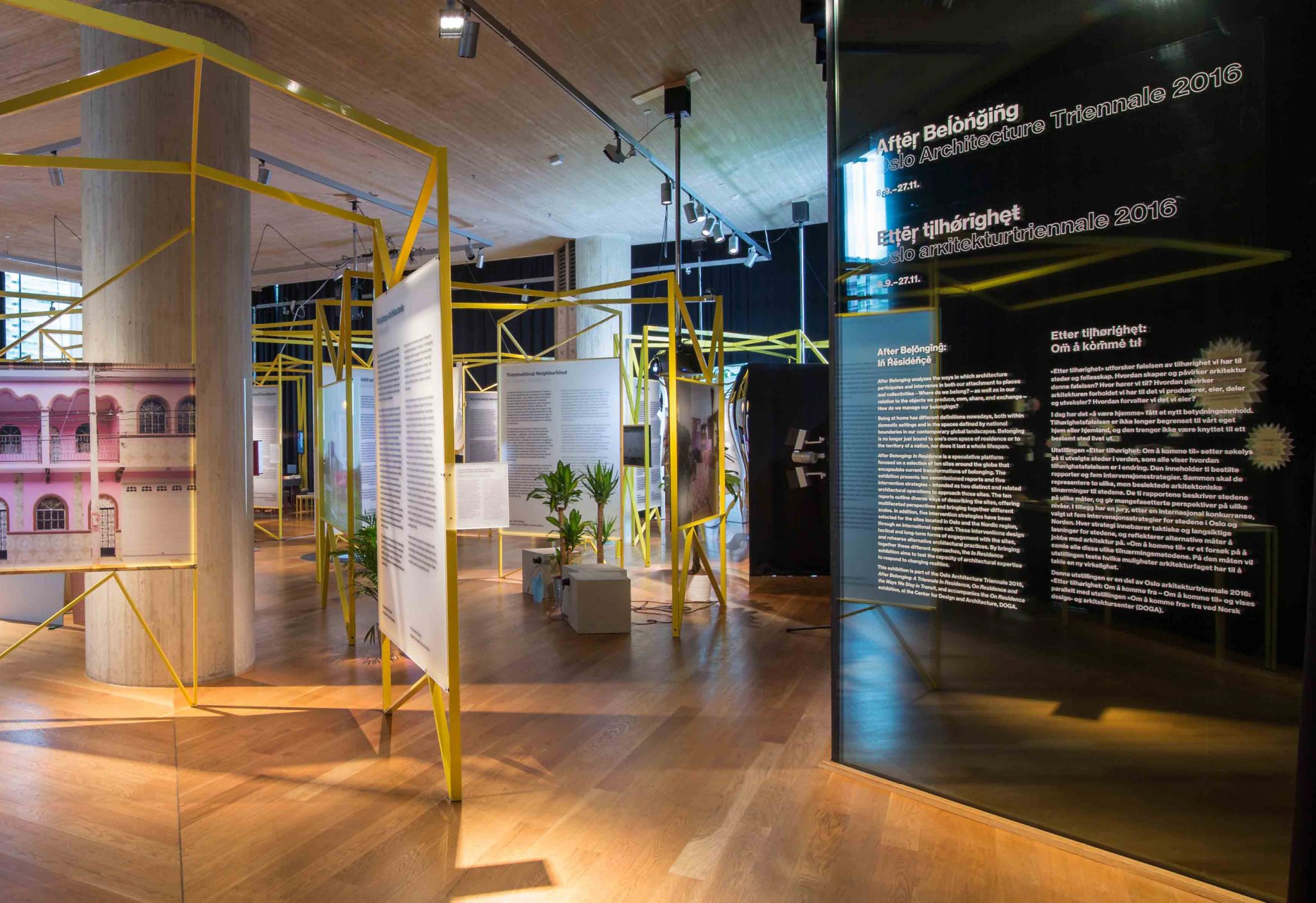
From Sept. to Dec. 2016, After Belonging, the Oslo Architecture Triennale opened to the public, with two exhibitions — On Residence, and In Residence — as its core programming. Both exhibitions served to to explore architectural and residential concepts of transit, displacement, temporariness and border conditions.
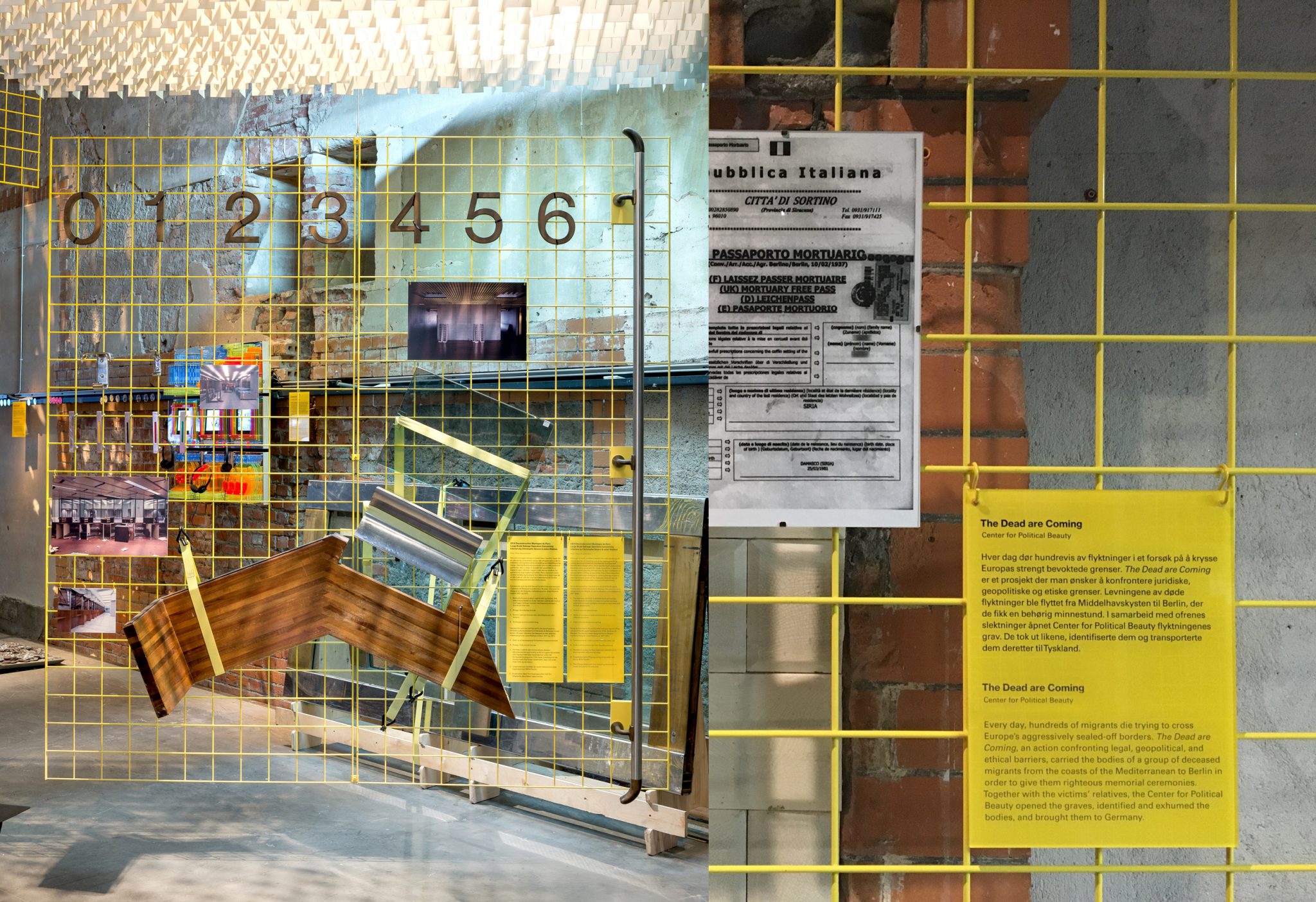
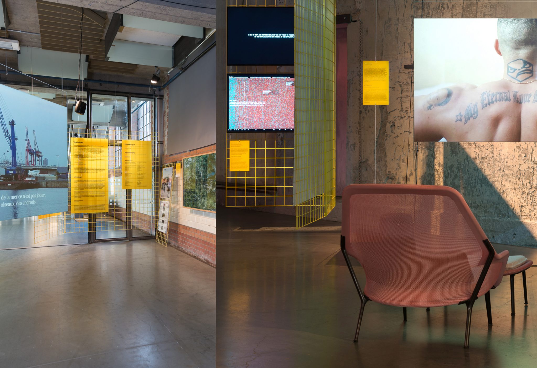
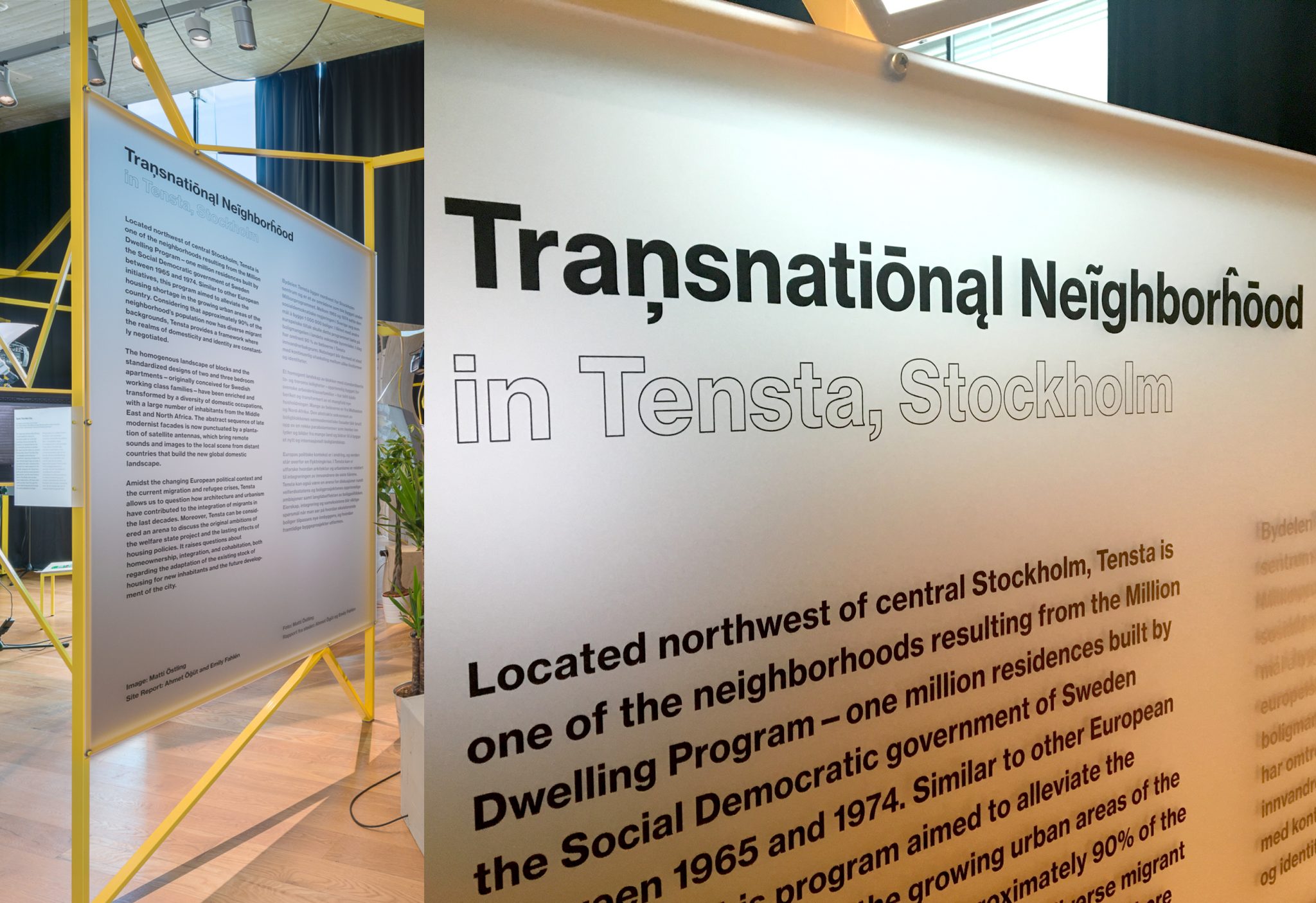
As the graphic designers of the triennale we were tasked with designing all typographic and information displays. For the On Residence exhibition, we designed main signage for the curatorial concept zones, with vinyl lettering on clear plexiglass, and information panels for each project description printed directly onto yellow-colored PVC. For the In Residence exhibition, we designed large typographic panels directly printed onto milky-white plexiglass. Each typographic panel incorporated the core identity of the triannale: the customized alphabet with extended diacritic marks from all latin-based languages.
NYC 1993 Timeline
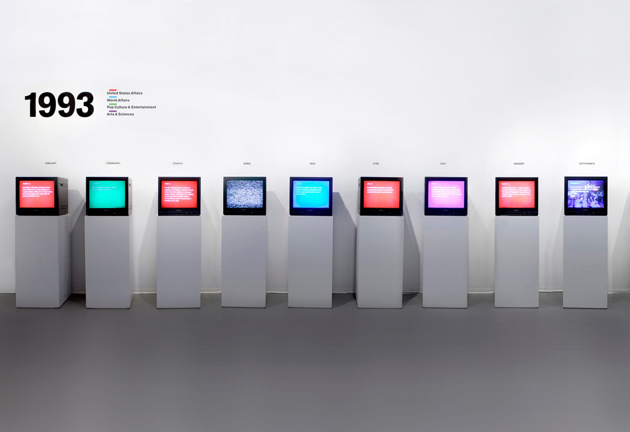
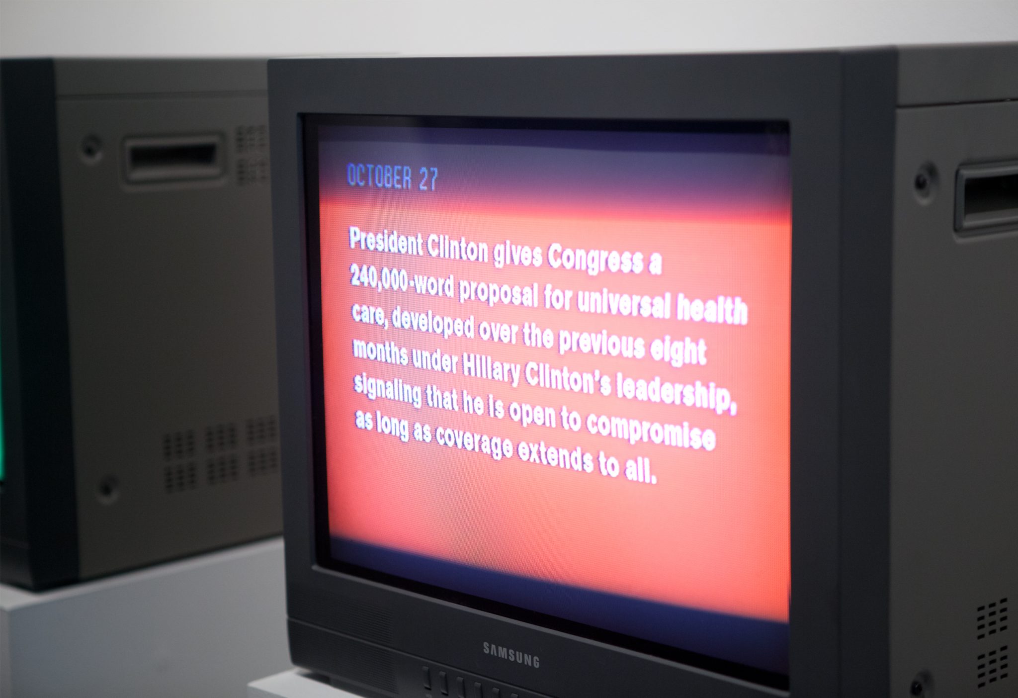
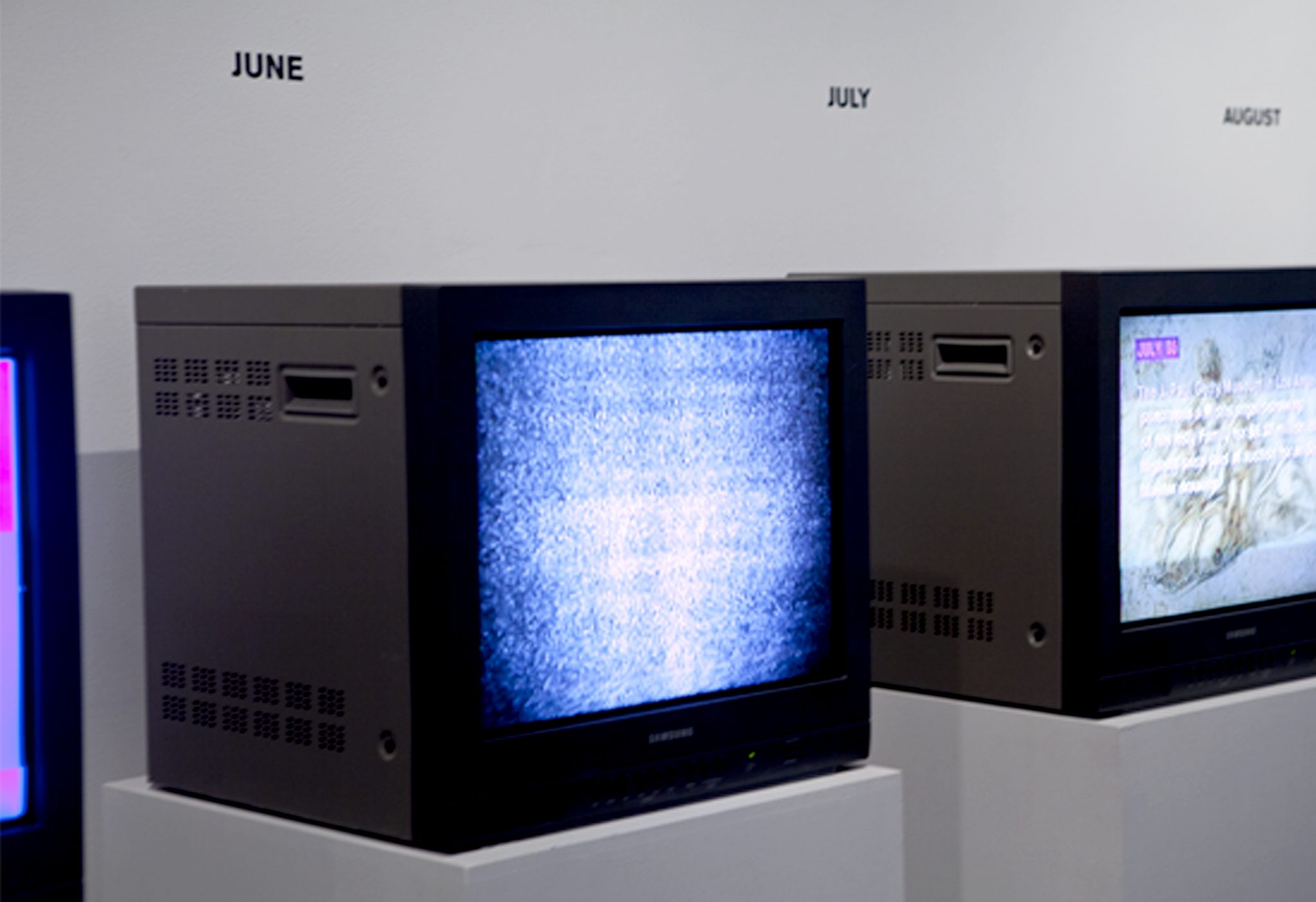
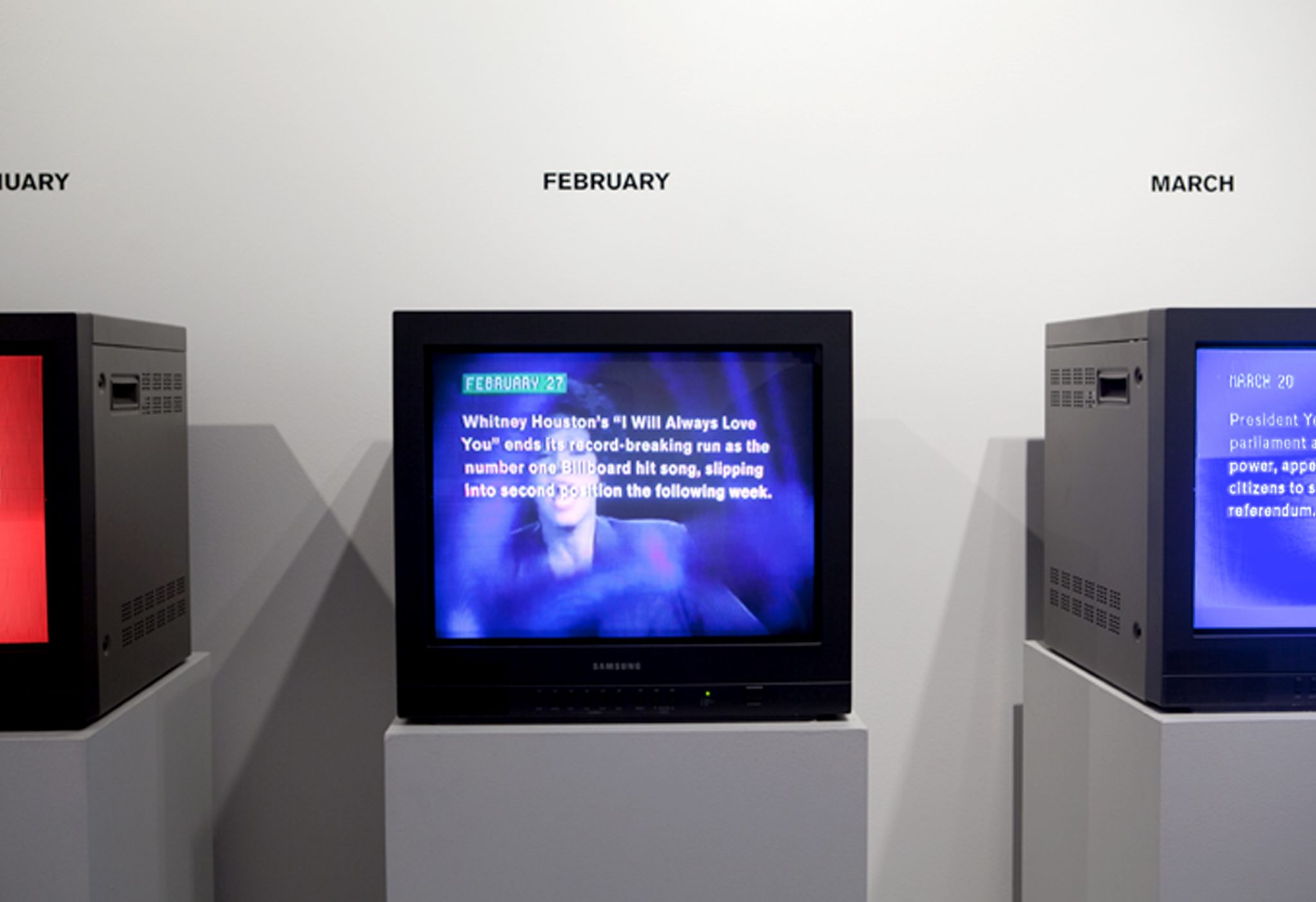
We won a commission from The New Museum of Contemporary Art in NYC to create a timeline of the year 1993 as part of their 2013 exhibition NYC 1993: Experimental Jet Set Trash and No Star. Given the sheer volume of content (around 1,200 events) we chose to work in video over a more traditional wall vinyl display. Since cable TV was the dominant form of media in the early 90’s we displayed the videos on monitors from the era. To reinforce the timeline, we created a 12-channel video installation, allotting one month per monitor.
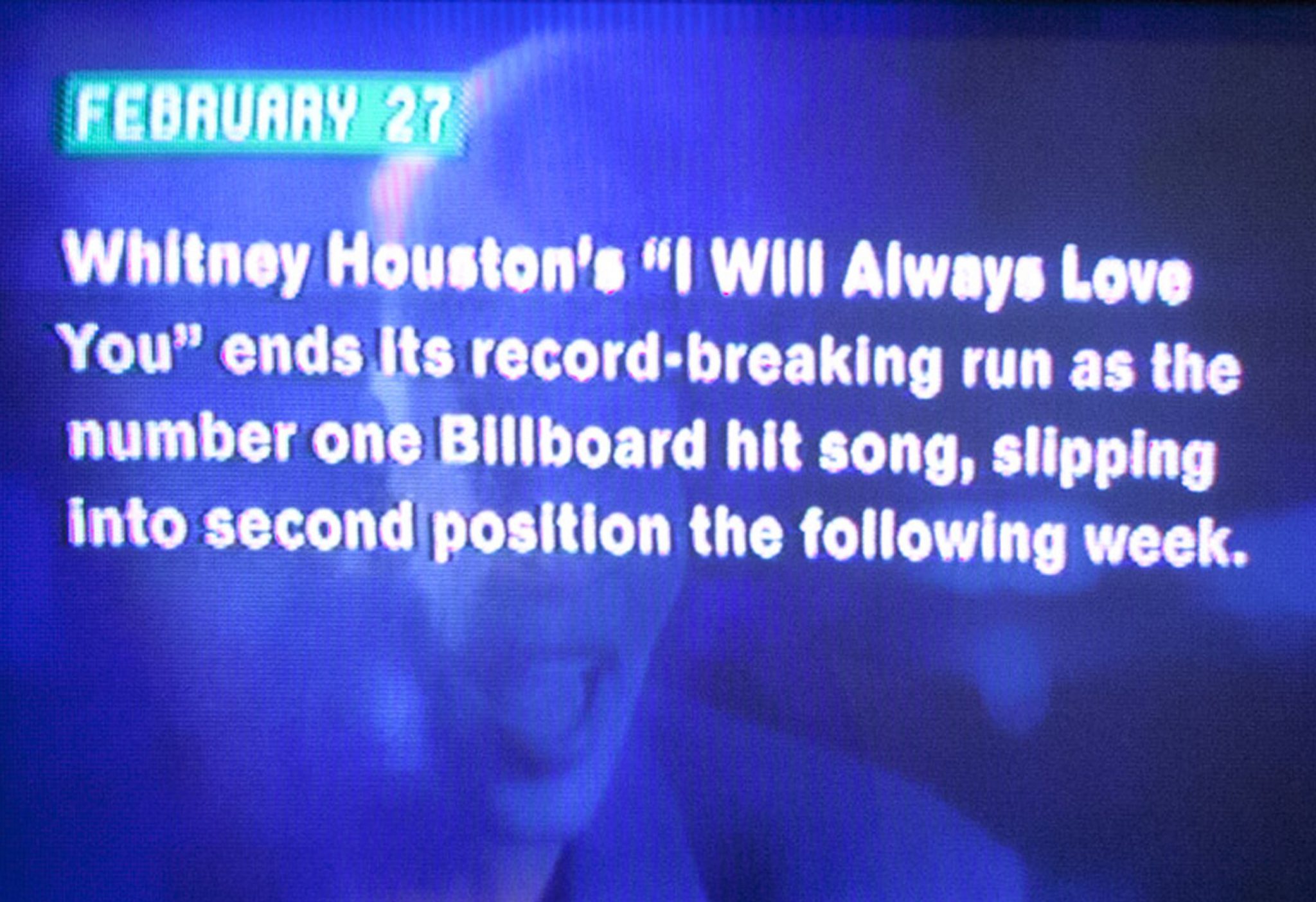
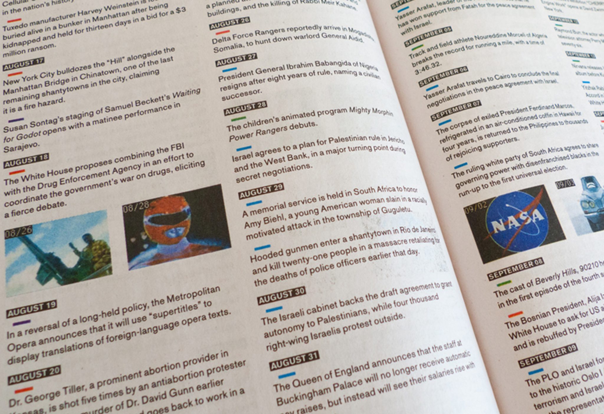
Events were color-coded into four categories: US Affairs, World Affairs, Pop Culture and Arts and Sciences. We sourced 1993 TV content for each month from YouTube, making the timeline filled with primary content from the era. Each monitor contains a looping video of events from a given month, interspersed with tv channel-changing ‘fuzz’. All monitors play simultaneously and the variation of unique events creates unexpected overlaps between pop cultural references, global war and political disasters. In this regard, the timeline is both chronological and non-linear, and a true representation of the diversity of recorded history.
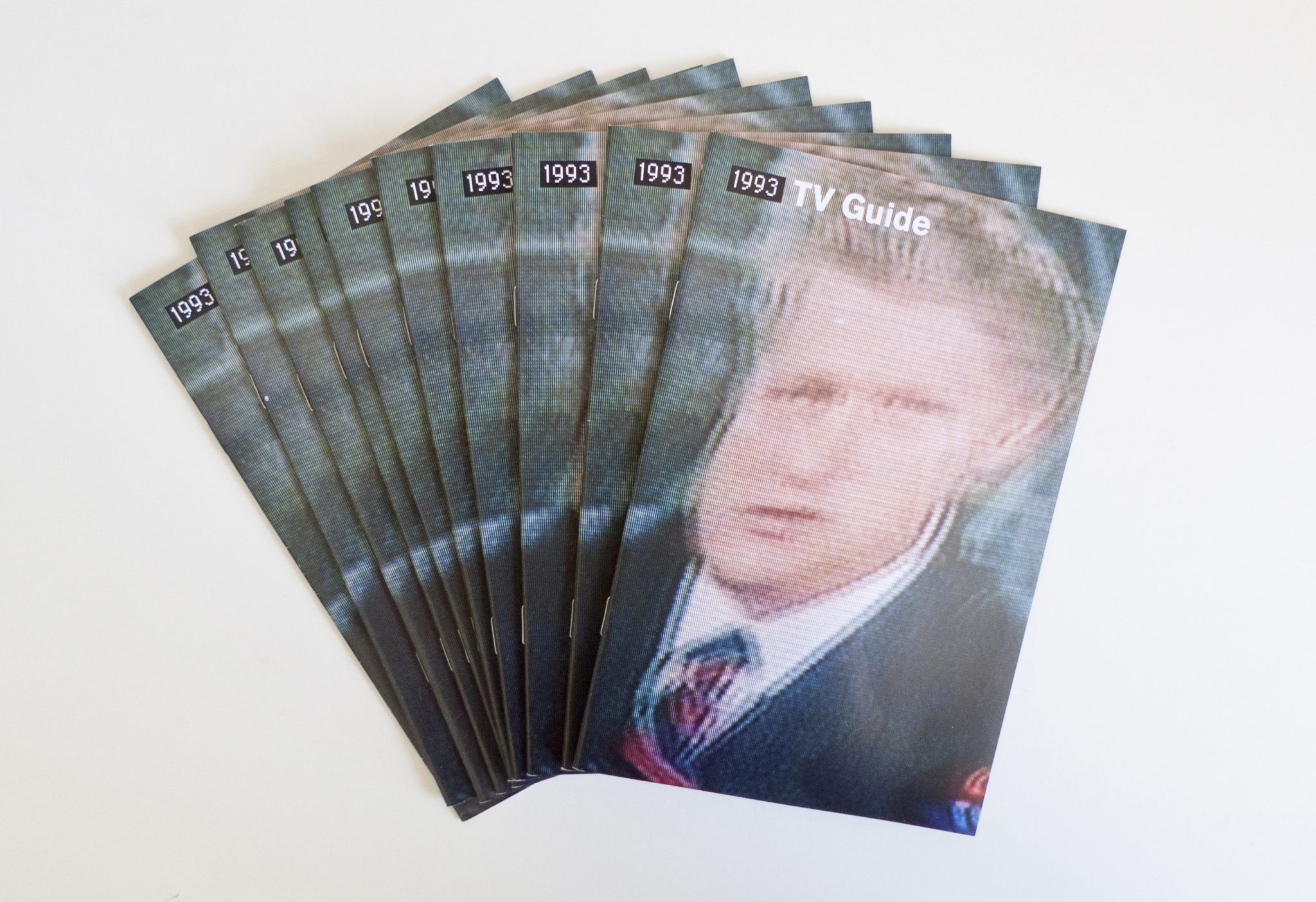
We designed an accompanying “TV Guide” publication, a takeaway for the first week of the NYC:1993 exhibition. It included the full written timeline in chronological order, printed on cheap newsprint to reference its predecessor.
After Sunset: Poetry Walk
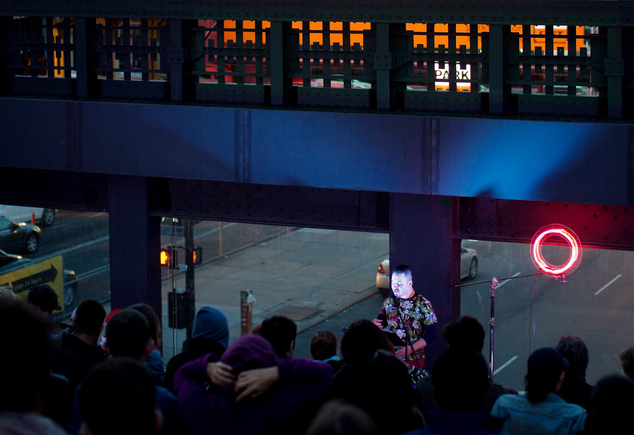
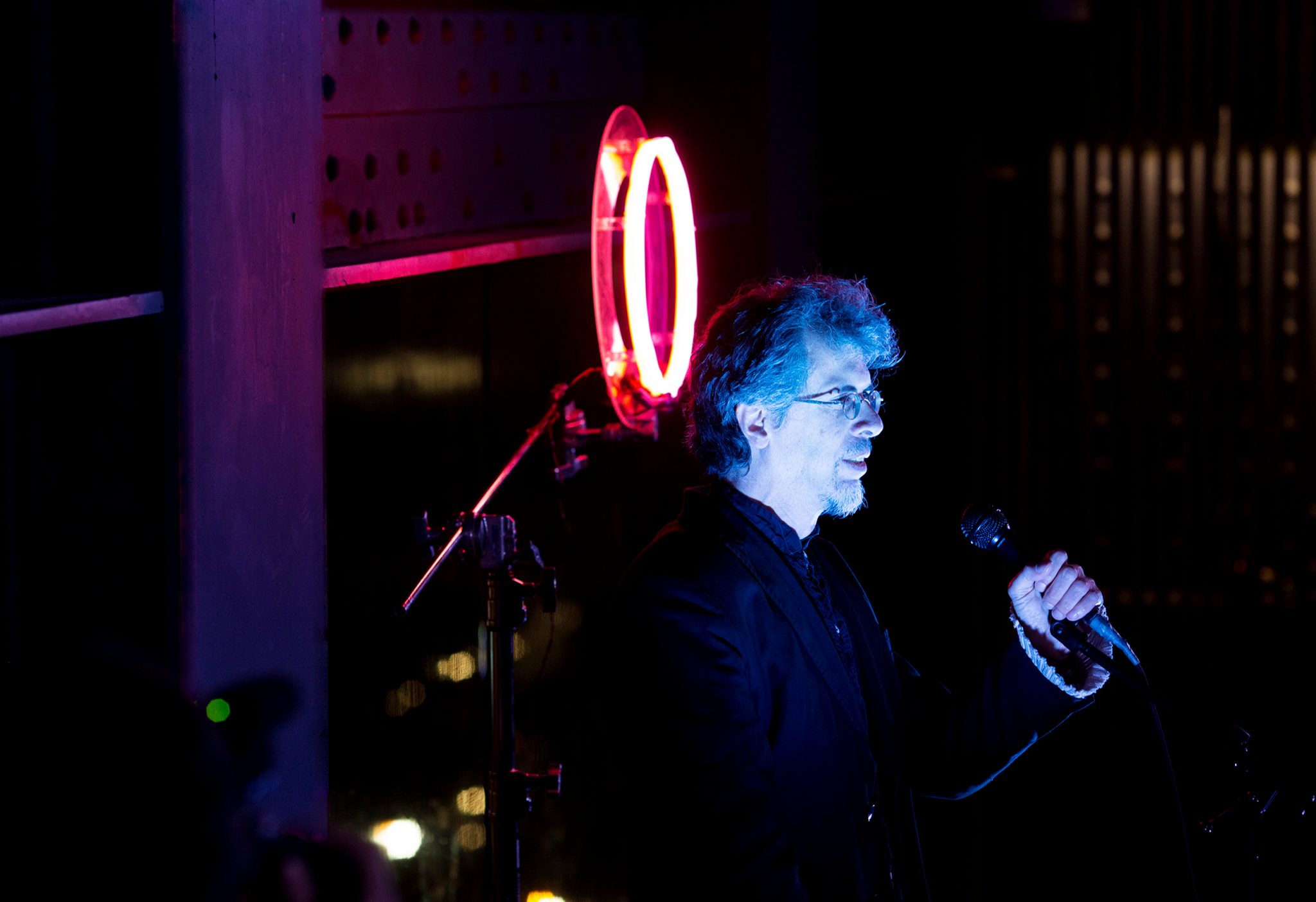
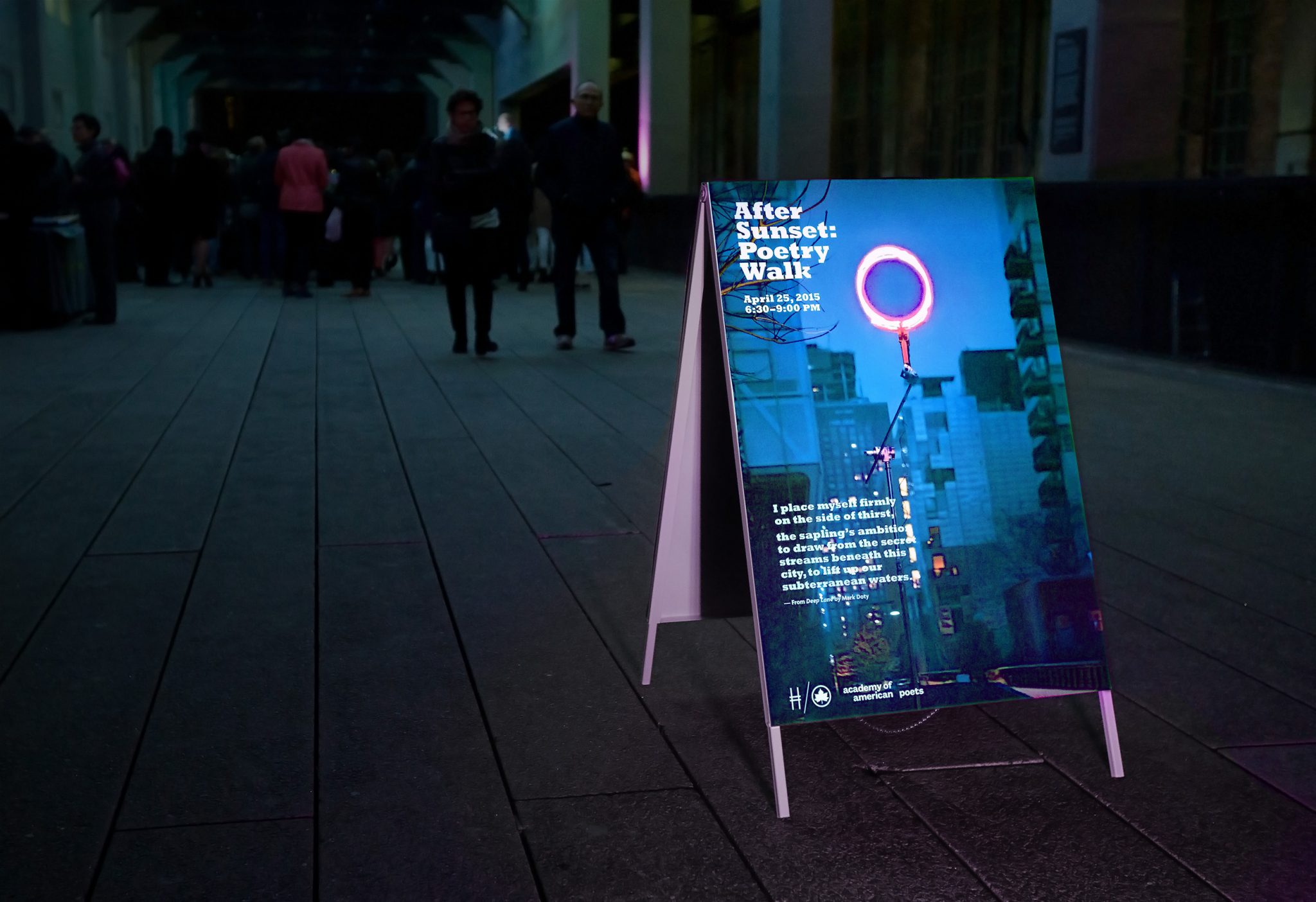
At sundown the evening of April 25, 2015, the High Line hosted the “After Sunset Poetry Walk,” an event that brought together 30 poets who read their poetry over a stretch of twenty blocks of the High Line. Since the event would begin at dusk, we searched for a way to illuminate the darkened atmosphere and provide a way to guide visitors down the High Line to listen to the various poets.
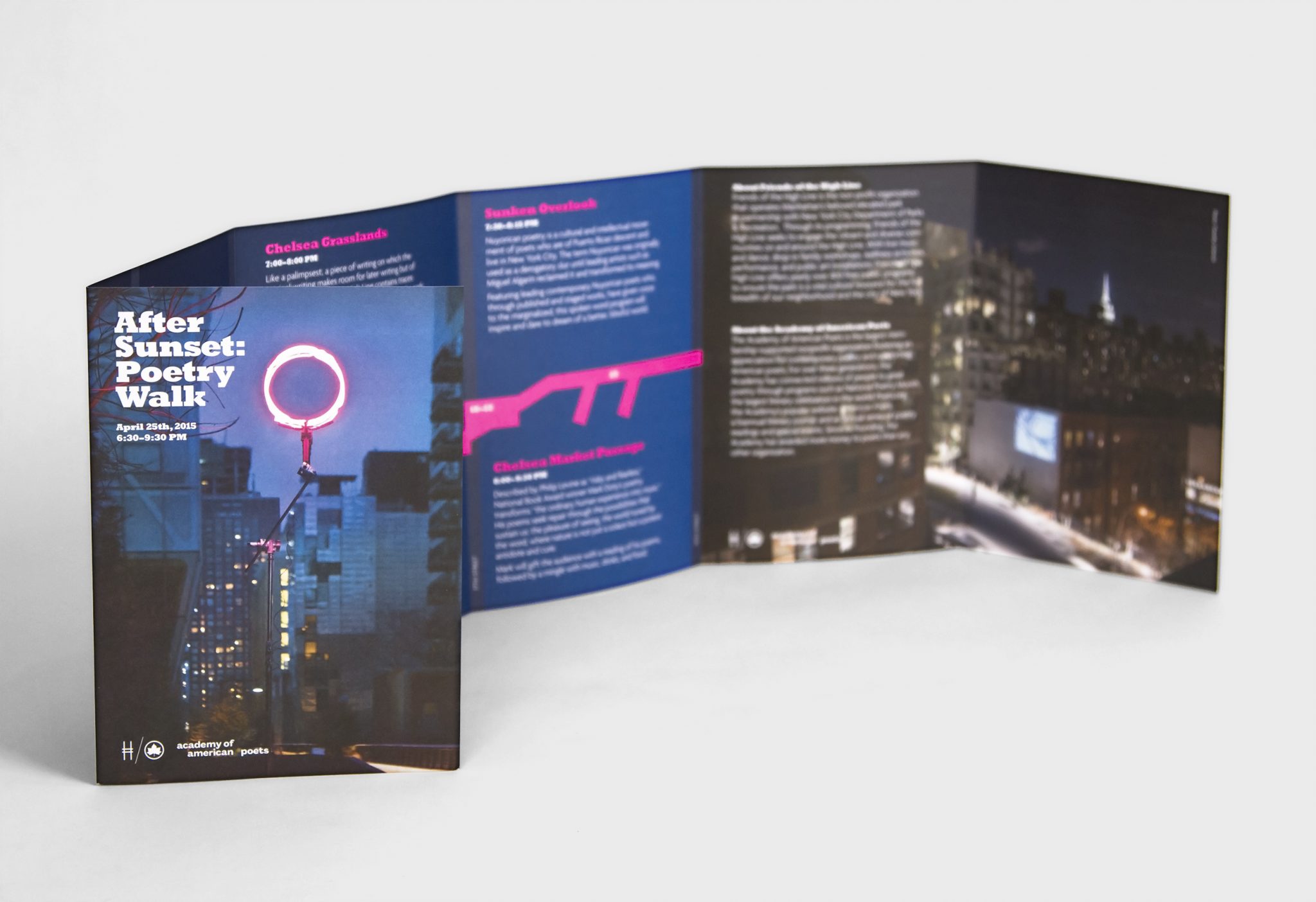
After experimenting with various glowing materials, we created a glowing ring out of orange and pink neon tubes. This would serve as the unifying theme of the experience and suggested a unique kind of sun that rose after sunset. We placed the ring at the steps overlooking Tenth Avenue to serve as a backdrop for where one poet was stationed and read his work.
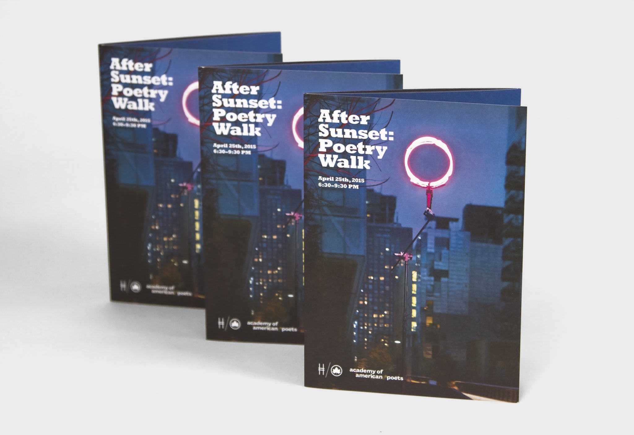
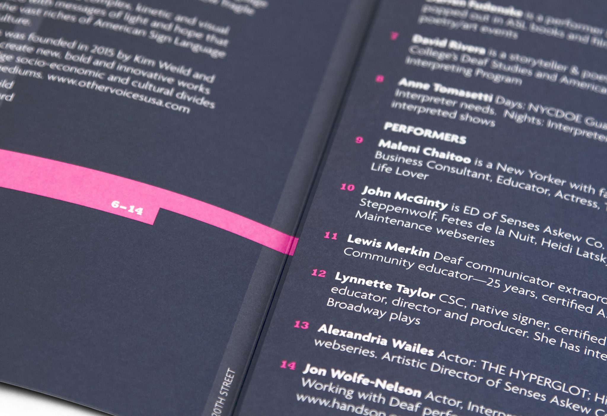
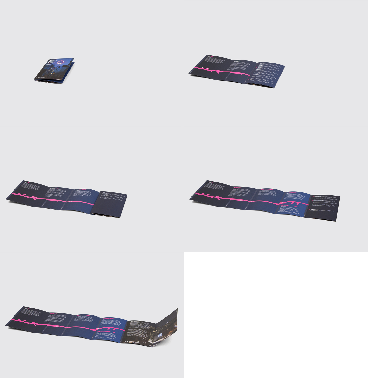
Wanting to maintain the idea of illumination in the poster and pamphlet that advertised the event, we directed a photo shoot to capture the pink glowing ring at the High Line after dusk. The photo was then used as the poster placed every few blocks along the High Line, and some posters featured screen prints of various poems being read that evening.
