Categories for Exterior Signage
After Belonging: Identity
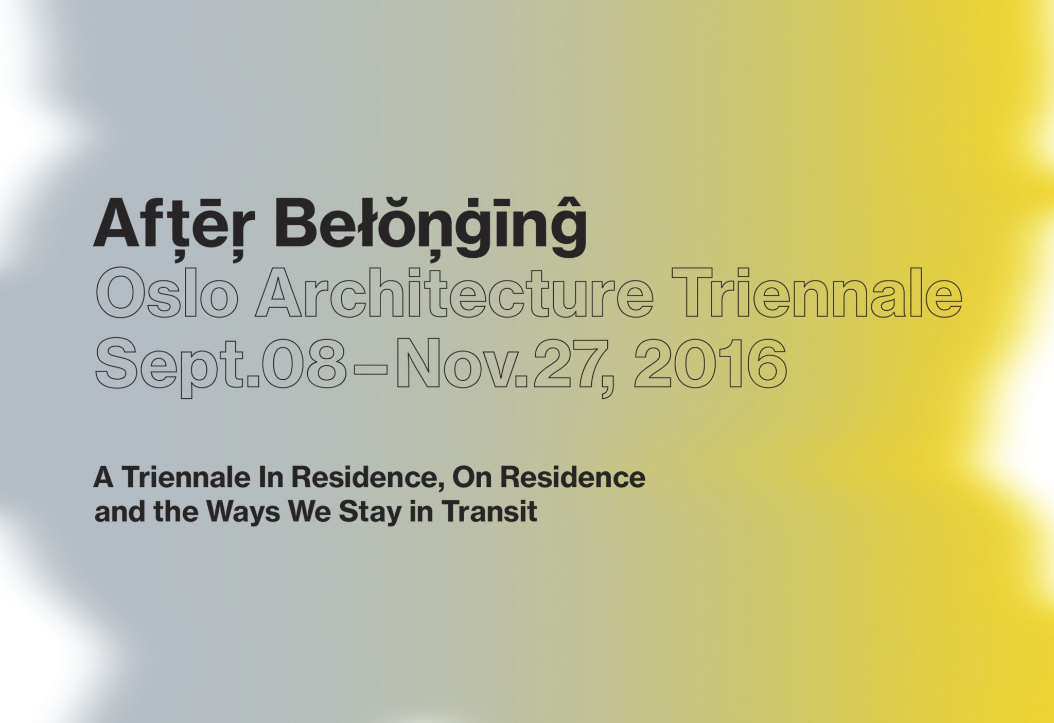
From Sept. to Dec. 2016, After Belonging, the Oslo Architecture Triennale opened to the public, with 2 exhibitions, a publication, and 3 months of various events in Oslo.
The curatorial idea of ‘After Belonging’ looks at the architectural concept of ‘residence’ in the current state global transitions — from cruise ships as floating cities, to refugee housing and displaced populations — in essence, the condition of not belonging to one place.
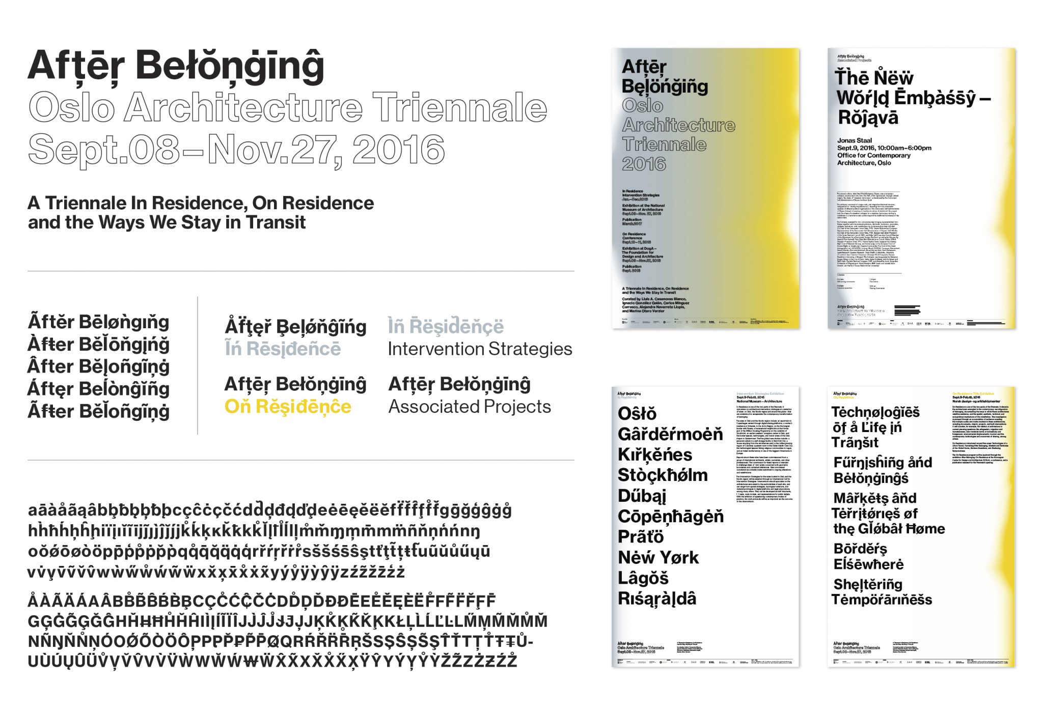
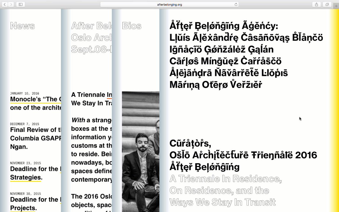
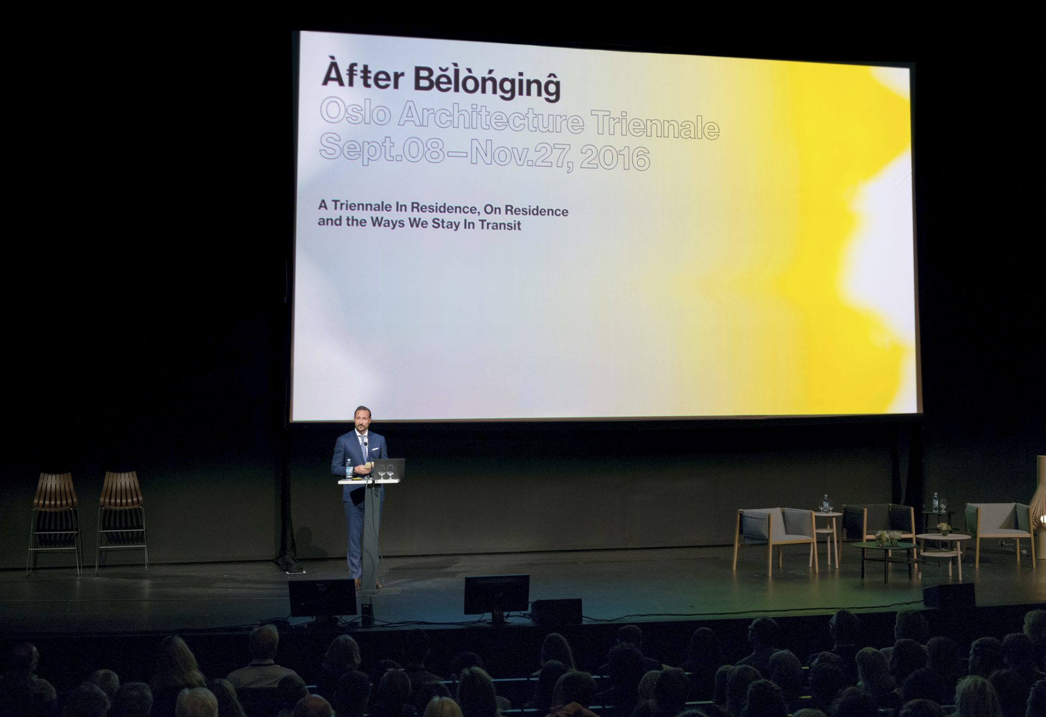
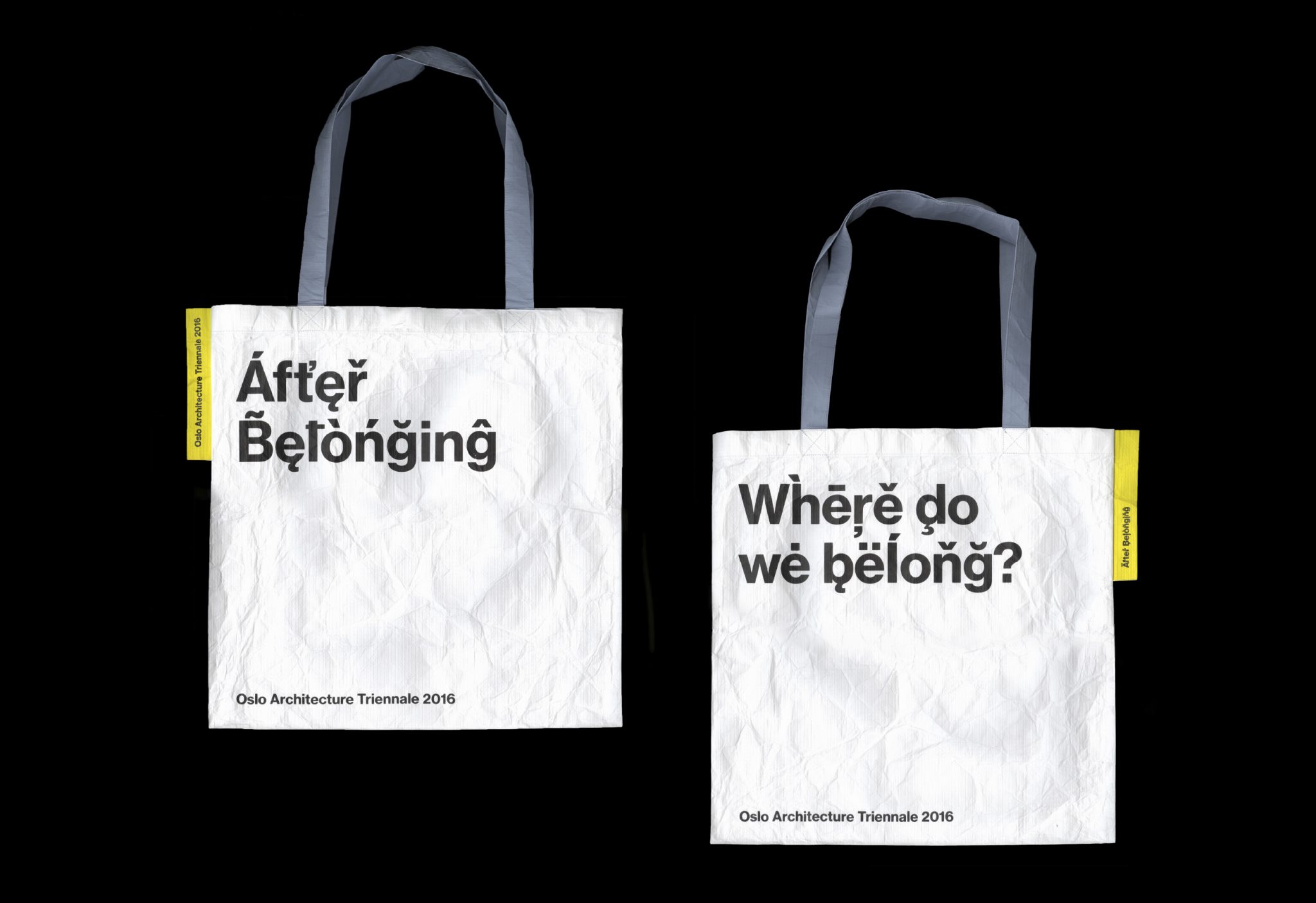
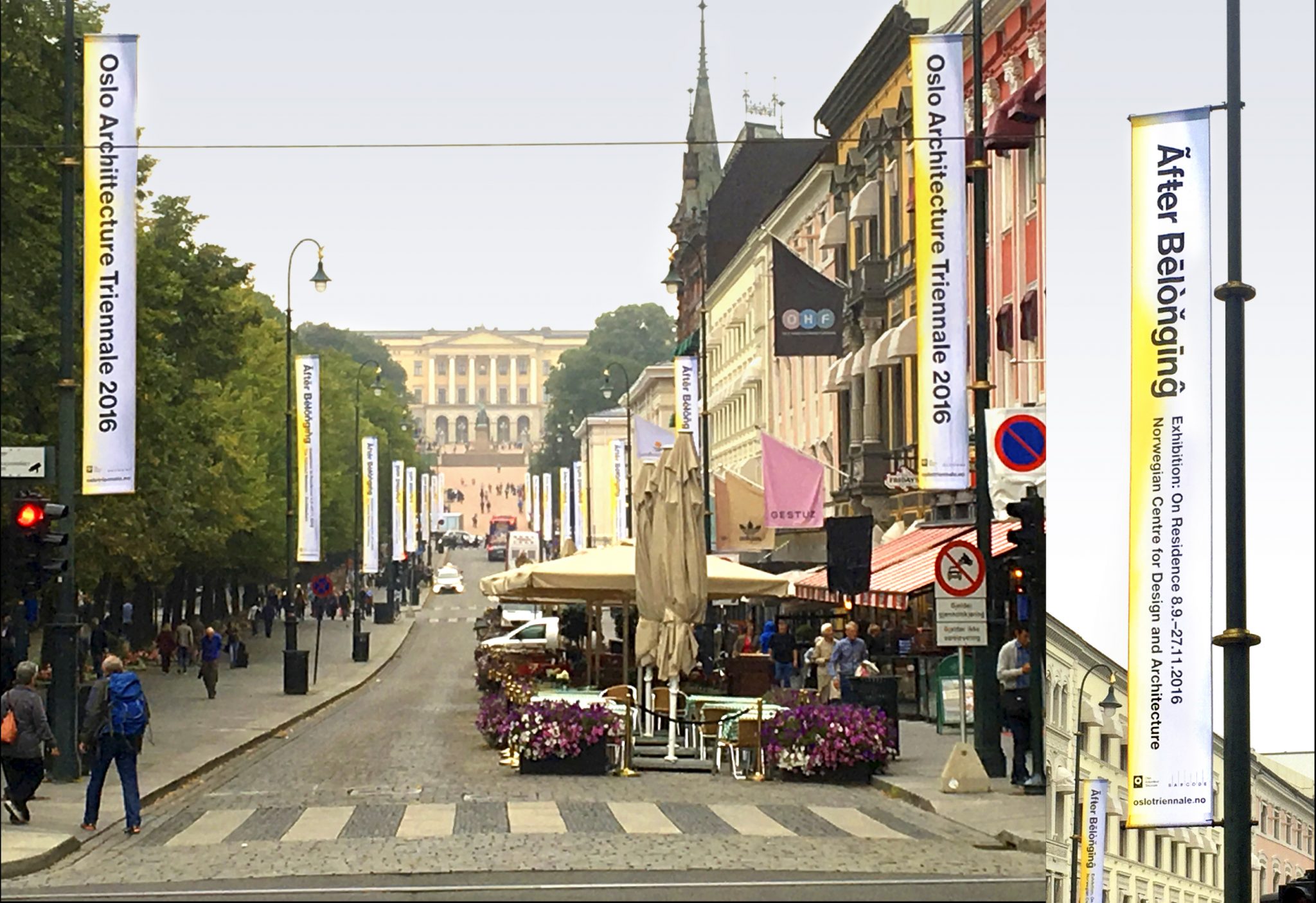
For the graphic identity, we created a typographic world that would be at once universally recognizable and yet unfamiliar. If language you speak defines where you belong, this language belongs to no place.
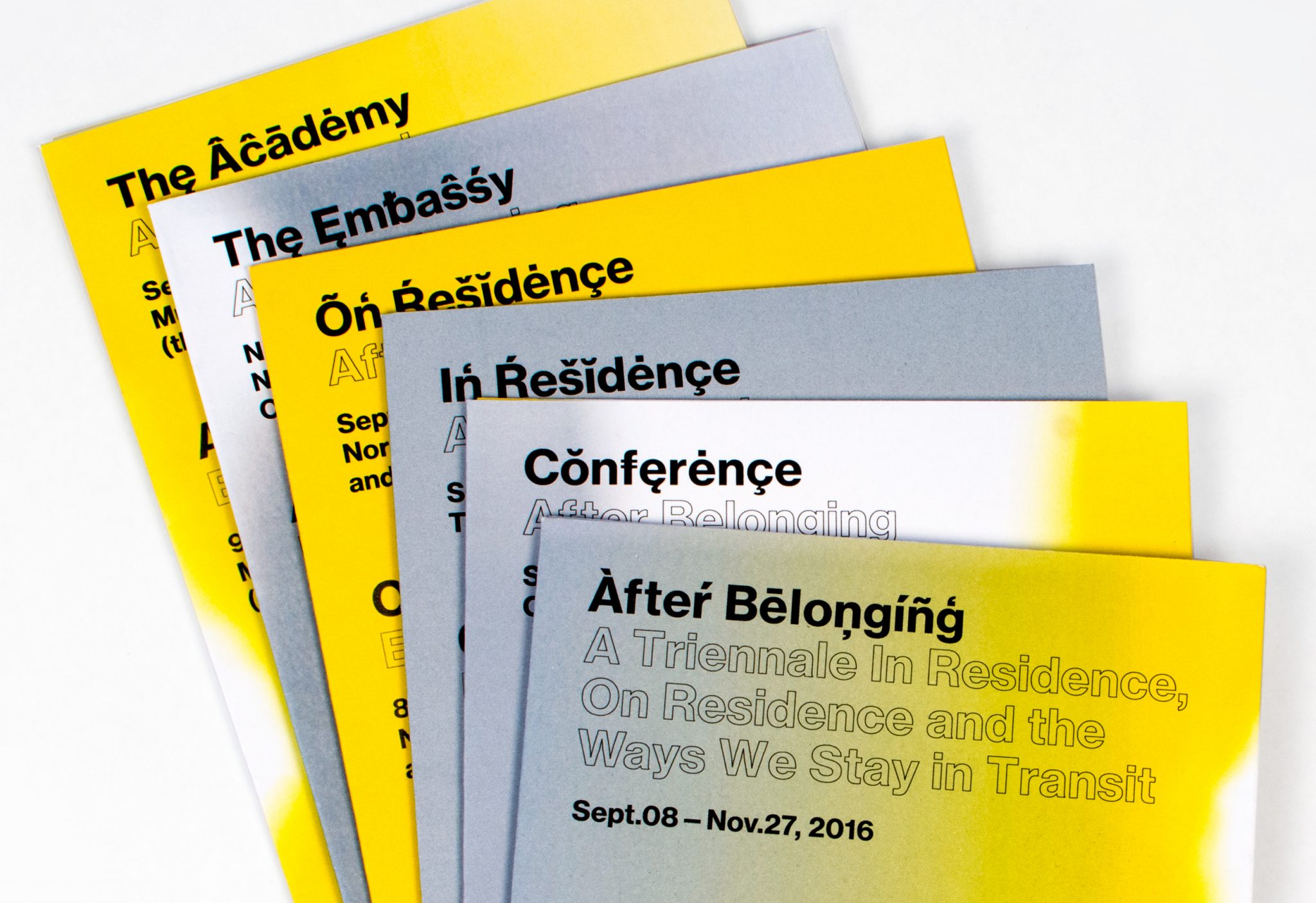
The identity employs a modernist typographic base, and uses all of the diacritical marks in the font. We created a script that randomly selects each glyph to maximize combinations. The diacritical marks are the primary identity marker for the triennale, there was no ‘logotype’ file or branded mark. Colors appear as gradient flushes of yellow and grey, highlighting the different components of the triennale programming.
The identity was deployed over the triennale’s multiple formats — exhibition graphics, signage, print collateral, totebag, and a 400-pg catalog and archive of the triennale with original work and essays.
Storefront—Being
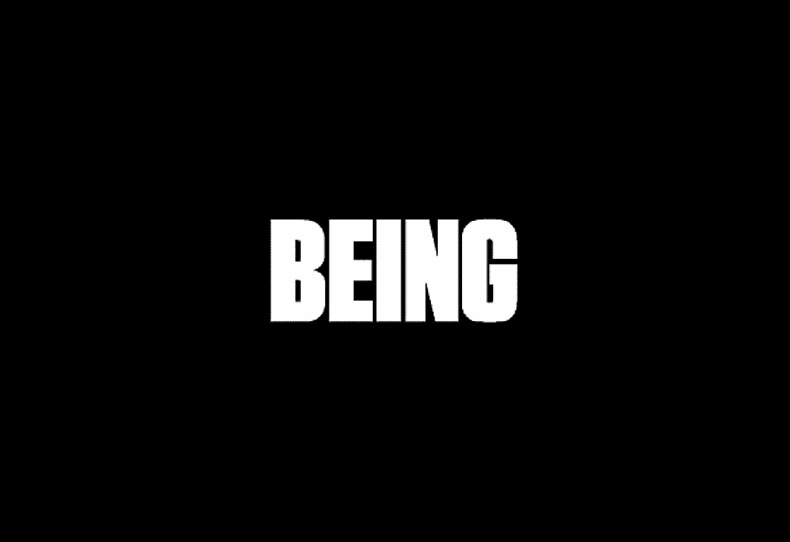
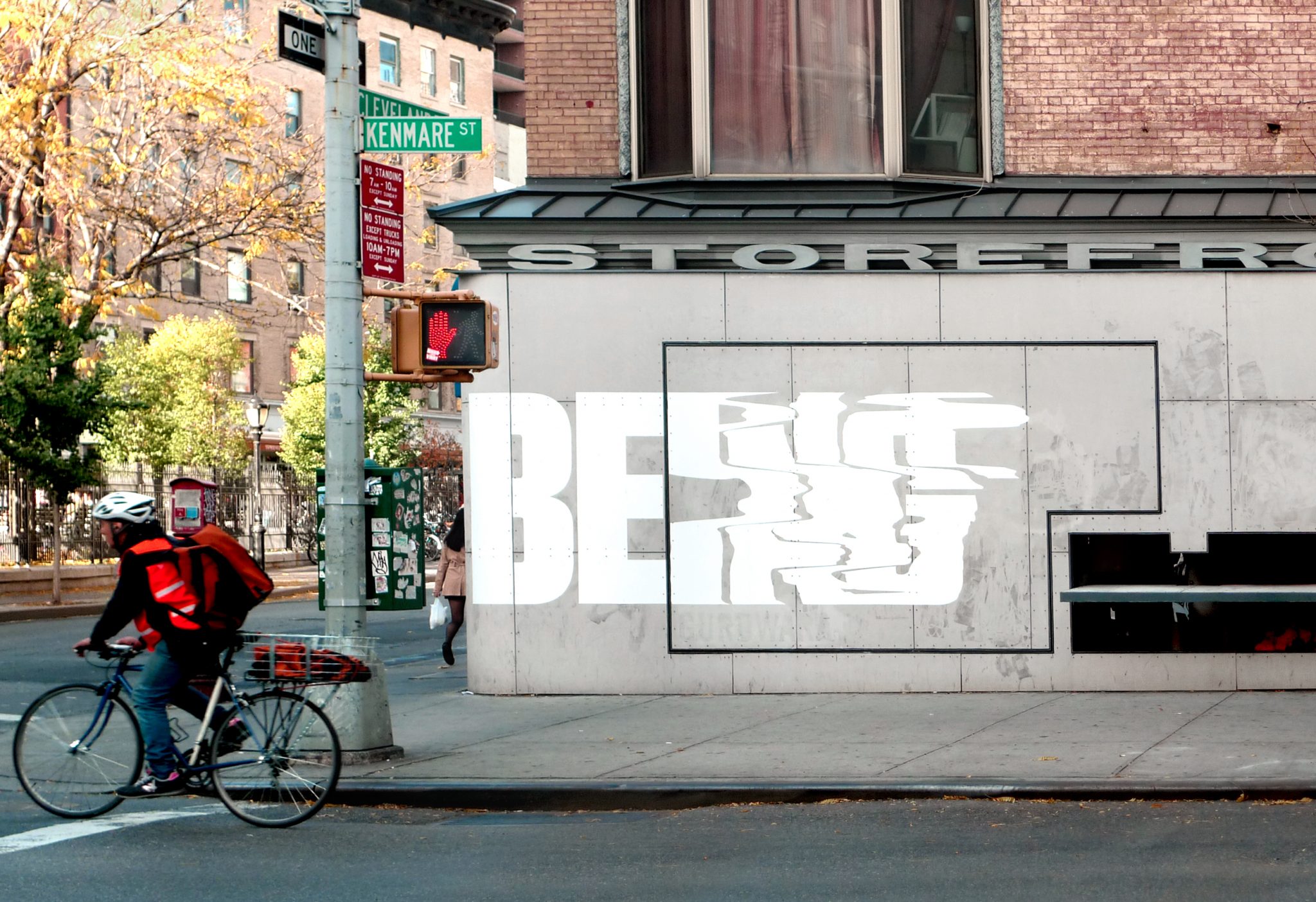
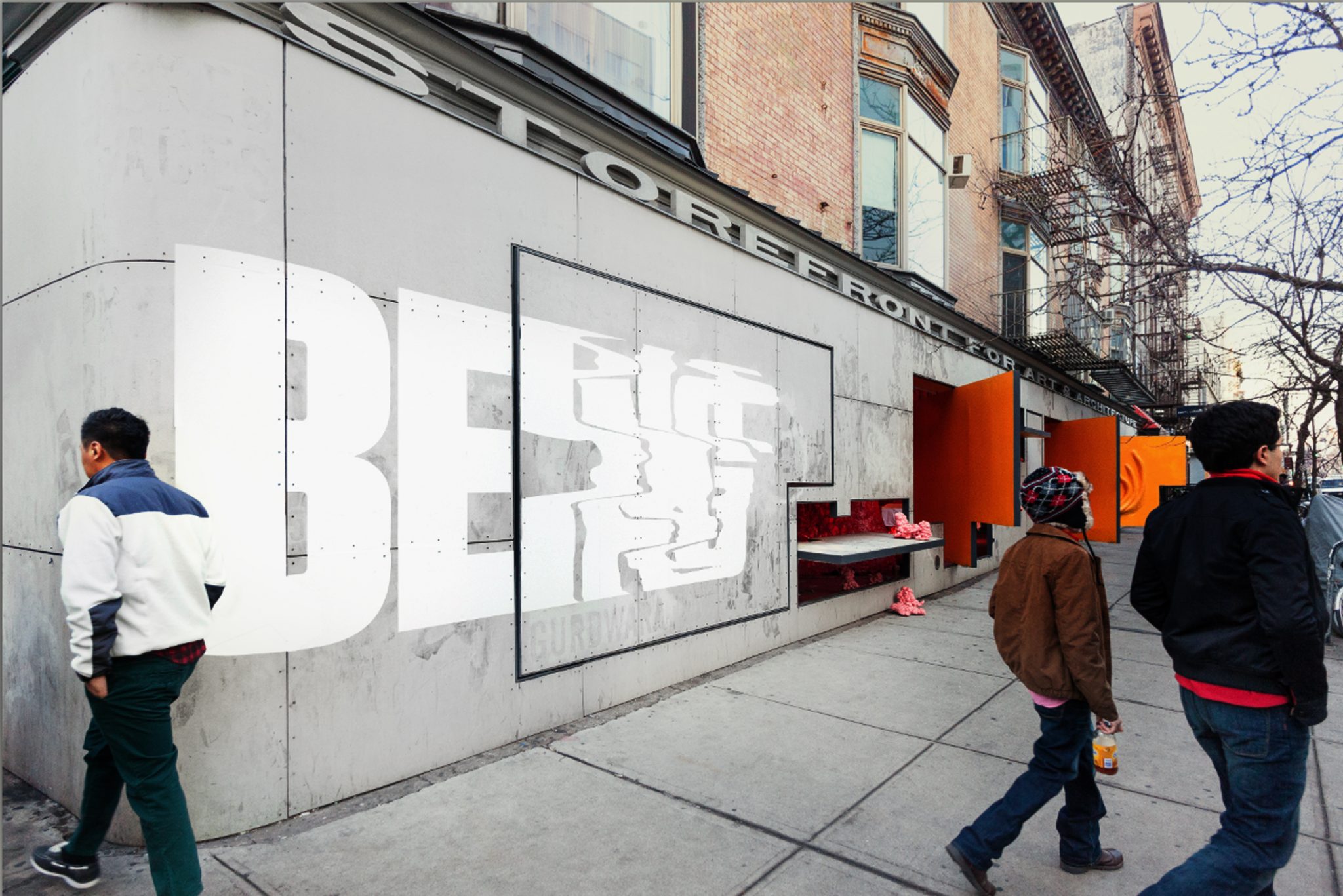
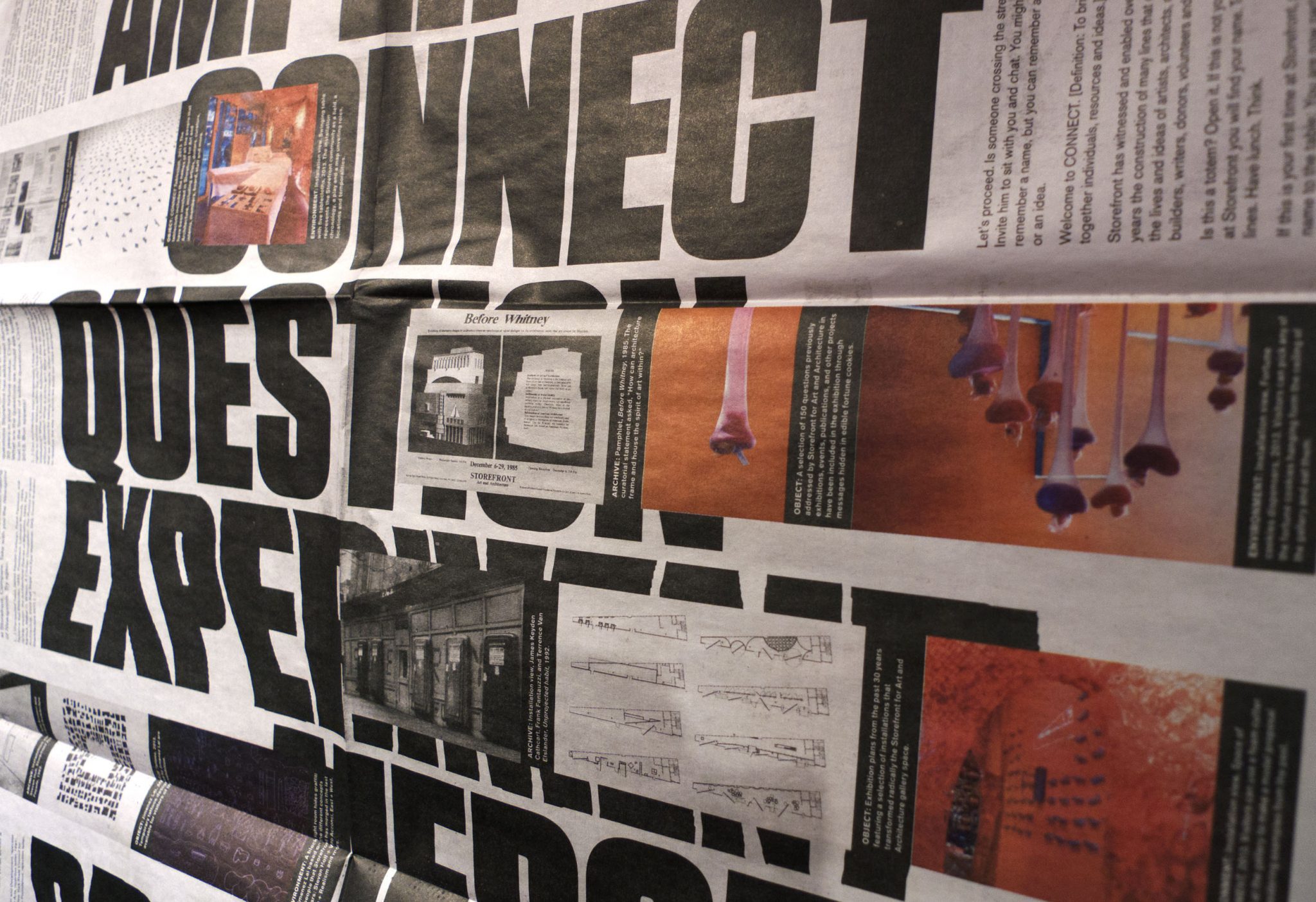
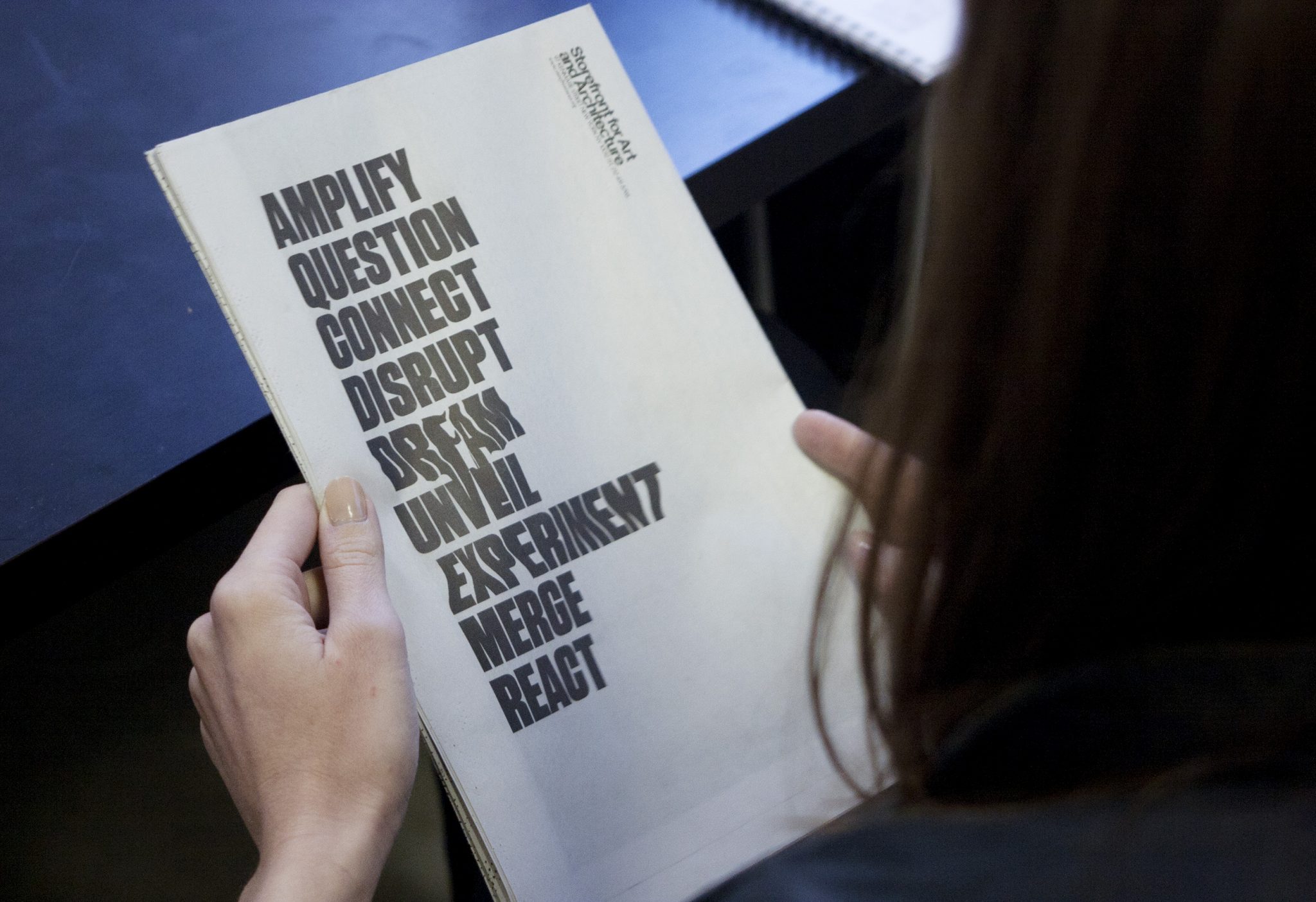
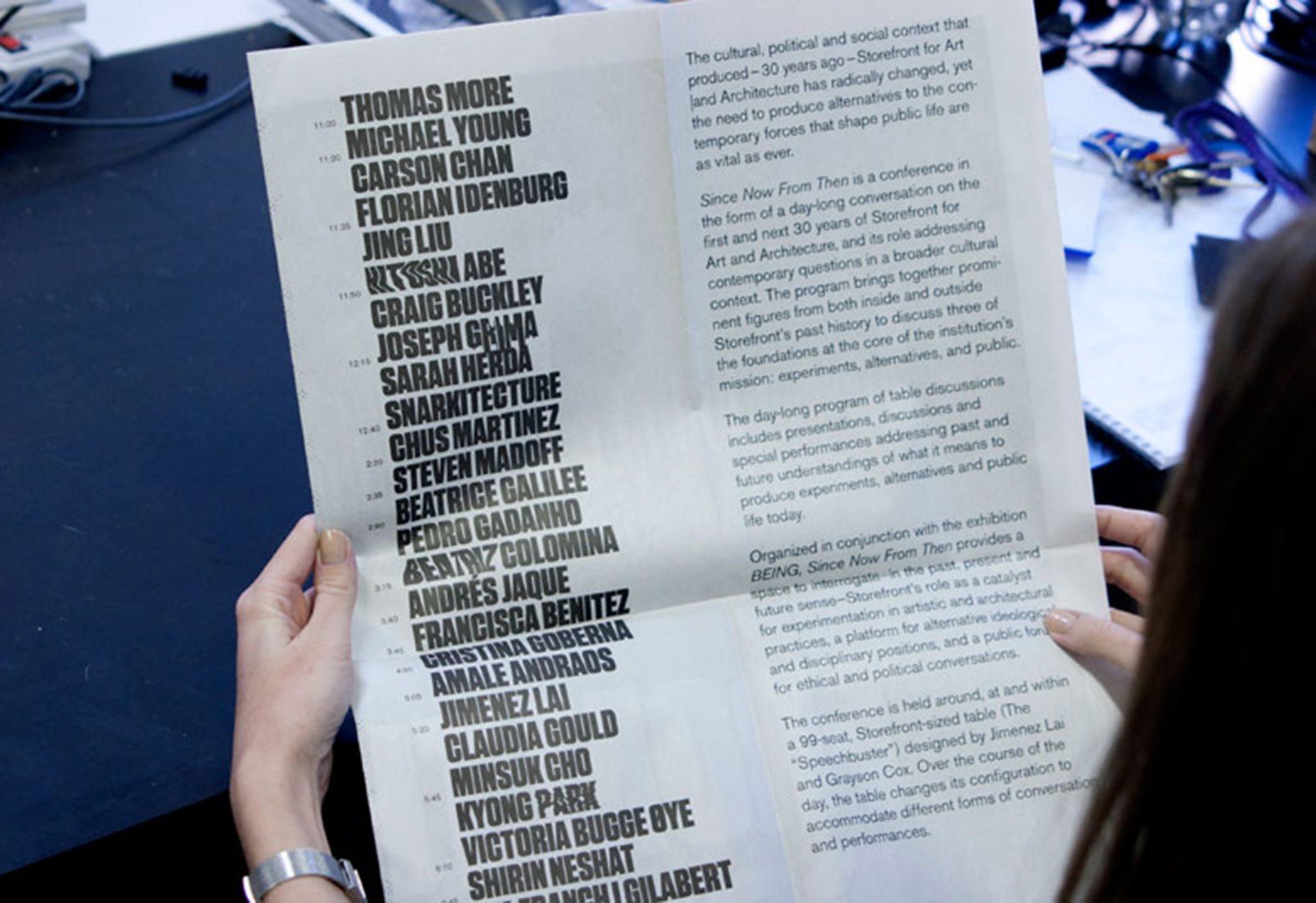
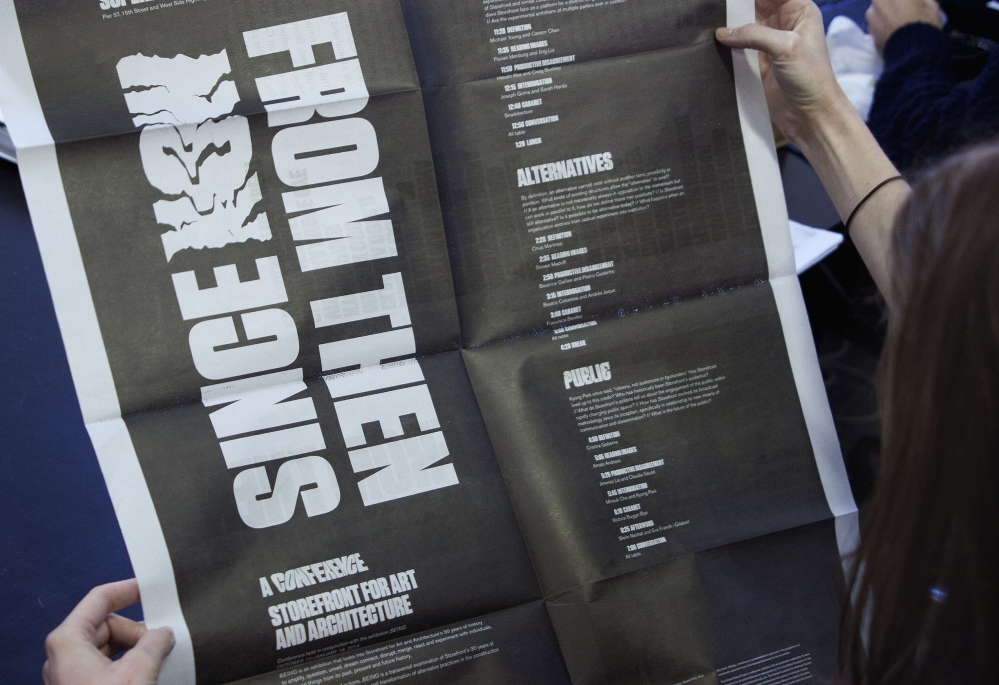
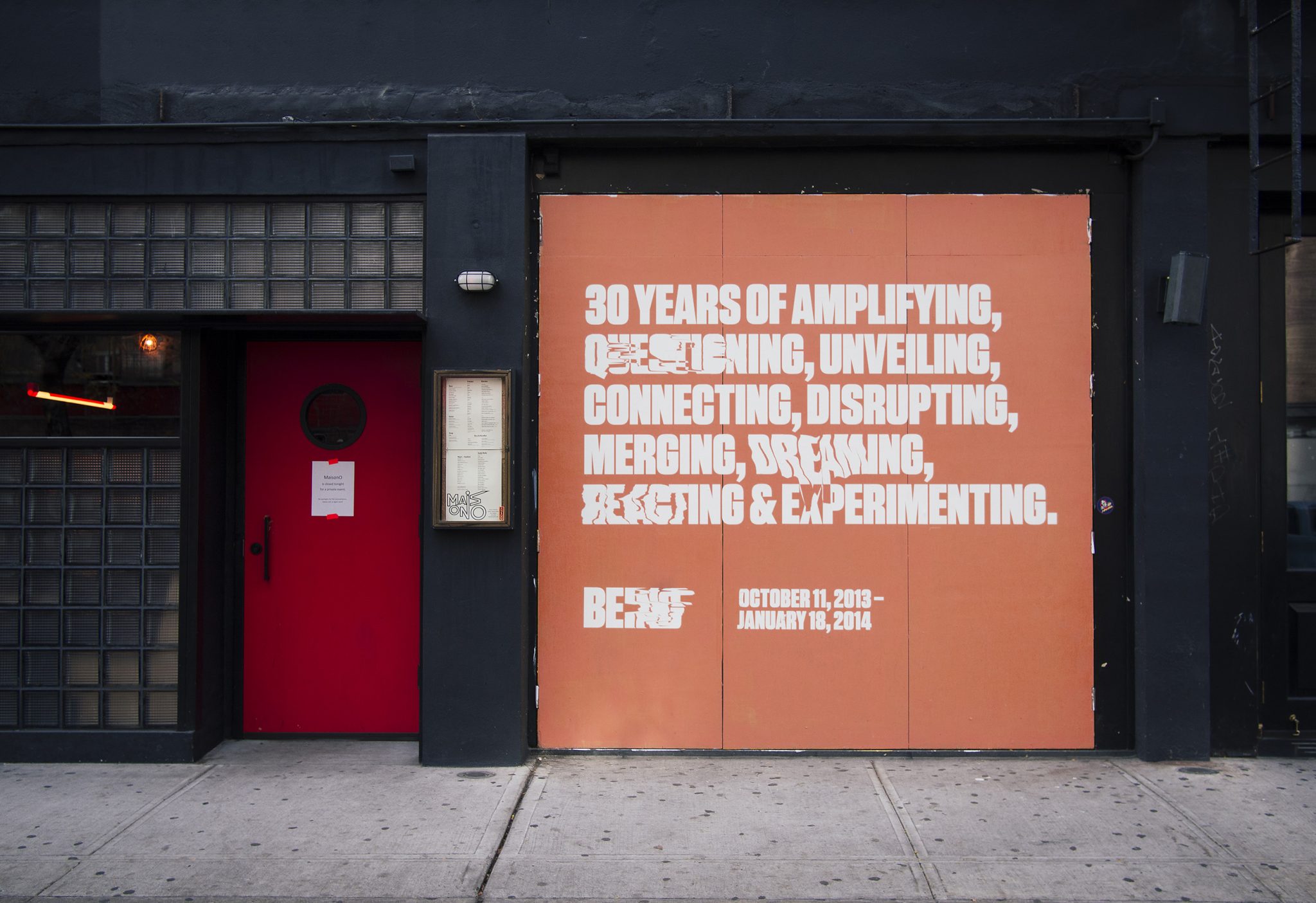
We collaborated with the Storefront for Art and Architecture, for their 30-year celebration show, titled Being. The show was an experiment about Being Storefront in the form of 9 actions. Our challenge was to create an identity that was alive, and we created a typographic form that had something like a pulse, with an on-beat and an off-beat.
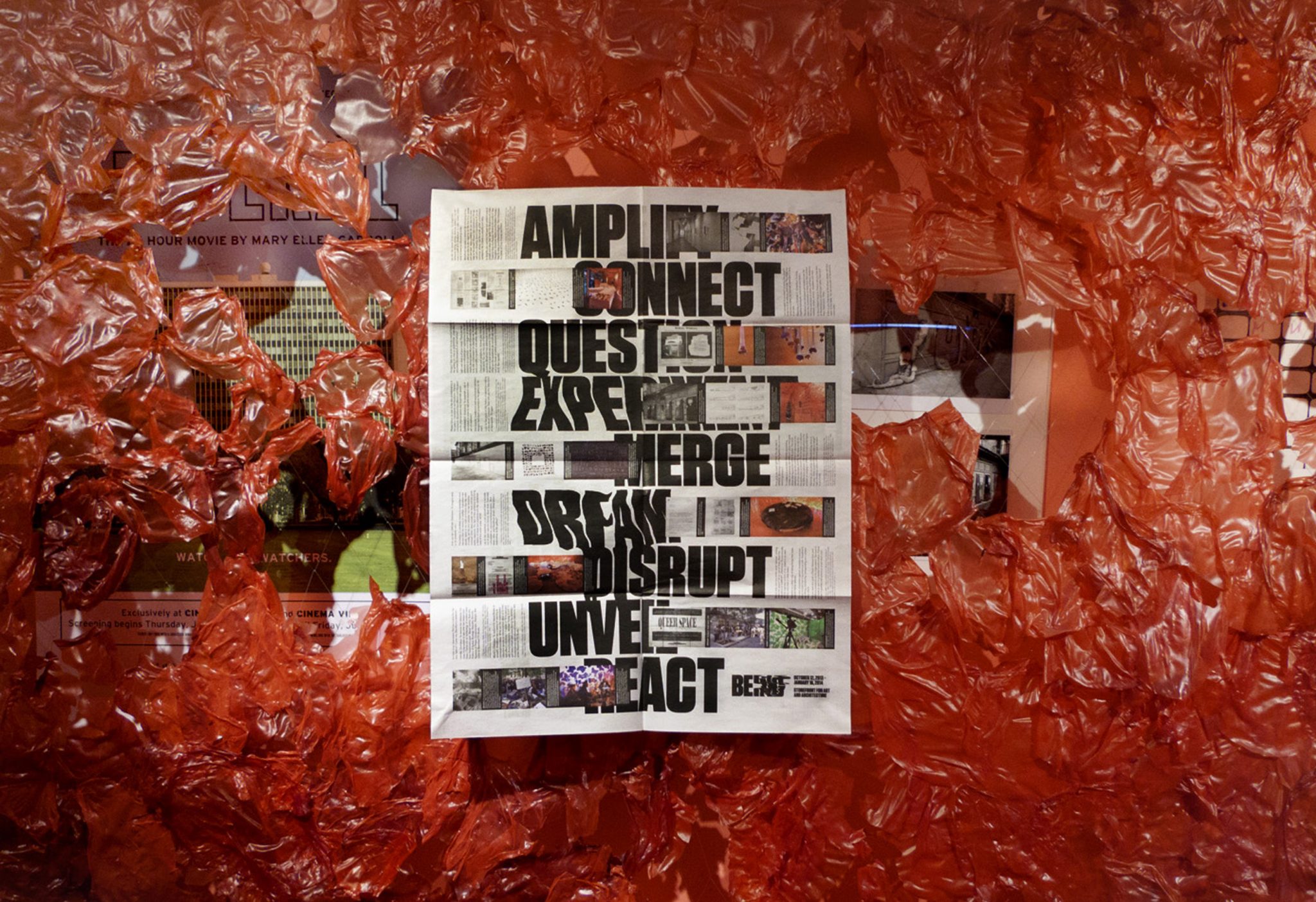
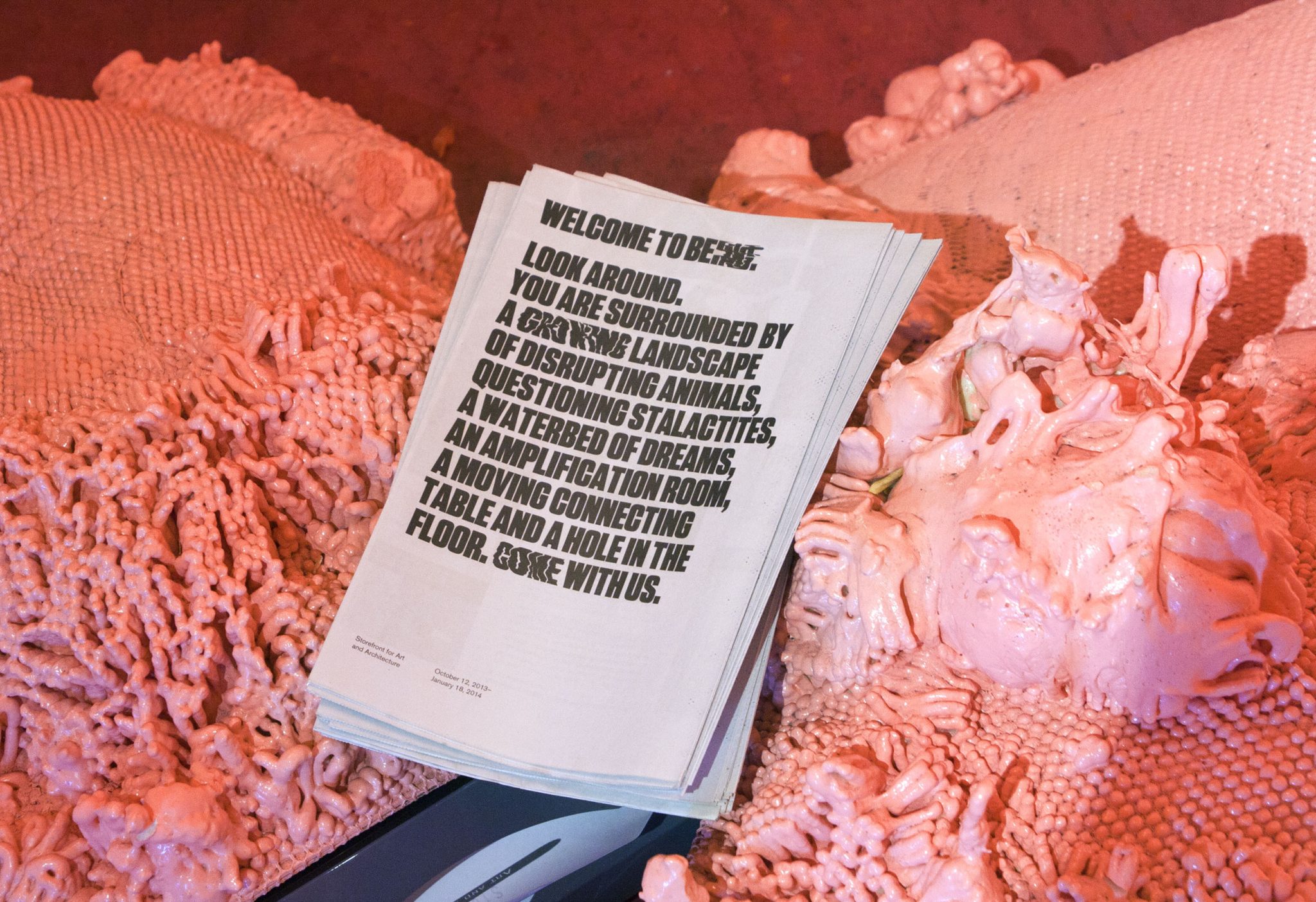
The identity is both a rational, high impact graphic that is clearly legible, and also a chaotic graphic form whose extreme instances melt into abstraction. The pulse appears in the print work in randomly selected words within the various program texts. The identity maintains readability and graphic impact, and allows for unique variations to occur. Our black and white palette reduced the message into didactic form alone, and highly contrasted the pink, fleshy architecture of the show.
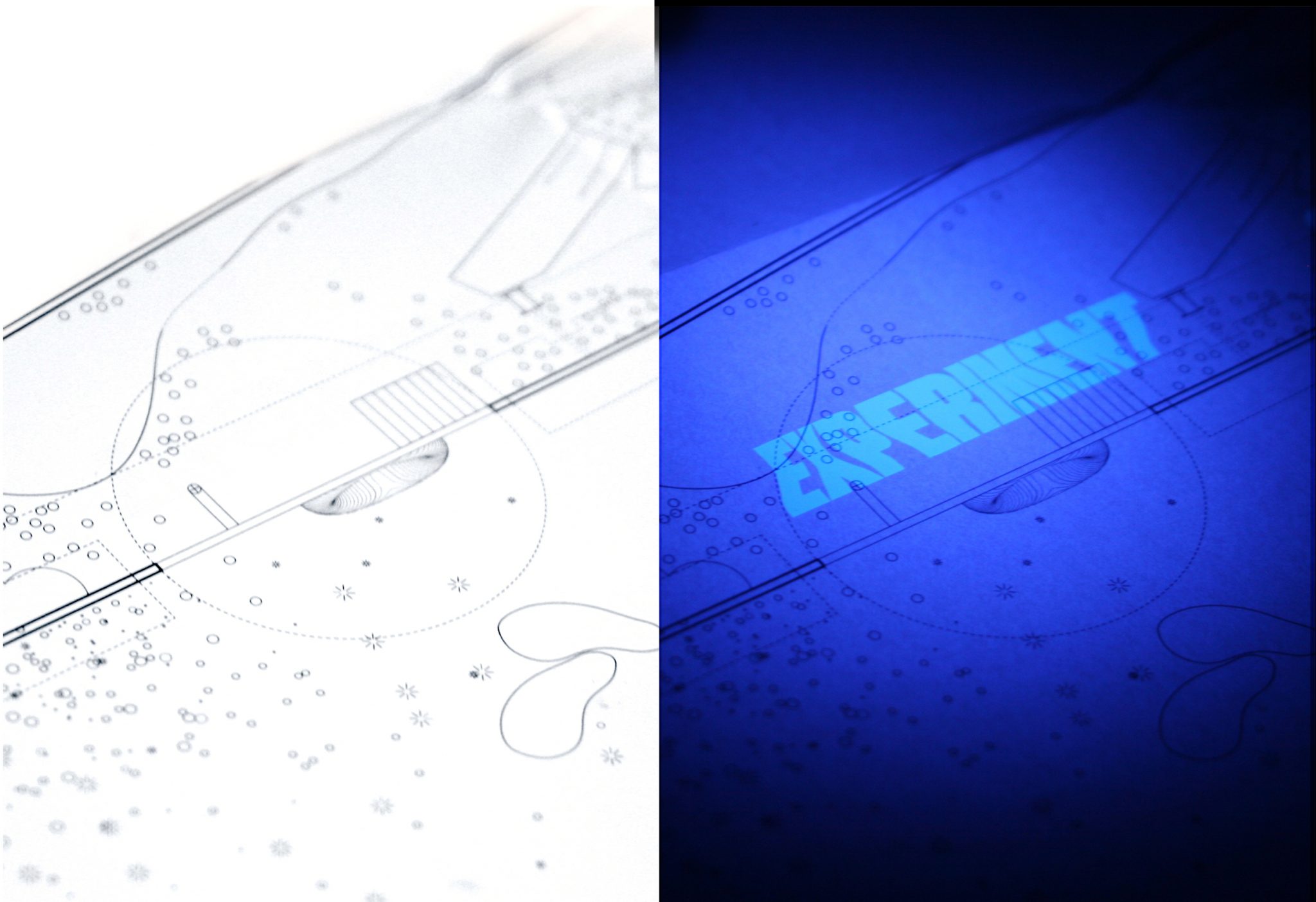
We designed a limited-edition print guide to the exhibition. It used Ultraviolet inks to make the piece come alive only when in the black-light lit areas of the gallery.
Newsprint broadsheets were designed to catalogue the show, and to announce the related conference. The poster side of the newsprint featured clusters of 3 images (archival, object and environment) that relate Storefront events to each of the nine verbs the exhibition used to express the idea of “Storefront-ness.”
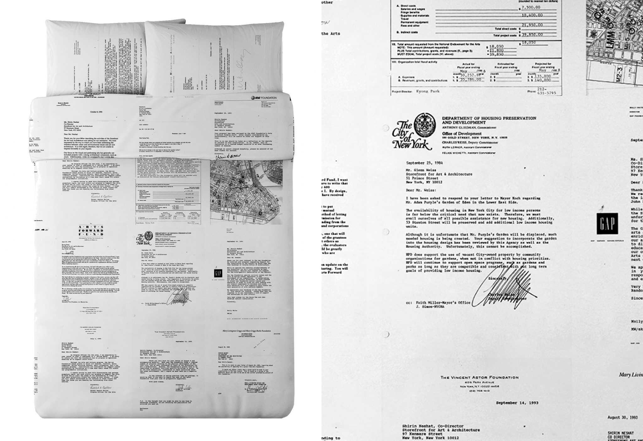
For the exhibition we designed limited-edition Queen duvet set and pillows for the waterbed that appeared in the show. It uses rejection letters of failed grant applications from Storefront’s history— displaying all of the failed ‘dreams’ of past Storefront directors.