Categories for Identity
After Belonging: Identity
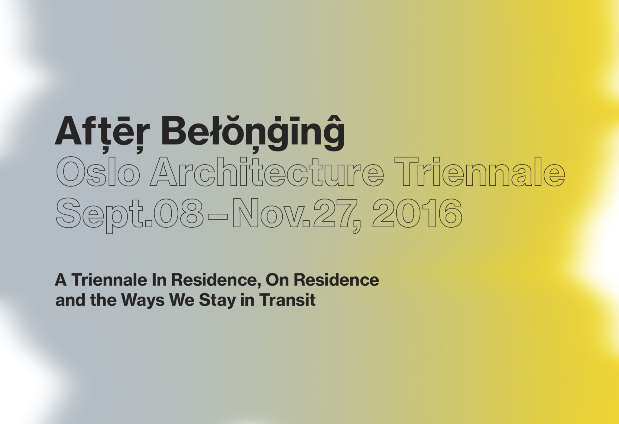
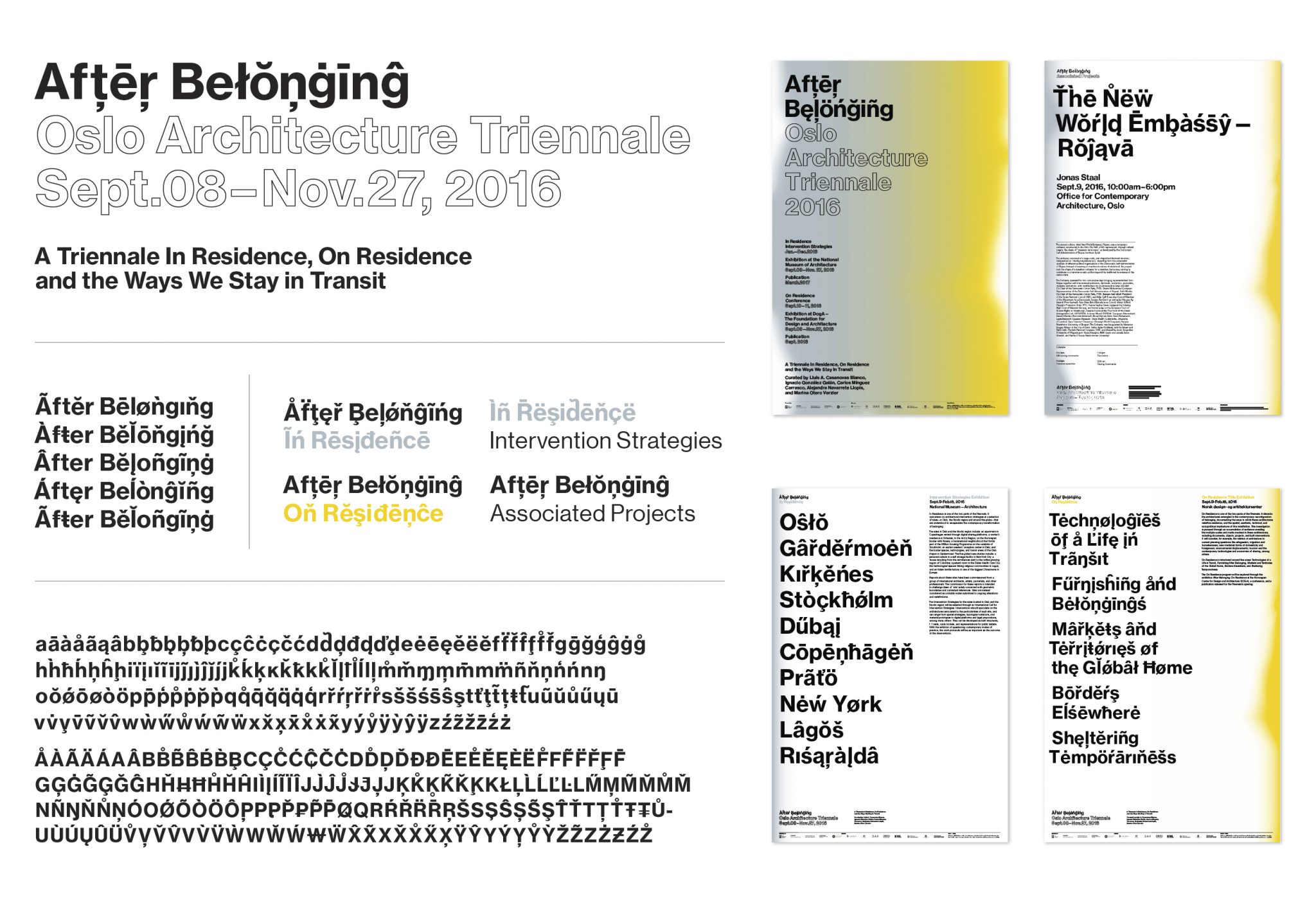
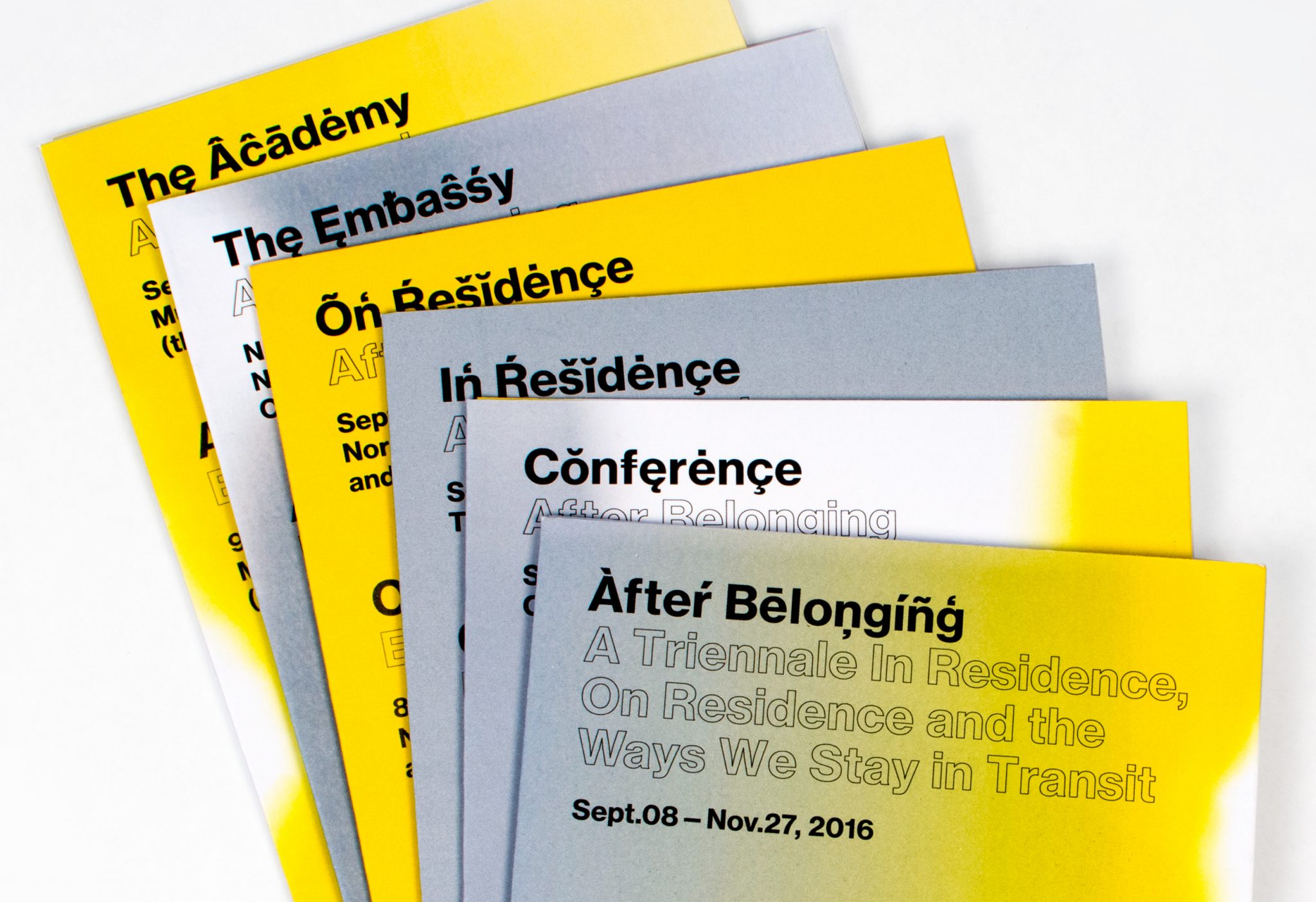
From Sept. to Dec. 2016, After Belonging, the Oslo Architecture Triennale opened to the public, with 2 exhibitions, a publication, and 3 months of various events in Oslo.
The curatorial idea of ‘After Belonging’ looks at the architectural concept of ‘residence’ in the current state global transitions — from cruise ships as floating cities, to refugee housing and displaced populations — in essence, the condition of not belonging to one place.
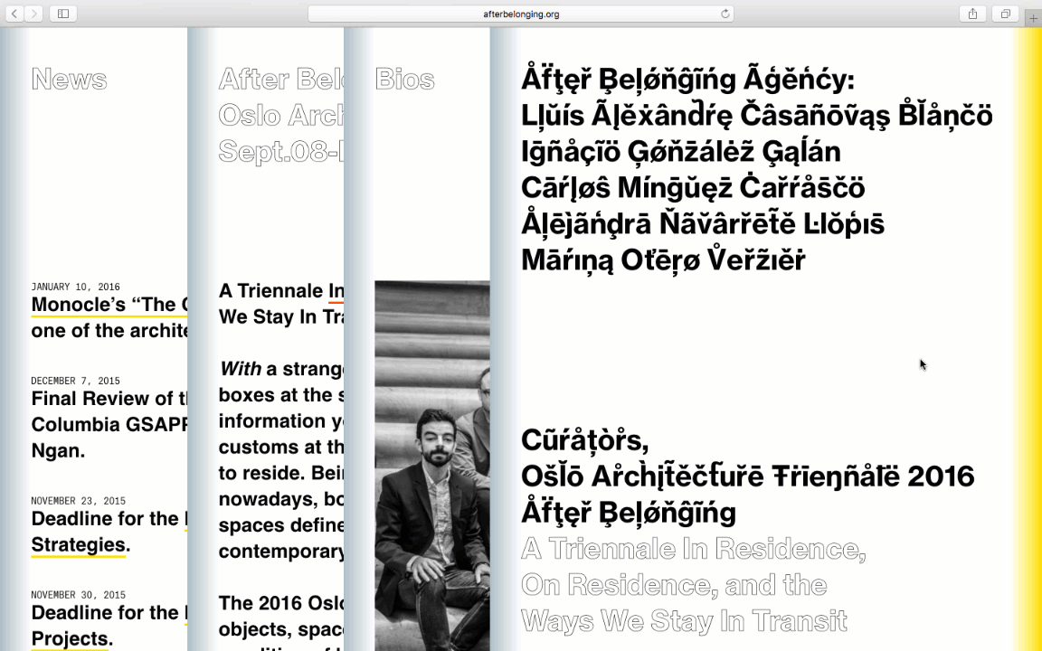
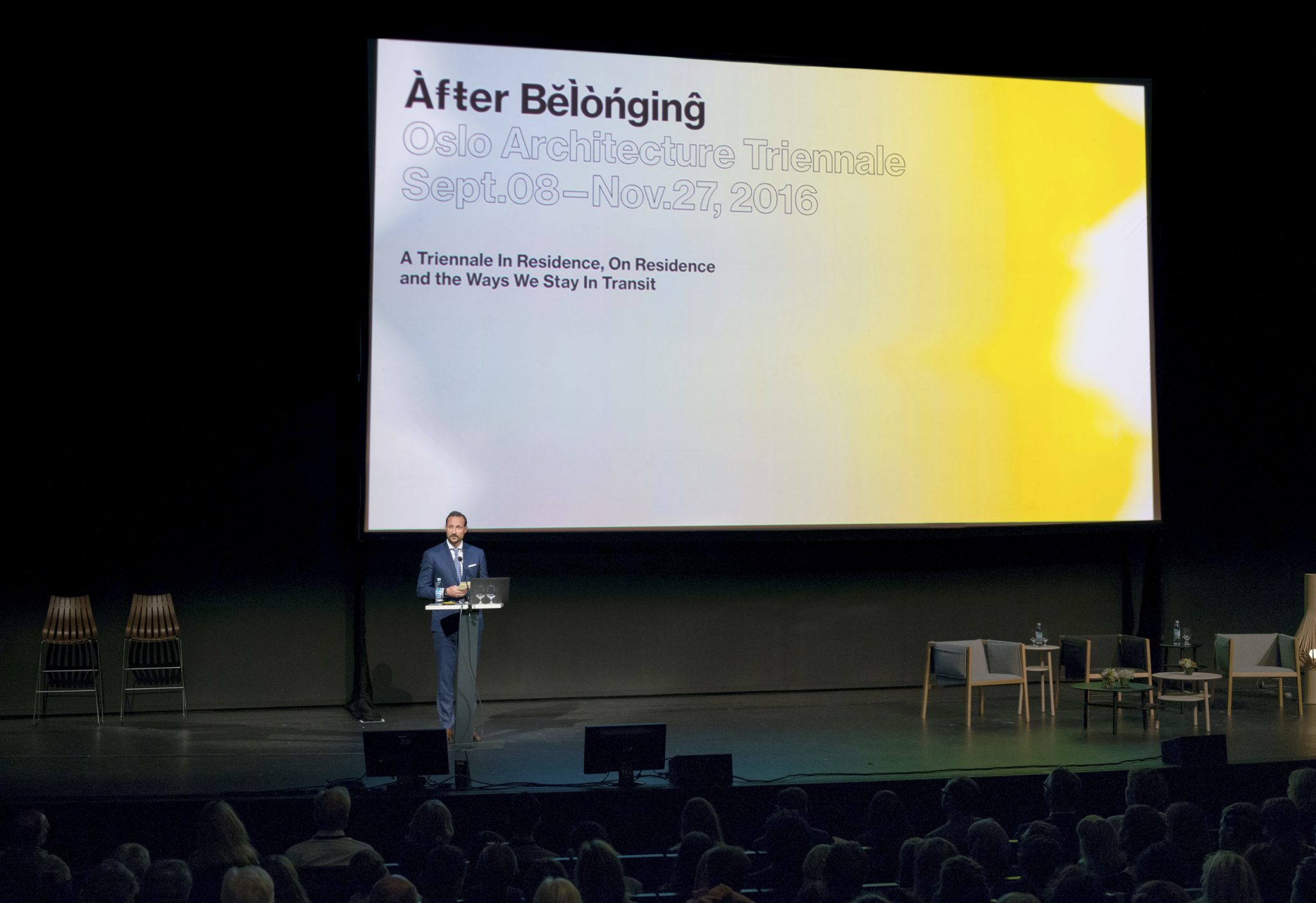
For the graphic identity, we created a typographic world that would be at once universally recognizable and yet unfamiliar. If language you speak defines where you belong, this language belongs to no place.
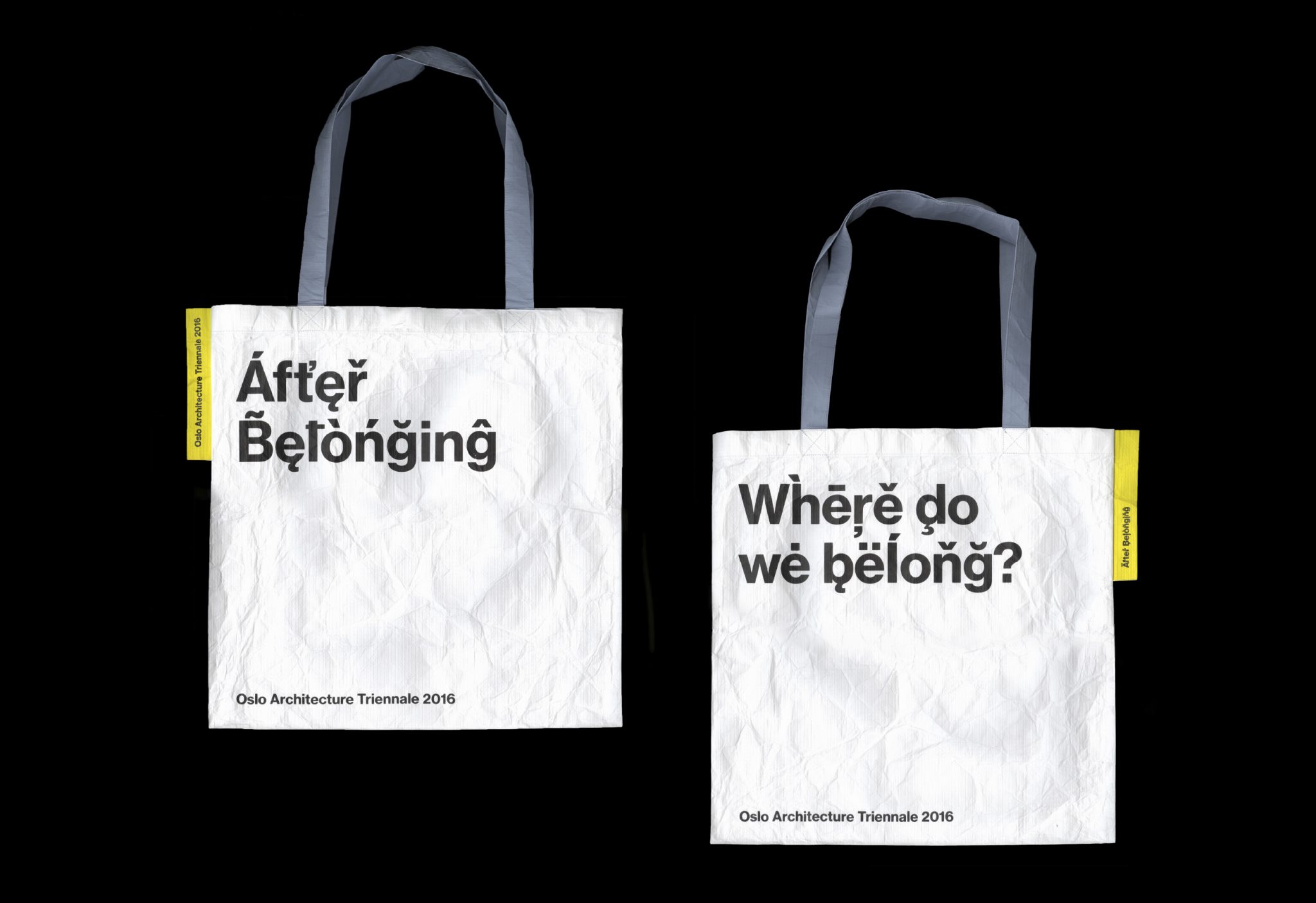
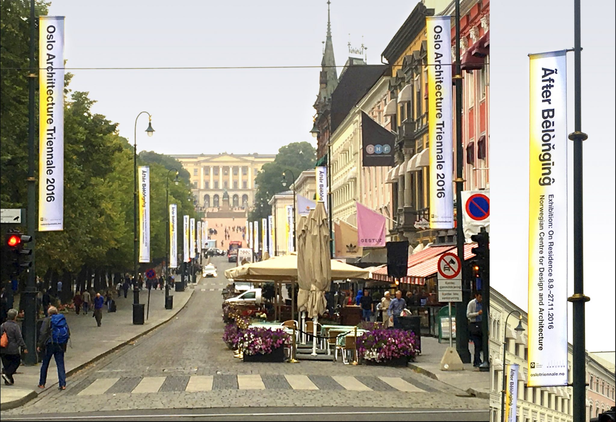
The identity employs a modernist typographic base, and uses all of the diacritical marks in the font. We created a script that randomly selects each glyph to maximize combinations. The diacritical marks are the primary identity marker for the triennale, there was no ‘logotype’ file or branded mark. Colors appear as gradient flushes of yellow and grey, highlighting the different components of the triennale programming.
The identity was deployed over the triennale’s multiple formats — exhibition graphics, signage, print collateral, totebag, and a 400-pg catalog and archive of the triennale with original work and essays.
Interrupt 3: Language Art Conference
In the spring of 2015 Brown University hosted the third annual “Interrupt” conference, an event created by the Digital Language Arts program of the Department of Literary Arts. This conference explored ways that coding can create new forms of literature. The format of the conference included “Interrupt sessions” in which artists had five minutes to present their work but could be interrupted at any point by another presenter. In this way interruption itself became a protagonist, taking on various unexpected forms and playing with how people experienced interruption.
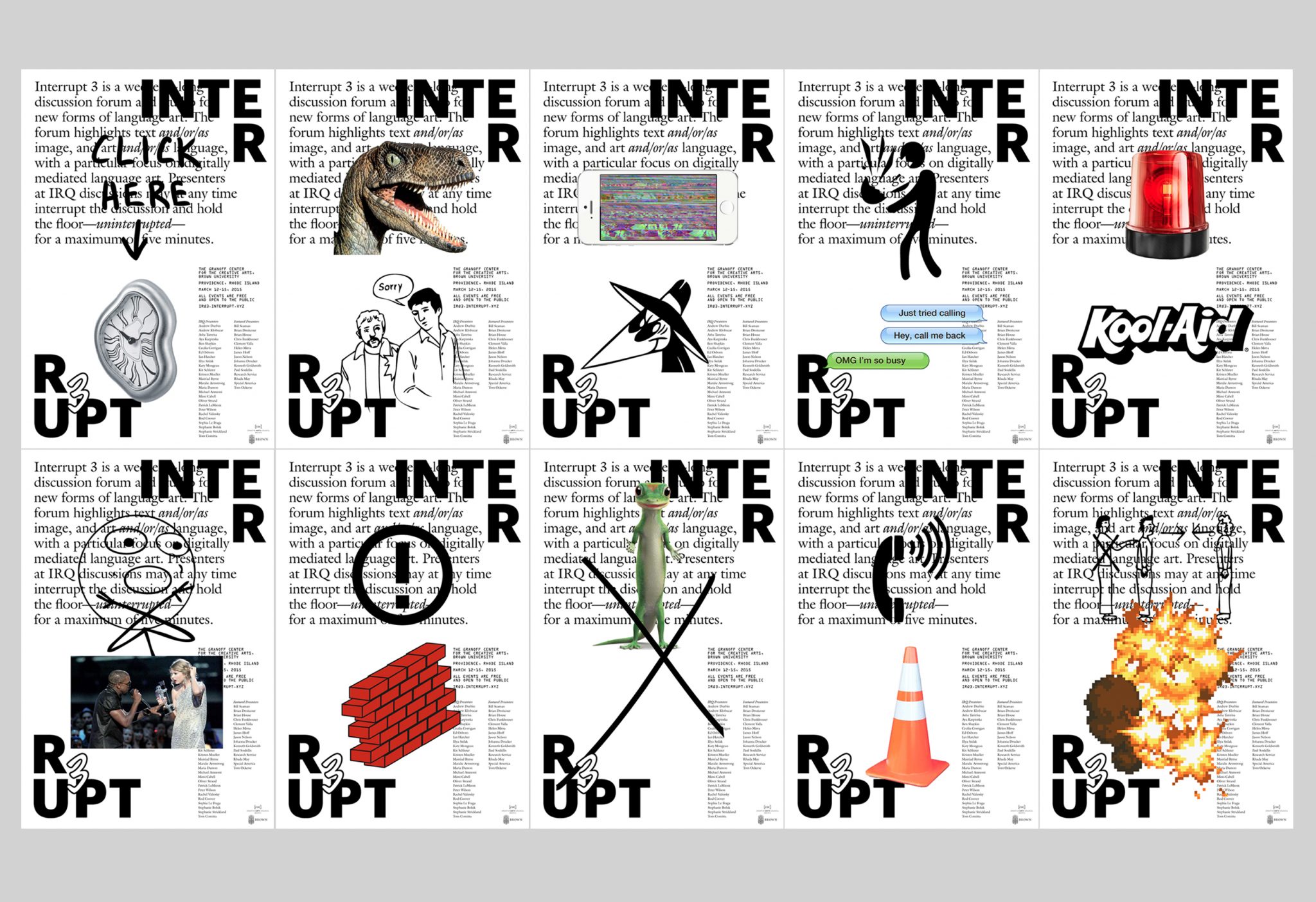
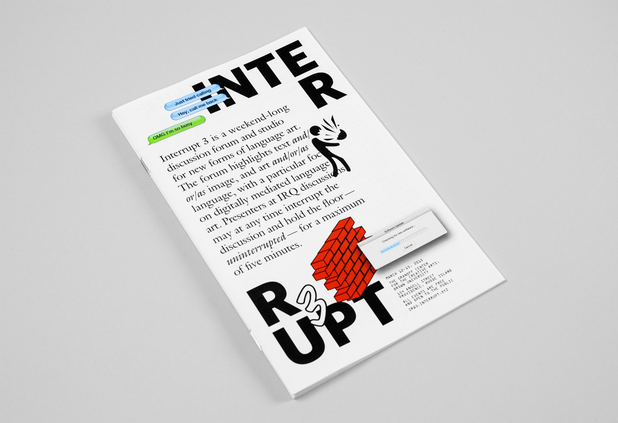
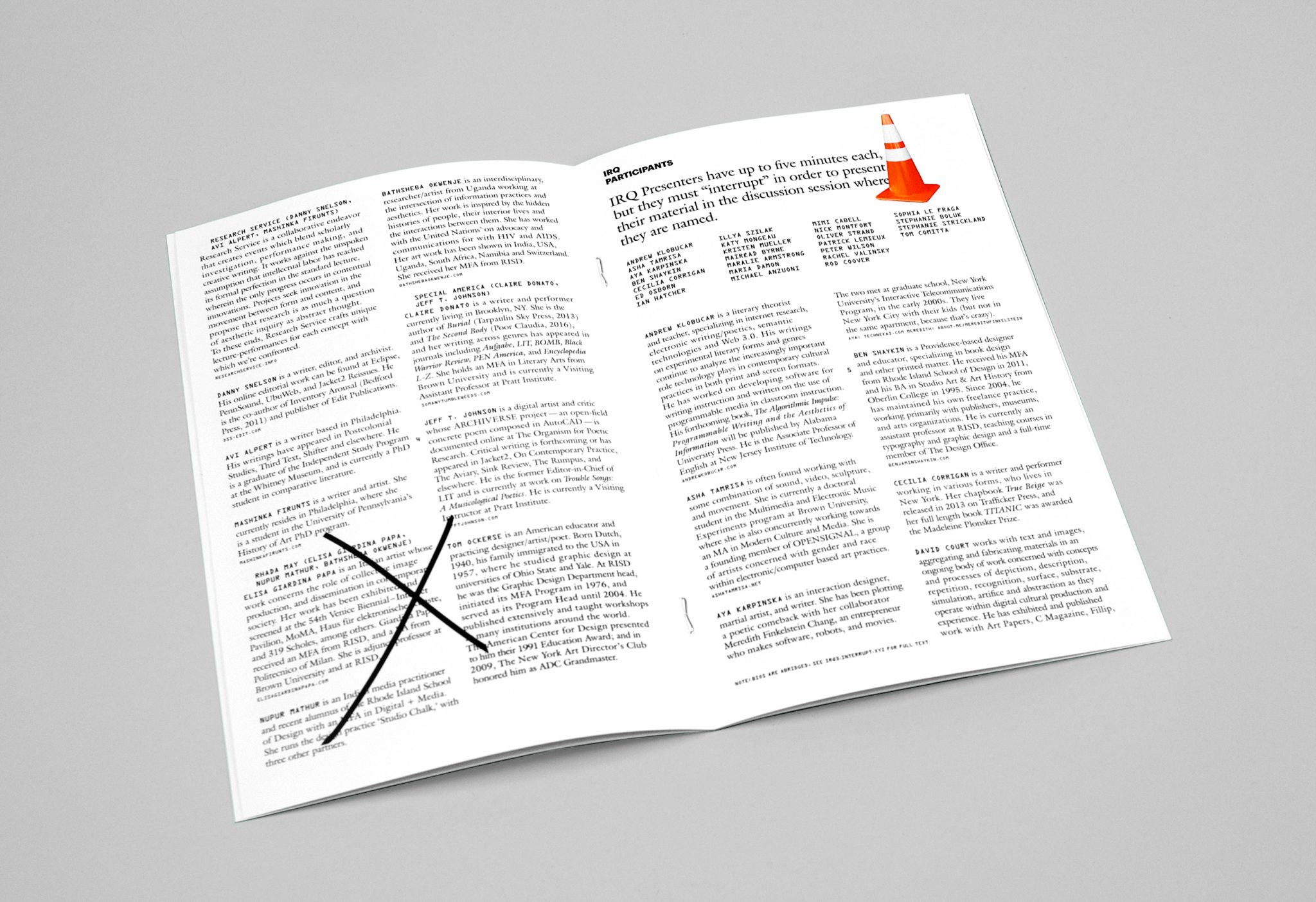
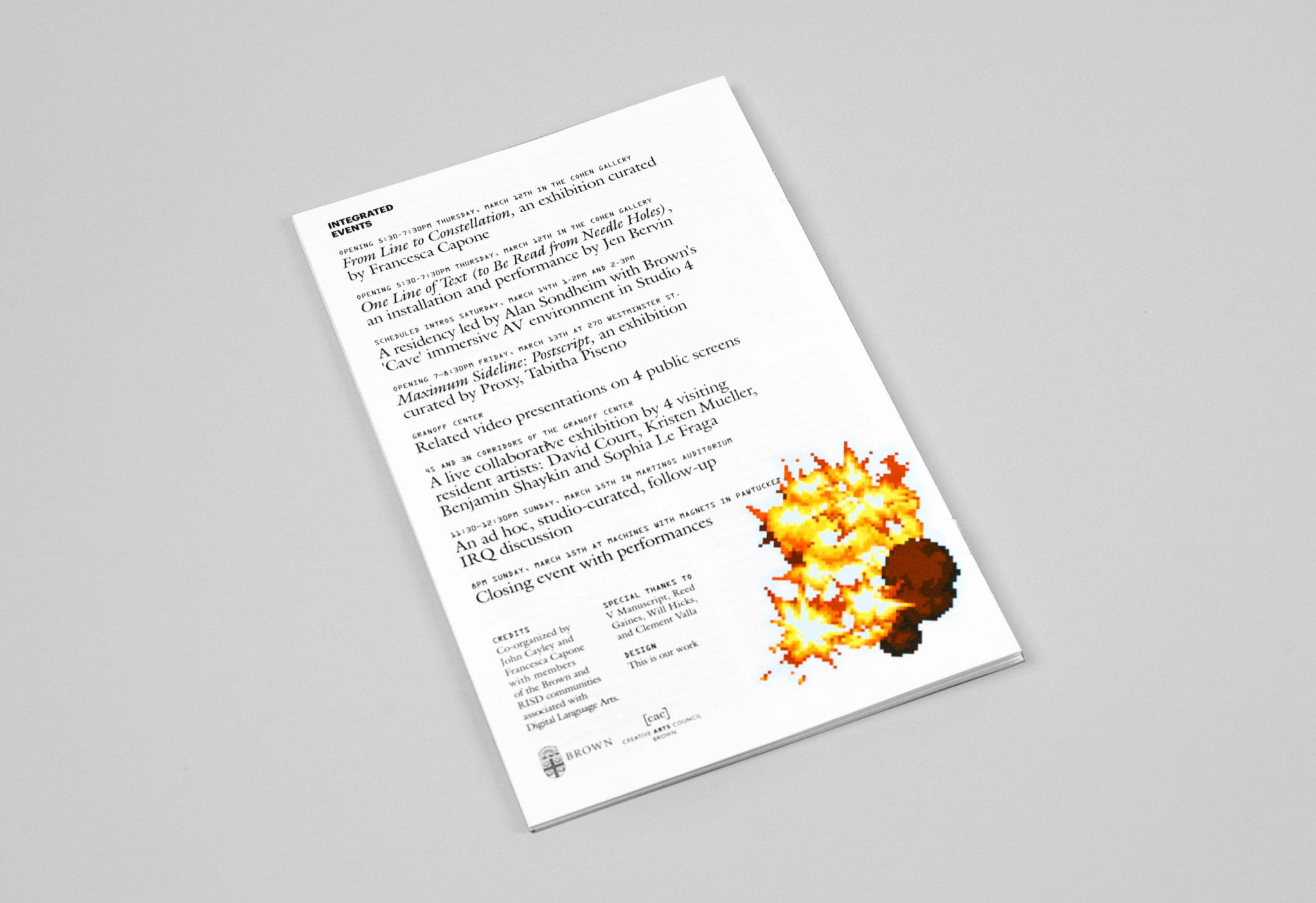
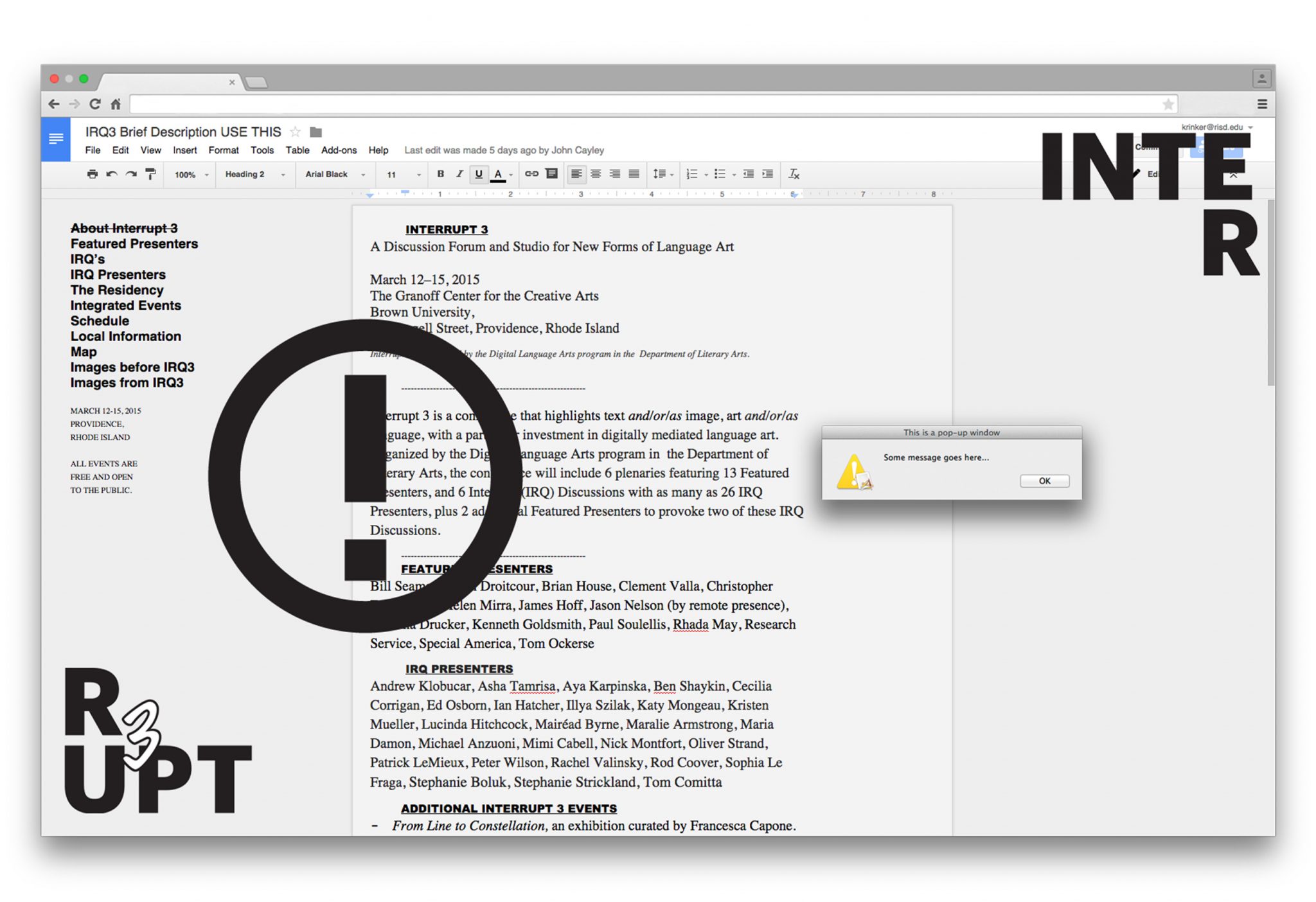
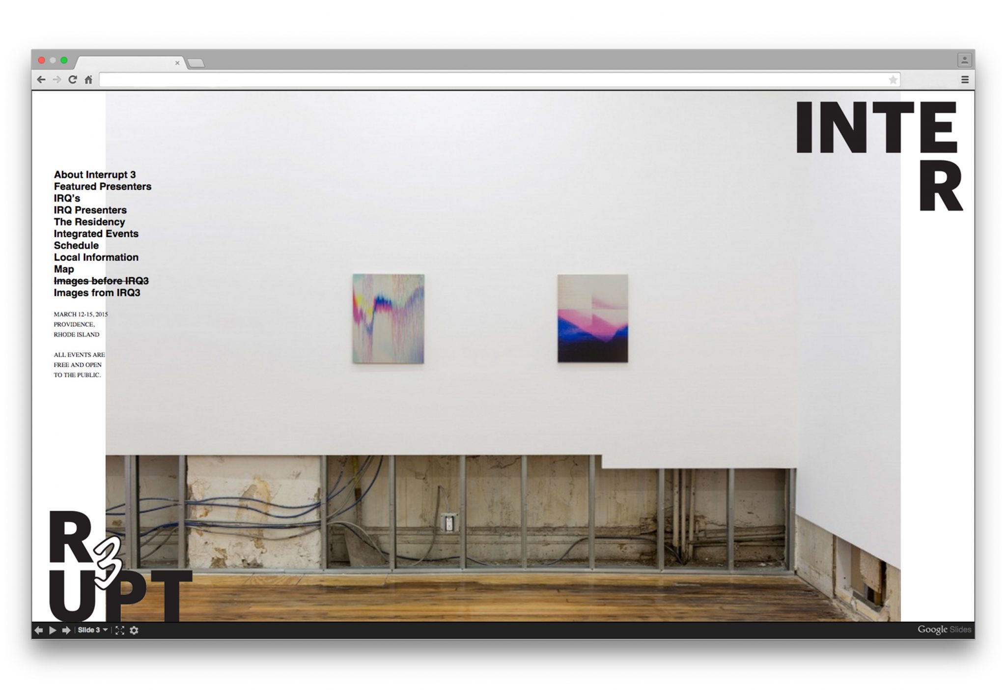
We were asked to create the identity of this event, including posters, a pamphlet, and the website. Two elements formed the core of the identity we would use throughout these materials: the logo with the word “Interrupt 3” split apart and in opposite corners, and seemingly random pop-up images that would appear actively on a screen or would surprise a reader on a printed page or surface.
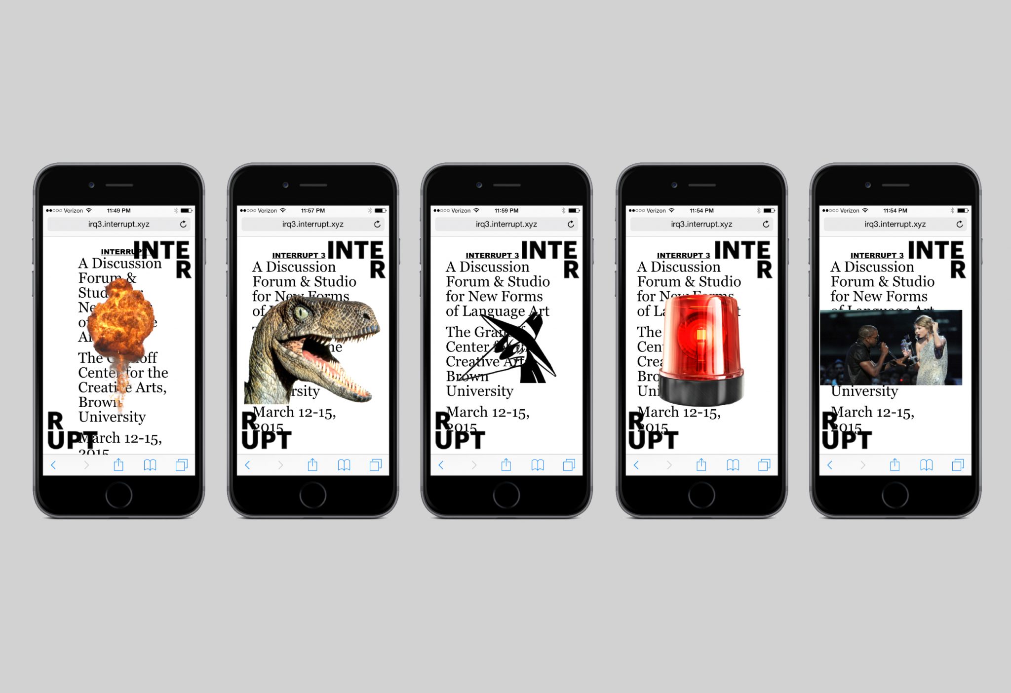
Our posters feature background text that is covered by interruptions of the logo and pop-up images. We created ten different versions of this poster, each with a unique combination of an illustration and photograph as pop-ups. While the pop-ups might seem haphazard, they were actually placed systematically and posters were shown in groups of three so that all text would be visible on at least one of the posters. In this way we made sure that the names of presenters would always be visible somewhere while also emphasizing the idea that the overriding narrative of the event are the interruptions themselves; a search for meaning will only be frustrated at some point. Pop-up pictures also occur throughout the pamphlet we created for the event, but in a way that is less obtrusive for the reader needing access to the information in print.
The most interactive and playful use of the pop-up interruption is in the website. The reader has the choice to click on each pop-up to remove it, or do nothing and allow the pop-ups to gradually invade the screen. We built the site on top of an actual google document page, so that conference organizers could make content updates until the very last minute. This feature also allowed us to apply the pop-ups to every page of the website without interfering with the website itself.
Lauren Wegel Architect
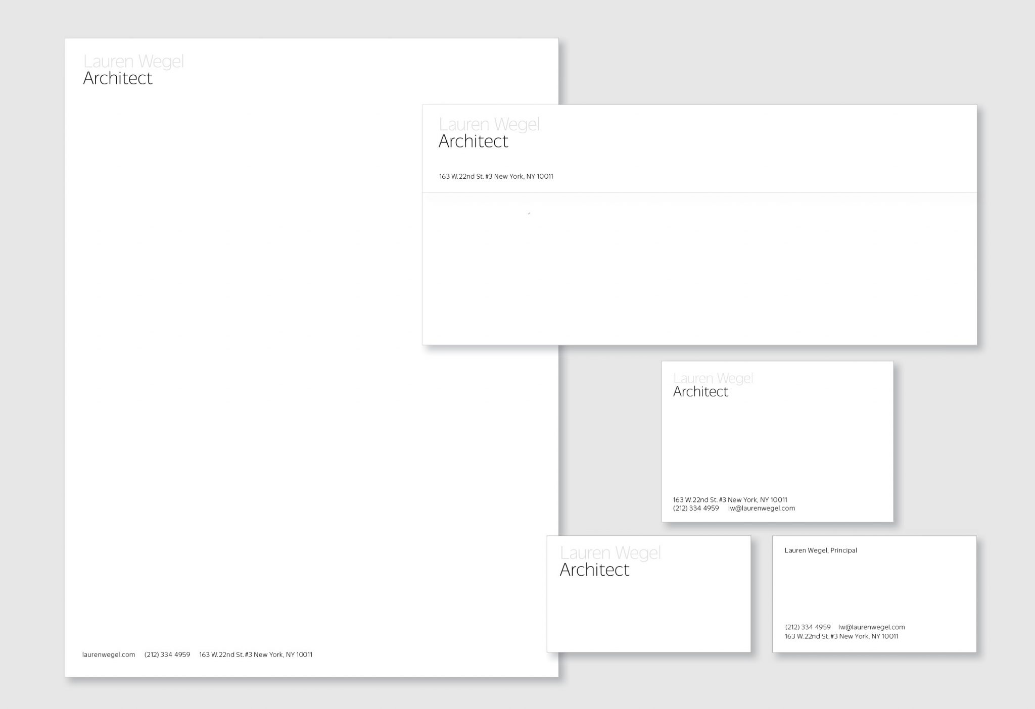
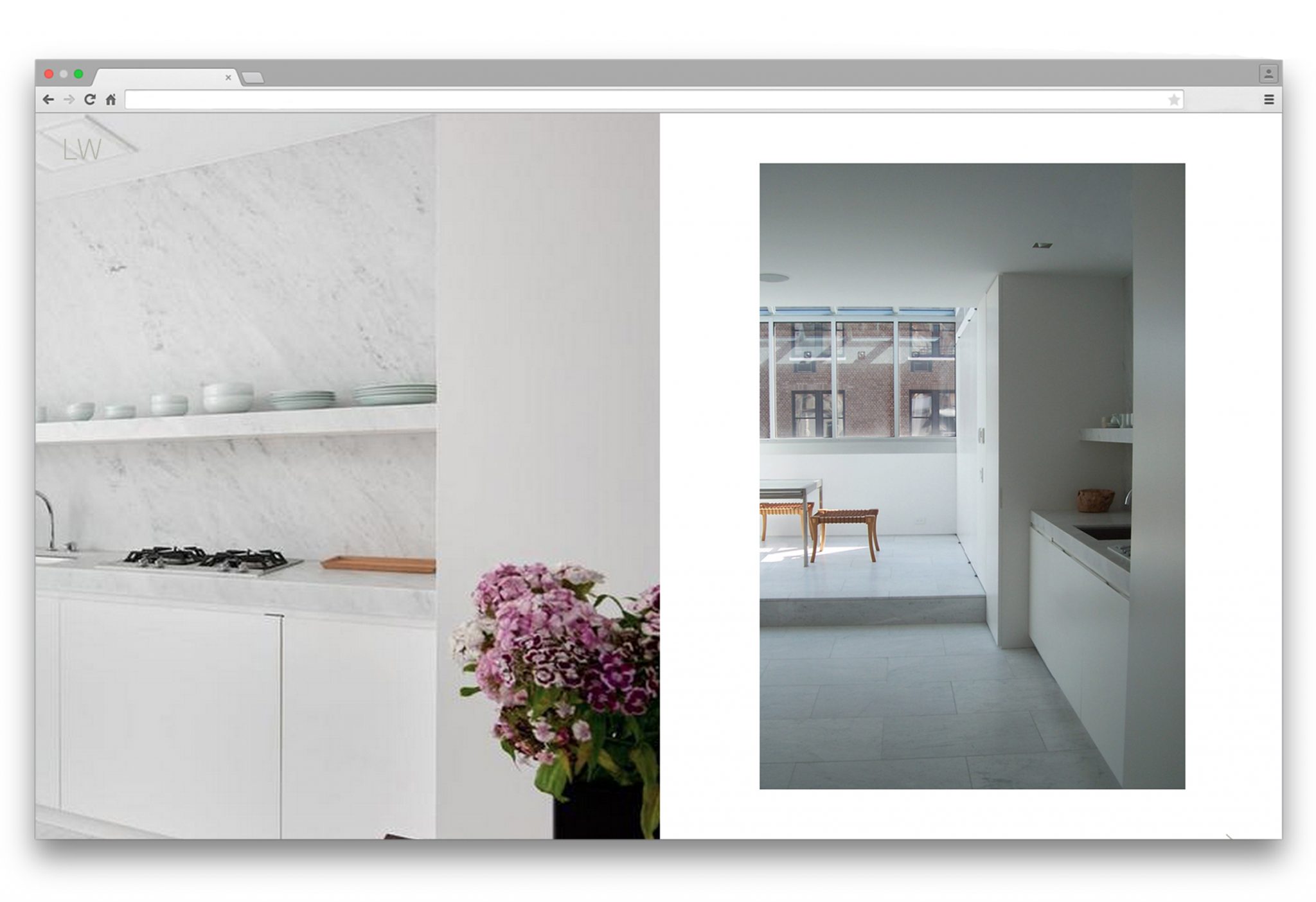
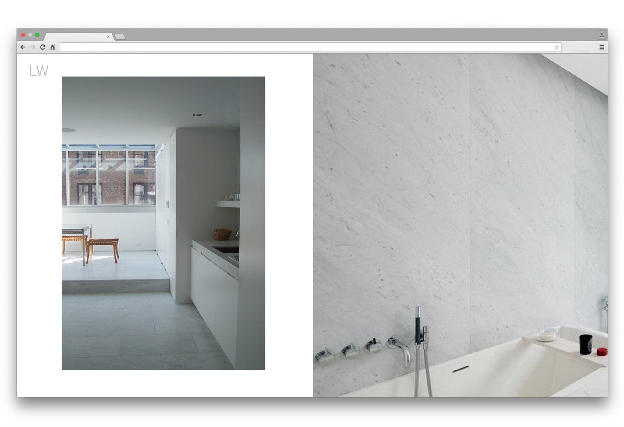
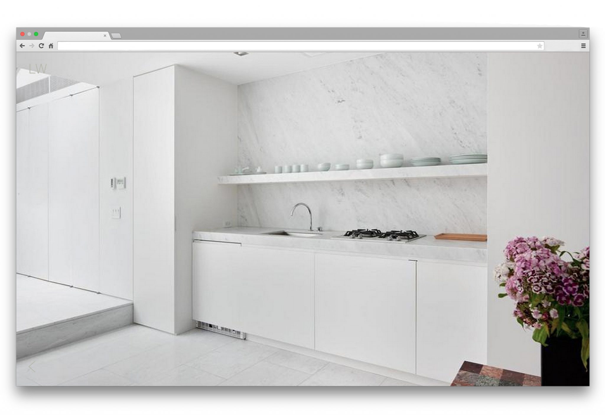
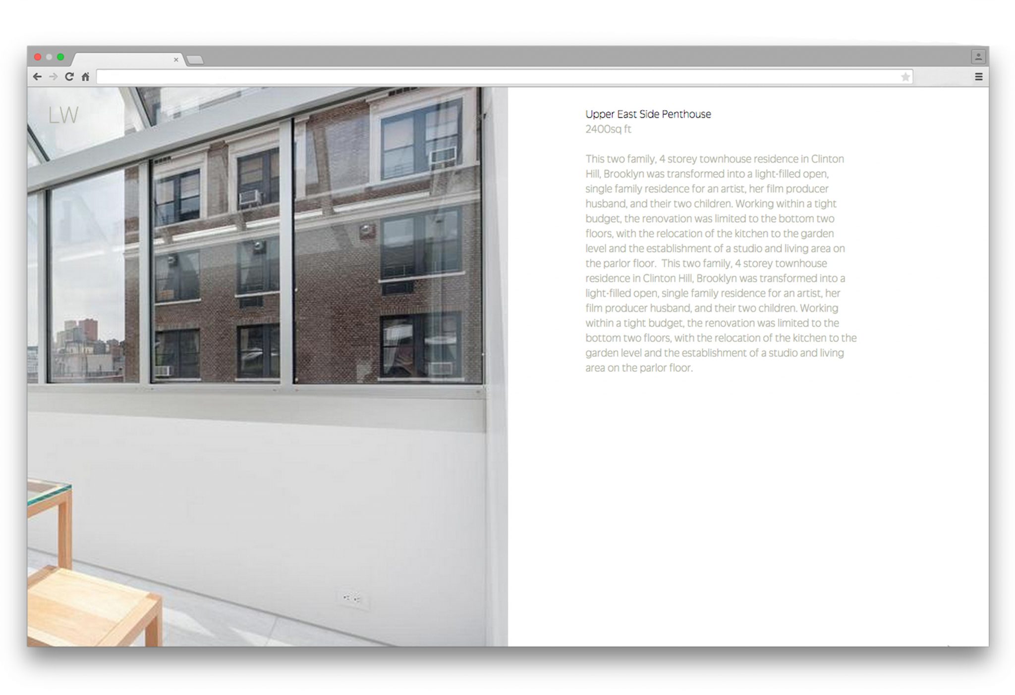
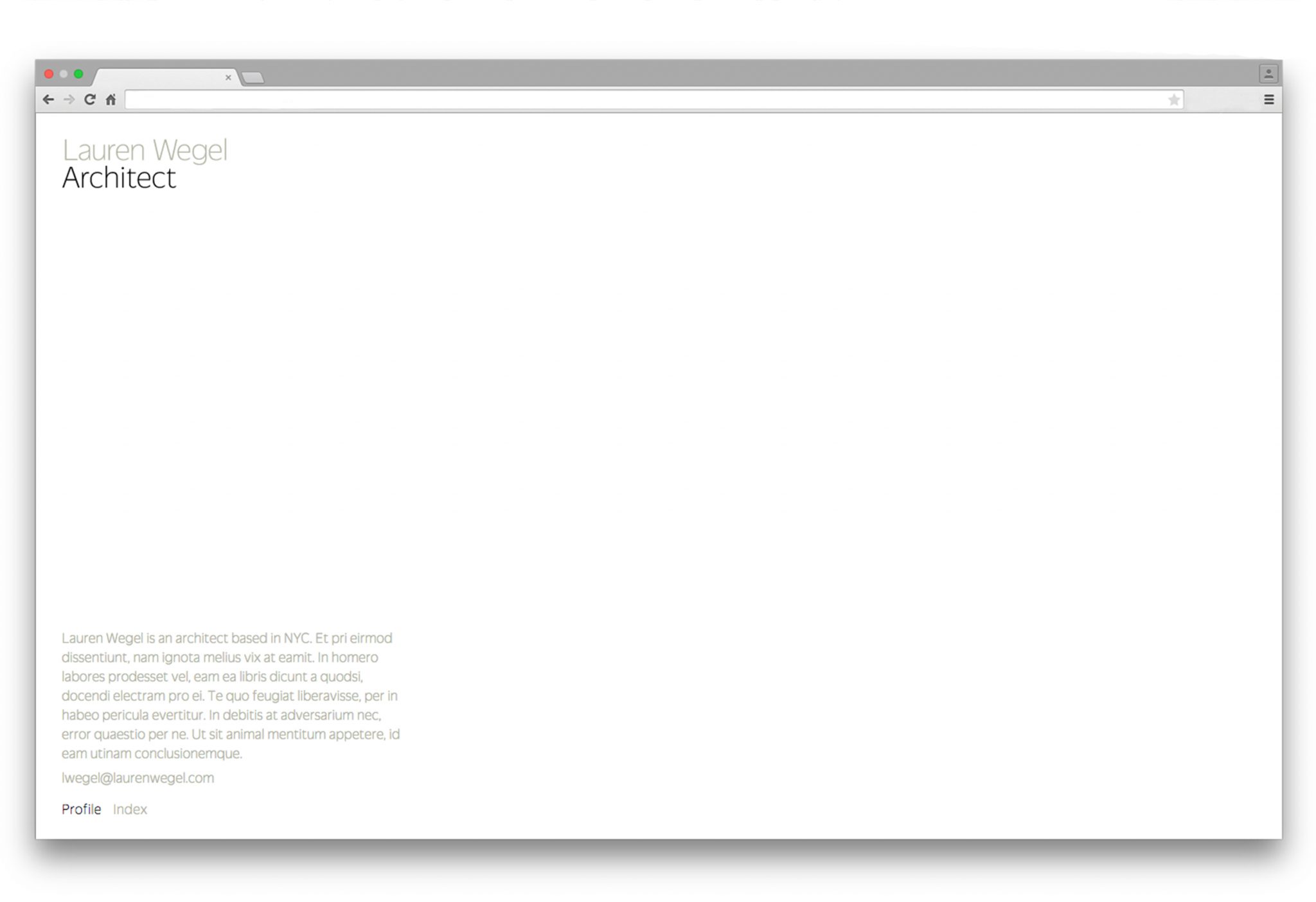
Architect Lauren Wegel was looking to share and promote her work in a way that would reflect her quiet, delicate style while assuaging any apprehension about her work being exposed to the public.
For her logotype, we looked for ways that would reflect her strength and precision as an architect, and the subtle beauty of her minimalism. The custom letterpress is a subtle tactile statement rather than loud pronouncement, and expresses her light, exact, and balanced touch. Her name is grayed out, again in line with her preference for the delicate statement.
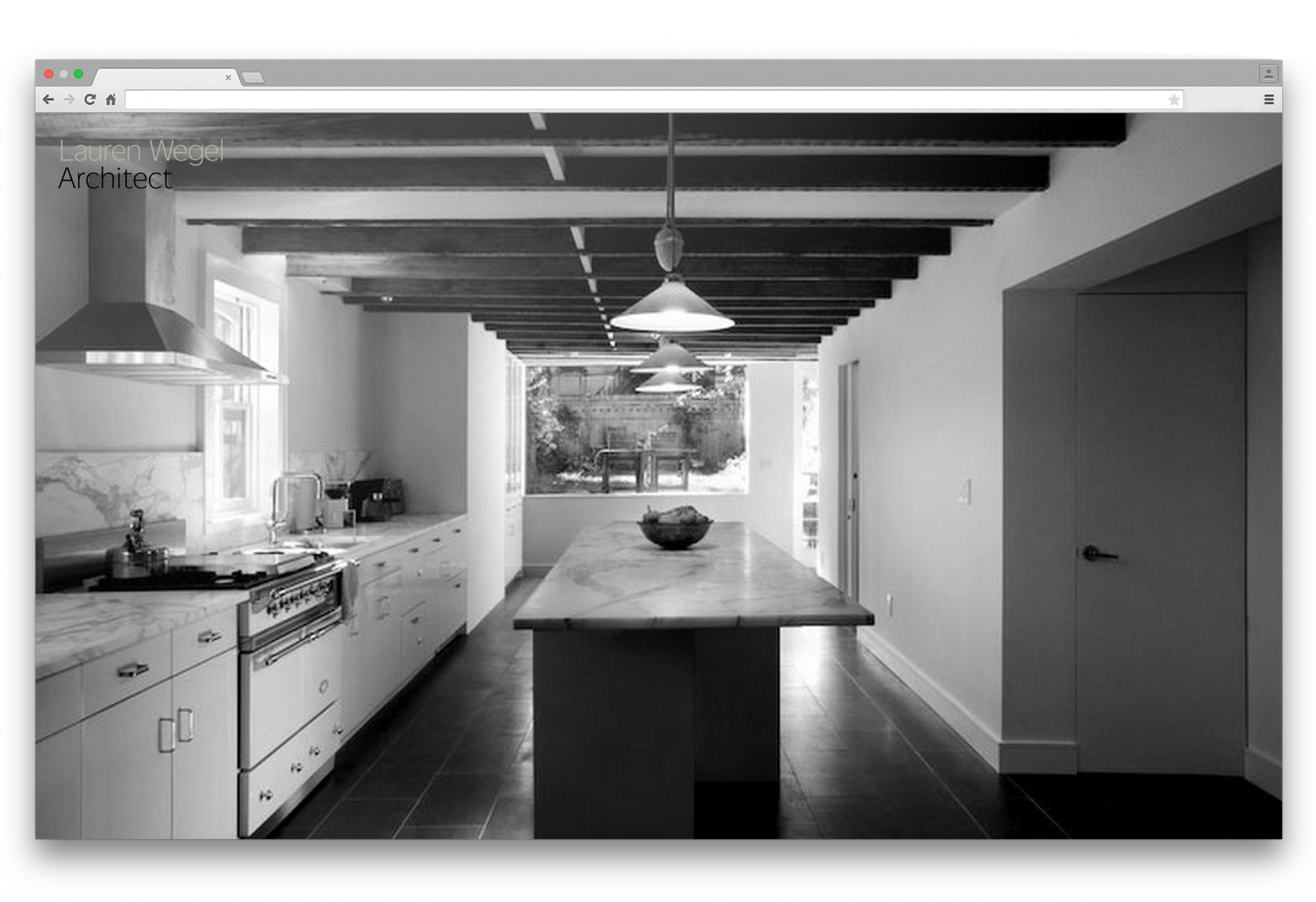
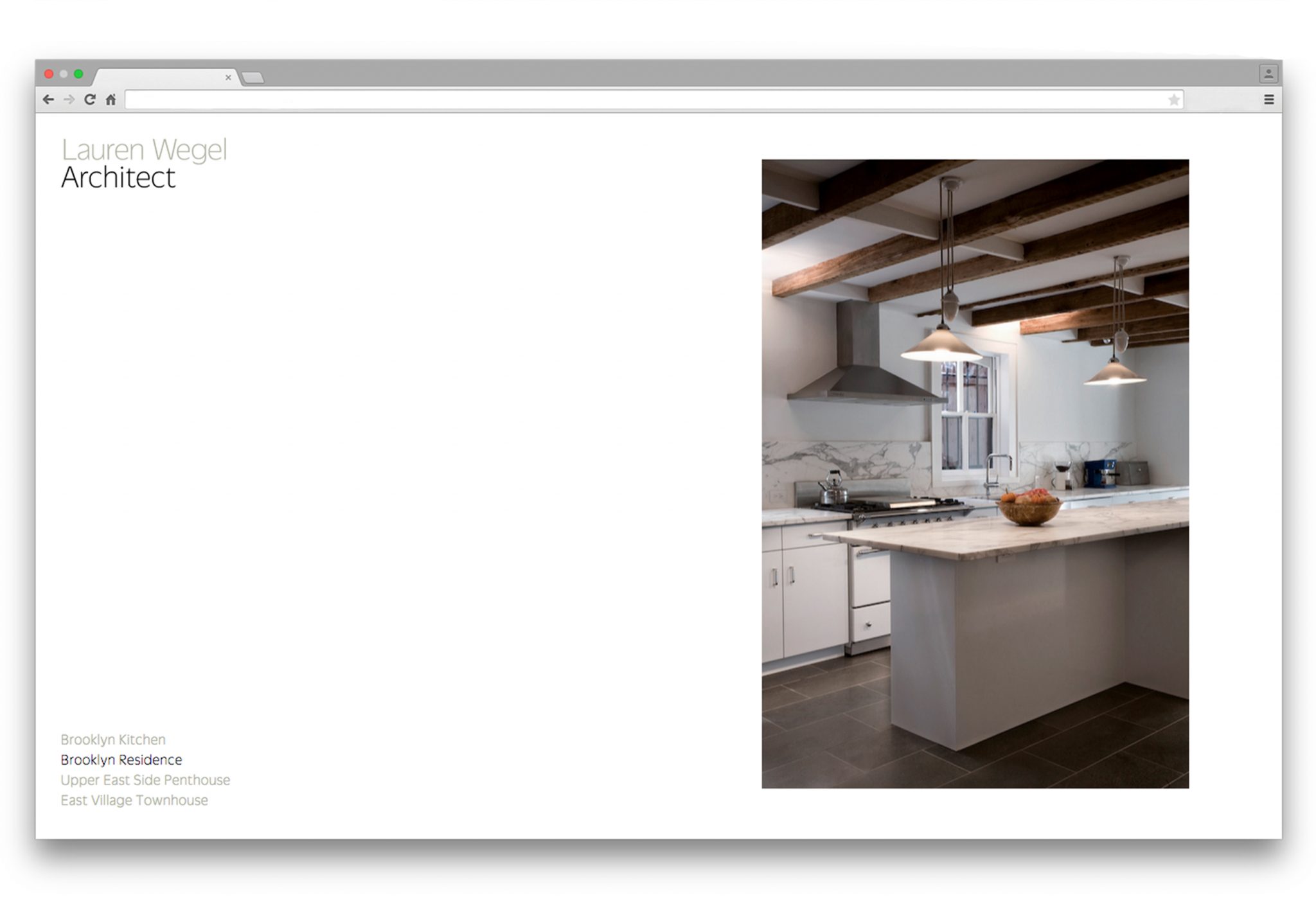
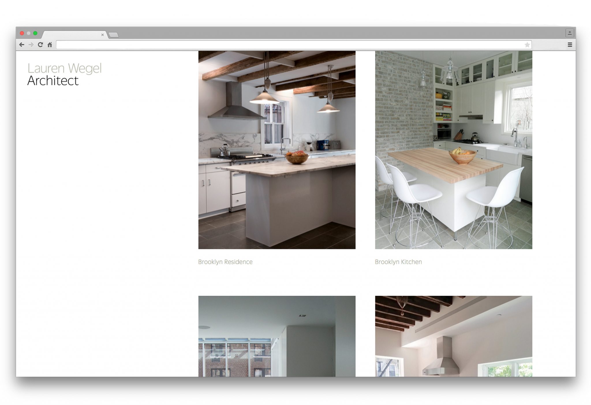
Similarly, in designing her website, we wanted to present her projects in a minimalist way that showcased her precision and harmony. We found inspiration in fashion editorials, where a strict relationship of images invites the reader to pause and take a closer look at the content. Her work is shown in photographs both cropped and fullscreen in order to create a focus on detail as well as a framing of the work as a whole. The partial advancement of the slideshow images crops the fullscreen images into halves, allowing for details to be focused on and nearly doubling the quantity of images.
Storefront—Being
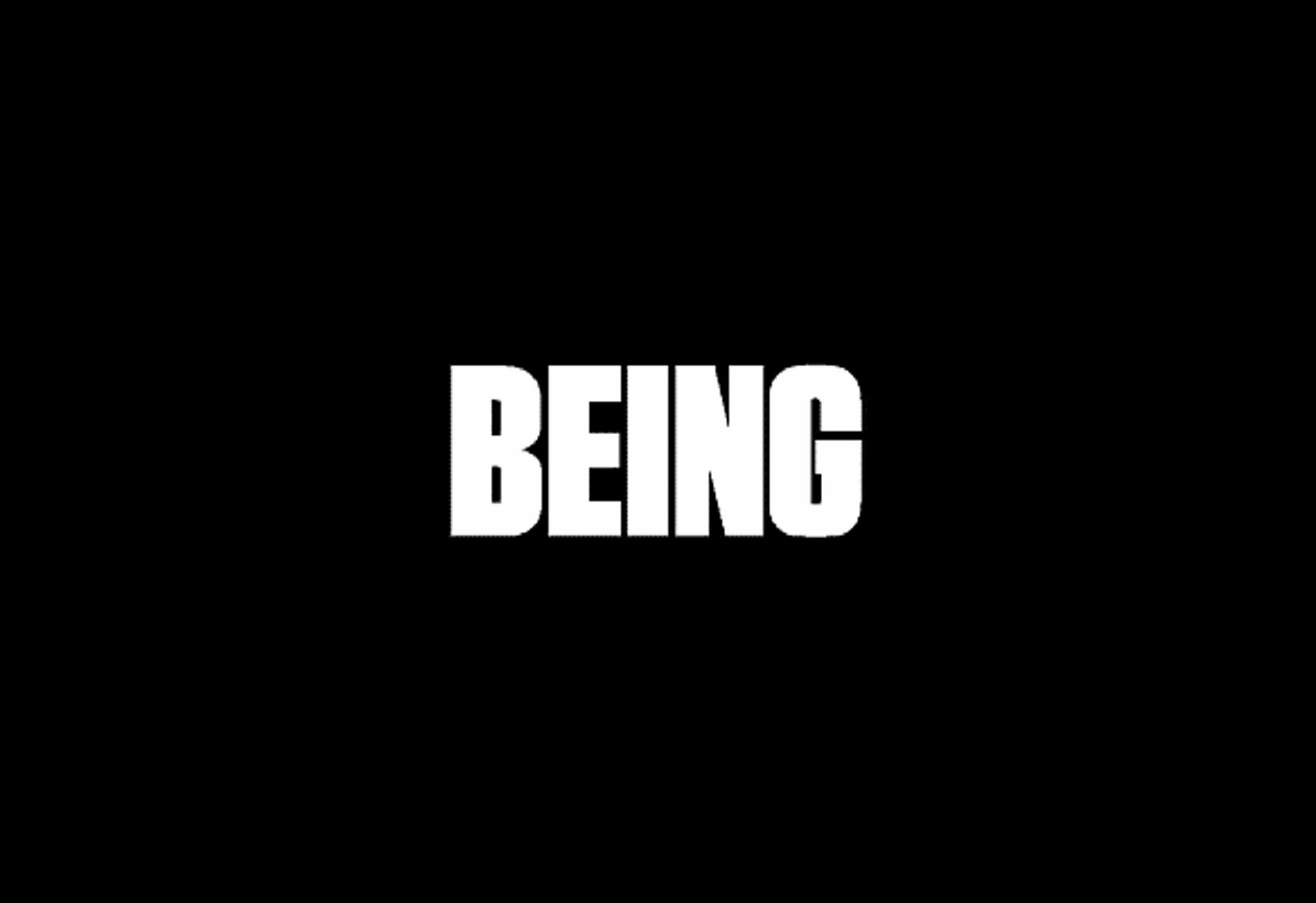
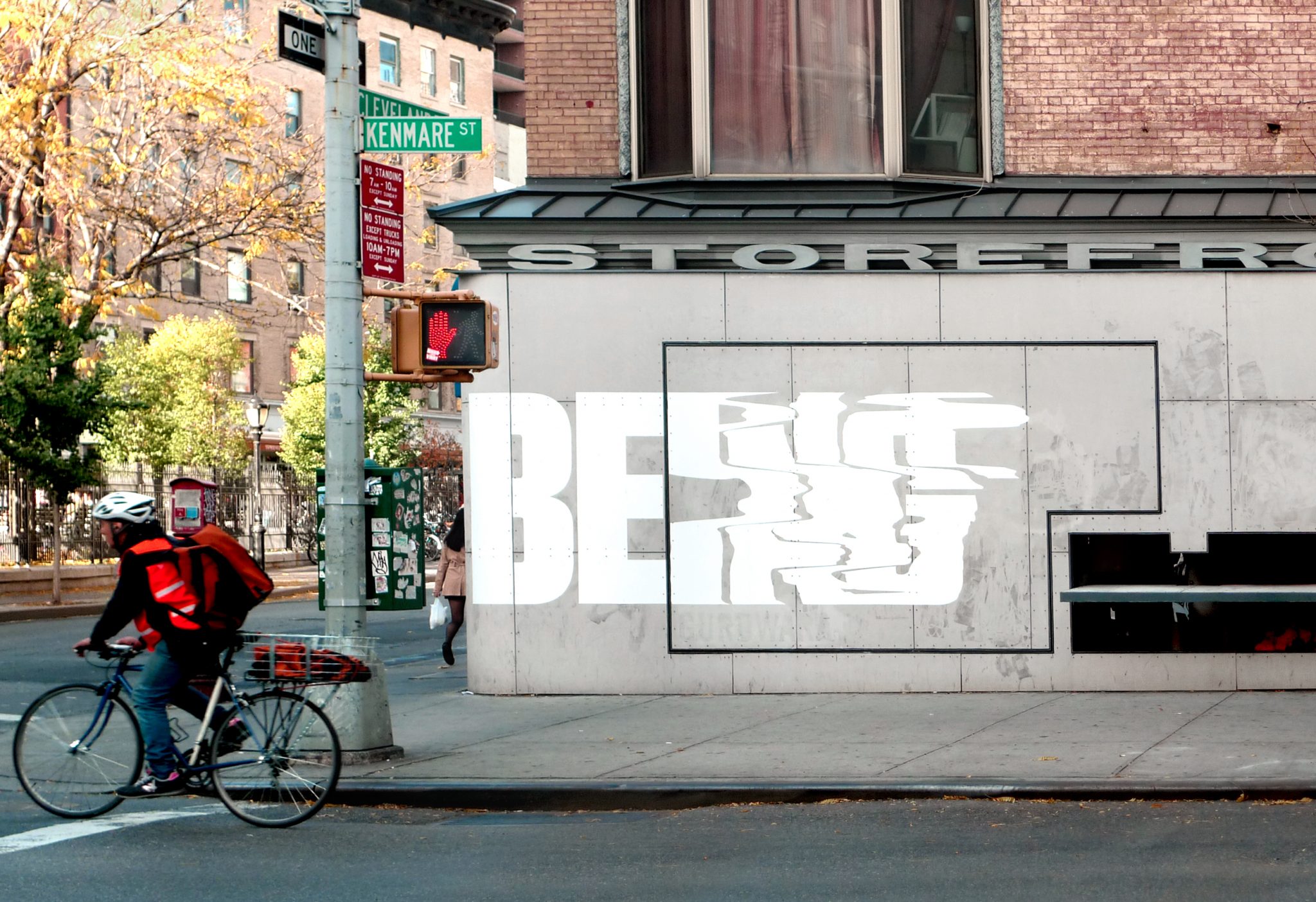
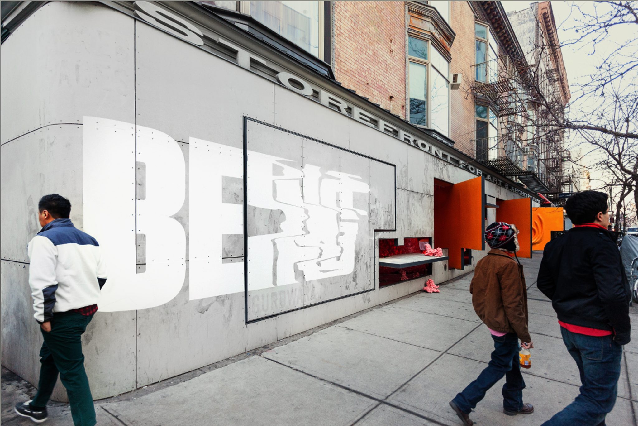
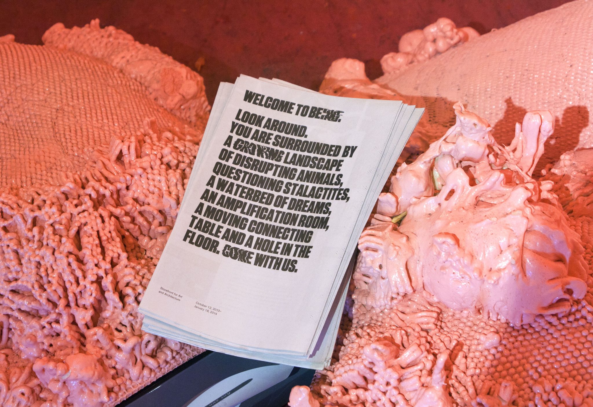
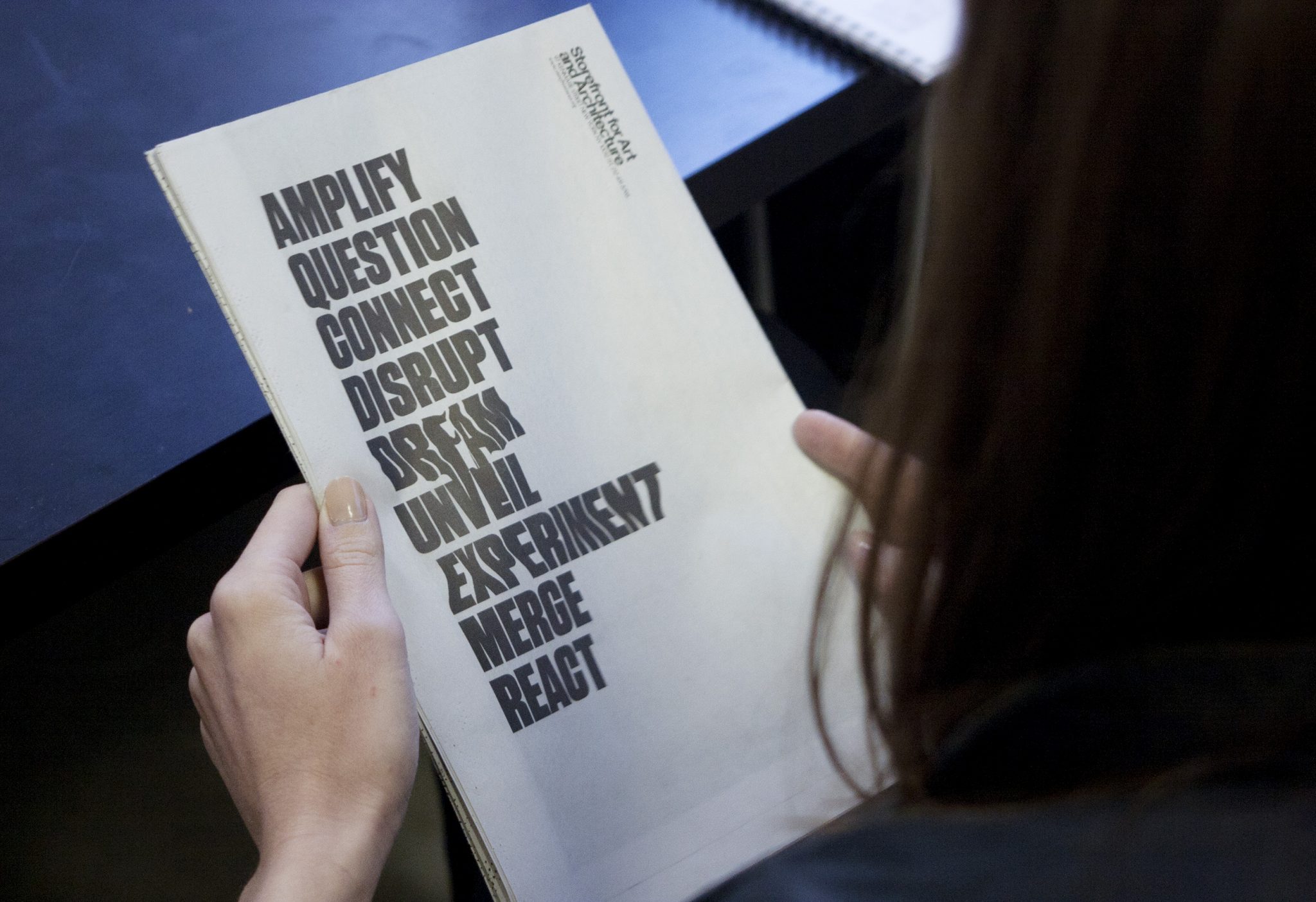
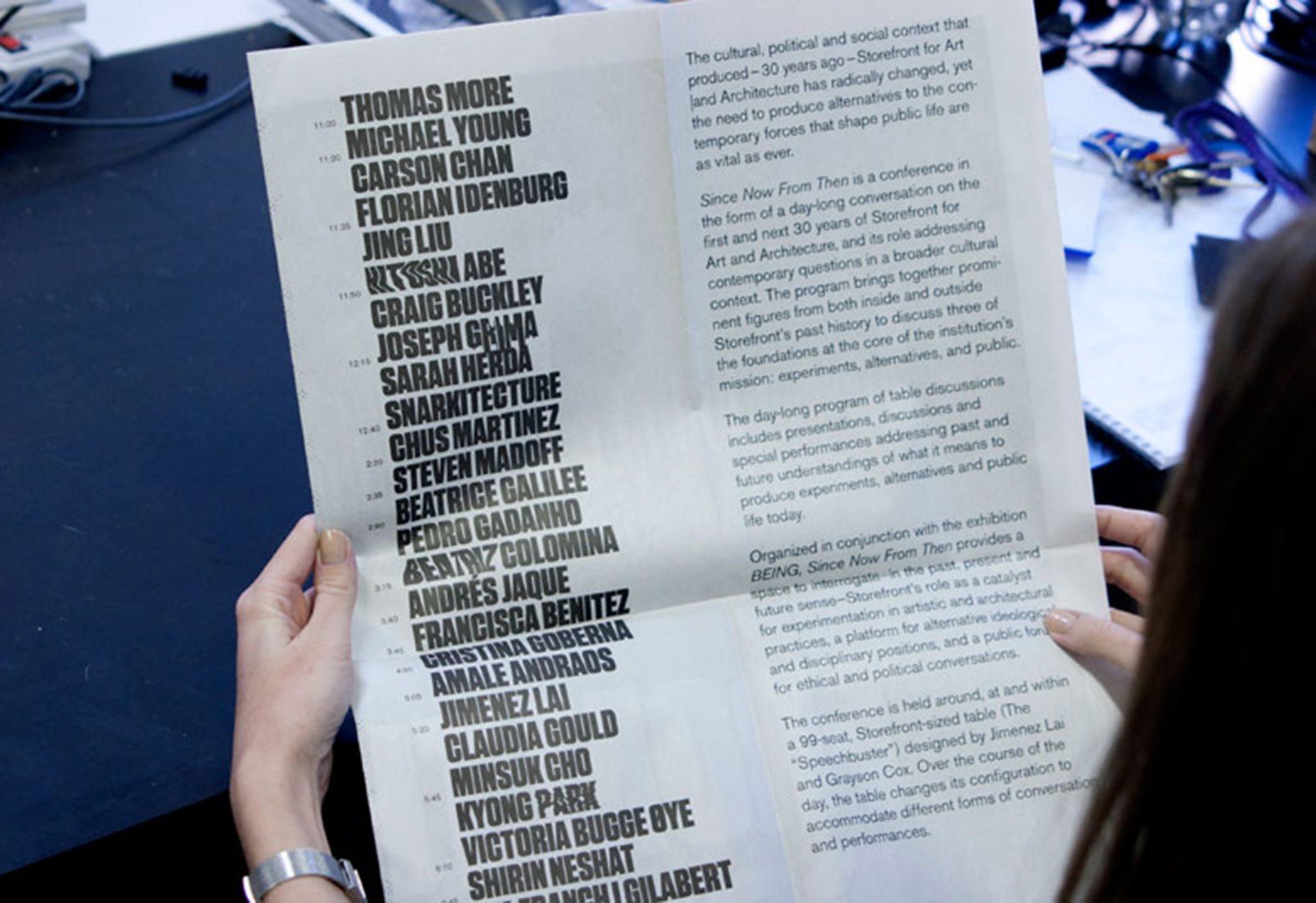
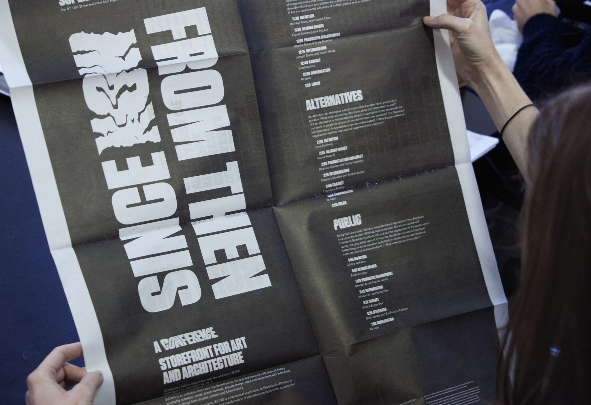
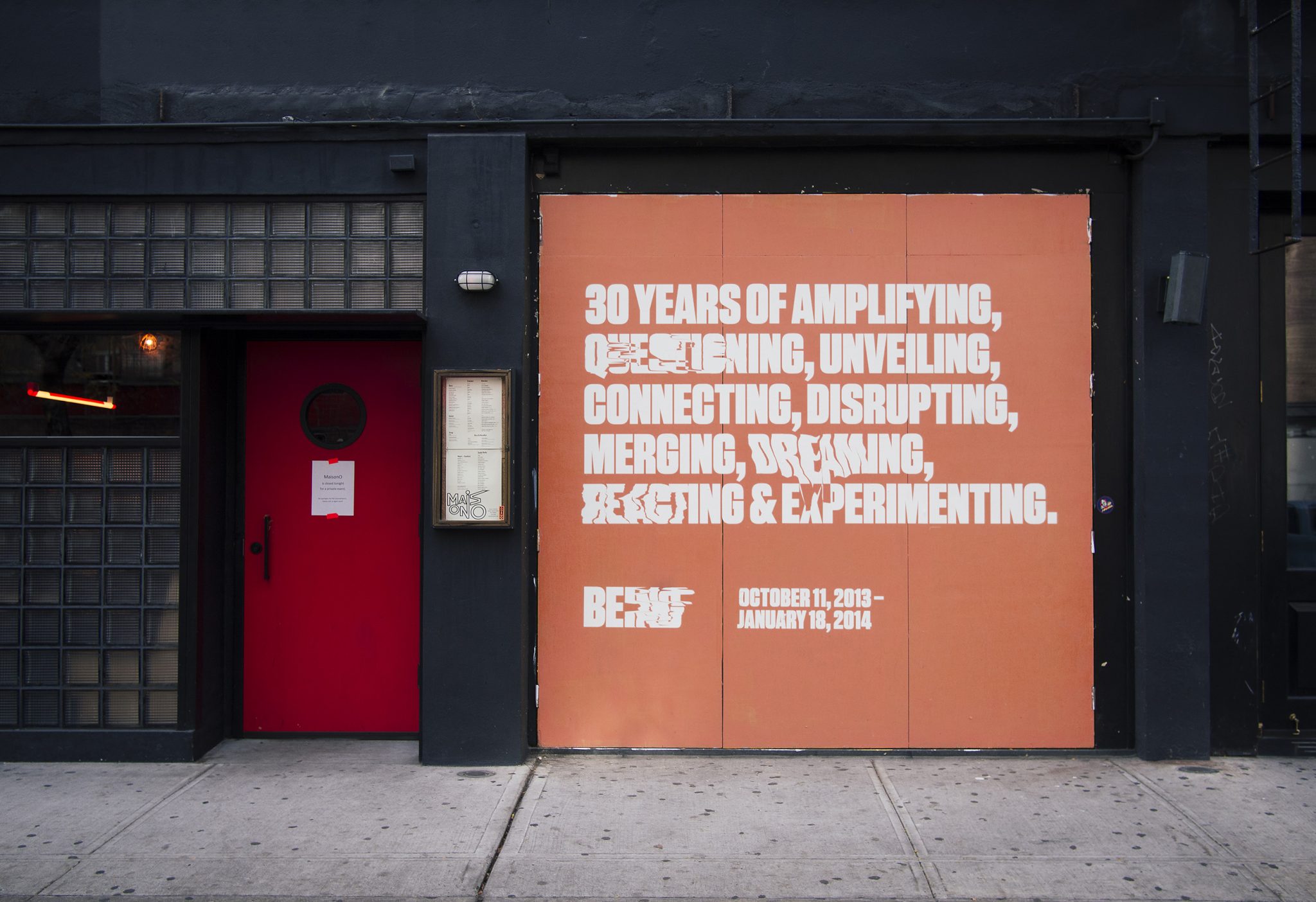
We collaborated with the Storefront for Art and Architecture, for their 30-year celebration show, titled Being. The show was an experiment about Being Storefront in the form of 9 actions. Our challenge was to create an identity that was alive, and we created a typographic form that had something like a pulse, with an on-beat and an off-beat.
The identity is both a rational, high impact graphic that is clearly legible, and also a chaotic graphic form whose extreme instances melt into abstraction. The pulse appears in the print work in randomly selected words within the various program texts. The identity maintains readability and graphic impact, and allows for unique variations to occur. Our black and white palette reduced the message into didactic form alone, and highly contrasted the pink, fleshy architecture of the show.
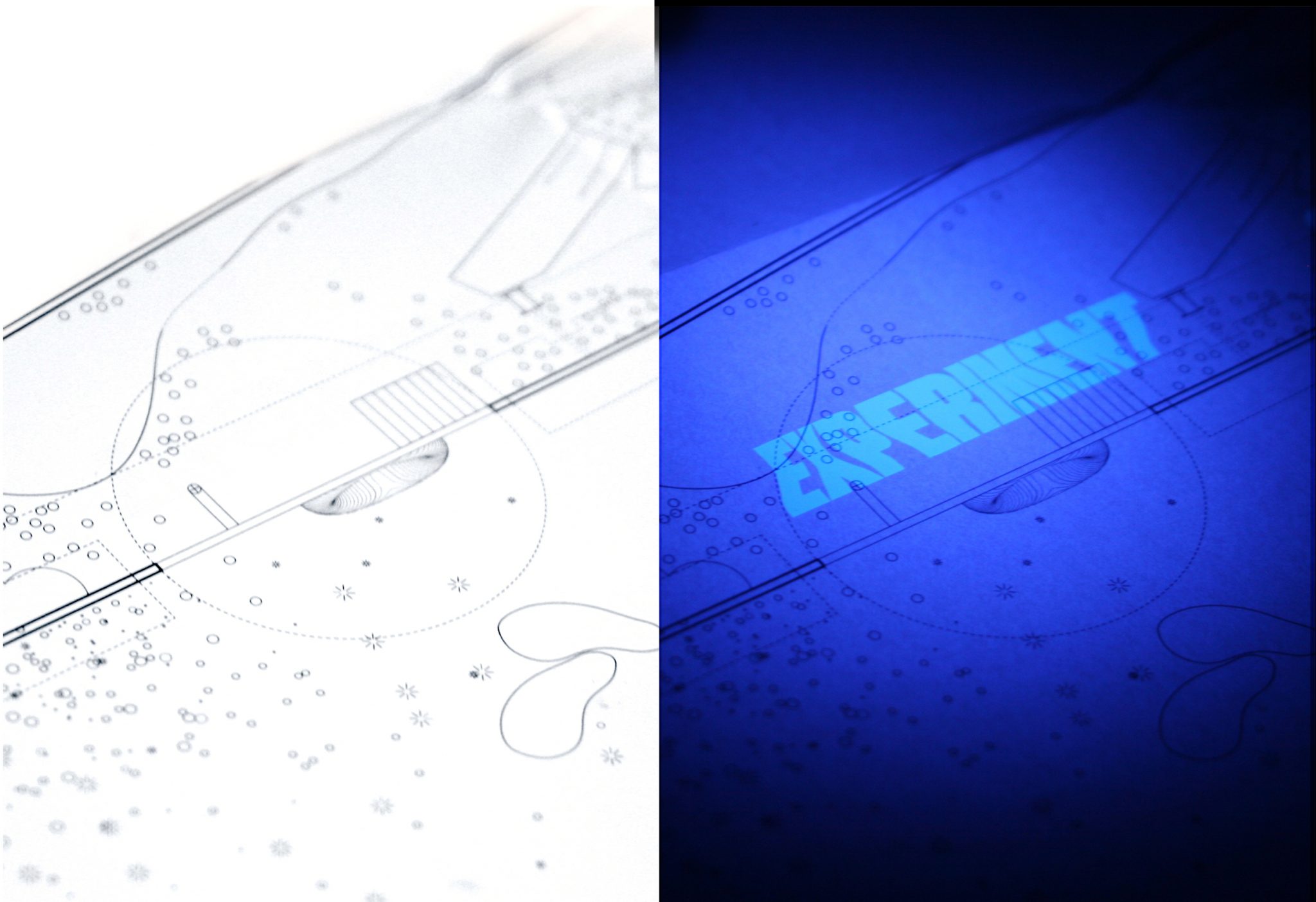
We designed a limited-edition print guide to the exhibition. It used Ultraviolet inks to make the piece come alive only when in the black-light lit areas of the gallery.
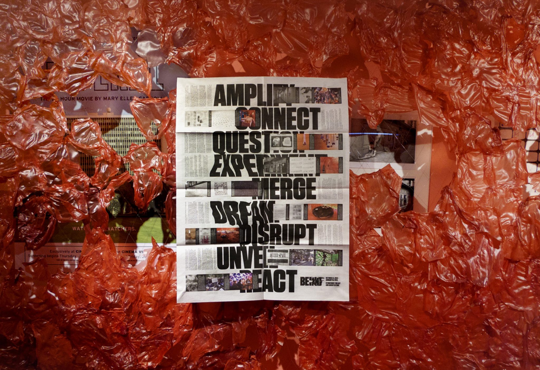
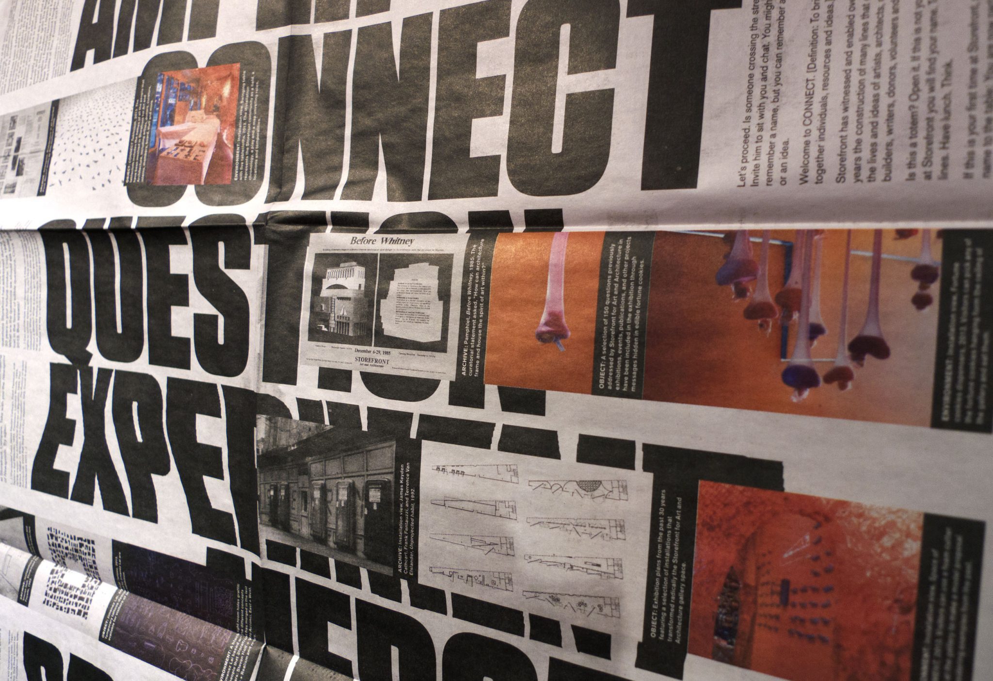
Newsprint broadsheets were designed to catalogue the show, and to announce the related conference. The poster side of the newsprint featured clusters of 3 images (archival, object and environment) that relate Storefront events to each of the nine verbs the exhibition used to express the idea of “Storefront-ness.”
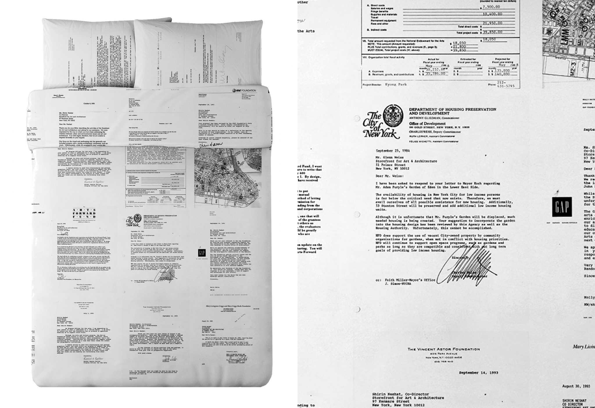
For the exhibition we designed limited-edition Queen duvet set and pillows for the waterbed that appeared in the show. It uses rejection letters of failed grant applications from Storefront’s history— displaying all of the failed ‘dreams’ of past Storefront directors.
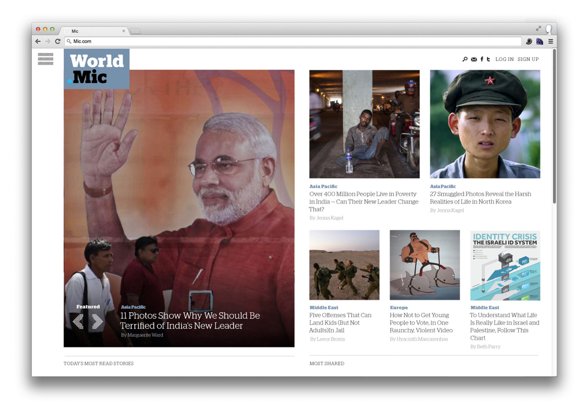
Mic.com Rebrand
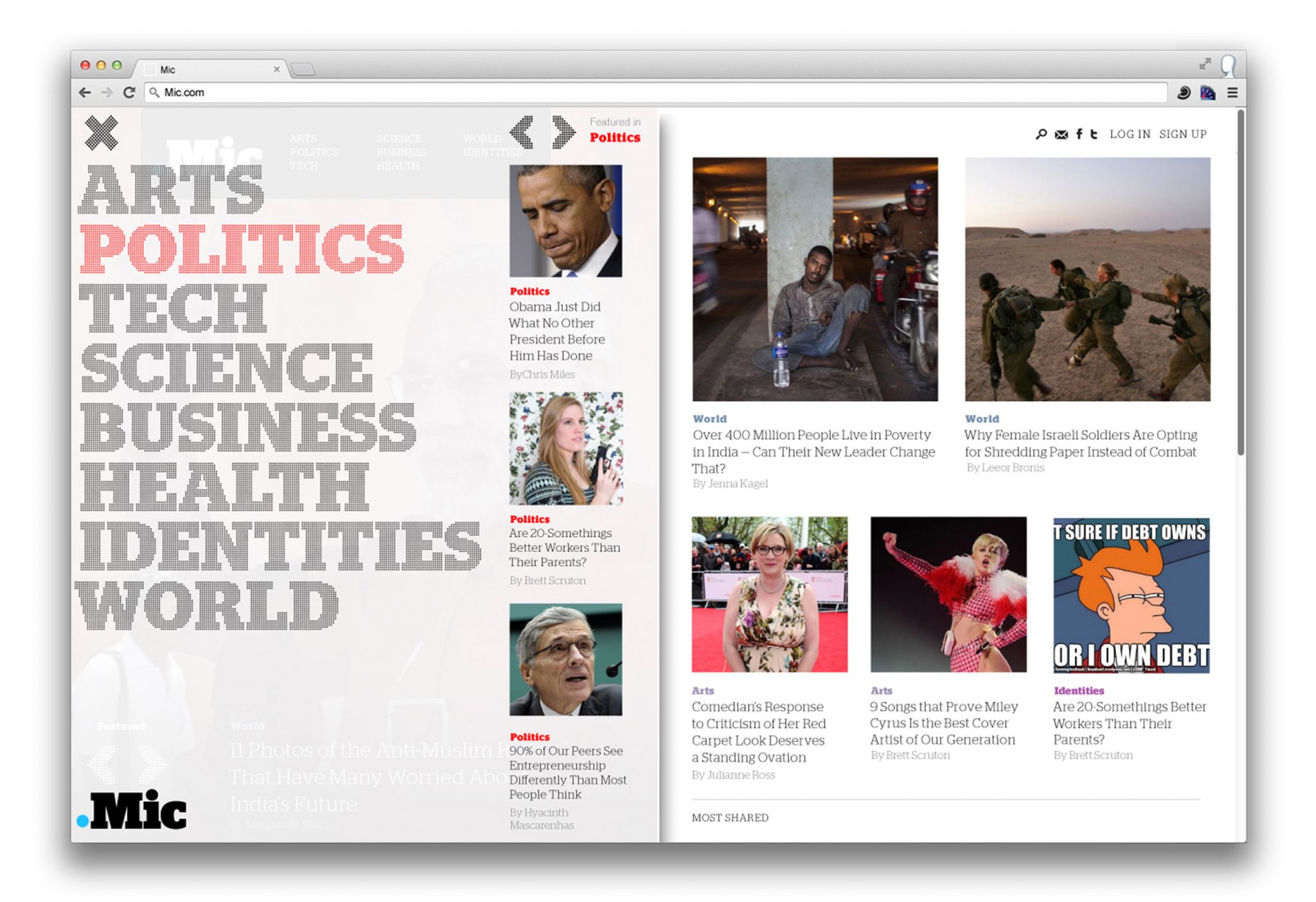
In redesigning the Mic brand, we avoided anything gimmicky or overtly stylish— their audience was too media-savvy for that. Instead, the new Mic logotype and graphic system had to project their engaged, socially-conscious voice, and feel unpretentious, confident and most importantly: casually smart.
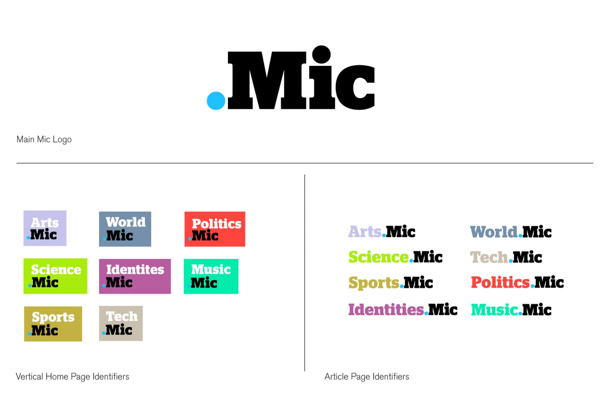
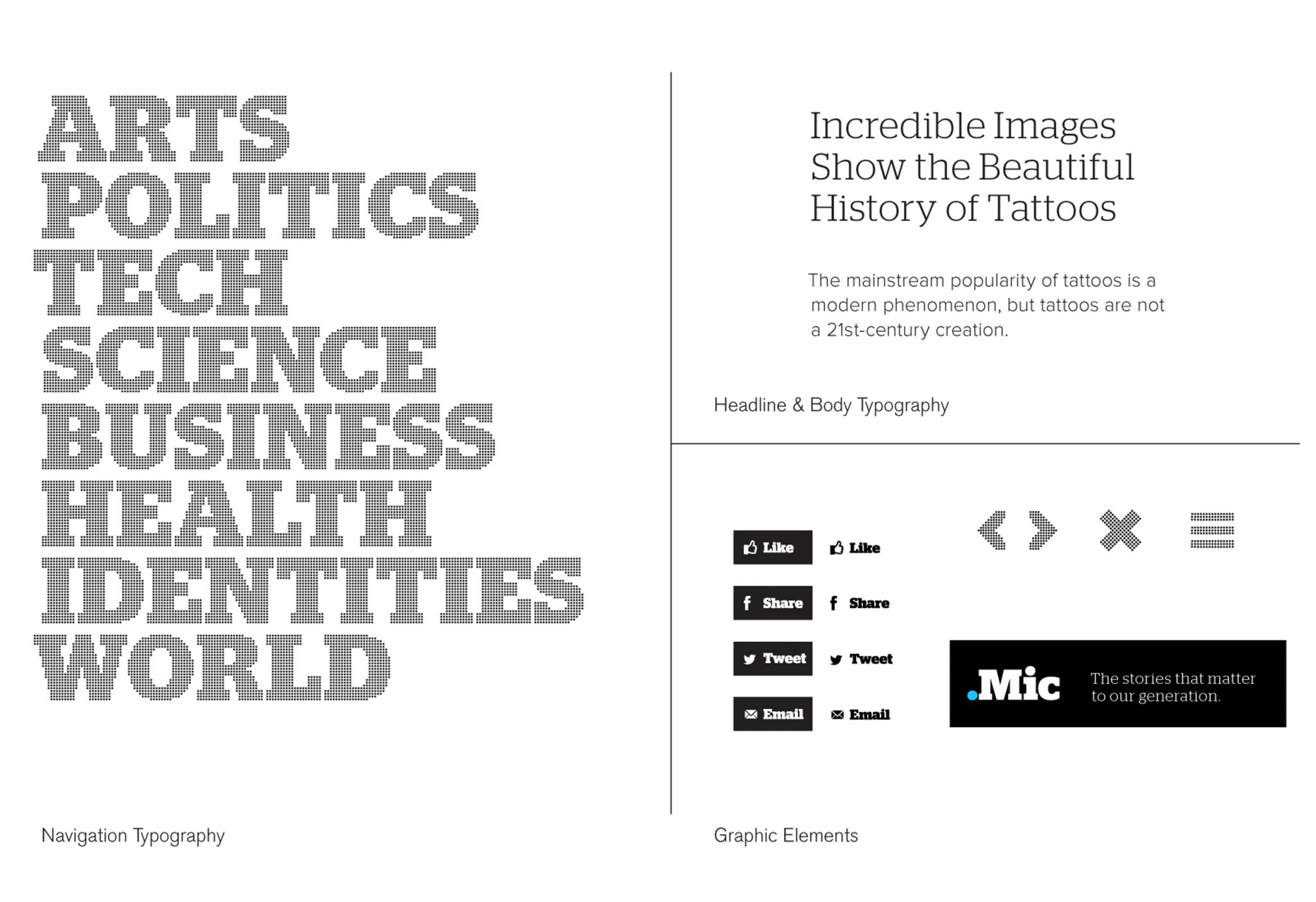
We mulled over the name a lot — “Mic,” an abbreviation (so Millennial) for ‘microphone.’ We kept coming back to the dot-pattern typically found on microphone icons. The dot also surfaced in the new verticals nomenclature — the sports vertical would be ‘Sports.Mic’, the music vertical would be ‘Music.Mic’ and so-on — and thus the dot became the primary visual element of the brand. The identity extends into dot-matrix typography, and takes on a tech-savvy feeling, something friendly and credible without being authoritative.
As a whole the new Mic identity is an interlocking system of parts — the main ‘Mic’ logo, the dot matrix-typography, the bold identifying verticals colors, all connected by the dot. The system gives the brand its real visual strength. All the parts of the identity — vertical pages, social media avatars, overall Mic logo—reinforce each other without over-repeating the same graphic mark. In this case, a strong identity is an elegant system of parts that plays out in different platforms, emphasizing Mic’s Millennial aptitude.