Mic.com Rebrand
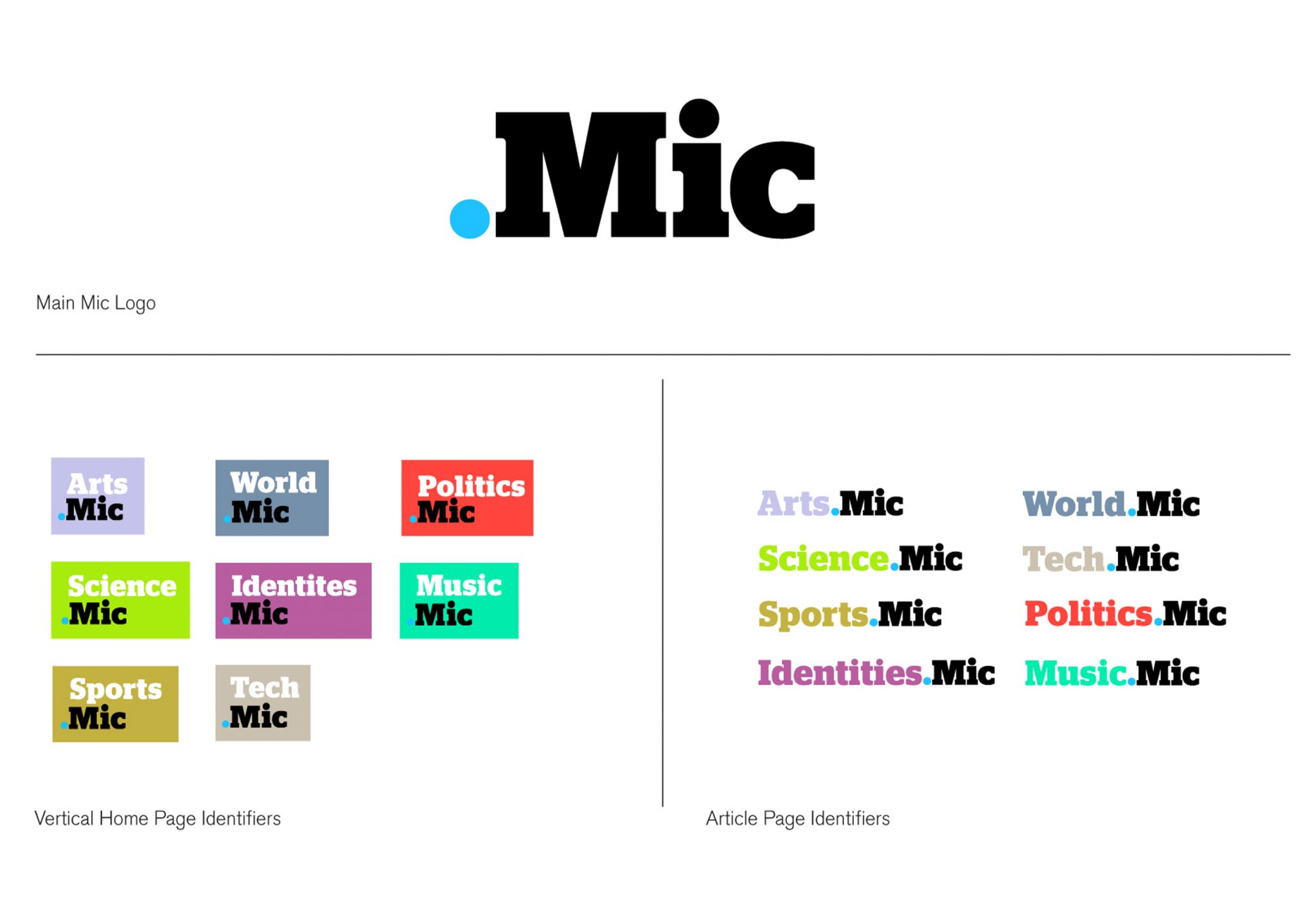
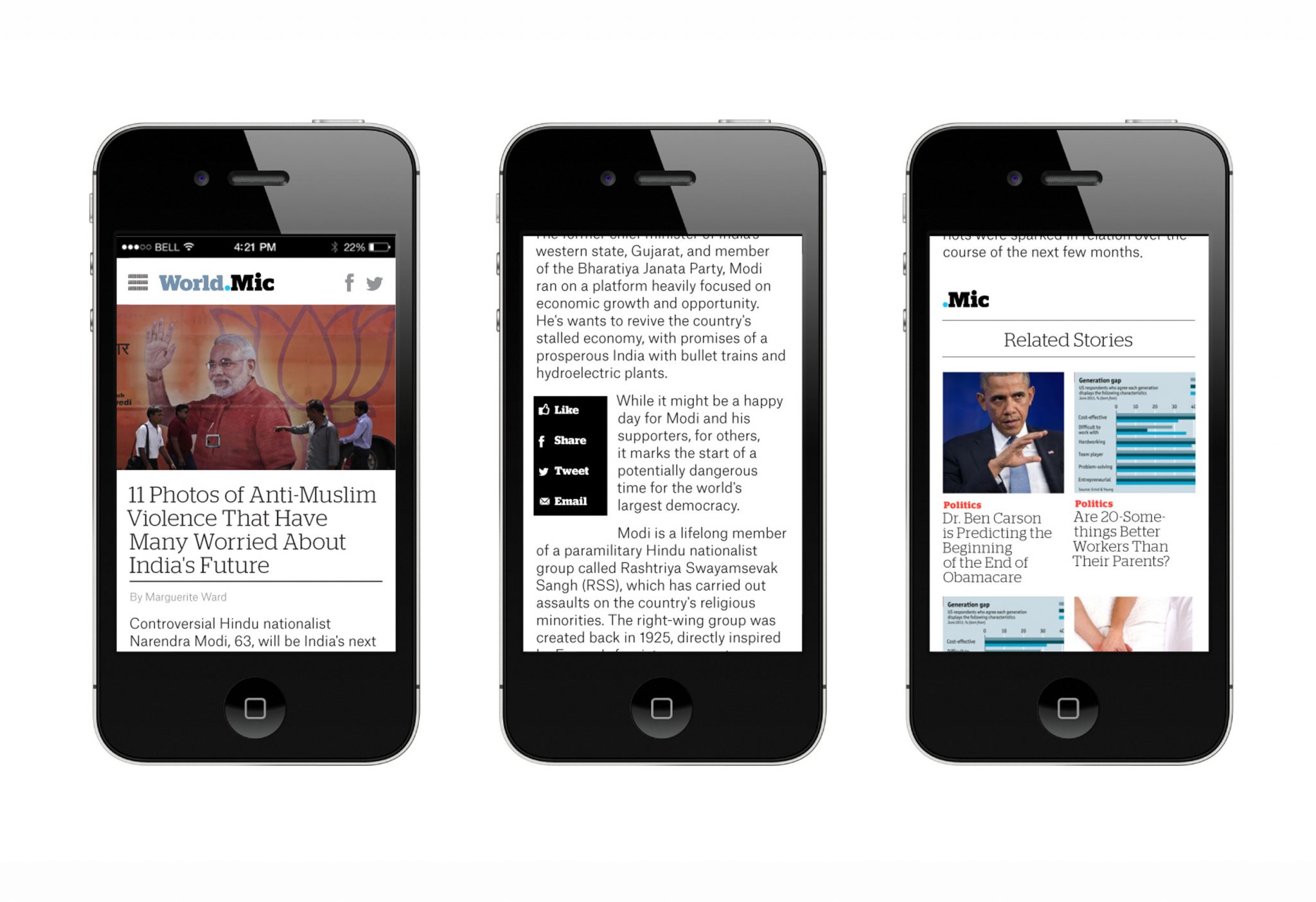
In redesigning the Mic brand, we avoided anything gimmicky or overtly stylish— their audience was too media-savvy for that. Instead, the new Mic logotype and graphic system had to project their engaged, socially-conscious voice, and feel unpretentious, confident and most importantly: casually smart.
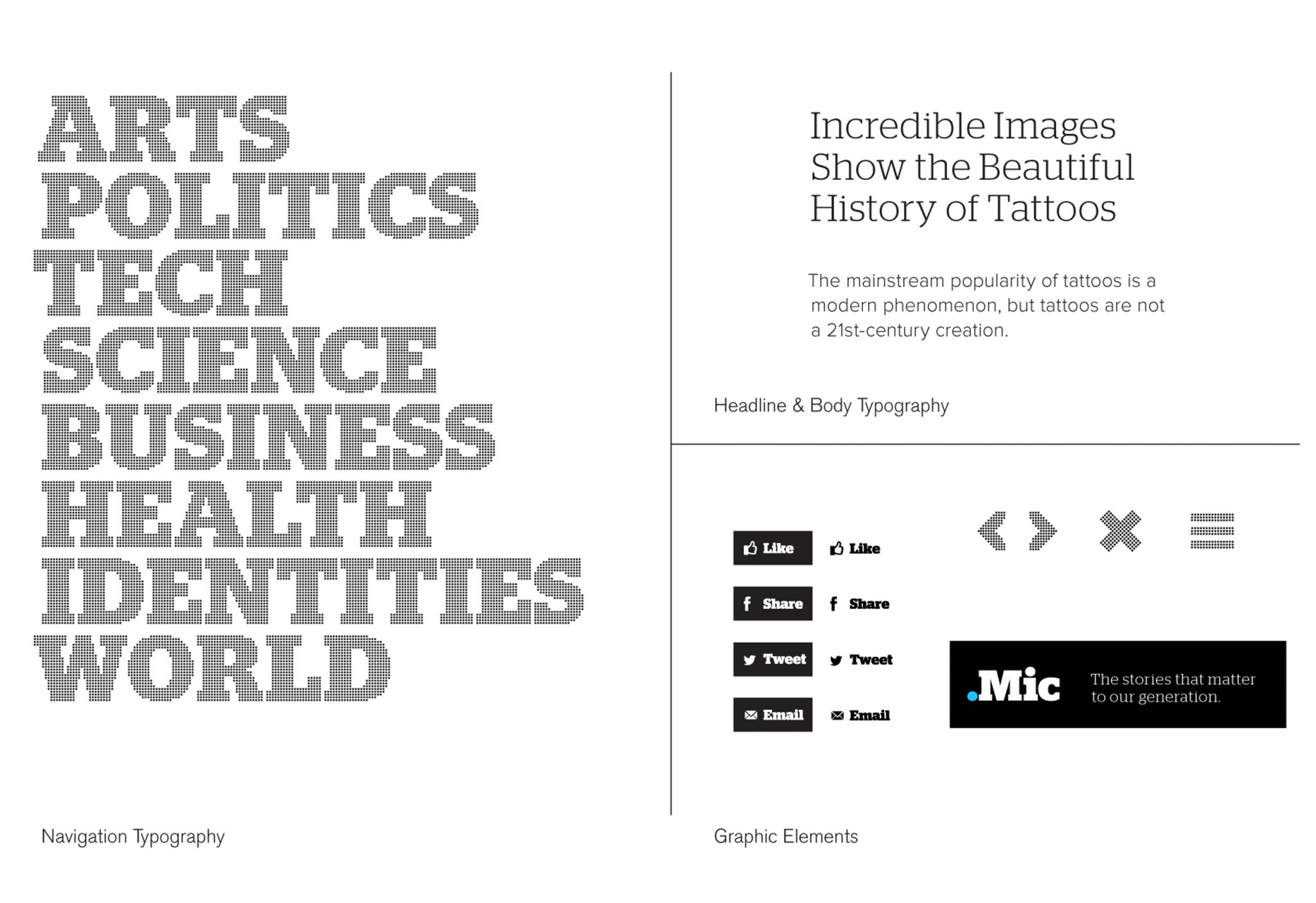
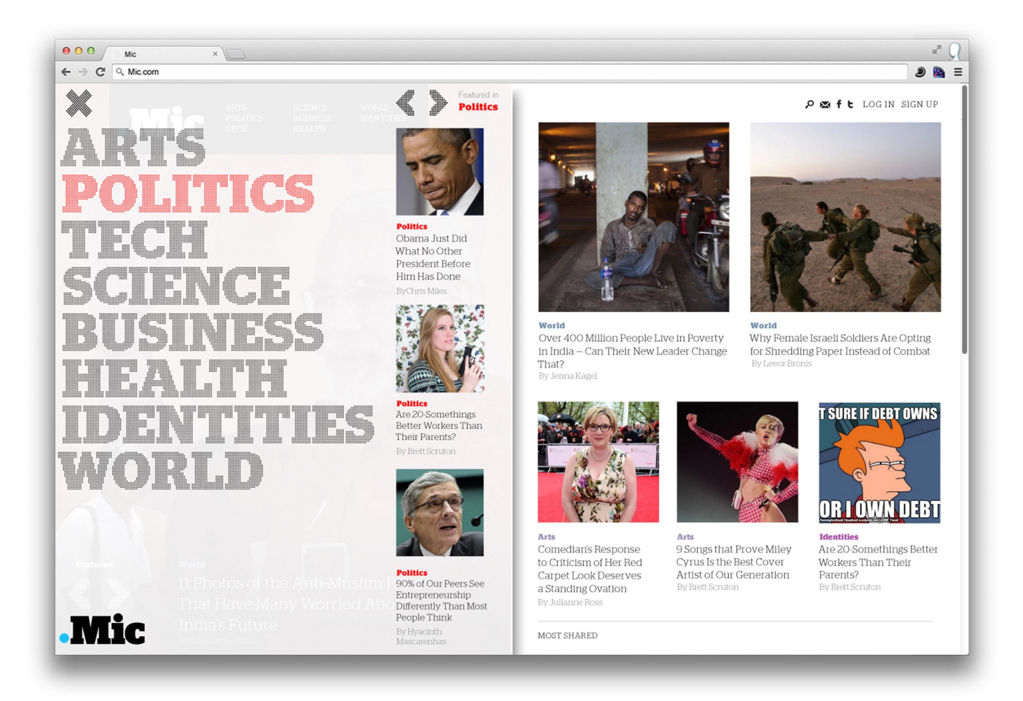
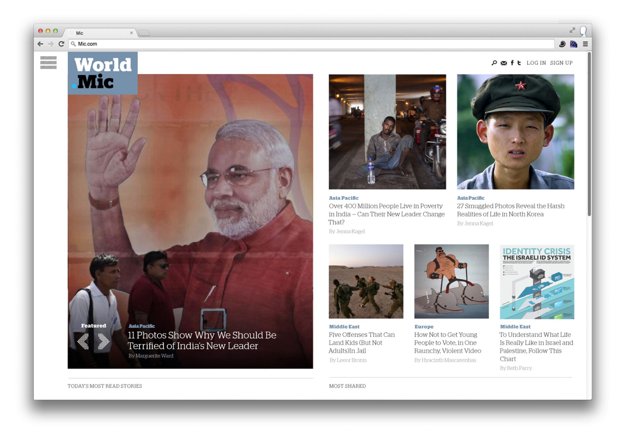
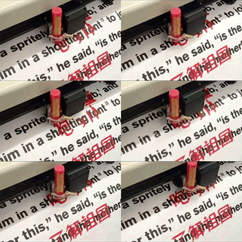
We mulled over the name a lot — “Mic,” an abbreviation (so Millennial) for ‘microphone.’ We kept coming back to the dot-pattern typically found on microphone icons. The dot also surfaced in the new verticals nomenclature — the sports vertical would be ‘Sports.Mic’, the music vertical would be ‘Music.Mic’ and so-on — and thus the dot became the primary visual element of the brand. The identity extends into dot-matrix typography, and takes on a tech-savvy feeling, something friendly and credible without being authoritative.
As a whole the new Mic identity is an interlocking system of parts — the main ‘Mic’ logo, the dot matrix-typography, the bold identifying verticals colors, all connected by the dot. The system gives the brand its real visual strength. All the parts of the identity — vertical pages, social media avatars, overall Mic logo—reinforce each other without over-repeating the same graphic mark. In this case, a strong identity is an elegant system of parts that plays out in different platforms, emphasizing Mic’s Millennial aptitude.
After Belonging: Identity
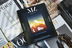
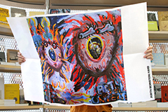
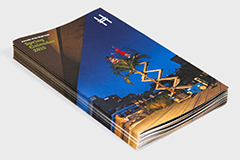
This is our work is a graphic design studio run by Megan Feehan and collaborators. Our work includes visual identities, publications, exhibitions, print collateral and interactive projects for architecture, art and miscellaneous institutions. We specialize in being design generalists, in not fetishizing technology over communication, and letting experiment and play guide form and format decisions.
Our design process incorporates research, analysis, and genuine curiosity to determine the best outcome with the most impact, whatever the format. Our aim for every project is to produce memorable, meaningful and intuitive communication design. We love the full spectrum of the process — embracing grand concepts and granular production specifications equally.
Our clients include the Oslo Architecture Triennale 2016, Rhode Island School of Design, New Museum for Contemporary Art, Storefront for Art and Architecture, Brown University, David Brooks Studio, Post-Office Architectes, On Stellar Rays Gallery, and Lauren Wegel Architect, amongst others. The studio was founded in New York City in 2013, and is based in lower Manhattan.
2015 © This is our work
