Interrupt 3: Language Art Conference
In the spring of 2015 Brown University hosted the third annual “Interrupt” conference, an event created by the Digital Language Arts program of the Department of Literary Arts. This conference explored ways that coding can create new forms of literature. The format of the conference included “Interrupt sessions” in which artists had five minutes to present their work but could be interrupted at any point by another presenter. In this way interruption itself became a protagonist, taking on various unexpected forms and playing with how people experienced interruption.
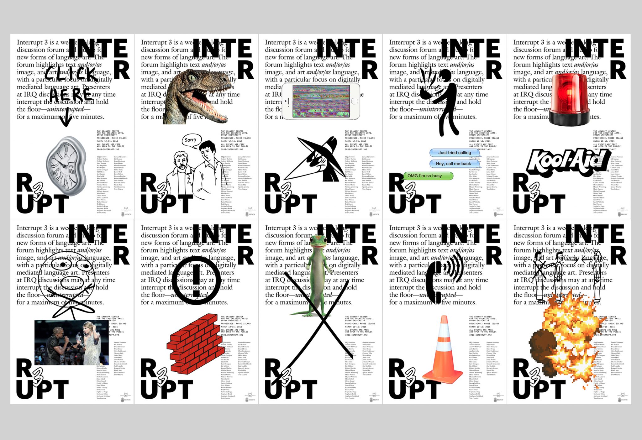
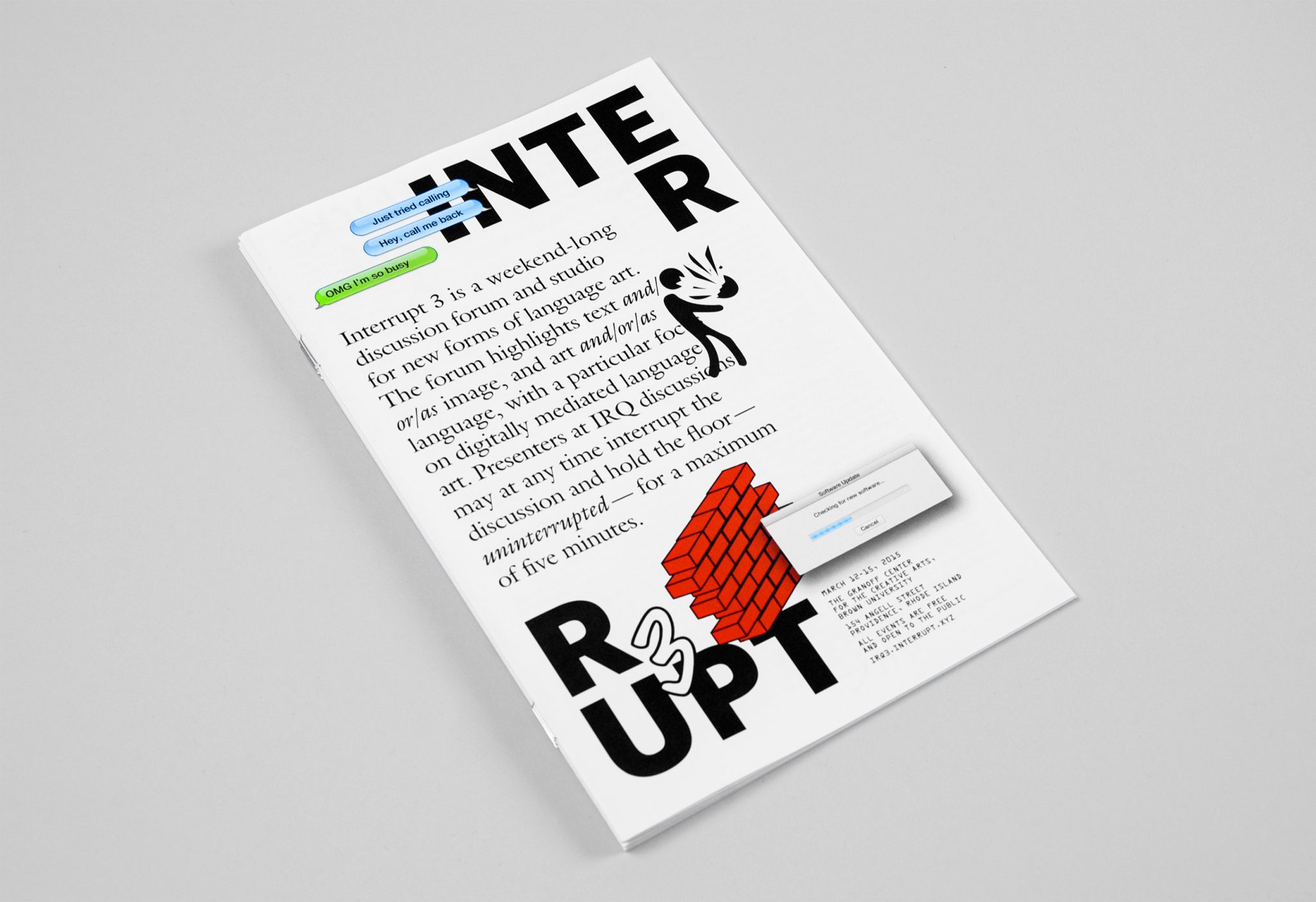
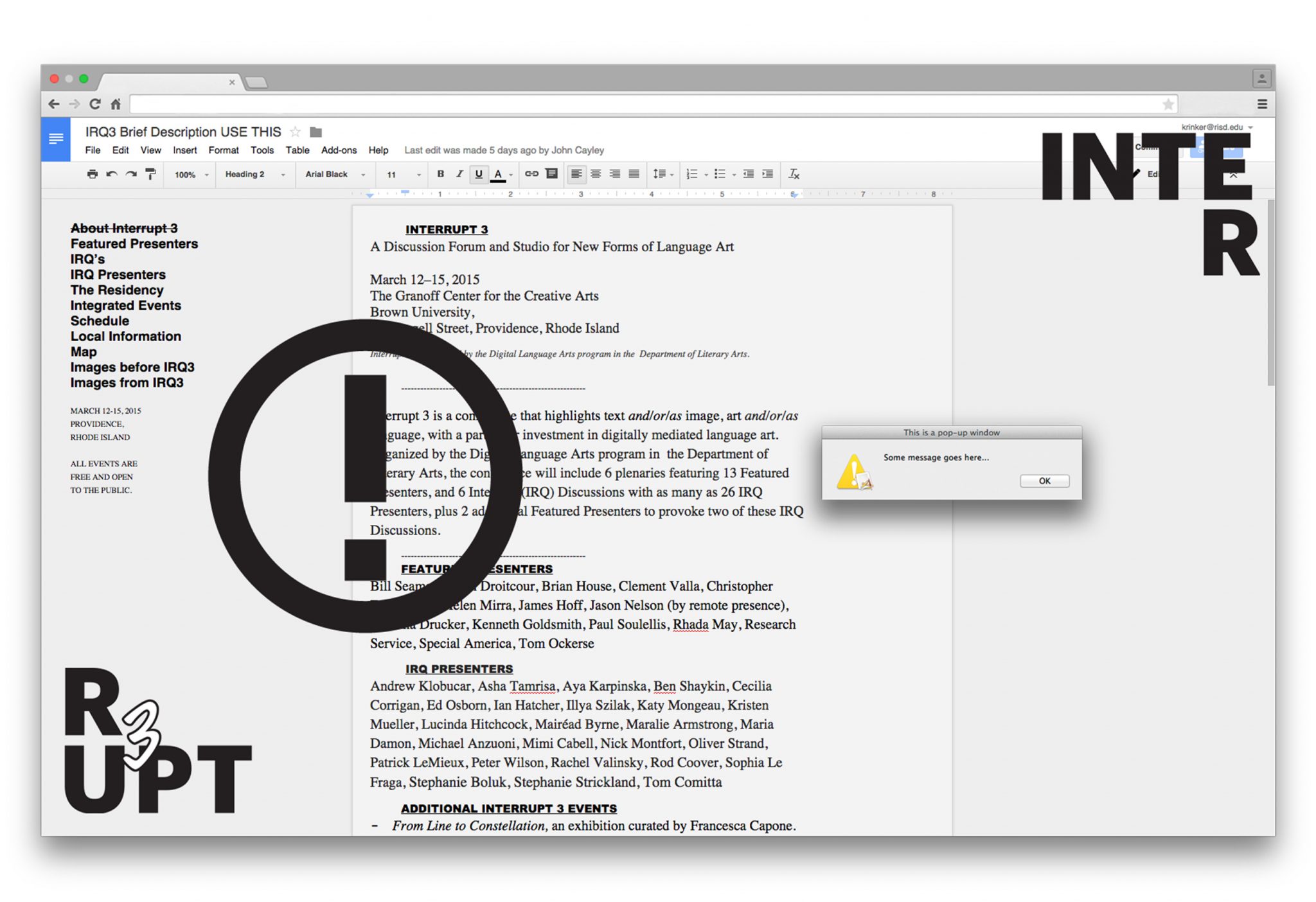
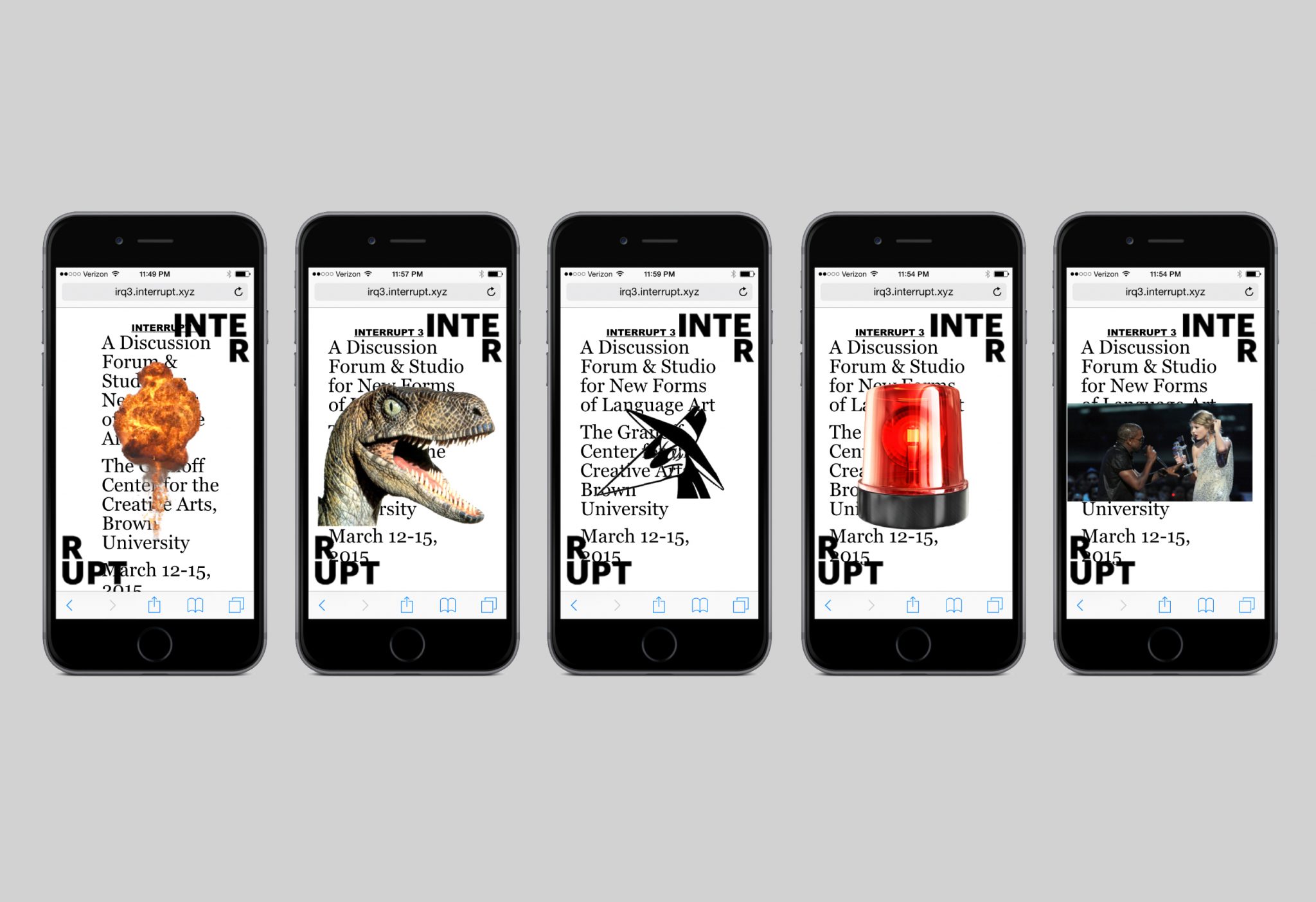
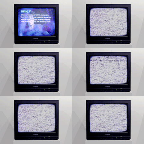
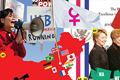
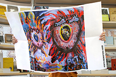
We were asked to create the identity of this event, including posters, a pamphlet, and the website. Two elements formed the core of the identity we would use throughout these materials: the logo with the word “Interrupt 3” split apart and in opposite corners, and seemingly random pop-up images that would appear actively on a screen or would surprise a reader on a printed page or surface.
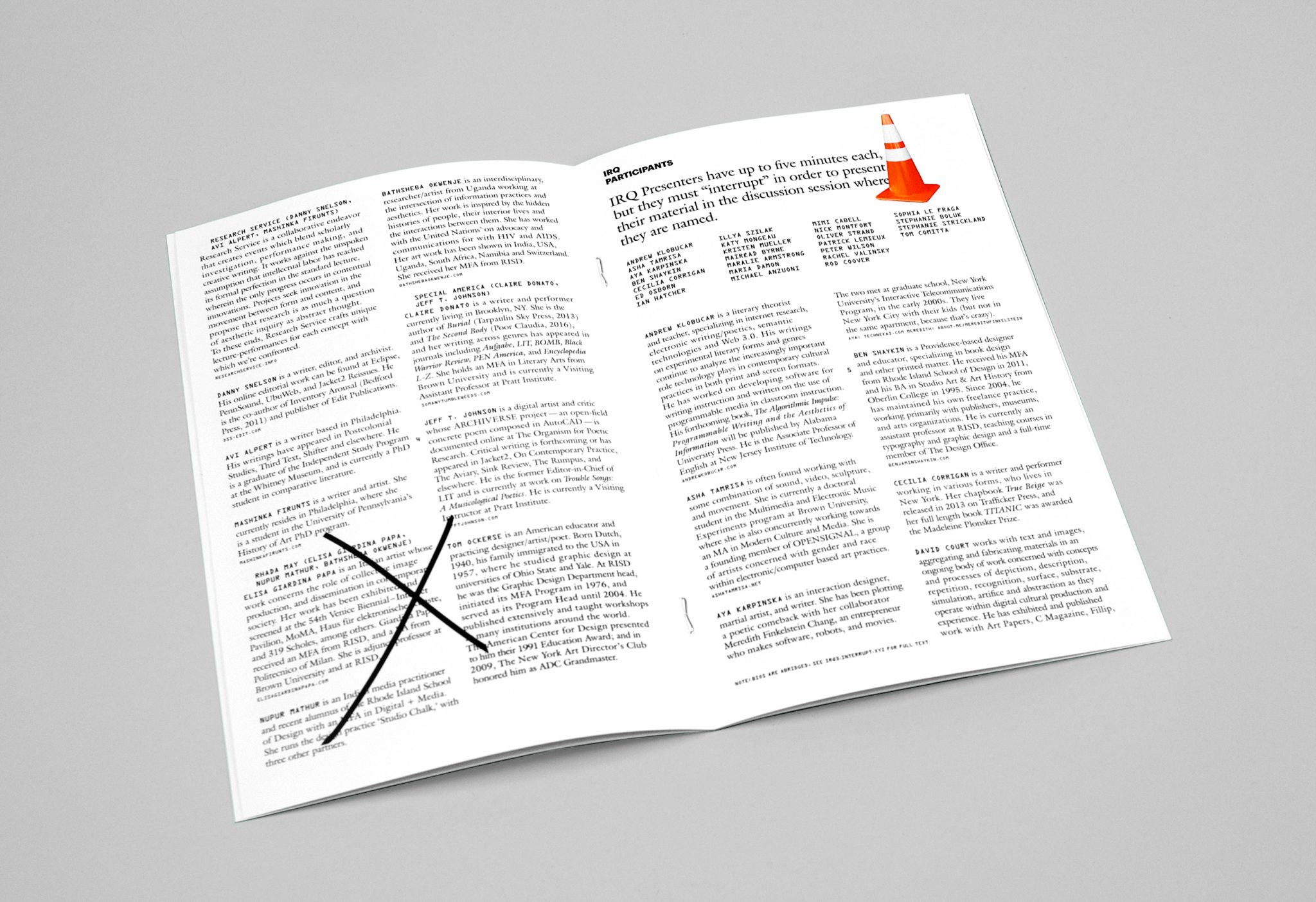
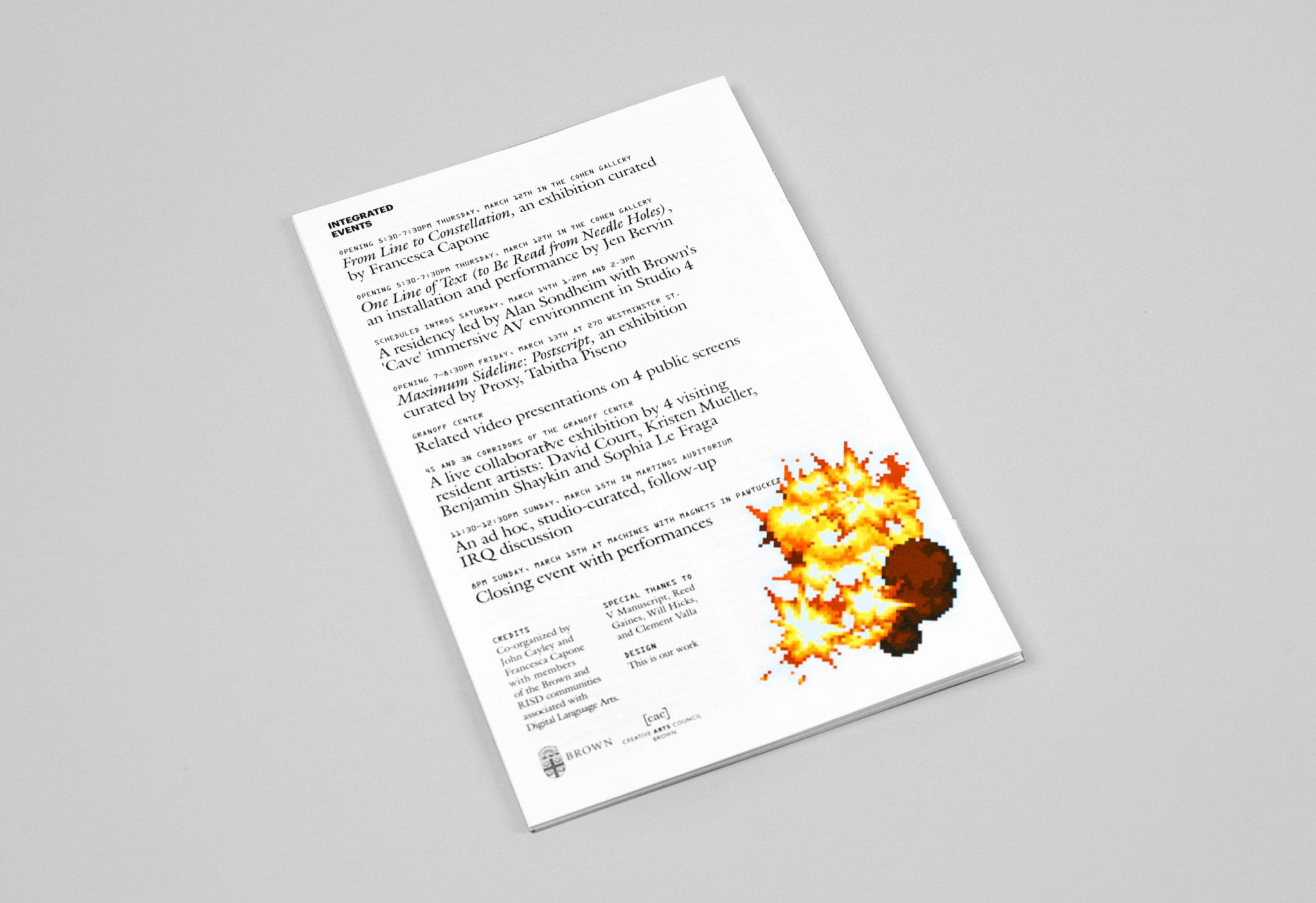
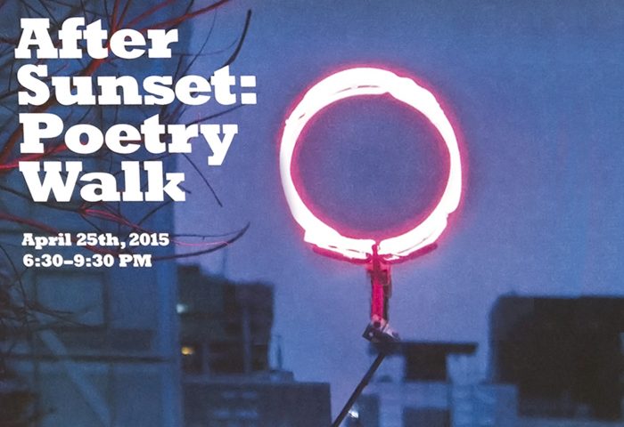
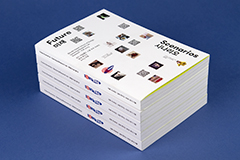
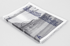
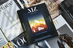
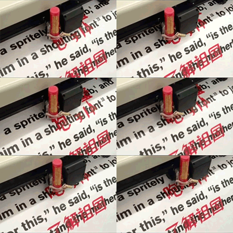
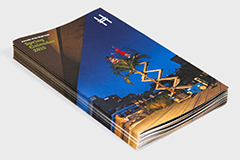
Our posters feature background text that is covered by interruptions of the logo and pop-up images. We created ten different versions of this poster, each with a unique combination of an illustration and photograph as pop-ups. While the pop-ups might seem haphazard, they were actually placed systematically and posters were shown in groups of three so that all text would be visible on at least one of the posters. In this way we made sure that the names of presenters would always be visible somewhere while also emphasizing the idea that the overriding narrative of the event are the interruptions themselves; a search for meaning will only be frustrated at some point. Pop-up pictures also occur throughout the pamphlet we created for the event, but in a way that is less obtrusive for the reader needing access to the information in print.
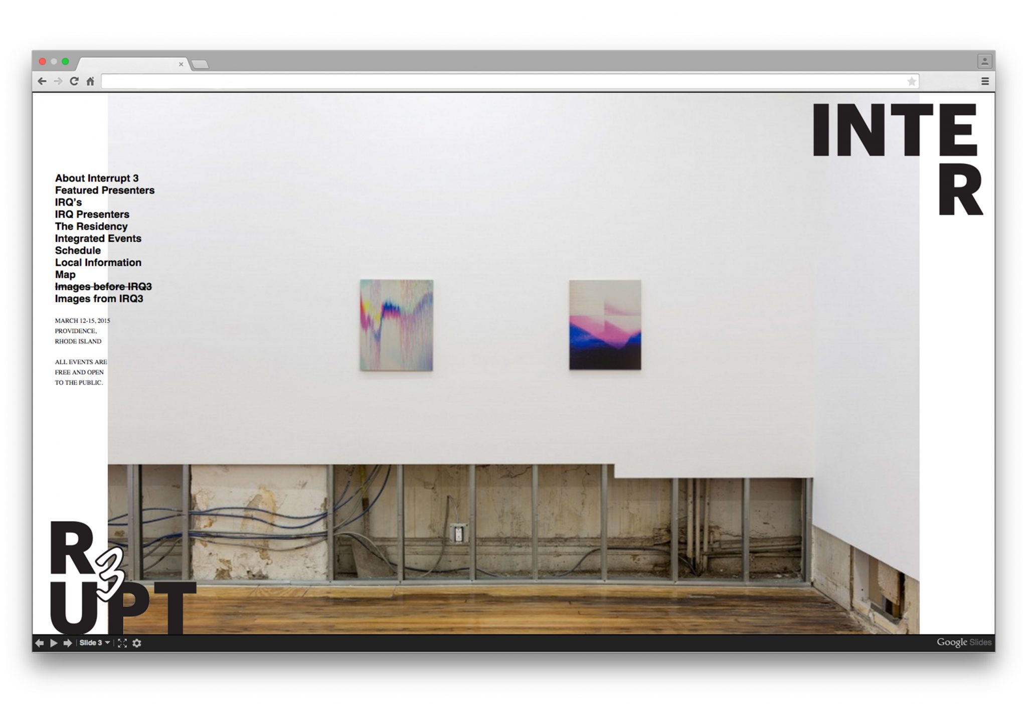
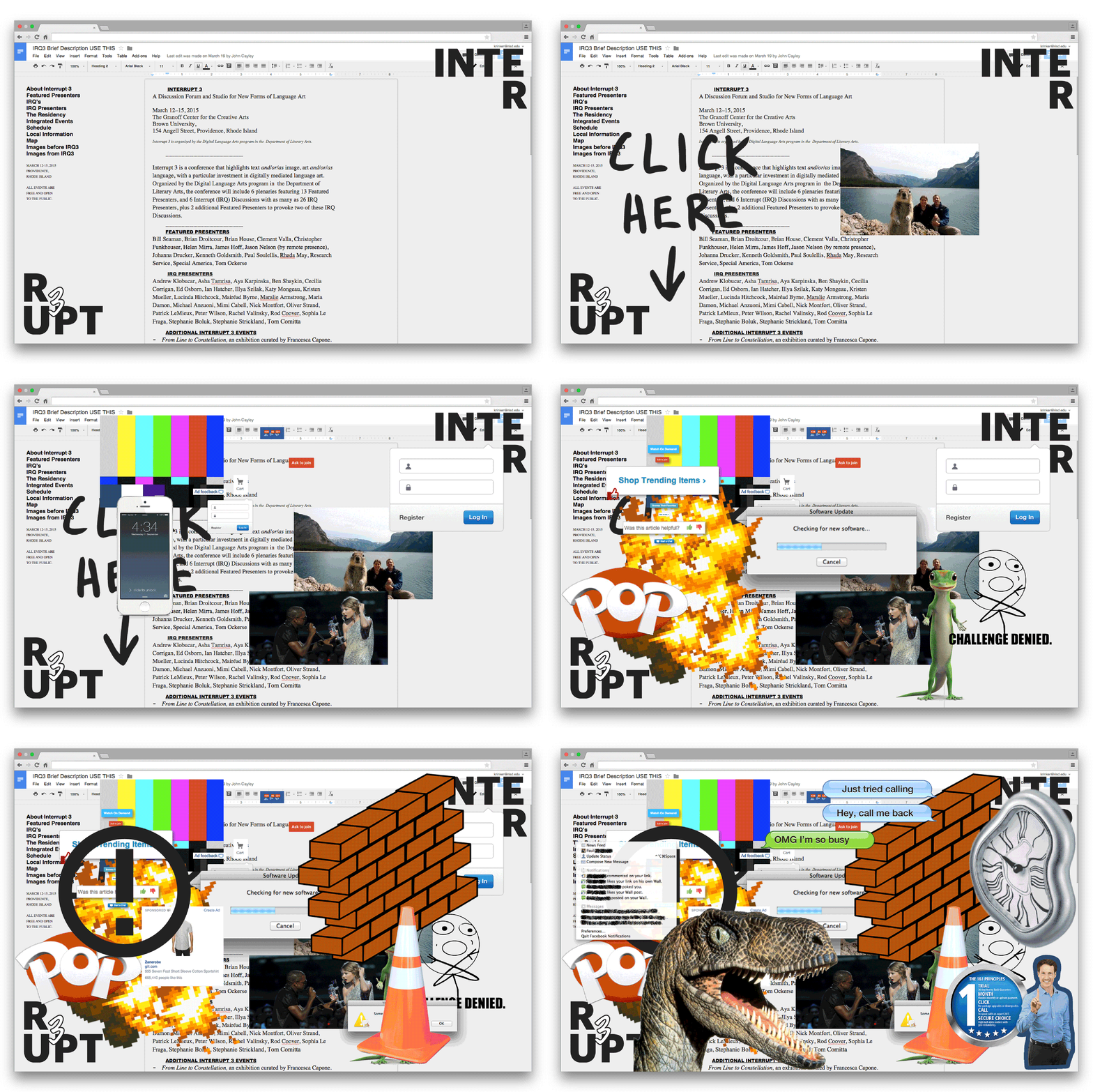
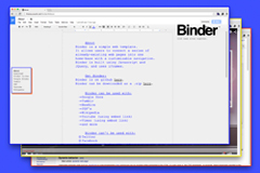
The most interactive and playful use of the pop-up interruption is in the website. The reader has the choice to click on each pop-up to remove it, or do nothing and allow the pop-ups to gradually invade the screen. We built the site on top of an actual google document page, so that conference organizers could make content updates until the very last minute. This feature also allowed us to apply the pop-ups to every page of the website without interfering with the website itself.
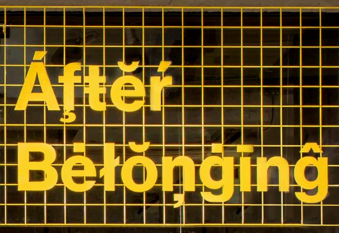
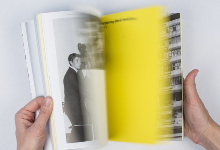
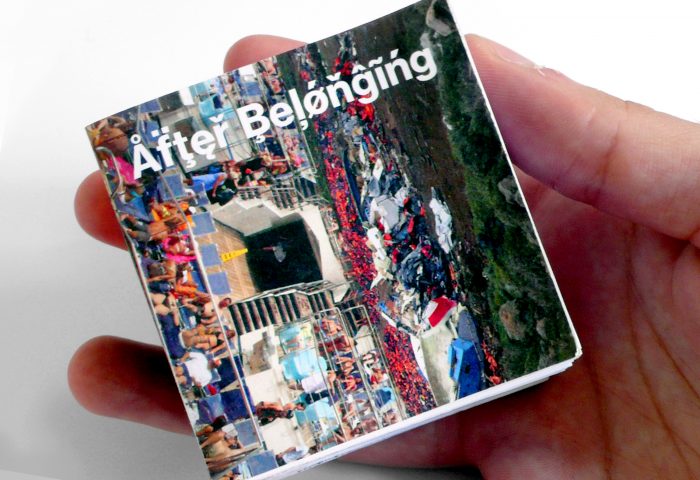
After Belonging: Identity
This is our work is a graphic design studio run by Megan Feehan and collaborators. Our work includes visual identities, publications, exhibitions, print collateral and interactive projects for architecture, art and miscellaneous institutions. We specialize in being design generalists, in not fetishizing technology over communication, and letting experiment and play guide form and format decisions.
Our design process incorporates research, analysis, and genuine curiosity to determine the best outcome with the most impact, whatever the format. Our aim for every project is to produce memorable, meaningful and intuitive communication design. We love the full spectrum of the process — embracing grand concepts and granular production specifications equally.
Our clients include the Oslo Architecture Triennale 2016, Rhode Island School of Design, New Museum for Contemporary Art, Storefront for Art and Architecture, Brown University, David Brooks Studio, Post-Office Architectes, On Stellar Rays Gallery, and Lauren Wegel Architect, amongst others. The studio was founded in New York City in 2013, and is based in lower Manhattan.
2015 © This is our work
